'header image' - working on my blog
-
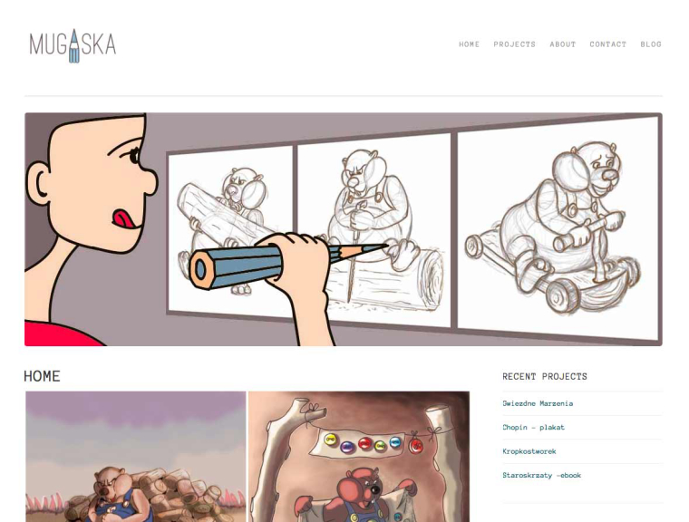
Hi, I am working on header image now. I wanted to draw myself using a blue pencil from my logo (screenshot of my first in below). My blog will be called 10000 hrs and explaining that aim learning. I know I am holding the pencil in an awkward way, but i kind of think its ok cause i am learning, right? or not?...
") How does it look to you? What is your opinion guys?
How does it look to you? What is your opinion guys? ")
-
You're holding a blue pencil but the pencil drawing is in brown?
It looks like you are getting ready to stab the drawing.
The hand holding the pencil is a bit odd as is the positioning of the arm.
I think there is an idea here just keep pushing it a bit more.
-
@aska being a web designer myself a little advice is when someone first comes to your page you want them to see the content. Looking at the screen shot you have the header with navigation and then the large banner, then your content starts below all of that. If he banner has some content on it or even teaser text with a clickable area to get to your blog post that would work. You could even make the banner 3/4 of the width and then the other 1/4 could be a text area with some info.
-
@jimsz Ha, Ha it defenietly looks like Iam going to stab it!
With the colour, I got version where I colour beavers pants blue just forgot to post that one. Thanks for encouragement tho -
@chip-valecek Thanks for good idea Chip
I don't think as a web designer. This picture works as 'come back to home page' but nothing more. I think I am going to add some text. -
I would definitely change the hand. You say you think it's ok to be showing you holding the pencil in an awkward way because you are still learning- but the drawings that the woman are drawing are too advanced for that. It might work if it was a little kid drawing scribbles, but in this case it doesn't work. Even the kid in the reference below is holding her crayon more naturally for her scribbles.
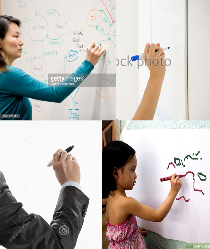
Website: www.tessawrathall.com
Instagram: www.instagram.com/tessawrathall_art/
-
Cute idea for a header! I think the character that is "you" looks a bit off, though - no hair? When I look closer, I can see the hair shape, but it blends in with the background color so much that it looks like the character is bald with a pointy forehead LOL! Maybe try to change the color and have the hair drape more instead of being the rounded/square corner above the ear.
Good for you on working on your blog!
-
@tessw thanks for the reference Tess
I think the main reason why i drew it this way was to show a big pencil and didn't know how else to hold it... but now i know i need to change it for sure. I will leave it a few days and maybe try some other idea too -
@kat ha, ha u really made me wanna change it now! I don't want to be bald!
thanks a lot for your comment