Please Critique
-
Hello,
I have a couple images from a personal series I've been working on. I appreciate any critiques in this early stage of the series.
Thank you!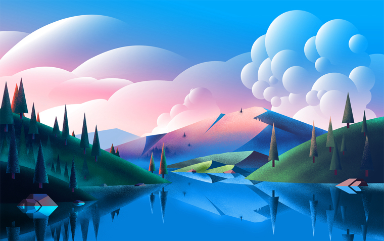 Lake
Lake
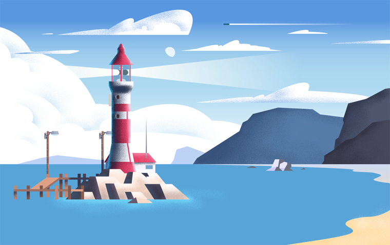 Lighthouse
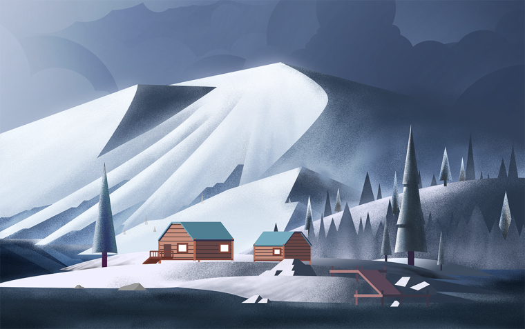 Glaicer
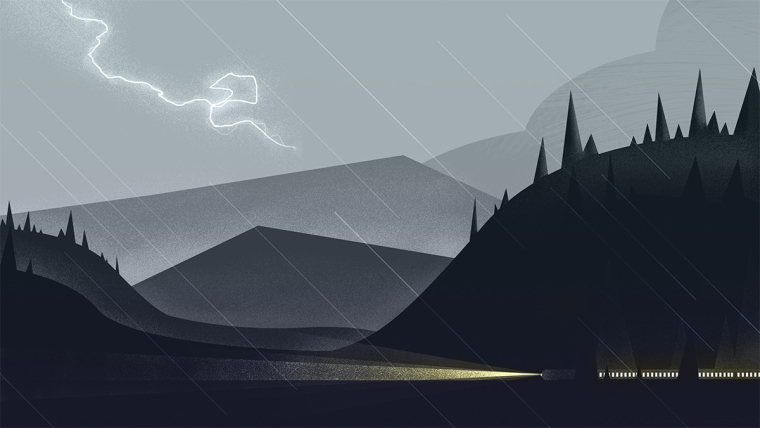 Train
Train -
I really like the lake. All of them feel like the same style however the painting of the lake seems to have more gradients then the other three. The other three feel more flat.
-
@chip-valecek Thanks. I'll keep that in mind.
-
I do like this style of illustration if you are trying to be consistent across your work then the second piece needs to have reflections added to the water. In the first piece the some of the pinkish color would also so up a bit darker in the water
-
@rcartwright Alright thanks. I know there are areas that are unfinished. Do you think I could improve on color or value at all? Those are the areas I'm not as good at.
-
I think your values are pretty good in these pieces, as far as color goes it is hard to say overall colors feel harmonious to me as you seem to be using warm and cool to point out story elements
-
Wonderful consistency in style and very well executed images! Seriously impressive.
A few very small things jump out at me--
In the Lake image, this is just a detail thing--the reflection of the hill on the right has the tip covered very slightly by the hill BEHIND it. Oops.
") Also, this is definitely the busiest piece, I would experiment with toning down the value difference in the reflected part of image so the eye can find somewhere to rest more easily. It may or may not work, but give it a try :-).And maybe a tiny touch more pink and/or blue on the foreground hills (Alternatively, a tiny bit more green in the back) ? To me, they feel kind of separate from the background now, that might help them hang together better--again, experiment and see, I'm just throwing out ideas here :-).
Also, this is definitely the busiest piece, I would experiment with toning down the value difference in the reflected part of image so the eye can find somewhere to rest more easily. It may or may not work, but give it a try :-).And maybe a tiny touch more pink and/or blue on the foreground hills (Alternatively, a tiny bit more green in the back) ? To me, they feel kind of separate from the background now, that might help them hang together better--again, experiment and see, I'm just throwing out ideas here :-).In the Lighthouse image, the water seems very flat and empty compared to the rest. Most of the rest of the image has something going on, either with details or texture. The water doesn't fit, it feels flat. Just adding a bit of the texture you have going on elsewhere would be all it takes there I think.
In the glacier image, the cabins seem strangely smooth and free of snow to me. Even just a dusting of snow clinging around the corners, and a bit more on the roofs? They just aren't fitting into their environment, if that makes sense. I love the looming clouds, the lost edge of the mountain, and the cold feel--the cabins just aren't fitting with that quite yet.
Love the train image. The lighting is so cool. Not a big deal, but I find myself wishing that one or two of the trees on the right broke out of the mountain/hill silhouette in the background. Either that, or were a little further a way. It isn't exactly a tangent, just something compositionally that feels the tiniest bit off to me. Take it or leave it.
Those are my thoughts, feel free to apply or ignore as you see fit
-
@sarah-luann Thank you!! These are really great points. I'll be sure to keep them in mind While finishing the project
-
@rcartwright Interesting. I never noticed I pointed elements out with warm colors, but now you mention it I see it. Thank you!