New To Digital Painting - Looking For Feedback
-
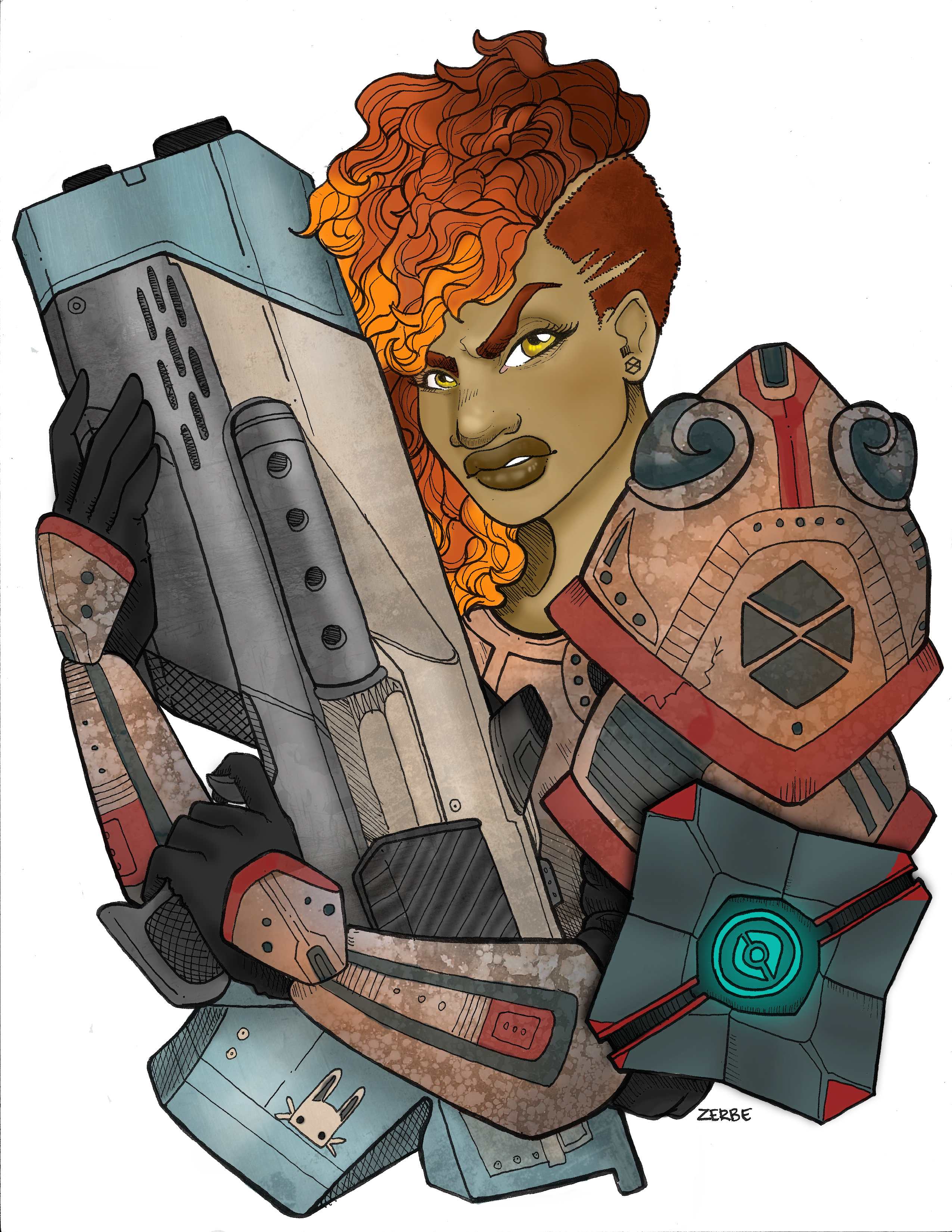
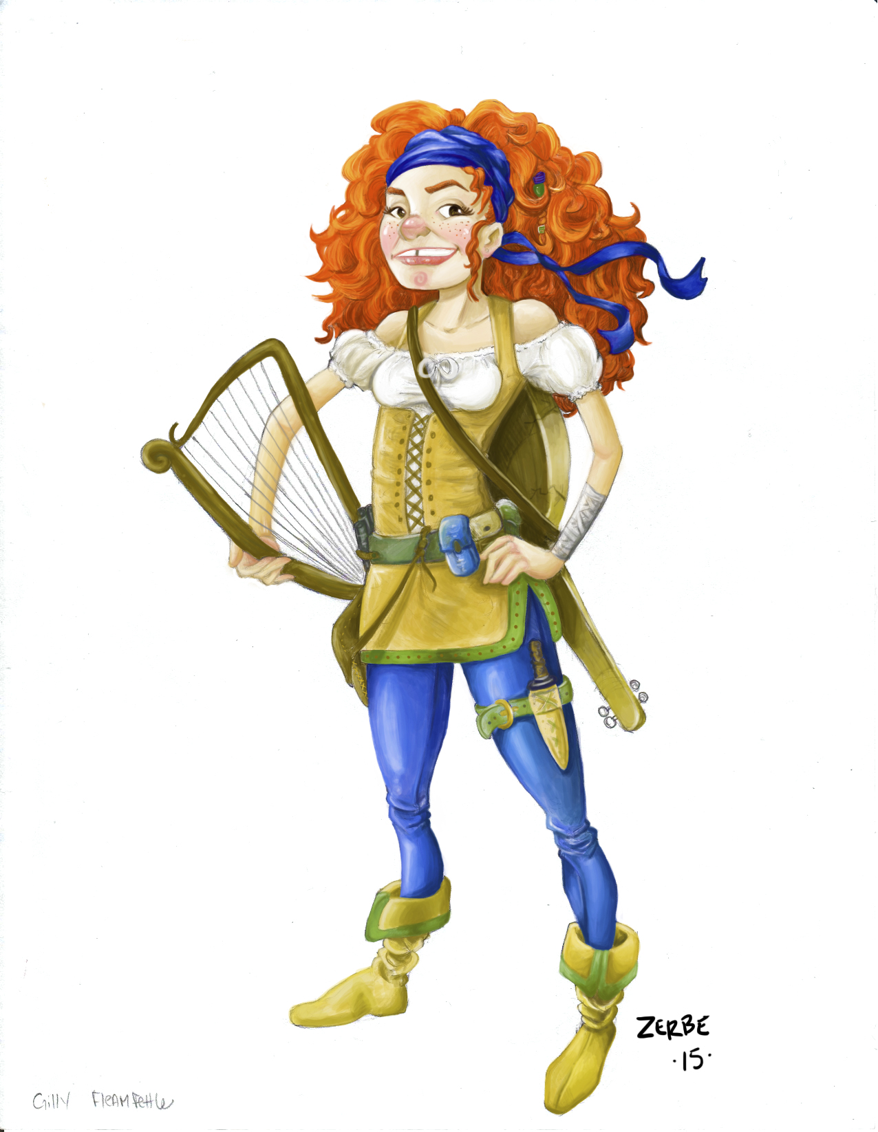
I just got a Wacom tablet about 3 weeks ago and I'm still learning how to work with it. I'm trying to practice doing more painterly work rather than the cell shaded style and heavy line work I was doing previously. I would really love some feedback and critique that could help me improve. Image one an example of my super airbrushy line work style previously, and image two is the painterly one I just finished.
-
For you first painterly like image, you've have done a great job. your use of color and shading are really well done. I feel her arms and legs are a little thin. If you keep pouring out work like this then you're going in the right direction.
-
Both drawings are great, but it could have been pushed even further. I will talk about the first one.
The color is great, nice textures and all, but lack of shadows, especially cast shadows, makes it look flat - shoulder pads cast shadow, gun casts shadow, hair casts shadow, hands should cast shadow, there is no shadow on the back of the head, there should be some highlights on the gun as it is metal (or is it a toy gun?). Same goes for the armor, if it is metal, it should shine.
Just do a multiply layer with more shadows and overlay layer with highligths and lets see how it looks
")
-
I also am starting on a Wacom...I looked up some UTube video's and the one thing I really took away was to use it all the time like when you do your email, blog, just browsing...that way your muscle memory will sharpen and when you go to draw it'll be easier.
thought I would share.
-
Thanks for the feedback. The top image was done before I had a wacom tablet, so I did it with my mouse trackpad on my laptop.
before painting the bottom image, I definitely tried those exercises you mentioned! I'm still not "perfect" at navigating my computer with the wacom pen, but I do really like using it. I'm struggling with weather I should be painting above or below my line work. In the bottom image I painted above it, and in this image I painted below. I know I'm still not pushing contrast enough. I really have to make time to work through the color and light class.
-
For someone who is new at digital painting I think you are doing fan-frickin-tastic! So the top one is more about armor and texture, some thing I know nothing about so it seems fine to me. The red head has spunk and personality! You painted her great! However I suggest painting against a mid tone grayish brown so that you can go dark into shadow and really highlight the brights. It helps push value instead of color. Some thing I still work on myself. (I'm a traditional painter at heart and just love to throw on every color in my collection! lol) Oh and the red head's arm that holds the harp is wonky. Perhaps the elbow should be closer to the body?
I know what you mean about painting below or above your line work. On my recent 3rd thrusday piece I thought I'd be able to paint under my line but I just didn't like the look. So I vectored every single thing in that image. Ugh. There must be a good middle ground. Still searching.
Great work! I'm gonna follow you! (Stalking in a nice way! ;-))
-
I really think you have a talent for digital art, I love your second image. I like to work my images initially working below my line work, that way i can see forms. Then towards the end of a image i start to paint on top of the linework. Its a good compromise.
-
I like your second image as well. Great start. Digital painting is challenging. I struggle with it. Keep going...you are only going to keep getting more skilled.