Reworked Halloween Image
-
highlights along her hat and such, like Kevin was saying, along the right side of her and the cat.
-
@Lynn-Larson I thought you meant the rim of the moon. LOL
-
oh lol, i can see that though hehe.
-
@Lynn-Larson yea I thought maybe the moon had to much warm rim light. What do you think?
-
I think the moon is fine
") maybe take a bit of the brighter yellow around the witch and fan it out a bit more
maybe take a bit of the brighter yellow around the witch and fan it out a bit more -
@Lynn-Larsonok ok, thanks
")
-
Hi Thrace! first of all I really like your sky texture and the image is fun. Let talk about some of the inconsistency that stand out for me. I think you might want to give your cat and mouse some visible texture so they look they belong to the style/texture, also I feel like the cat is not very safe in its position and pose at the moment, I would do what you did with the pose of the mouse. I agree with Kevin on the moon color, it can be less saturate, and I would also introduce some of the moon light to the sky around it. Compositionally looks good.
-
Still working but how about these changes?

-
I like them! Oddly, it really draws your attention to the cottage, which is good
-
Newest update

-
Looking good! The spider definitely shows up as a spider now!
-
@Lynn-Larson thanks!
-
Looking good - i like the warm light you added to the witches hat - you might want to add a bit of warm light to the bottom of the witches shoes (just like you did with the elf playing mandolin) and to her bottom also ...and underside of her arm - ...and then possibly the same treatment to the cat but more subtly ....the tip of the broom has now become the focal point so you may want to not use pure white in that area - you could put a but of the transparent yellow over the white to knock it back a bit - i like the trail location and splash of light..i think you can use that light to give a bit more volume to things..the house looks great
-
I have some suggestions if you wanna see another take on a few things.
The first thing to I notice is a conflicting color balance because we have the warm toned moon, face, and sparkle at the end of the broom, and house. So I opted to try and cool down the moon to a greenish blue hue. I also transferred that green to the house so it doesn't compete with anything. That will pop the face a bit more. I also lightened the value a bit overall.
I noticed the broom being very straight which can kill your gesture and sense of movement, so I bent it to have an upward curve to it.
I added some canvas around the entire image because it seemed a little tight and I added to stars to add interest to the negative spaces. I changed the cat's ears to look as if he is moving with some speed. I added little hints of blue to define some of the dark areas in the witch and on the cat (which someone suggested above). I may have gone overboard on that, but I did it quick so no big deal.
Feel free to keep what you want and ignore what you don't.
Happy painting! : )
Cheers,
-L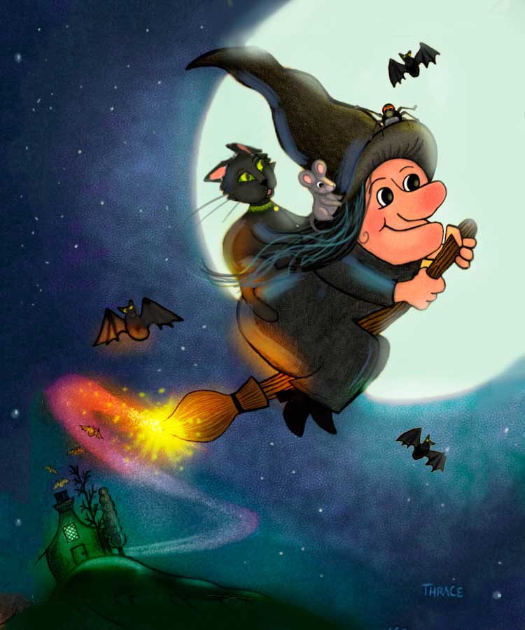
SVS Faculty Instructor
www.leewhiteillustration.com -
@Lee-White wow, it is so cool to see something you created brought to a new level! I have watched you edit others' work but it really does help my motivational level to see the changes made to mine. Thank you so much for doing this for me, I can't express enough how grateful I am!
-
My pleasure! It's so fun for Will, Jake, and I to see you guys progressing so quickly!
-
Here is a compromise of all input I think, especially Lee's! I think its a big improvement.

-
Looks great! So different from the start! The most important is you are happy with it

-
@Thrace-Shirley-Mears This is looking great Thrace! My favourite is the rainbow sparkle broom haha
The one thing I think you still need to massage is the moon - moons aren't yellow, and should be more of a blueish white (like in Lee's). Also - I think you changed the size of it - it was better before because now there's tangents on the edge with her hat and her bum.
I like the bounced light you added in too from the bright sparkle bit - nice touch!
-
Ok, fixed the tangent issue. I am going to do a version with the light green moon I just wanted this one for the magazine cover because I think this color moon looks more like Halloween.
