Society of Visual Storytelling

    SVSLearn Forums

    • Register
    • Login
    • Search
    • Recent
    • Tags
    • Popular
    • Users
    • Groups
    • Search

    Building my Portfolio

    Projects
    17
    33
    10746
    Loading More Posts
    • Oldest to Newest
    • Newest to Oldest
    • Most Votes
    Reply
    • Reply as topic
    Log in to reply
    This topic has been deleted. Only users with topic management privileges can see it.
    • audrey dowling
      audrey dowling @Lee White last edited by

      @Lee-White thanks for the advice lee, I will take it into account!

      website: https://audreydowling.wordpress.com/
      twitter: https://twitter.com/audreydowling
      facebook: https://www.facebook.com/Audrey-Dowling-Artist-Illustrator-498582176906242/timeline/?ref=bookmarks

      1 Reply Last reply Reply Quote 0
      • tallison7
        tallison7 last edited by

        Audrey I think your work is incredible and obviously you are on your way to something special! When you get your 10 portfolio pieces done will you share them here?

        www.traciallison.com
        https://twitter.com/traciallison

        audrey dowling 1 Reply Last reply Reply Quote 1
        • tallison7
          tallison7 @Lee White last edited by

          @Lee-White Wow I wish I had heard all this before now! Going to my first SCBWI regional event in a few weeks and I'm not nearly prepared...

          www.traciallison.com
          https://twitter.com/traciallison

          1 Reply Last reply Reply Quote 0
          • audrey dowling
            audrey dowling @tallison7 last edited by

            @tallison7 oh thanks! of course, I will share them as I go along 😉

            website: https://audreydowling.wordpress.com/
            twitter: https://twitter.com/audreydowling
            facebook: https://www.facebook.com/Audrey-Dowling-Artist-Illustrator-498582176906242/timeline/?ref=bookmarks

            1 Reply Last reply Reply Quote 0
            • audrey dowling
              audrey dowling last edited by

              here's where I am with my illustration.
              there has been great progress, but lord it's SO slow!
              I can't wait to improve to the stage where I can work faster. My portfolio will be ready in 10 years time at that pace 😕
              any feedback on this, while I'm at it?

              website: https://audreydowling.wordpress.com/
              twitter: https://twitter.com/audreydowling
              facebook: https://www.facebook.com/Audrey-Dowling-Artist-Illustrator-498582176906242/timeline/?ref=bookmarks

              1 Reply Last reply Reply Quote 4
              • Ace Connell
                Ace Connell last edited by

                Lovely composition! I like it 🙂

                Ace

                1 Reply Last reply Reply Quote 1
                • mattramsey
                  mattramsey last edited by

                  Just know that, even if it is (painfully) slow, you are on the right track. I happen to be a pretty slow painter and that's what I have to keep telling myself. Also I have to keep reminding myself that if I don't get up at 5:30am everyday to paint for 1-1.5 hours my portfolio will never ever get done.

                  This is very good work!

                  https://www.inprnt.com/gallery/mattramsey/
                  https://mattramsey.artstation.com/
                  https://twitter.com/mramseyART

                  1 Reply Last reply Reply Quote 1
                  • audrey dowling
                    audrey dowling last edited by

                    5.30!
                    I'll go crazy if I sleep any less 😃
                    I manage to squeeze some time most afternoons. I wish I had more time (story of my life ^^ )
                    thanks for the support
                    I love your work matt

                    website: https://audreydowling.wordpress.com/
                    twitter: https://twitter.com/audreydowling
                    facebook: https://www.facebook.com/Audrey-Dowling-Artist-Illustrator-498582176906242/timeline/?ref=bookmarks

                    1 Reply Last reply Reply Quote 0
                    • shinjifujioka
                      shinjifujioka SVS OG last edited by

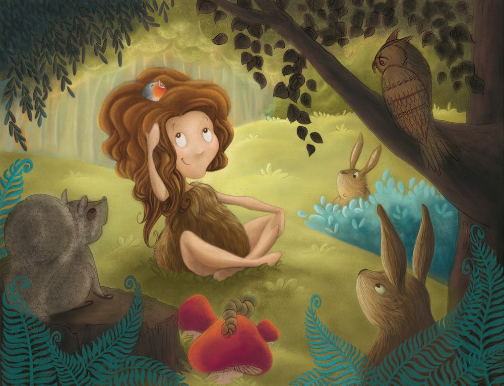
                      Sweet illustration! I really like how you depicted that bush the bunny is hiding behind with those variations of blue.

                      My suggestion would be to add a more distinct contact shadow where her legs and bum are making contact with the grass. I think it will give more of the illusion of something heavy kind of pressing the grass down. Not that I think she is heavy...

                      Also, because I like that blue bush so much, I think it is making the ferns and the leaves in the foreground feel out of place. The intricate linework of the leaves and ferns give it more of a feeling of "exactness" while the bush has more of a feeling of whimsy and playfulness. Hope that kind of makes sense, lol 🙂

                      shinjifujioka.com
                      https://www.facebook.com/shinjifujiokaart
                      IG: @shinjifujiokastudio

                      audrey dowling 1 Reply Last reply Reply Quote 0
                      • audrey dowling
                        audrey dowling last edited by

                        yes perfect sense 😉 I'll take your suggestions into account when I get to these. thanks!

                        website: https://audreydowling.wordpress.com/
                        twitter: https://twitter.com/audreydowling
                        facebook: https://www.facebook.com/Audrey-Dowling-Artist-Illustrator-498582176906242/timeline/?ref=bookmarks

                        1 Reply Last reply Reply Quote 0
                        • audrey dowling
                          audrey dowling last edited by

                          I managed to work a bit on this piece lately, so here's the progression so far

                          I still have a lot to do on the vegetation and animals, but getting there...

                          website: https://audreydowling.wordpress.com/
                          twitter: https://twitter.com/audreydowling
                          facebook: https://www.facebook.com/Audrey-Dowling-Artist-Illustrator-498582176906242/timeline/?ref=bookmarks

                          1 Reply Last reply Reply Quote 1
                          • audrey dowling
                            audrey dowling @shinjifujioka last edited by audrey dowling

                            @shinjifujioka I thought about the firm lines versus fuzzy lines of the fern and bush, but the leaves of the trees might give a nice balance to that, so I'll see how it looks when I have done more

                            website: https://audreydowling.wordpress.com/
                            twitter: https://twitter.com/audreydowling
                            facebook: https://www.facebook.com/Audrey-Dowling-Artist-Illustrator-498582176906242/timeline/?ref=bookmarks

                            shinjifujioka 1 Reply Last reply Reply Quote 0
                            • shinjifujioka
                              shinjifujioka SVS OG @audrey dowling last edited by

                              @audrey-dowling Actually, I think it's balancing out better now. In the version before, there were darker outlines around the fern leaves which made them look like a different style than the bushes. Since both the bushes and the ferns don't have the dark outline, it feels more unified.

                              Your piece is really coming together. Really love that bird in her hair!

                              shinjifujioka.com
                              https://www.facebook.com/shinjifujiokaart
                              IG: @shinjifujiokastudio

                              1 Reply Last reply Reply Quote 1
                              • Kevin Longueil
                                Kevin Longueil SVS OG last edited by

                                Hello Audrey - this is a really nice piece - i especially like your owl! - the thing i wanted to mention critique-wise is that to me the warmth of the background is pulling it forward - i did a super quick paint over - not suggesting this is correct - i picked the color of the tree trunks in the color picker and slid the slider up to blue and sprayed a low opacity airbrush over it - i just wanted to see it with a lower color temperature behind the girl - i think it helps push the background back where it belongs - i know i am not exactly the color guy but what do you think? - 2.jpg
                                Portfolio: kevinlongueil.com
                                https://www.instagram.com/kevinlongueil/

                                audrey dowling 1 Reply Last reply Reply Quote 0
                                • audrey dowling
                                  audrey dowling @Kevin Longueil last edited by

                                  @Kevin-Longueil yes definitely!
                                  I'm not an expert at colours either (yet! 😃 ). I wasn't completely satisfied with that background but wanted to experiment again later. I definitely prefer it that way. thanks for that 😉

                                  website: https://audreydowling.wordpress.com/
                                  twitter: https://twitter.com/audreydowling
                                  facebook: https://www.facebook.com/Audrey-Dowling-Artist-Illustrator-498582176906242/timeline/?ref=bookmarks

                                  1 Reply Last reply Reply Quote 0
                                  • audrey dowling
                                    audrey dowling last edited by

                                    How about 4 months per illustration for a work pace? ahem...
                                    And this one is not even finished yet, but I WILL get there 😃 leaves on the top and a fine tuning and done. what do you think?

                                    website: https://audreydowling.wordpress.com/
                                    twitter: https://twitter.com/audreydowling
                                    facebook: https://www.facebook.com/Audrey-Dowling-Artist-Illustrator-498582176906242/timeline/?ref=bookmarks

                                    1 Reply Last reply Reply Quote 1
                                    • Bobby Aquitania
                                      Bobby Aquitania last edited by Bobby Aquitania

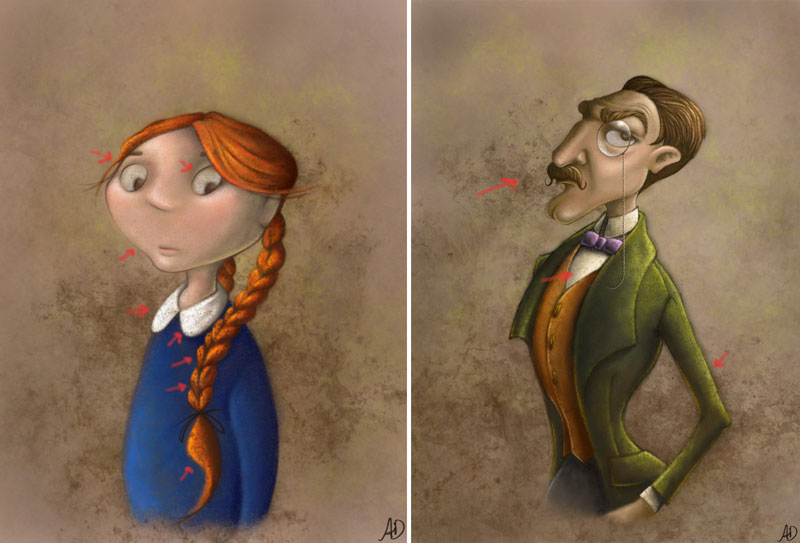
                                      I want to preface that I think your work is great, and that you ARE on the right track. Everyone has given you great advice... this is just one thing I caught in the portraits, because I have used the same style. Which is to use a layer of grunge for the background...

                                      What I think you did here is apply the grunge AFTER the piece was done, which I hope can still be altered. I think when this is done after the fact, the tendency is to make the piece look muddy. I have marked with red arrows where your whites are disappearing from their brightness. And where your colors are looking more speckly and not adding anything to the piece as a whole.

                                      Also watch out for applying this effect too dark or opaque. It tends to take away from the surrounding areas.

                                      Like the side of man's nose and chin, the girl's braid, and parts of the man's coat. This can be avoided if the grunge layer is on it's own layer, so that it can be adjusted. I would turn the opacity down slightly so that the man's face comes forward more. And erase it out of the braid, the coat, the collar, her eyes, and his white shirt...

                                      I know you meant to do this, but the grunge is overpowering all the other great stuff you did, so much so that I saw it first. Cause it covered up all your great little details, and you don't want that to happen. This is just my opinion. I hope I haven't offended you... I see in your new piece you didn't use grunge at all, and it's full of bright wonderful color.

                                      But I do get why you did use it for the single pieces, it gives a nice " antique-y " feel to them, like old photographs.
                                      untitled.jpg

                                      1 Reply Last reply Reply Quote 0
                                      • audrey dowling
                                        audrey dowling last edited by audrey dowling

                                        Thank you Bobby I will remember your advice for next pieces. However, for these two, it is the effect I was looking for 😉 The grungy background and the details that you have pointed out are 2 different layers, and I purposely used a brush with a lot of texture to paint the characters. Like you said, the "antique-y" feel was what I was after 🙂

                                        And I think I am finished with this piece too. phew!
                                        Feel free to critique 🙂

                                        website: https://audreydowling.wordpress.com/
                                        twitter: https://twitter.com/audreydowling
                                        facebook: https://www.facebook.com/Audrey-Dowling-Artist-Illustrator-498582176906242/timeline/?ref=bookmarks

                                        Lynn Larson 1 Reply Last reply Reply Quote 4
                                        • Lynn Larson
                                          Lynn Larson SVS OG @audrey dowling last edited by

                                          @audrey-dowling I think it is amazing! The critters are adorable, she's cute as a button, and your colors are so pleasing 🙂 I wouldn't change a thing

                                          https://instagram.com/lynnlarsonart/
                                          https://twitter.com/lynnlarsonart

                                          audrey dowling 1 Reply Last reply Reply Quote 0
                                          • audrey dowling
                                            audrey dowling @Lynn Larson last edited by

                                            @Lynn-Larson thanks so much Lynn!
                                            Especially the nice comment about the colors, which are not my strongest point. I've sweated to get this illustration done... and already I'm starting to become not entirely satisfied. I can't wait to start the next one to improve! 😃

                                            website: https://audreydowling.wordpress.com/
                                            twitter: https://twitter.com/audreydowling
                                            facebook: https://www.facebook.com/Audrey-Dowling-Artist-Illustrator-498582176906242/timeline/?ref=bookmarks

                                            Lynn Larson 1 Reply Last reply Reply Quote 1
                                            • First post
                                              Last post