Zombie Prom - Looking for Critique
-
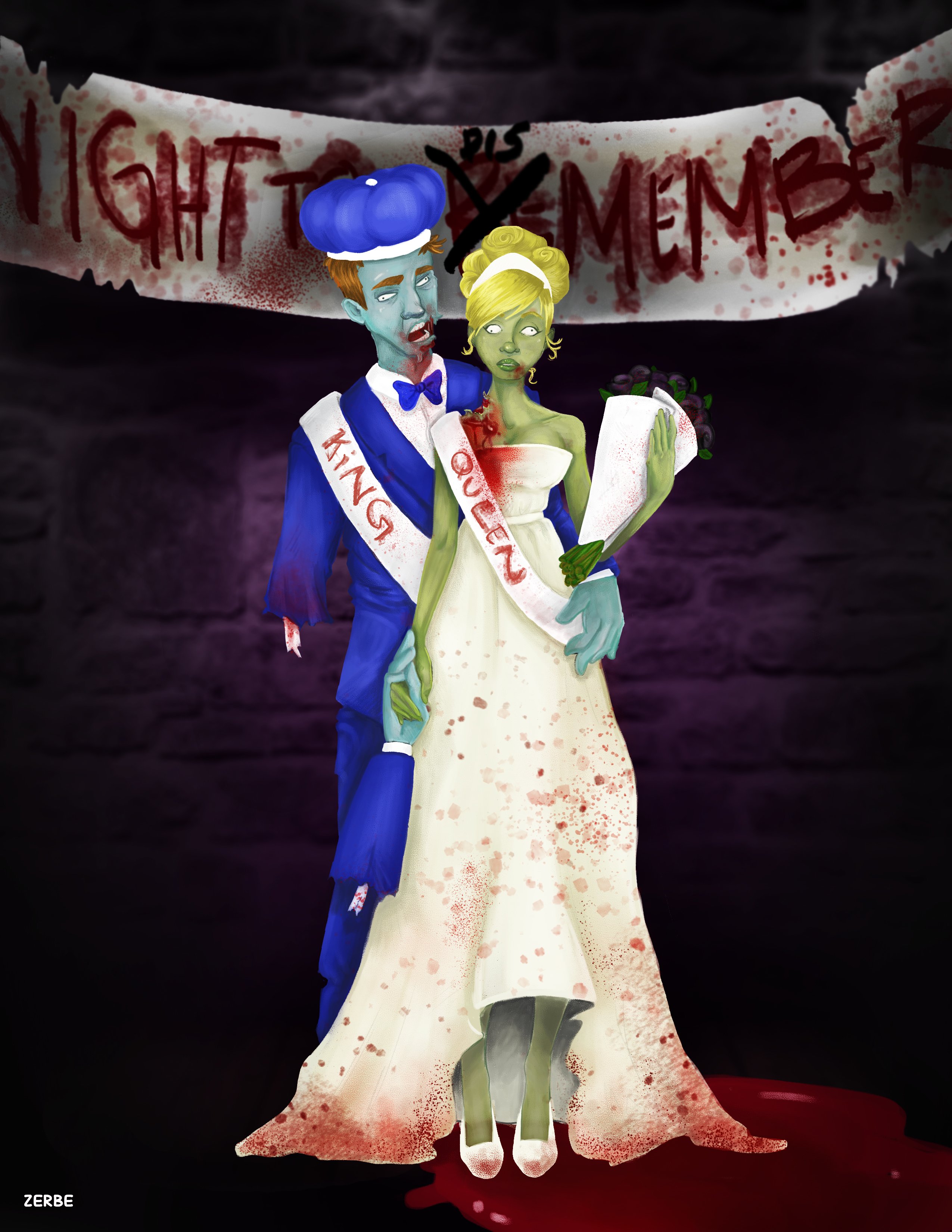
Working on a halloween "zombie prom" image. My first completely digital piece. I did the sketch work and everything with the tablet. I kind of lost steam for the BG, I'm not really used to working on backgrounds. Would love some crit and feedback. Trying to get better!
-
Hi, I am looking at your image, and its hard to understand what your trying to do/say with it. What's the story, show the story? You need to use your background as a tool for setting the scene to you image. Your figures a too stiff, so you either need to change their posture or position. Also the lighting is a little boring. I like he idea behind your picture, I would sit back and try to visualise what you want your image to say.
-
I have nothing constructive to say other than every time I see the title of this thread I read it as 'Zombie Porn' and it freaks me out every single time until I realise I already made that mistake earlier and it says prom.
I hope my in-depth critique helped you

Ace
-
Backgrounds are very important! I did a painting once where I was in love with the main subject but felt the painting fell flat. I showed it to one of my mentors and his first comment was, "Did you plan the background because this painting makes me feel like it was a total after thought". I went back and repainted the image only this time planning the background. The image turned out 1000% better.
-
Thanks for your thoughts everyone. @Steve Young. Yeah I agree, there isn't much of a story here. My intention was for them to look stiff and dazed, because they are corpses...but I do have an issue where I get the feedback often that my characters look "stiff". I honestly don't know what that really means or how to fix it. Any feedback or thoughts on that would be really appreciated.
My idea was for it to look like a prom portrait. They are always in front of stupid backgrounds with some banner that says something cheesy, and they couple always seems awkward. So I wanted to take that and make it Zombie themed for a "Zombie Prom" Party that is coming up at the end of the month. No real big story, just mostly a character piece.
Any advice anyone can offer about how to avoid, or improve on "stiff" characters would be great. I'm still brand new to the tablet, but that is a crit I've gotten with my traditional drawings as well.
-
What I would suggest is to google image some prom pics and then use those as references. You could zombify one of those couples.
That may help if you (or others) feel your characters aren't life-like enough (because you will be using real-life references).
I think you did a really nice job on the faces but there are anatomy issues on the hands and there is an overall flatness to the clothes and parts of the bodies.
-
@mattramsey Good tip Matt - also, earthsworld.com and iamchicago.net are great resources for references to zombify as well. I draw from those sites and caricature them almost daily.
Ace
-
thank you all so much! I will definitely check that out. I've decide to try to fill up a sketch book with quick gesture drawings of people as well, to help me loosen up my drawings and try to give my characters more life. I hope by doing it constantly I'll be able to really see the movement and avoid stiffness in the future.
http://zerbetron.com
http://kimchizerbe.com
ig: @kimchizerbe -
@kimchizerbe Doing that has never, ever resulted in anything but drawings get infinitely better. Do it
")
Ace