Rapunzel - color and composition?
-
@Kevin-longueil I don't know how you do it, Kevin, but everytime you point to some issue, I can directly see the problem. Why I don't see it before?
") So please, keep on pointing to things you see. I can just learn from it. For sure, I will work on the horses legs. Thanks!
So please, keep on pointing to things you see. I can just learn from it. For sure, I will work on the horses legs. Thanks!
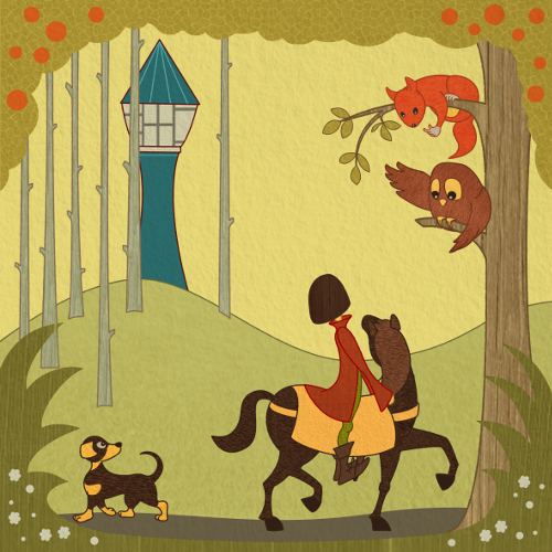
@Rich-green Thanks for your feedback, Rich. You are right, the trees have a different style. I will try a version with shapes, which are more similar to the sketch. It is worth, comparing these two options. -
It is difficult for me to see my own work clearly too after a while - I think that is where flipping the canvas horizontally really helps - or holding a painting up to a mirror (I'm sure you know this) - very helpful to have an extra set of eyes - one thing I just noticed is the possible tangent between the squirrel tail and the owl head - in the color comp there is a nice negative space between them - I would possibly try curling the tail a bit away from the owl's head (possibly point it subtly toward the tower too) and giving some space between them again and see what you think -
-
After many (sad) days without drawing, I finally found some time to work on Rapunzel again. Following Kevins (@Kevin-longueil) advice, I made some changes at the horses legs. I guess it is better now. After switching the whole image, I liked the switched version even more than the original. So I keep on going with the new version.
In a tutorial I learned that if the character moves from left to right, the viewer is moving together with the character, because we read an image from left to right. There is a positive connection so to say. But if the character moves from right to left, there is a confrontation with the viewer. Which can cause more negative feelings. What do you say? Can you follow this argumentation? For this piece I have to say, I feel much better when I, as a viewer, move together with the horse. It is more like making the same experience as prince and horse. Or is this total rubbish?
")
-
Looking great Jana! - I believe what I like about the first composition is that we discover the tower the same way the rider does - we move our eye from the squirrel to the owl to the horses head to the riders head and then to the tower - with it flipped we see the tower first then go to the riders head (seem to skip the horses head entirely)then to the owl then the squirrel - and back to the tower - I both the dog is discovered slightly later which is fine ....anyways I don't disagree with anything you wrote but I though I would share how I am reading it
- beyond that the horses legs look good! - sorry to keep going back to your original study but I think the gesture of the rider and the scale of the rider really looked nice in that color study - in this new version the upper body of the boy is too long - I understand that he may be "posting" in the stirrups but I think he reads as too big somehow - the head stands out to me as being too large also...I know it is his haircut but I though I would just say what I was seeing - once again i'll point back to your color study - it looks correct there and also the negative space between the boy and the horse looks very nice in the study also - anyways it may just be me so feel free to ignore! ...really looking nice!