Society of Visual Storytelling

    SVSLearn Forums

    • Register
    • Login
    • Search
    • Recent
    • Tags
    • Popular
    • Users
    • Groups
    • Search

    Edgar and Nate

    General Discussion
    3rd thursday
    10
    12
    3326
    Loading More Posts
    • Oldest to Newest
    • Newest to Oldest
    • Most Votes
    Reply
    • Reply as topic
    Log in to reply
    This topic has been deleted. Only users with topic management privileges can see it.
    • Lee White
      Lee White SVS Team SVS Instructor Pro SVS OG last edited by

      Looking good! Shoot for more concept if you can. Maybe the letters in his name can reference something from a story? The skull and books seem a little generic. Try to be specific to a story. Look for specific props that are totally "Poe" and no one else.

      nice looking ink work and character!

      SVS Faculty Instructor
      www.leewhiteillustration.com

      1 Reply Last reply Reply Quote 0
      • Jonathon B
        Jonathon B last edited by

        Crazy awesome! Love it.

        https://www.facebook.com/JonathonBeeBaker

        1 Reply Last reply Reply Quote 0
        • mattramsey
          mattramsey last edited by

          great line work--this is really cool. I'm interested to see where you take this!

          https://www.inprnt.com/gallery/mattramsey/
          https://mattramsey.artstation.com/
          https://twitter.com/mramseyART

          1 Reply Last reply Reply Quote 0
          • Naters.Art
            Naters.Art last edited by Naters.Art

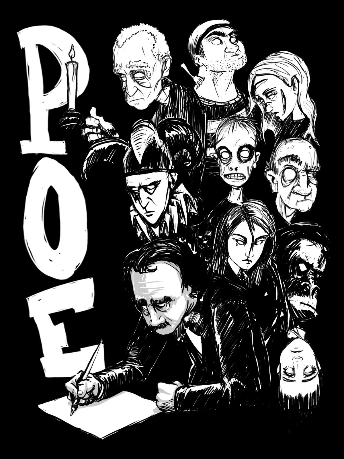
            i decided to illustrate some of Poe's well known literary victims looming over him as he stares at the blank page...
            poe2.jpg

            my Sketch Blog
            https://www.instagram.com/naters.art/

            Leontine 1 Reply Last reply Reply Quote 2
            • Ace Connell
              Ace Connell last edited by

              Gorgeous! I know nothing of Poe, other than that's what the crow's called on that Canadian animated show Ruby Gloom; but this is looking real nice and I feel the Inktober influence works well for the dark stories (I'm assuming) Poe wrote haha.

              Ace

              1 Reply Last reply Reply Quote 0
              • Rob Smith
                Rob Smith last edited by

                I really like the second image. Very strong work!!

                1 Reply Last reply Reply Quote 0
                • Leontine
                  Leontine @Naters.Art last edited by

                  @Naters-Calderone Really awesome work you've got here!

                  Leontine
                  "A picture is worth a thousand words."

                  https://leontineillustrator.com
                  https://www.instagram.com/leontine.illustrator/
                  http://www.facebook.com/leontineillustration

                  1 Reply Last reply Reply Quote 0
                  • Jana
                    Jana last edited by

                    Who says you are not good in use bold dark areas with control? 😉
                    This is amazing. The first one is my favorite, but I also like the creepy faces of the second one.
                    Great, Nate! 🙂

                    1 Reply Last reply Reply Quote 0
                    • AWall
                      AWall last edited by

                      I liked your first drawing but I really dig your second. It might be taken farther if you can do something to distinguish Poe from the other characters. You might try a variation in size to isolate him since they are so tightly packed. Just an idea but play around with it a bit more, I think it can get even better.

                      Let's connect!
                      www.amandawall.ca
                      www.facebook.com/AmandaWallCS
                      Instagram: @amandawall_cs

                      mattramsey 1 Reply Last reply Reply Quote 0
                      • mattramsey
                        mattramsey @AWall last edited by

                        @AWall said:

                        I liked your first drawing but I really dig your second. It might be taken farther if you can do something to distinguish Poe from the other characters. You might try a variation in size to isolate him since they are so tightly packed. Just an idea but play around with it a bit more, I think it can get even better.

                        I'll second that. You will either want to change the value of those characters (probably go lighter) or go with a different color for them.

                        The other main thing: you will want to really work at getting their organization just right. As it is, it more resembles a cut-n-paste/randomly placed crowd milling behind him. You want their placement to be very deliberate and designed. Don't be afraid to use different angles (you have most of the figures vertically aligned) and the figures can (should?) bleed into each other.
                        Related to that: you might want to vary their shapes/sizes more.

                        This is a really great image--one of the stronger ones I've seen so far for this contest. Really excited about it. I think you nailed the Poe figure and I like the composition of him and the text.

                        https://www.inprnt.com/gallery/mattramsey/
                        https://mattramsey.artstation.com/
                        https://twitter.com/mramseyART

                        1 Reply Last reply Reply Quote 0
                        • First post
                          Last post