Would love to give a critique
-
@amphailin
I like how there are 3 "hats" on the floor, but the kid is wearing a piece of the castle instead. The objects on the floor are evenly spaced. You might want to consider making them more random. Maybe you could have a couple of them next to / overlapping each other.
The background is confusing to me. The wall is very unusual. Is it a mural? Sometimes it's hard to tell what's going on when there's a drawing or art within a drawing. Also, what is the circle? Is it a window? Or a mirror? You might want to change to a plain background so it's not competing with your subject. -
@jbleau
I like the misty / cloudy moonlight feel to the background. I'm fairly new to SVS as well, and I'm also trying to figure out lighting and color. Actually, I'm such a beginner, sometimes I don't know what I should focus on first! I still need a lot of practice just on shapes and anatomy. So I'm just an amateur, but I can try to give some helpful feedback.It looks like the only light source in your piece is the full moon behind the dog's head (and some bouncing off the clouds / mist). So the rabbit and the ground cover & pumpkins wouldn't have these bright colors from the cool, dim moonlight. The gray ground cover, bushes, and background seem much more appropriate to me. Also the "carrots" sign seems kind of awkward and I don't think it would catch the light at that angle.
I think the lighting on the dog looks good. I'm not sure about the red light underneath, though. It would make more sense if he was standing on something red. You might want to add a shadow under the dog, too. The dog's ear on the far side threw me off a little. At first, I thought it was the dog's jaw. It does work, but you might want to change the shape of the ear a little, and / or make the teeth whiter to help define the mouth. I like the energy & posture of the dog. He's doing whatever it takes to get rid of that rabbit!
The speckles at the top of the image are a little confusing. At first, it seems as if they are part of the explosion of the dog bursting through the fence. Then, I thought they were fireflies, but there seems to be a whole lot of them. I've never lived where there are fireflies, but don't they stay fairly close to the ground? They also could be stars, but I think they are fireflies. Also, do they stop glowing when there is a big noise? (Like crickets stop chirping.)
A couple of other things that aren't making sense to me are the 3 dots at the base of the rabbit's foot, and the shape of the rabbit's tail. The round shapes on the foot look like they could be the pads of the rabbits paw, but that would go under the rabbit's toes at the other end of the foot. I would make the rabbit's tail circular, oval, or round at the bottom with a slightly pointed tip. I think their tails are more compact rather than wispy / shaggy.
Overall, you did a great job conveying the story.
-
@andyg
Your car is so cute! -
@will-terry
Wow, Will! Even your chairs are adorable! -
@pam-boutilier
Pam, your 2nd drawing is fantastic! -
@audrey-dowling
I don't understand the circle in the lower right corner (is it space for text?), but I love the expression on the boy's face! -
thanks @miriam . there will be a smaller illustration inserted there
-
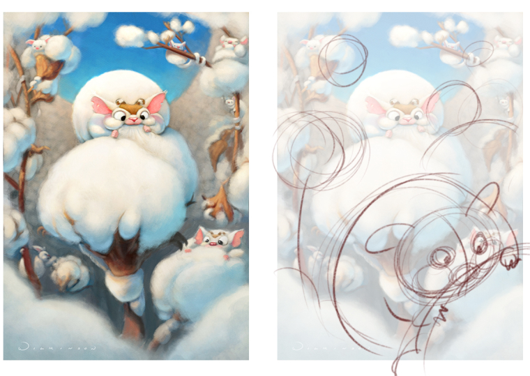
@gary-wilkinson Hey Gary,
Nice piece! It's very finished. My comments aren't going to be absolute - more of suggestions that I would do for storytelling. I think you rendered an image that communicates what you want - I'm going to share what could make the story more easy to convey?
-
I'm not a huge fan of the strait on view of your critter - it works - it could be a me thing but I prefer seeing him turned a little more.
-
I used to drive through the cotton fields when I lived in Cali years ago - I had to get out of the car to pick some because until we moved there I had never seen any up close. I'm guessing most people don't know what it is. For this reason I would make the first glance and subsequent focal point - your critter. I think it's more interesting and would make your composition more dynamic to get more of a close up on him/her.
-
I didn't draw it but I would also perhaps show a middle ground critter clearly dropping pieces of cotton in his/her mouth in profile. If eating is the activity I would more clearly show it. A successful illustration for your portfolio should communicate one main idea very clearly - you can have more ideas/story that reads second, third, etc. but you really want your viewer to understand the statement you're making quickly.
Really nice color and I like how tight you got on your main critter - nice job!
Will

-
-
@miriam Thank you!

-
@miriam Yes, there is a story behind why he wear the pieces in stead. I plan on having more items on the floor, mainly hats. The background plan is to have wall paper type feel once finished. It will be less pronounced. The circle is a window
-
@marsha-kay-ottum-owen Ive been thinking about adding shevles in the wall? Have some stuffed animals and small toys up there as well. I'm okanning in adding more hats in the floor. I'm iffy about the window. Could be distracting.
-
@amphailin I don't think you need to add too much but just something on the right side to balance things out. And, I'm sure I am not the best critiquer either
 I think it is really cute.
 -
@will-terry Thanks Will I really appreciate it. I'm always looking to learn and improve, so this was a great help!
-
@gooddharma This one is hard to critique in this forum because it's more of an advertising illustration and subsequently has a different purpose. Rather than telling a specific story it's goal is to communicate more of a general idea - Celebrating the Christmas holidays with various forms of transportation. It's really nice in many ways. My main paint over if this were a children's story illustration would be to limit your focal points to one main idea/story - but I think that wouldn't be appropriate for this one.
Thank you for sharing!
-
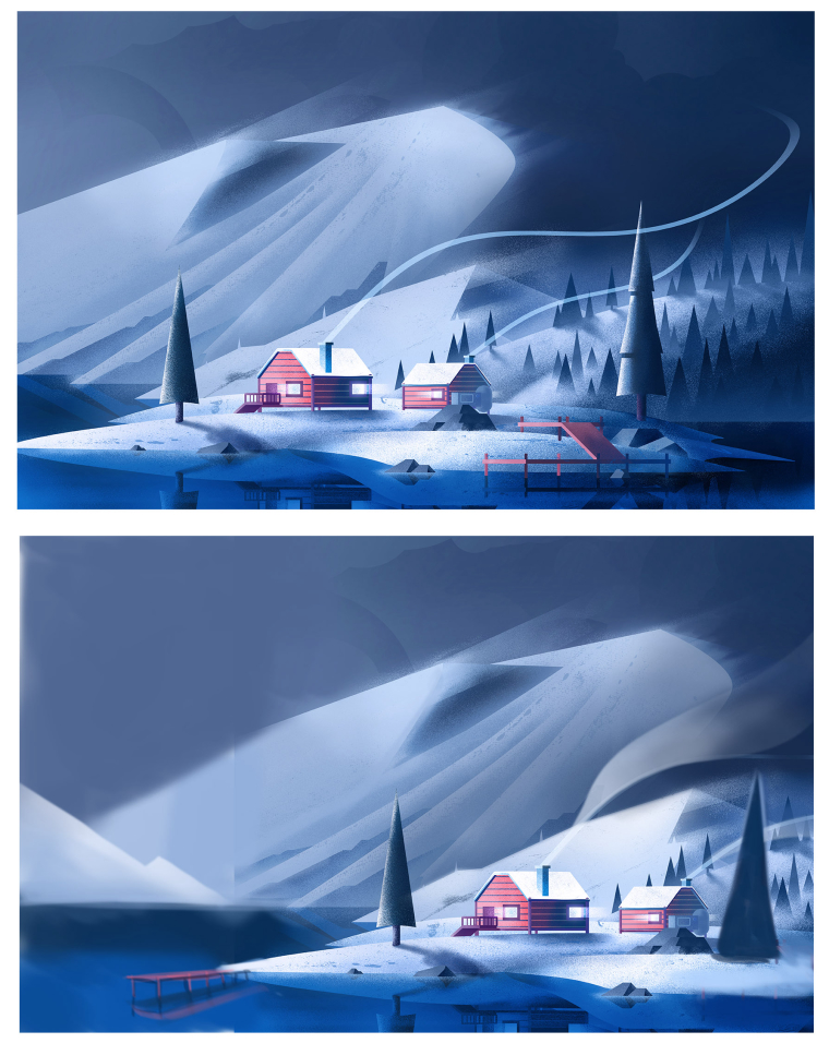
@ben-migliore Nice illustration Ben.
Here's what I would change:
-
I would move the cabins to the right or left to take them more off center - right now you have interest on both sides of the cabins which divides your viewer's eye movement.
-
I would progressively widen the smoke lines coming out of the chimneys to more closely mimic the physics of smoke.
-
I'd move the dock over to become a second focal point.
-
I'd add a figure or two in there to build this into more of a story - perhaps someone in a boat? Fishing? Meditating on the dock? An airplane coming in? Could be the start of an adventure.
Really nice feeling - thank you!

-
-
@will-terry thank you!! Good to keep in mind
-
@jonas-zavacky It's hard for me to give a detailed crit at this stage because I don't think I have enough visual or concept information. But my gut feeling is that you'll need to show more of the figure cropping out so your viewer can easily comprehend what type of figure this is and what the body language is?
-
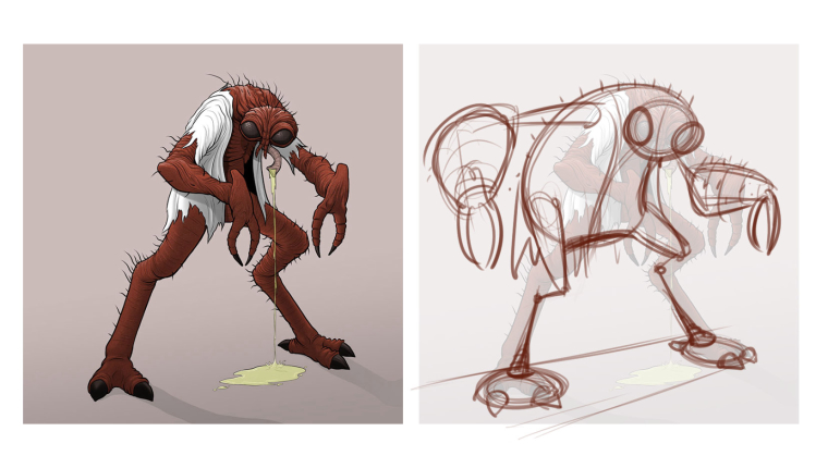
@ians Thanks for sending your character design - I like paying with characters shapes.
A few things to consider:
-
I would vary your leg lengnth and overall muscle shapes . When you keep legs and arms the same width they tend to get boring. You can also consider straights and curves and their relationship.
-
I think you could have more fun - variance on your color to build interest. I didn't have time to do a paint over but I'm sure you can explore character designs from your favorite artists to consider this option.
Thank you,
Will

-
-
@will-terry Thank you ! oh yeah that is true... I will not post WIP next time for this type of critique

-
@miriam Hello! just now checking back in after the holidays and saw your very thoughtful crit. Thank you for spending the time to give feedback. Lighting and color is a big struggle for me. I agree with all your comments, not sure how to fix yet. With a night scene I know things are diffused but I was trying to add some color ...Yes, shadow will help and the ear is odd now that I look at it. Speckles were to be stars but since you picked fireflies, I will say that was what I was going for
 I will go back and review rabbit feet anatomy. Thanks again for the time and effort to give some great feedback, very much appreciated!