New Portfolio Piece Critique
-
Newest update

-
@Kevin-Longueil I am just mortified because I just realized that I never did thank you for the draw over you did for me. It really helped to see what you were talking about! I used a lot of your advice. Again, thank you for taking your time to help me and sorry for my short-sightedness!!
-
@Jonathon-B thanks for your help!
-
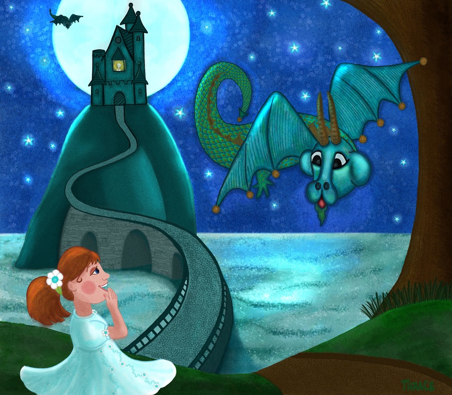
@Thrace-Shirley-Mears Wow the core shadow on the mountain really makes a dramatic difference - great job on this - it really is looking good - if you are up for more i would mention that in previous versions more of the castle was leaving the top of the canvas - i think it was enough that it did not feel like a tangent before - now i feel it has that tension that a tangent creates at the top of the tower where the finial touches the top of the canvas - the bridge looks good - i like what you did to lessen the contrast - the moonlight on the water the rim lighting of the mountain and dragon wings - very nice - there are still some things that read as being flat - this may be the style you are after though - but if not - i believe the castle looks flat - the way it meets the top of the mountain is a very nice curve and would work better if the horizon were above the top of the mountain - but the horizon is well below so we should not see that nice curve at all - i think a fix that might preserve what it might be that you like about this view would be to push the bottoms of the two towers next to the castle gate back a bit this would mean shortening the bottoms even just a tiny bit - the bottoms would have a different curve to them - even a straight line there would work a bit better to help the perspective - if you put a roll of paper towels on the kitchen counter and look at it from the kitchen floor that you will see the contour the bottom of the towers should have - ..the dragons wings and part of his tail have volume but much of it is flat - a hint of a core shadow on the dragon would help to give volume to it (maybe on the wings too)- the face is flattened i think because it has a very even light on it - but also the shape of the eyes do not feel as though they are surrounded by bone and muscle but seem flat which might be flattening the whole face for me....but you may be going for flat with this so i will stop :).....I'm sorry you were mortified about not thanking me...absolutely no worries ever about that!! - i didn't respond right away when i saw your update because i wanted to hang back and see if you could get someones else's opinion or perspective - i worry that my laundry list approach will might get old with folks
") - ..a couple last things - i think it would be pretty easy to construct a 3d model of the castle - even out of paper,cereal boxes, cardboard tubes and tape - you could make a maquette of the castle then sit on the floor looking up at it to get the right lines and angles - you could even light it from the back to see what it would look like....white or grey legos or wooden blocks would work for the model too - then you can really get the perspective and volumes nailed - and lastly the road next to the tree needs to taper on its top edge as it nears the water - i did a real quick job on my draw over but if you look at it it gives the impression that the road continues down the hill - with an abrupt line that does not taper and curve on the top edge it looks like it may just drop off after we pass that point....does that make sense - anyways - looking very good!
- ..a couple last things - i think it would be pretty easy to construct a 3d model of the castle - even out of paper,cereal boxes, cardboard tubes and tape - you could make a maquette of the castle then sit on the floor looking up at it to get the right lines and angles - you could even light it from the back to see what it would look like....white or grey legos or wooden blocks would work for the model too - then you can really get the perspective and volumes nailed - and lastly the road next to the tree needs to taper on its top edge as it nears the water - i did a real quick job on my draw over but if you look at it it gives the impression that the road continues down the hill - with an abrupt line that does not taper and curve on the top edge it looks like it may just drop off after we pass that point....does that make sense - anyways - looking very good! -
@Kevin-Longueil Thank you once again for all of your advice. I am working on it now!
-
Hi Thrace - I think one of the reasons the castle looks flat is that you have not done any shading (highlights or shadows) on the structures. I really think those rounded towers could use some volume lighting to give them that rounded effect.
-
@Rich-Green thanks, I will work on it!
-
@Kevin-Longueil once again...

-
if you were to treat the towers the same way you treated the mountain you would have the core shadow in the middle of the towers and fade to the highlights at the edges - just like the mountain shape - right now you have the shadows at the edges of the towers and a highlight in the middle - same thing for the dragon - keep the rim light you had and darken the value in the core or center of the volumes of the dragon - in some places you have a very thick outline - i think you are putting this on the bottom edges of the dragon to show weight - i don't think this formula works for a flying thing - the road looks good - wasn't sure i was making sense with that - the castle looks better where it meets the ground - still a tangent at the top but it is a new one where the finial is touching the edge....do you think the where the moon hits the bottom edge of the castle is a tangent too?...it might be - one thing also i will mention is in Lee White's paint over he softened the edge of the water at the horizon..he also softened the edge of the moon..or is that from Jonathan B? ..either way i would at least put a layer over this and soften some edges and see what you think - as for the tangent...can you increase the canvas size a bit on top? i'm sure you do not want to shrink your castle any further..but you could also increase the size of the castle so more of it is off camera .....maybe Rich will pop by again - so great to get more than one opinion - Cheers
-
You know I was looking at the update and reading Kevin's comments and as I thought about the image some more I kept wondering if the entire castle would be more in silhouette with such a bright light source directly behind it? I mean in a real world scenario would we really be able to see the front of the castle or the details like that?
Now of course this is a fantasy illustration so it does not have to be totally realistic but it does make me think about it some. Or at least wonder if the castle should at least be a bit darker than it currently is to give that illusion without removing all of the details we see. This way it does not need to be just a solid silhouette but that increased contrast against the moon could be nice.
Hmmm - interesting lighting challenge.
-
@Rich-Green Good point.Yeah, with all the light behind, it'd be totally blown out and almost all silhouette (why is that such a difficult word to spell?)
Ace
-
I think I am done with this one.
-
OK so now that you are done working on this piece - I have to ask the burning story line question I have had. Who is the figure in the castle window???
-
@Rich-Green she is the Dragon Queen.
-
Well done Thrace! I really love the colors, and it is just all around beautiful...nice job dear!
-
@Lynn-Larson gosh, thank you so much for your kind words!!
-
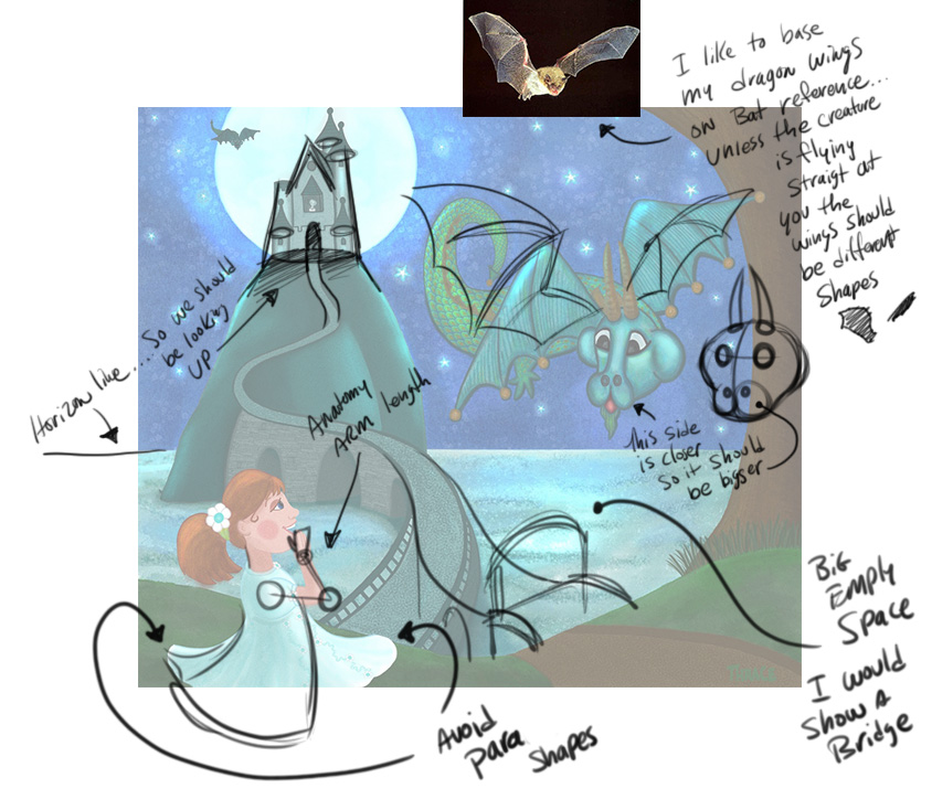
Hi Thrace, here are a few of my suggestions - nice piece and as always - these are just suggestions
SVS Instructor
http://willterry.com/ -
@Will-Terry thank you so much for your input!! I will work on your recommendations and I love the bridge that you added!!
-
@Will-Terry You're very welcome - I meant to say "parallel" down there on the bottom...also - I would get good bridge reference - my bridge is horrible
SVS Instructor
http://willterry.com/ -
@Will-Terry I knew what you meant. I will get a reference but I don't think yours is horrible it gives me a good idea of what to do!! I really do appreciate your taking the time to help me it means so much!!