Fearless WIP
-
I agree with @LauraA - A and B are my favorite and I think read most clearly, I like A for facing fears but it would possibly be more dramatic if it was clear that the skydiver had faced the fear and made the decision, maybe mid-step out of the plane?
-
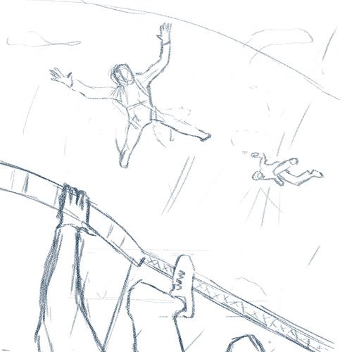
Expanding on A and B here are my sketches for both. Which one should I move forward on?
Option 1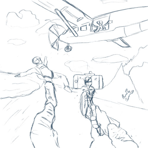
Option 2
-
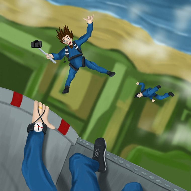
Option 2 gives me a more visceral response (to the point that I wish the spread-eagle guy was giving a thumbs up or something, I need to know he’s okay!!
 ). I’m not great with heights.
 -
I agree with Pam. Option 2 makes me feel for the spread eagle figure and I want to see his/her expression. What does fearless look like on a person's face? I'd like to know since also like Pam I would never be fearless enough to jump out of a plane!
-
@chip-valecek
I agree with @Pam-Boutilier & @demotlj
In option 2, I really get a sense of the height & feel like I am looking down at the ground so far below. I really like seeing the hand and foot right at the edge. It gives the feeling of that moment just before the jump. Anticipation is a huge part of thrills such as skydiving and rollercoasters. I remember reading or hearing that it's the reason rollercoasters aren't full-speed the whole time. It's actually scarier / more thrilling to have the slower parts building up to the rush. I think this design captures that moment. -
SOLD i will be moving forward with option 2.
-
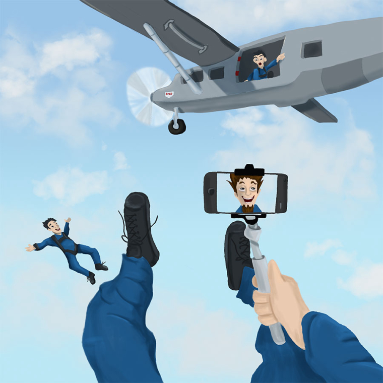
@chip-valecek Hey Chip - I hope you don't mind my late opinion - for me option one is a much stronger composition and speaks better to the idea of fearlessness - the selfie stick shows that this person is totally at ease in a situation where most of us would not be - compositionally I think moving the tangent of the foot lining up with the jumper's leg and possibly removing the diver to the right of the iphone might be worth a try - I'm sure both would turn out very well but for me the first composition seems very well done - once again, I hope you don't mind my feedback after you have already decided on the other.
-
@kevin-longueil Thanks! I was thinking since they are both the same subject maybe i could do both and lay them out like a comic type page. I did that before with one of the 3rd Thursday with a polar bear and some killer whales that came to save him.
-
I'm really late to this party! I really like both of these, but I'm with Kevin and prefer the first one. It's unique--I've never seen it before. The second one is great, but very familiar. The options for facial expression on the selfie seem really fun!
-
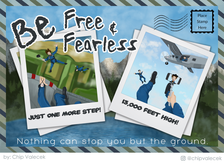
So I decided to do a postcard, maybe one you would buy in a gift shop when you go skydiving. I took both pieces and finished them and then did a quick background. Did a little graphic text layout and other graphics around it all to pull it together. Here are all the pieces by themselves and then all together.
-
@chip-valecek
I really like the postcard with the photos layout. This was a great solution!The phrase at the bottom, "Nothing can stop you but the ground." could use a little work. It makes it sound like you are going to hit the ground hard (to me!). And feels almost like a contradiction to the phase at the top "Be free & fearless".
I'd also prefer the 1st phrase to be a formatted differently. Maybe it's supposed to be more free-form, but it's looking a bit messy compared to the rest of the postcard.
On picture postcards, the stamp goes on the opposite side of the postcard (with the addresses and message), and it doesn't get the wavy lines until it's cancelled at the Post Office (in which case, it should have a stamp affixed). But I guess these can be forgiven, since otherwise it wouldn't be clear that it's a postcard, unless you add another postcard peaking out behind this one and have it facing the other way, showing the back. But then it would get confusing because it would be hard to show the difference of the photos being part of this postcard, but the two postcards being separate.
Overall, it looks really good! It would be cool for a skydiving company to offer this design, where you can insert your own photos.
-
@miriam all great points. I was trying to be silly with that bottom line. I see what you mean about the stamp part. Maybe I can do what you were saying about showing the back of it. I will see I have time before the deadline to do that. One of the reasons I haven't submitted it yet. I like to sit on it for a while and see what pops out. Thanks again for your feedback!
-
@chip-valecek
re: "I was trying to be silly with that bottom line."
Ok, it works if it's supposed to be a joke! (Maybe add an exclamation point? ...unless it's supposed to be more dead-pan.)It does work to leave the stamp area. I don't think most people would see it as a problem. (I was just mentioning it as something to think about. Also, I've seen mail where the Post Office put the cancellation stamp in the wrong place, so there's that, too!)