WIP- Critiques Wanted please
-
@chip-valecek Hi, I was also thinking about the dragon breathing fire but as awesome as it may, I want the attention to be on the princess. I'm not scrapping that idea though. I'll surely consider it. Thanks
-
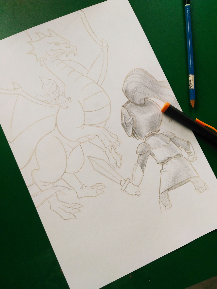
Hi, Everybody! Just a quick update! I've just printed my sketch and have just started shading it using my good old 2B pencil. It's almost finished.
")
-
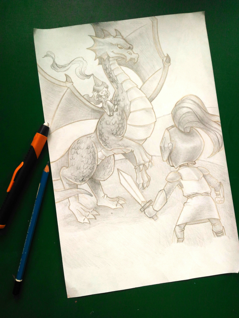
I like the second one because the sword is in a bettr position, not lost in the Dragons hands. The stance is a little wider or deeper..and gives it a bit more tension, like he's ready to defend!
Marsha Ottum Owen
-
@marsha-kay-ottum-owen Thank you. They are actually just the same illustration. But in the 2nd version, I enlarged the knight. I think it's more dynamic this way, more life, more tension (as you said). Again, thank you.
-
@nyrryl-cadiz Looking forward to seeing the finished product
Marsha Ottum Owen
-
@marsha-kay-ottum-owen thanks!
-
Hi! After leisurely sketching, I finally finished. Here it is. Hope you guys like it.
Portfolio: nyrrylcadiz.com
Instagram: https://www.instagram.com/nyrryl_cadiz/
YouTube: https://www.youtube.com/channel/UCbJCF1Im8ZO7hpGWTKOJMuA -
@nyrryl-cadiz Yes, it looks good! Just go tto add feet
Marsha Ottum Owen
-
@marsha-kay-ottum-owen oh... I didn't really plan on adding the feet. I was planning to just leave it at that. Do you think it's alright?
Portfolio: nyrrylcadiz.com
Instagram: https://www.instagram.com/nyrryl_cadiz/
YouTube: https://www.youtube.com/channel/UCbJCF1Im8ZO7hpGWTKOJMuA -
@nyrryl-cadiz
I like feet.Marsha Ottum Owen
-
@marsha-kay-ottum-owen haha
I'll think about it. -
@nyrryl-cadiz I think if you crop it or frame it he won't need feet. Love a good dragon myself, and I like that she's giving raspberries to the knight. Good poses, and I also like the negative space around the sword.
-
@nyrryl-cadiz Really, I think it looks fine without feet. I was just looking at the bottom of the page and wondering why it wasn't finished
Marsha Ottum Owen
-
@marsha-kay-ottum-owen The paper was bigger than the illustration.

-
@nyrryl-cadiz said in WIP- Critiques Wanted please:
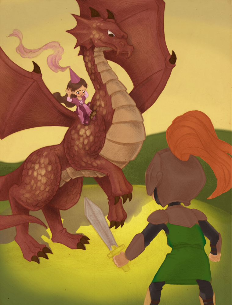
@demotlj Thanks for the critique! The princess is actually the rider. She's the more fearless one in this situation. I imagine her as some sort of damsel in distress who got tired of waiting and defeated the dragon who was guarding her tower. Now as her knight has arrived, we can see that she no longer needs his help.
I LOVE that idea! (and i love her face lol) If it was me, i'd draw the knight a little more ...defeated? (is that the right word?) with a " aww maaann" slump to his shoulders (and his sword arm relaxed).
-
Hi, guys! Sorry for the long wait but here's an update on my illustration. I've finished coloring the background, the dragon, and the princess. I must say I'm very satisfied with how they turned out but, I must admit, I'm having trouble with my knight. I don't know what color to use. Any suggestions? Thanks. Any input is highly appreciated.
Portfolio: nyrrylcadiz.com
Instagram: https://www.instagram.com/nyrryl_cadiz/
YouTube: https://www.youtube.com/channel/UCbJCF1Im8ZO7hpGWTKOJMuA -
This is looking really fantastic. Love the princess really nice rendering job!
-
I would consider a lighter value on the helmet as it is very close in value to the green hill area and it disappears into it.
-
@nyrryl-cadiz This is beautiful! For the knight, his green tunic and sword hilt needs to move a bit further into the foreground. You can do that by coloring the hilt a dark color and adding a transparent dark tone (i.e., shadow) to his entire form, but maybe have a bit of his left edge showing some light coming around his form.
Also, I'm a bit confused about where the light is coming from. It seems to be a spotlight, and I see the dragon's shadow, but nothing for the knight.
Lastly, there's a tangent where the sword touches the dragon's claw. You can either tuck the dragon's foot further behind the sword, or move the angle of the sword. This, of course, can be done in Photoshop.
-
@johanna-kim Hi! Thanks for the comment. Yeah, the knight is still not finished. I'll be sure to apply what you said.