Old and New - WIP critique request
-
Hi All,
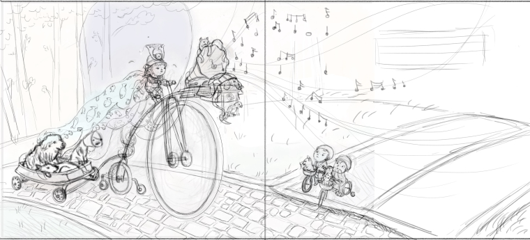
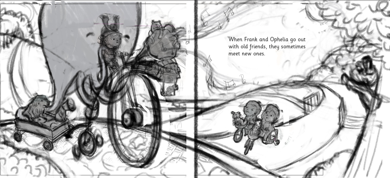
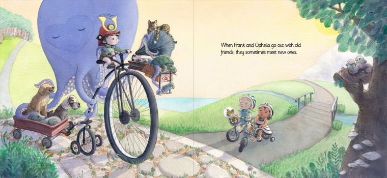
I'd appreciate any feedback on this WIP for the March theme. I've decided to try to do a few more illos based on my February Octopus illo, but introduce this new concept. My thought was to make all the big bike's accessories look antique/old/dusty/cobwebby/faded. The animals on that bike would also be old/rickety. On the other hand, the two smaller bikes would be sparkly, bright and new, including the puppy and kitten.
Thanks in advance for your suggestions/comments.
Johanna Kim
-
As often happens, when I returned to my desk this morning and got a fresh look at my composition, I saw issues, particularly with how the image fills the page. The tricky part is avoiding getting important details stuck in the gutter. Here's an update on my composition, for your review and welcome feedback.
Johanna Kim
-
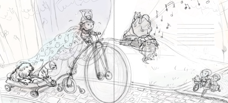
looks great, my eye gets confused with the stabilizers a bit, but that might be just me.
")
-
@johanna-kim This is a great image and concept! - i started doing this draw over before i saw your edit so i don't know if any of this will be relevant - the main thing that was keeping my attention in the drawing was the perspective of the radio-flyer - it feels like the lines of the cart should follow the forced perspective of the road? (I pushed that idea a little too far in my draw over ) I agree with Jason about the stabilizers being confusing - it also feels like the cart may not be centered behind the bicycle - i changed the landscape to try to lead the eye around the page and back to the penny-farthing and rider - increased the scale of the two little kiddos too - your piece does look great the way it is so feel free to ignore
-
@kevin-longueil Wow, Kevin! Thanks so much for your input and draw over. It's really amazing and enlightening to see how the illo transforms; your improvements definitely strengthen the piece compositionally. I'll see what I can use from your suggestions to improve my latest iteration.
-
@jason-bowen Thanks, Jason. Yes, I totally agree, the stabilizers will definitely have to be better defined. It's not just you:)
-
I think that your first sketch has better composition than the 2nd and I think that @Kevin-Longueil has made some awesome points about how to move it forward. If it's a 2 page spread then I would avoid having anything end in he middle of the page. I also think that you should lower your perspective a bit to emphasis the height of the bike and I think you could probably get a really nice flow to the composition that will guide the eye and make the text fit in really nicely.
Hope you don't mind me doing a quick sketch of what I would try to go for.
-
@gary-wilkinson Thanks for your excellent feedback and very strong sketch. I agree with everything you say. I guess I was hoping to maximize all my characters' faces and keep the background details to a minimum, which is why I thought to enlarge everything, but I see now that I have to revisit my thumbnail. These critiques are so incredibly helpful!
-
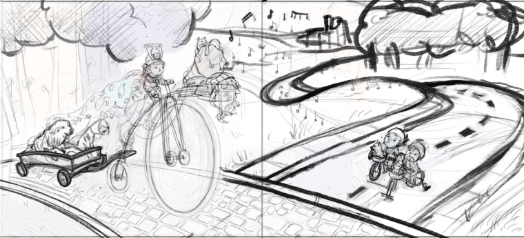
Okay, I think my thumbnail is better now. @Gary-Wilkinson , this version is heavily influenced by your quick sketch. I hope that's okay with you.
-
@johanna-kim Looking awesome Johanna! It's no problem with me that why I critique (mine probably wouldn't have work as well without seeing Kevin's paint over anyhow). You know I didn't notice the octopus in the first sketch even though I read it in the description
 I know it's more like an imaginary friend character for the main character, but it would be cool if the dogs had a little interaction with it. Kind of how dogs react to ghosts. Just an idea
 -
@gary-wilkinson Oh, thanks so much! And thanks for that suggestion about the dogs. I was looking for more ways to have the characters interact and as soon as you mentioned your idea, a potential visual solution popped into my head. I'm learning a lot from your critiques, by the way.
-
@johanna-kim Thanks, I appreciate it! I find that giving critiques is a useful challenge that helps me learn more by fixing issues that others have in my own way (rightly or wrongly). Of course most things are subjective and there are so many styles, so I hope those receiving the critiques don't feel forced to change an idea if that's why they were set on. Speaking of which... the path on the left hill has a similar shape to the legs of the octopus and could distract the flow of the composition (it may be fine with color, but just keep it in mind)
-
Love the way this illo is taking shape. Some great critiques and draw overs, you guys are amazing.
-
Hi All,
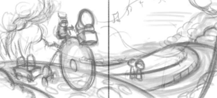
I think this is almost done, but have a nagging feeling that there's still room for improvement. Would love a fresh pair of eyes to tell me what it is. Meanwhile, I'm going to step away for a few hours and hope that whatever's bothering me will become obvious. Thank in advance for any feedback.
Johanna Kim
-
@johanna-kim Geeze, this is amazing. The creativity of it all is just so intriguing! Your style overall is so nice too... very easy to look at and enjoy. I also enjoyed your piece from last month's contest.
To me, the large front bicycle wheel just looks like it's a bit out of line, as if it's positioned in front of the far-back training wheel, instead of in line with the back center wheel. Covering the front wheel and looking at the relationship between the wagon axle and the back axle of the bike helped me to imagine where the front wheel should go. Uncovering it again revealed that it's too far back (or up - whichever way you want to think about it).
-
@kathrynadebayo Thanks so much for this feedback, and the kudos. I'll definitely take a look at that big wheel as you suggest.
-
@johanna-kim Looking great. It's not a big deal, but I don't think you need the sun in the picture. It is a little distracting in it's current position as some of the shadows don't line up with it as they should. Also it might be worth just seeing in photoshop if you could push those colors in the sky to emphasis the sunrise/sunset time of the scene.
Those are both non essential things though and it would look great without any changes regardless
-
@johanna-kim I admire your openness to suggestions this far into your process. I don't know what your work procedure is like, but I'd be interested in learning about how you might adjust a detail like the wheel's position (or anything else, really) when so much detail is already in place. It sounds difficult! (but I don't know much about using digital tools yet...) Again, amazing piece.
-
@gary-wilkinson Thanks for your helpful feedback on the sun, shadows and sky color. I see what you mean and totally agree. Will see what I can do.
-
@kathrynadebayo I've been starting my work traditionally in watercolor, then finishing them in Photoshop. This process may change if I can achieve the particular look that I'm aiming for. Fixing the wheel is possible since I'm working digitally at this stage, but of course, it's always better to catch these kinds of mistakes in the planning/drawing stage.
As for being open to feedback, I really value anyone that takes the time to help me improve my artwork. Sometimes it's difficult to hear, but I try to set my ego aside in order to make the best possible illustration.