Looking for advice on style
-
Maybe I'm just a nut but I can not settle on a style to work in. I don't know what's wrong with me. Anyway I can work in about 4 or 5 different styles that I'm able to reproduce consistently. All of them have problems that I need to work out.
Was hoping I can get some advice and thoughts on which ones I should keep (I'd like to just have 2 styles that I work in) Which ones just aren't working and should be scrapped.
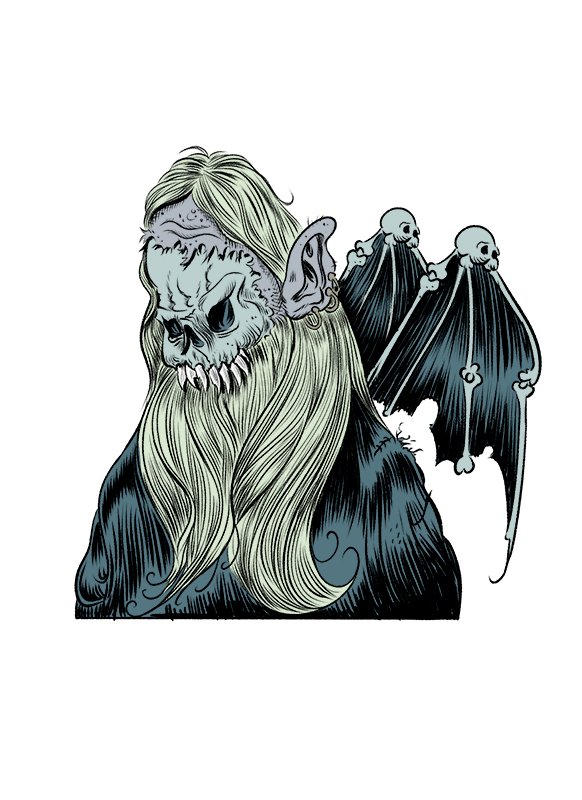
Cross Hatch style with color overlays - Basically a digital cross hatch of the values and then color overlays. This style I like working in but takes a long time and I seem to have trouble with the colors being overly dark.
Hand or digital brush ink with pretty much flat style- I like doing this because it's fast I could pump out three or for images a day. But I don't think it's very marketable and everything I use it for comes out a bit evil looking.
Watercolor over dip pen- Have to redo a lot of these several times because it's so easy to make mistakes working traditional. Also I've tried everything and I just can't seem to get them into the computer looking like the originals and it drives me INSANE!! But I love how the originals turn out.
Dip pen- messy line with coffee staining: For some reason these seem to scan into the computer just fine maybe because it's just values and not much color. I don't know if the limited color works well for the markets I want to work in which is children's books and product designs.
Thanks for reading this novella and any advice would be awesome. Either on what to do to make a style more marketable or what I should abandon.
-
Have you thought about which one or two styles you enjoy the most? Because whichever they are you should choose them. I think all your pictures are good.
-
@evilrobot You might want your chosen market(s) to dictate the style(s) you work in. Some of your stuff looks more suited to comics while other styles look more children's publishing friendly. In the end I really think you need to chase the work that makes you the most happy/satisfied as an artist.
-
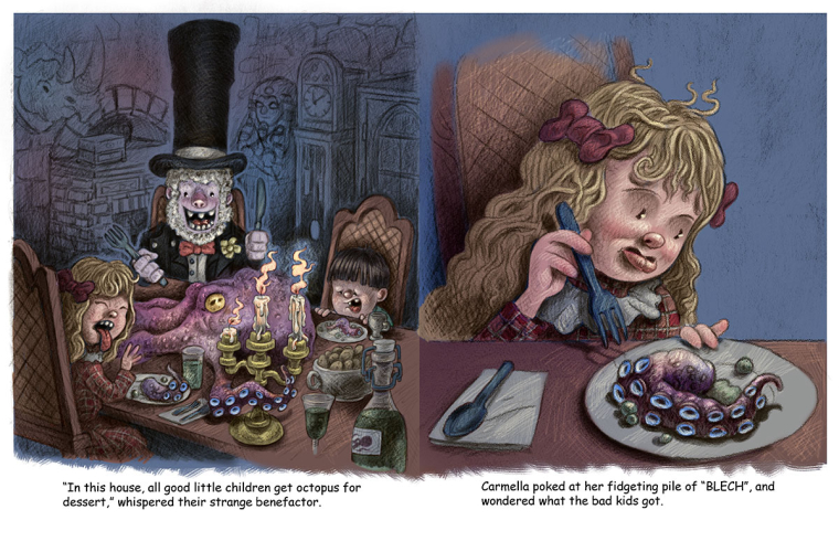
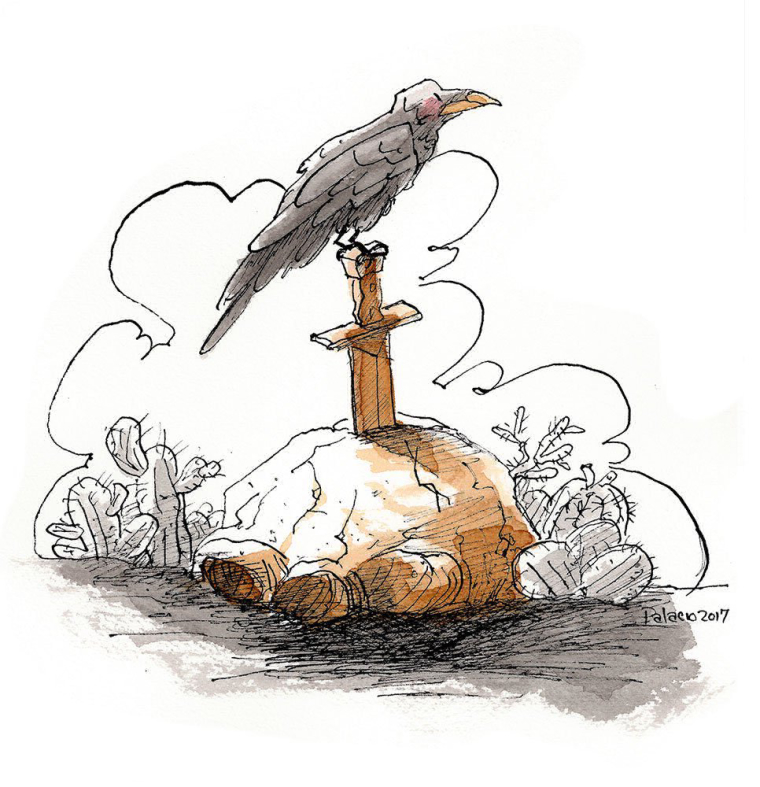
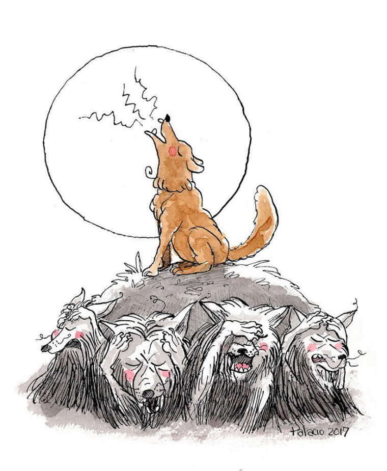
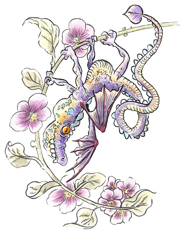
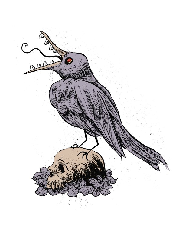
@evilrobot If you're interested in a purely subjective opinion, for children's books, I really like the loose style of the dog howling at the moon (also like that sense of humor) and the crow or raven, as well as the octopus dinner (which would appeal esp. to kids who appreciate creepy ghost stories). It's amazing that you can work in so many styles, and a curse I suppose. Which style do you personally like in terms of the end result? And which do you really enjoy the process? Those are the styles I would focus on, and then work on getting more jobs that align with those styles.
-
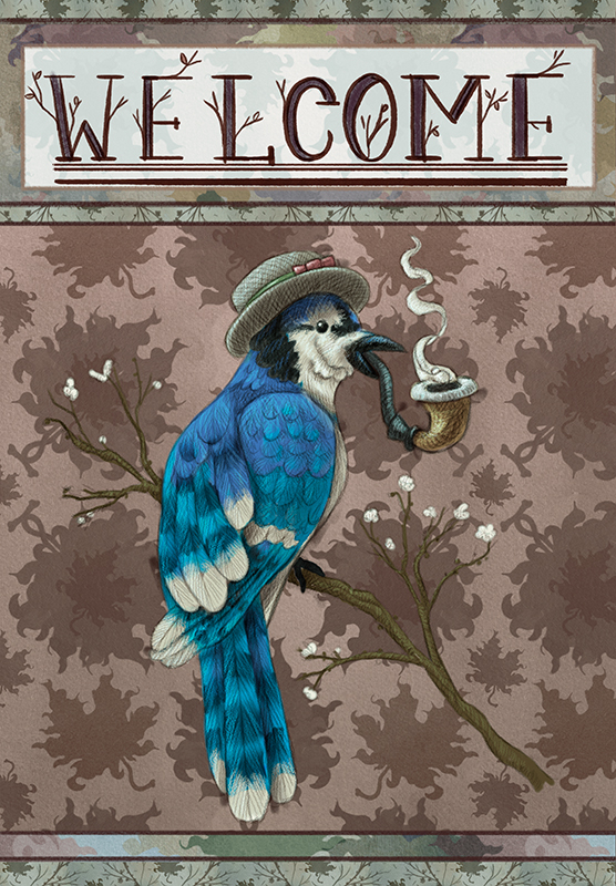
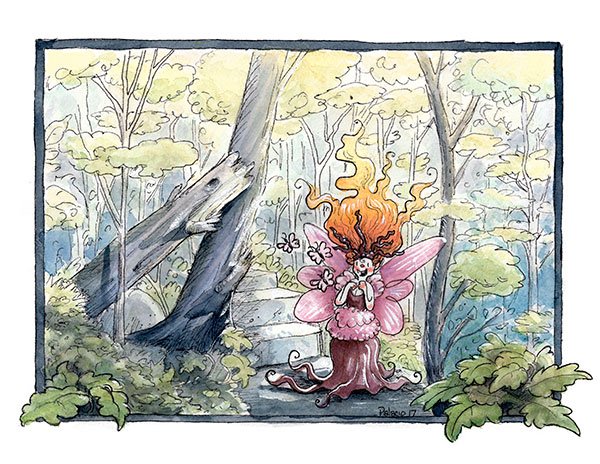
Ok, so I have been showing your work to some of my family. For some reason they all passed through my house today. They all said the same thing pretty much; your first one looks more geared towards picture books, and the lower images look more fit for comic books. That was without them reading Will Terry’s comment. Just to be clear, my family is my harshest critics. I really like the first image as well.
-
I think last two illustrations and it means style is great. I prefer this kind of art
")
-
I love the 2 inks and water colour -the howling dog and bird on the sword-or they might be the coffee ones
-
@evilrobot For me I think that these are all your style and I could recognize any one of them as being one of your drawings or paintings - I personally like them all - the highly rendered and the inked comic look might be my two favorites though - I was just catching up on Giuseppe Castellano's blog post and he had these two posts that seem relevant to this subject - a bit off the subject ...but I just checked out your website which I had not visited in a while - I really like the new clean look!! It really shows off your work
-
@kevin-longueil Thank you:) Those articles were very helpful.
-
There’s nothing wrong with having more than one style (repeating it to myself every day as a mantra, because I really struggle with that myself - despite all evidence that it´s not a problem) and which ones to focus on really depend on many factors. What project is it? What is catching people’s attention? Which pieces/style generate leads and which don’t?
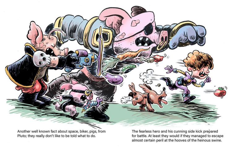
That said, there are a few things that catch my eye that I throw in for your consideration. I`ve seen lots of your art in the past years on the forum and all of it is very polished and very professional, and you clearly have lots of skills. Your drawing skills are amazing and this is probably something to capitalize on: when you give more emphasis to the linework (like in your inked pieces and basically all work here except the first two) I feel the work is more impactful and more „alive“.
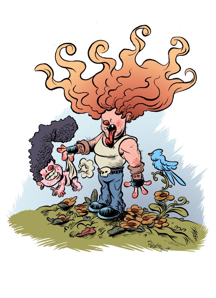
There is one aspect that I would think about: the way you do faces feels a little too formulaic. What I mean is that you have a shorthand for faces (which is good for speed, for sure), but they end up all looking the same, regardless of age, situation or character. I feel this could be a limitation potentially, especially given that you define character so well with other elements: physique, clothing and props. I think experimenting with different ways to express character through the facial features could elevate your work regardless of style.
Another aspect to consider is what at school they called „appeal“. We had lots of discussion about that, in many different courses. It has nothing to do with cuteness or even with a character being good or bad, and there are no concrete definitions of it...it´s more a „you know it when you see it“ kind of thing. So I know it sounds vague and undefined when I say that is something to think about. It affects characters particularly, but also any animal or object that can be thought of as a character. I guess you sense it when you say your character end up „evil-looking“. I think the word is „less appealing“. Maybe a way to say it more concretely is that there are elements in your drawings like teeth singled out, tongues sticking out, extreme positions of hands etc... that make it more difficult for the viewer to „stick“ with your image and feel a sense of identification with your characters. Maybe an artist to look into is Scottie Young, particularly his „I hate fairyland“ series, which features a thoroughly evil and unhinged but very appealing character.
So, after all this rambling, my personal draw is to the crow on the sword and the howling dog. Those pieces sticks out for me as the most appealing of all and the most suitable to children’s books. Whatever you decide to do in terms of style, maybe it´s worth exploring that one with human characters, environments etc, and see where it takes you?