Society of Visual Storytelling

    SVSLearn Forums

    • Register
    • Login
    • Search
    • Recent
    • Tags
    • Popular
    • Users
    • Groups
    • Search

    I need some help figuring out where I am going wrong with this one.

    Questions & Comments
    14
    32
    4106
    Loading More Posts
    • Oldest to Newest
    • Newest to Oldest
    • Most Votes
    Reply
    • Reply as topic
    Log in to reply
    This topic has been deleted. Only users with topic management privileges can see it.
    • evilrobot
      evilrobot SVS OG last edited by

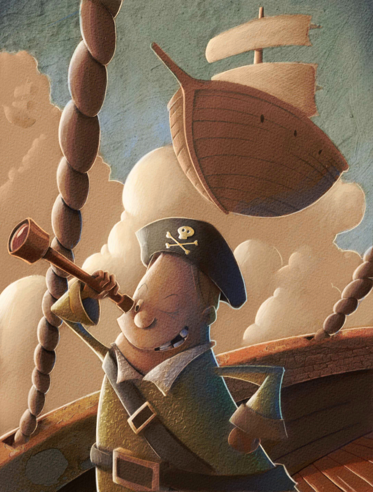
      I think @Gary-Wilkinson is giving some great advice on this one. I'd almost say leave it a value sketch you really got a cool vibe going on with it. Maybe make it look like one of those old time photos. 0_1522419853751_8c6756a8845b4d93789706d2e521d43a--photo-postcards-flapper.jpg

      http://www.palacioillustration.com/

      https://www.scbwi.org/illustrator-gallery/illustrator-detail/?illustrator_id=84142

      https://www.pinterest.com/evilrobot2/pins/

      https://twitter.com/MyEvilRobot

      1 Reply Last reply Reply Quote 1
      • rcartwright
        rcartwright last edited by

        I would look at a better position for the left arm it looks a bit awkward. Overall I like the tones and texture

        https://www.scbwi.org/members/richard-cartwright/
        https://www.instagram.com/richardwcartwright/
        https://www.pinterest.ca/richcartwright3/art-of-richard-cartwright/
        https://www.richardwcartwright.ca/

        1 Reply Last reply Reply Quote 1
        • Jason Bowen
          Jason Bowen SVS OG last edited by

          0_1522429467610_my thoughts.jpg

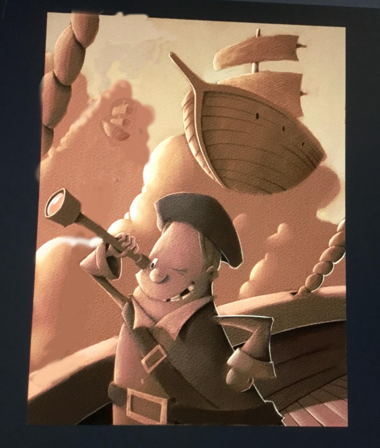
          I think the problem is the rope placement, everything else looks awesome to me. I did a quick paint over to show you how I would deal with the rope. Anyway just a thought, looking forward to see it finished 🙂

          https://www.instagram.com/jasonbowenoils/

          1 Reply Last reply Reply Quote 1
          • lidia-ull
            lidia-ull last edited by

            @Eric-Castleman Great piece! I also think @Gary-Wilkinson gave some great advice. By placing the boat behind the figure you'll give us a sense of depth, making the image much easier to read. I also love the sepia tones you've used. Perhaps try using just a one or two colors overlaid on some main shapes??? Hope that helps a little.

            1 Reply Last reply Reply Quote 1
            • Eric Castleman
              Eric Castleman last edited by

              Thanks everyone. I love all of the input and design critiques. My main issue is getting the color right. For some reason when I paint in photoshop, I can’t seem to get the same color consistency as I did in procreate.

              EricCastleman.com

              SCBWI profile
              https://www.scbwi.org/members-public/eric-castleman

              evilrobot 1 Reply Last reply Reply Quote 0
              • evilrobot
                evilrobot SVS OG @Eric Castleman last edited by evilrobot

                @eric-castleman How are you laying in your colors? On a multiply layer over the values? If you are doing it that way you want to make sure when you open your color picker you'll see the "B" value that's brightness. Have it at 100% for whatever color you are laying in on the multiply layer above. Basically the color will be added in with no black and since it's on a multiply layer above your values it will take on the value from that bottom layer. Otherwise if your color has some B value in it, it will add that darkness to the values you already have and throw it off. If it doesn't look right to you at that point it's because your value is off and you can adjust that on the bottom layer. Or adjust your (H- Hue) and (S-Saturation) values to get the right color you want.0_1522443550396_hue sat brihtness.png

                http://www.palacioillustration.com/

                https://www.scbwi.org/illustrator-gallery/illustrator-detail/?illustrator_id=84142

                https://www.pinterest.com/evilrobot2/pins/

                https://twitter.com/MyEvilRobot

                Eric Castleman 1 Reply Last reply Reply Quote 4
                • Eric Castleman
                  Eric Castleman @evilrobot last edited by

                  @evilrobot awesome tip!! This exactly what I am struggling with.

                  EricCastleman.com

                  SCBWI profile
                  https://www.scbwi.org/members-public/eric-castleman

                  1 Reply Last reply Reply Quote 1
                  • Chip Valecek
                    Chip Valecek SVS Team SVS OG last edited by

                    @evilrobot great advice, may I add when I do values first i tend to use the color or soft light layer mode to add the colors over the values. Then tweak the saturation after i get the color down. But majority of the time I will put down my local color first, then go on top with a multiple layer with a cool blue/gray color for the shadows, then an overlay layer on top with a warm bright orange for the highlights, and then another multiple with a darker blue/gray for the deeper shadows.


                    https://www.instagram.com/chipvalecek/
                    https://www.facebook.com/cvalecek
                    http://www.cshellmedia.com/

                    1 Reply Last reply Reply Quote 1
                    • Eric Castleman
                      Eric Castleman last edited by

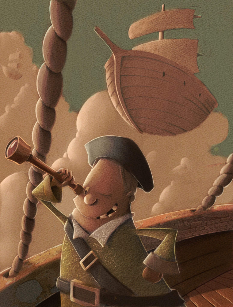
                      Here’s how it’s progressing. Spent most of the night on the foreground. Thanks everyone for the help.

                      0_1522483254321_FAA8573B-A17A-472E-B018-A902A8D88962.jpeg

                      EricCastleman.com

                      SCBWI profile
                      https://www.scbwi.org/members-public/eric-castleman

                      Jason Bowen Kevin Longueil 2 Replies Last reply Reply Quote 5
                      • Jason Bowen
                        Jason Bowen SVS OG @Eric Castleman last edited by

                        @eric-castleman looks great!

                        https://www.instagram.com/jasonbowenoils/

                        1 Reply Last reply Reply Quote 1
                        • evilrobot
                          evilrobot SVS OG last edited by

                          @Eric-Castleman this is looking great man. Your texture is getting a little heavy in a few places. I did a little diagram to show what I mean. Hope don't mind. Hope it helps. 0_1522518490731_light-and-texture.jpg

                          http://www.palacioillustration.com/

                          https://www.scbwi.org/illustrator-gallery/illustrator-detail/?illustrator_id=84142

                          https://www.pinterest.com/evilrobot2/pins/

                          https://twitter.com/MyEvilRobot

                          Eric Castleman 1 Reply Last reply Reply Quote 6
                          • Eric Castleman
                            Eric Castleman @evilrobot last edited by

                            @evilrobot awesome! That is very helpful. I know very little about the rules for texture. I was wondering if certain textures clash or if certain textures come forward more than others as well. This is one I had no clue about.

                            EricCastleman.com

                            SCBWI profile
                            https://www.scbwi.org/members-public/eric-castleman

                            1 Reply Last reply Reply Quote 0
                            • Kevin Longueil
                              Kevin Longueil SVS OG @Eric Castleman last edited by Kevin Longueil

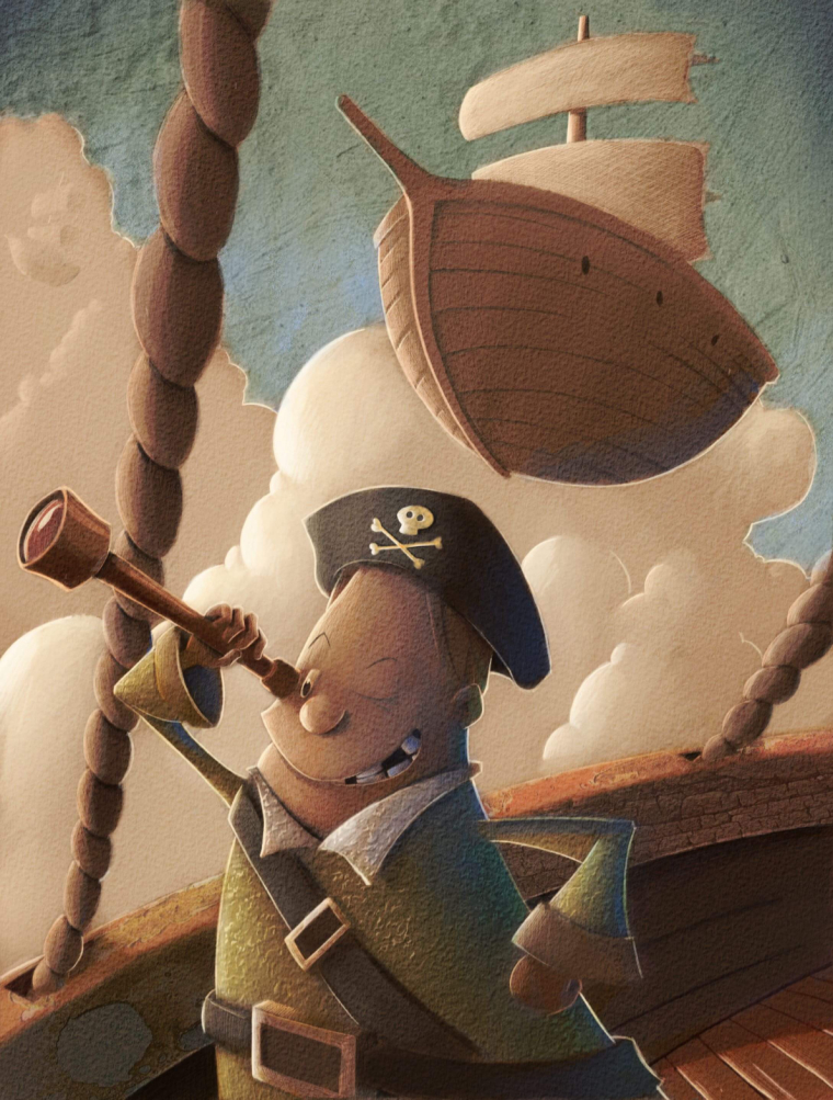
                              @eric-castleman Hey Eric - i am really enjoying your work! This is late feedback and can easily be ignored - just a couple of things that pop out for me - the relationship between the spyglass and the eye - it looks to me like the spyglass is resting on the cheek of the pirate. maybe let some light wrap around and under the eyepiece and slightly change the arm position and grip? The rigging does not need to be any one way and it is fine the way it is but i was wondering how it might look with simplified ship rigging showing? I did a paint over if you can call it that (my apologies 🙂 I tried to push the background further back with overlap and less definition too - anyways...awesome work!!

                              0_1522550037581_Untitled_Artwork-43.jpg

                              Portfolio: kevinlongueil.com
                              https://www.instagram.com/kevinlongueil/

                              1 Reply Last reply Reply Quote 4
                              • Eric Castleman
                                Eric Castleman last edited by Eric Castleman

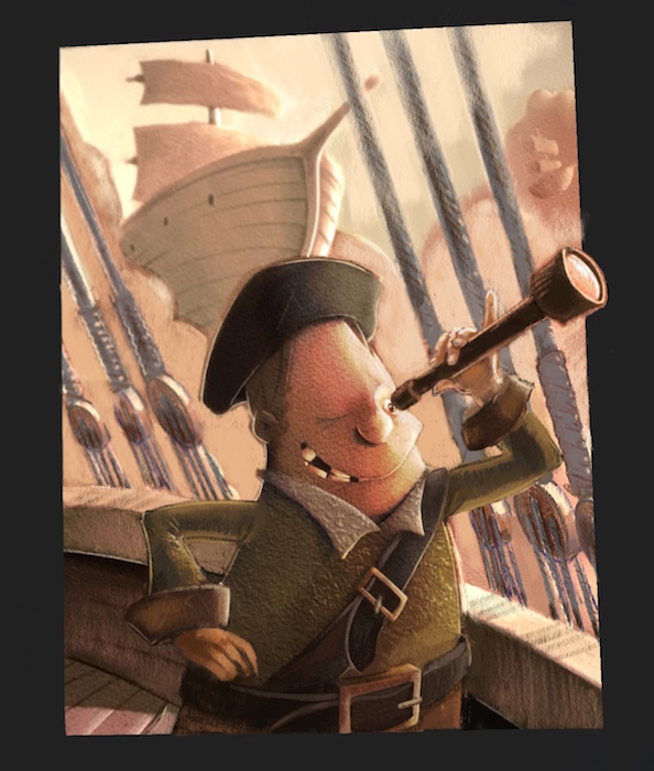
                                @Kevin-Longueil that looks great! I think I might add a few of those changes.

                                EricCastleman.com

                                SCBWI profile
                                https://www.scbwi.org/members-public/eric-castleman

                                1 Reply Last reply Reply Quote 1
                                • Jittles
                                  Jittles last edited by

                                  If you add ship's rigging (which is a great idea, btw), be sure to add at least a hint of it to the other ships.

                                  1 Reply Last reply Reply Quote 3
                                  • Eric Castleman
                                    Eric Castleman last edited by

                                    Here is how it’s coming along. I will be adding quite a few changes, but have been so occupied with getting the color right in photoshop. This piece has been a test piece for that, but absolutely love all of the critiques here. Still have a ways to go.

                                    0_1522637962209_7D49D6E8-4B7A-4D8A-9C35-A88968D075C2.jpeg

                                    EricCastleman.com

                                    SCBWI profile
                                    https://www.scbwi.org/members-public/eric-castleman

                                    Lee White 1 Reply Last reply Reply Quote 0
                                    • Lee White
                                      Lee White SVS Team SVS Instructor Pro SVS OG @Eric Castleman last edited by

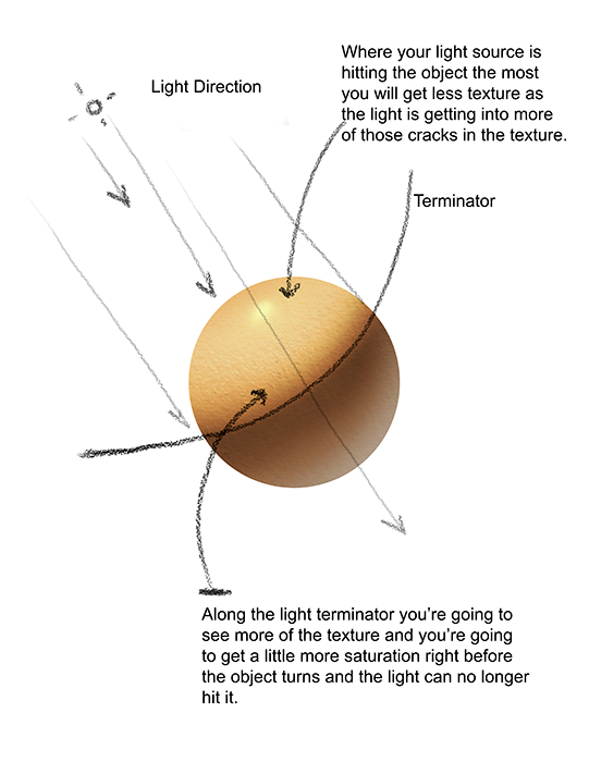
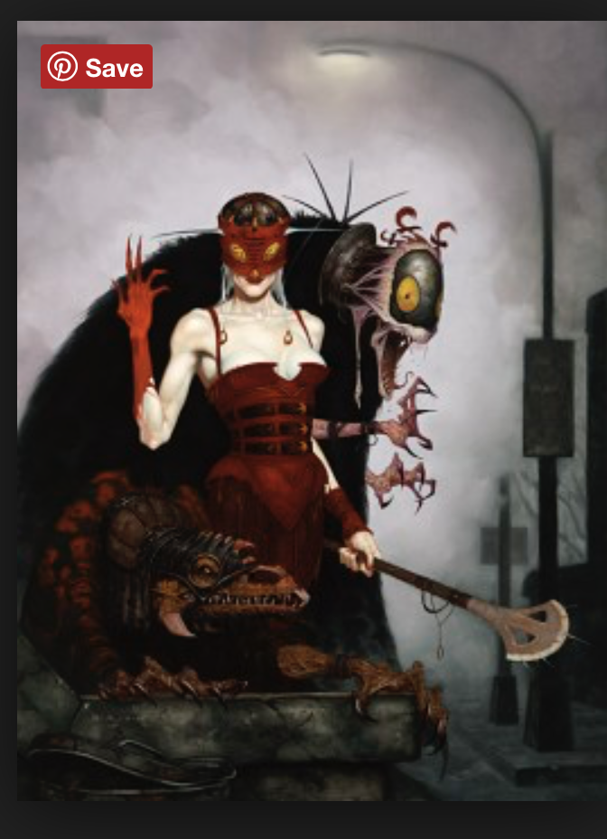
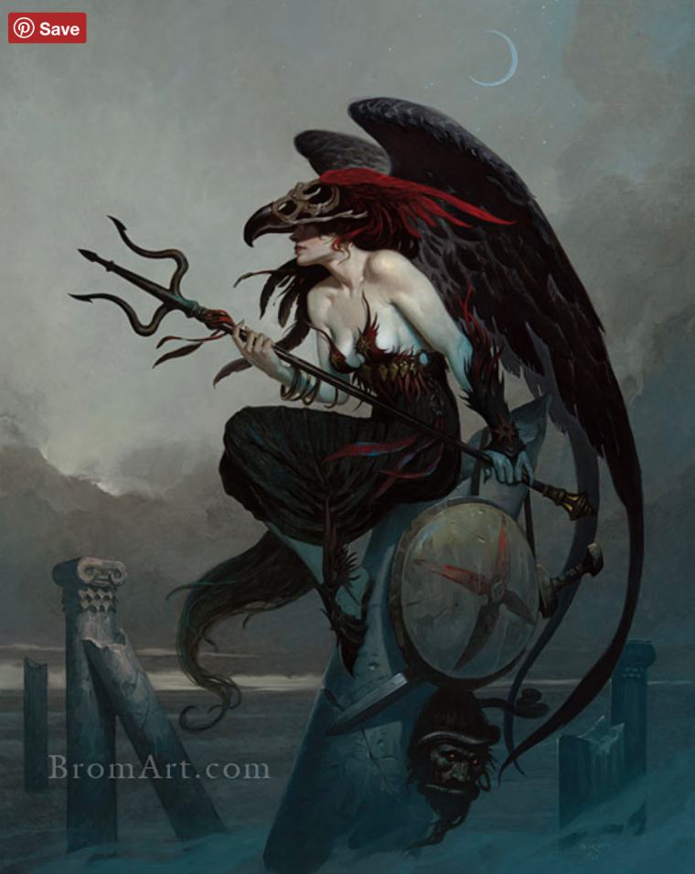
                                      @eric-castleman I like this piece and I've been watching it on the boards for the past week. It's all good critiques, but the main problem (IMO) is that your values are all over the place. I think as a whole you have a tendency to light each object to the max instead of reigning in your local values. So every object in your piece gets a very light side, and then a very dark side, and then an accent light along it's back edge. This creates a lot of value confusion in an image and makes value studies extremely difficult.

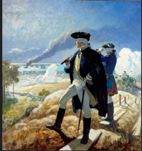
                                      Remember, your local values should dictate how light or dark an objet goes, independent of lighting (for the most part). For example, the black pirates hat here is a black object which means it should stay very dark, even on the lit side. It's range of values might be a 7 or 8 for the lit side and a 10 on the dark side (pure black). No rim lighting in the daytime for stuff like that. See the illustration by NC wyeth here. Look at how dark his darks are. But he also controls the mid tones and the lights. Each thing is either a light object, a medium value object, or a dark object. In your image every single thing is a dark, medium, and light object.

                                      The next thing to think about is contrast and focal point. The reason your character isn't standing out (even though he has almost pure white light hitting him) is because of the contrast of the cloud right behind him. That bright cloud right next to the darker cloud, which is right next to that very dark side of the rope creates a huge focal point which makes us go there instead of looking at the face. I would darken your clouds and light the face, OR go light with the clouds overall and darken the face. (see what I did there, either go for a light object on a darker background, or a darker object on a lighter background). Make the focal point have the most contrast, detail, and overall energy. Then let other things fall away and be secondary.

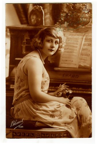
                                      Try doing a scene with NO lighting and get all the local values to work first. Then add a little lighting where needed. This is the easy recipe to make it all work out very quickly and easily. I included some other examples by Brom who is a master with controlling local value.

                                      Good luck!

                                      0_1522640783022_Screen Shot 2018-04-01 at 8.46.09 PM.png

                                      0_1522640863309_Screen Shot 2018-04-01 at 8.47.14 PM.png

                                      0_1522640907931_Screen Shot 2018-04-01 at 8.48.14 PM.png

                                      SVS Faculty Instructor
                                      www.leewhiteillustration.com

                                      Eric Castleman 2 Replies Last reply Reply Quote 4
                                      • Eric Castleman
                                        Eric Castleman @Lee White last edited by Eric Castleman

                                        @lee-white great input Lee. Yes, this is something I am aware that I do. I even lamented to my wife last night about having to lean on such a cruch in my art, but without it the image looked so lifeless. I have a serious issue when it comes to color. I cannot figure it out. When I do images in black and white, things seem to work well, but once I start dropping color in I cannot figure out how the values change. I have no clue how people just drop color onto an image and paint. Here are a couple of my black and white images. Notice I do not rely on rim lighting:

                                        0_1522643339536_BD9DCF1B-3A1C-4BCA-93DD-0E42E398C03C.jpeg

                                        0_1522643470459_F8B3C32B-F7C2-404E-9B20-8E26BBD62045.jpeg

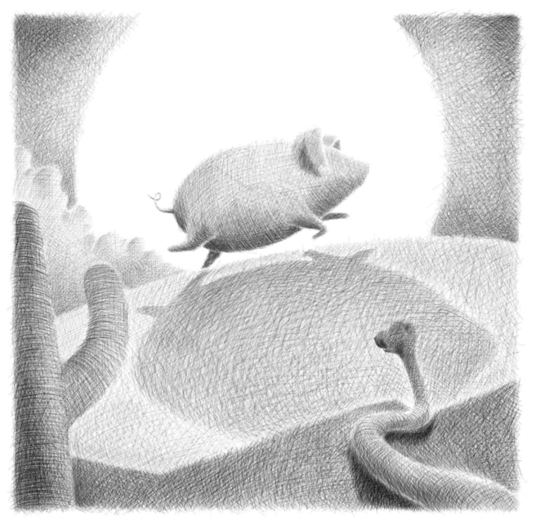
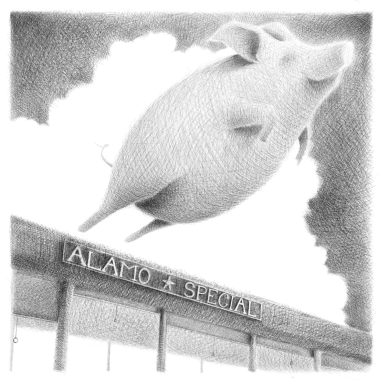
                                        I cannot get from this to color without rim lighting the crap out of the images. My brain cannot fathom how it works. Color for me is such a confusing issue. Is there a transition in learning I am missing from doing black and white pieces and then applying color?

                                        EricCastleman.com

                                        SCBWI profile
                                        https://www.scbwi.org/members-public/eric-castleman

                                        demotlj 1 Reply Last reply Reply Quote 1
                                        • Eric Castleman
                                          Eric Castleman @Lee White last edited by

                                          @lee-white looking better? I brightined the clouds behind him, and started removed the harsh rim lighting.

                                          0_1522652191535_35CB2455-4019-4BCD-A41F-EBE4407568B7.jpeg

                                          EricCastleman.com

                                          SCBWI profile
                                          https://www.scbwi.org/members-public/eric-castleman

                                          Jon Anderson 1 Reply Last reply Reply Quote 2
                                          • demotlj
                                            demotlj SVS OG @Eric Castleman last edited by

                                            @eric-castleman I too, would like to hear how people approach this because I struggle with moving to color, especially when I'm doing a series in which certain local colors have to stay the same (character's clothes, for example.) What I started doing was painting a monochrome value study and then when I choose a color, I use the classic color picker (in Procreate) to make sure the value slider stays on the same place as the value in the monochrome study. It feels very mechanical though and I'd rather have a better innate sense about what I'm doing.

                                            Laurie DeMott
                                            instagram.com/demotlj

                                            1 Reply Last reply Reply Quote 1
                                            • First post
                                              Last post