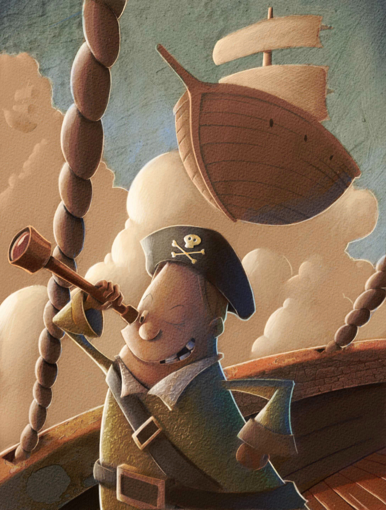
I need some help figuring out where I am going wrong with this one.
-
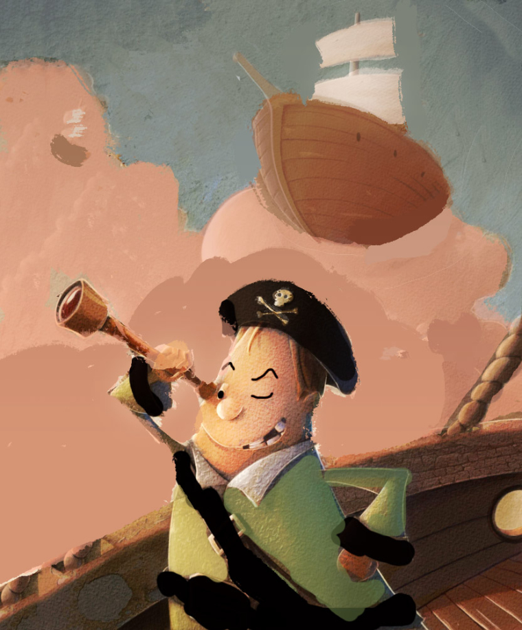
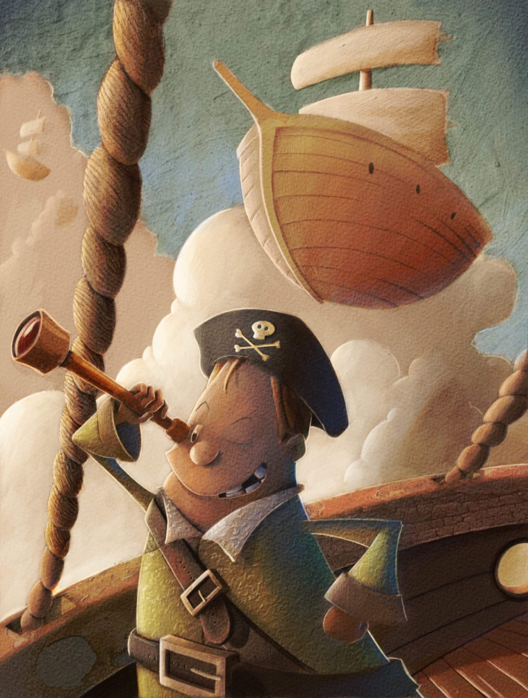
Here’s how it’s progressing. Spent most of the night on the foreground. Thanks everyone for the help.
-
@eric-castleman looks great!
-
@Eric-Castleman this is looking great man. Your texture is getting a little heavy in a few places. I did a little diagram to show what I mean. Hope don't mind. Hope it helps.
-
@evilrobot awesome! That is very helpful. I know very little about the rules for texture. I was wondering if certain textures clash or if certain textures come forward more than others as well. This is one I had no clue about.
-
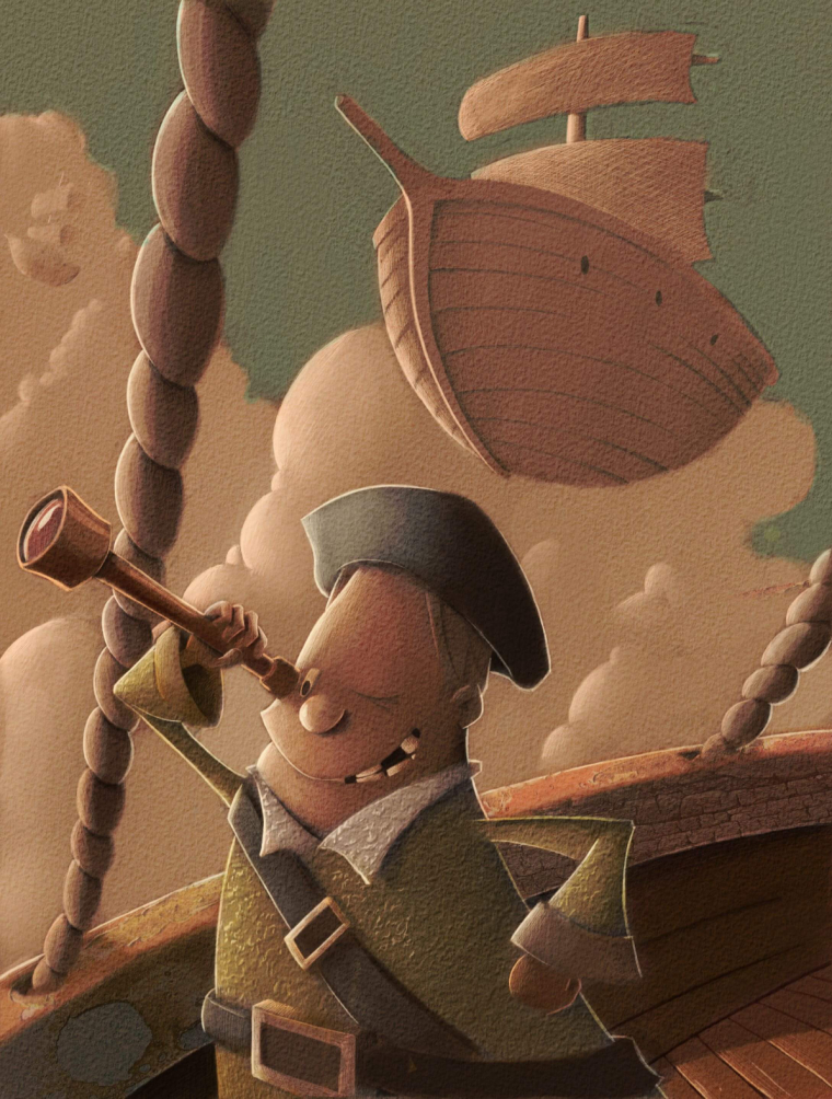
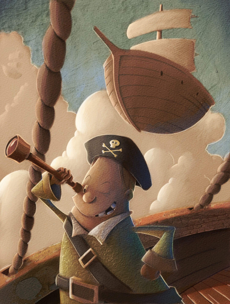
@eric-castleman Hey Eric - i am really enjoying your work! This is late feedback and can easily be ignored - just a couple of things that pop out for me - the relationship between the spyglass and the eye - it looks to me like the spyglass is resting on the cheek of the pirate. maybe let some light wrap around and under the eyepiece and slightly change the arm position and grip? The rigging does not need to be any one way and it is fine the way it is but i was wondering how it might look with simplified ship rigging showing? I did a paint over if you can call it that (my apologies
") I tried to push the background further back with overlap and less definition too - anyways...awesome work!!
I tried to push the background further back with overlap and less definition too - anyways...awesome work!!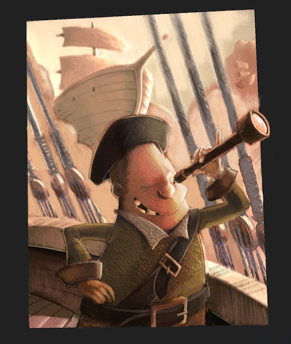
-
@Kevin-Longueil that looks great! I think I might add a few of those changes.
-
If you add ship's rigging (which is a great idea, btw), be sure to add at least a hint of it to the other ships.
-
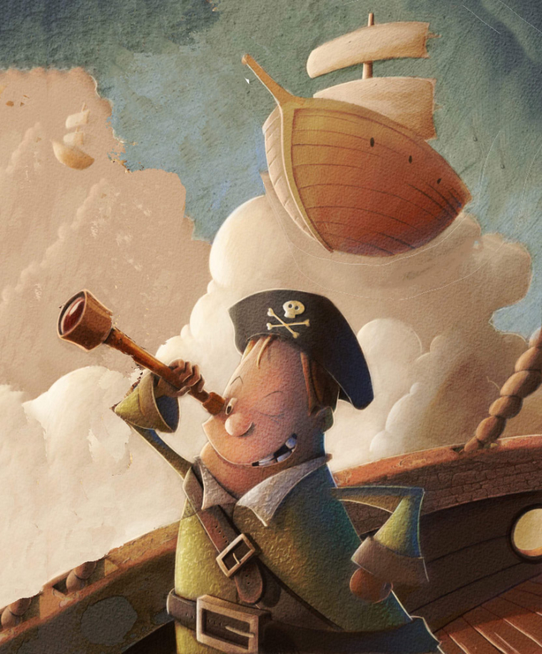
Here is how it’s coming along. I will be adding quite a few changes, but have been so occupied with getting the color right in photoshop. This piece has been a test piece for that, but absolutely love all of the critiques here. Still have a ways to go.
-
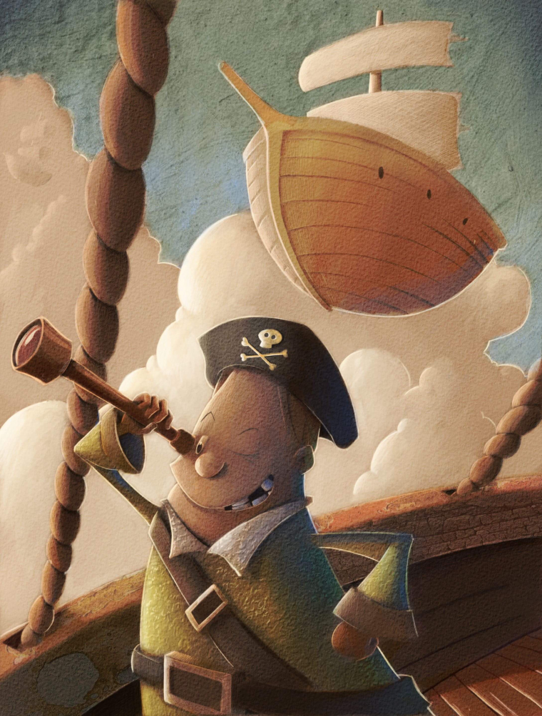
@eric-castleman I like this piece and I've been watching it on the boards for the past week. It's all good critiques, but the main problem (IMO) is that your values are all over the place. I think as a whole you have a tendency to light each object to the max instead of reigning in your local values. So every object in your piece gets a very light side, and then a very dark side, and then an accent light along it's back edge. This creates a lot of value confusion in an image and makes value studies extremely difficult.
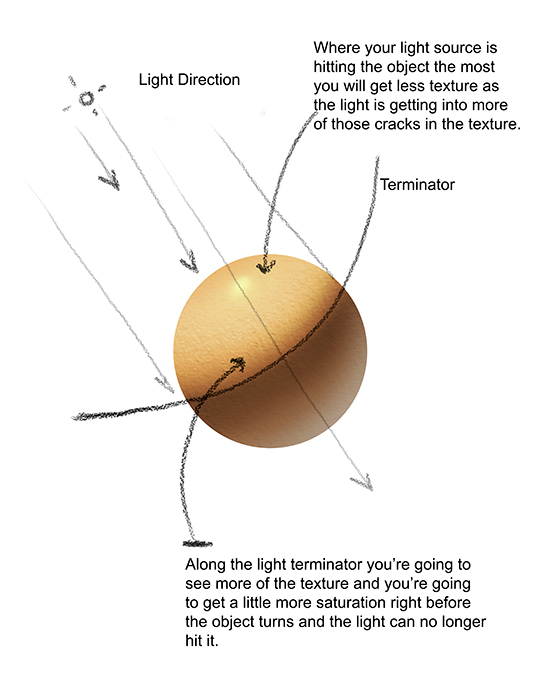
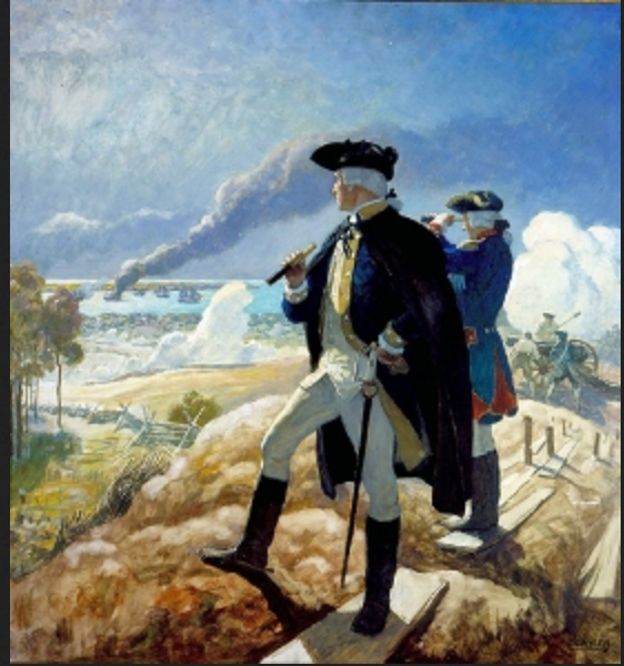
Remember, your local values should dictate how light or dark an objet goes, independent of lighting (for the most part). For example, the black pirates hat here is a black object which means it should stay very dark, even on the lit side. It's range of values might be a 7 or 8 for the lit side and a 10 on the dark side (pure black). No rim lighting in the daytime for stuff like that. See the illustration by NC wyeth here. Look at how dark his darks are. But he also controls the mid tones and the lights. Each thing is either a light object, a medium value object, or a dark object. In your image every single thing is a dark, medium, and light object.
The next thing to think about is contrast and focal point. The reason your character isn't standing out (even though he has almost pure white light hitting him) is because of the contrast of the cloud right behind him. That bright cloud right next to the darker cloud, which is right next to that very dark side of the rope creates a huge focal point which makes us go there instead of looking at the face. I would darken your clouds and light the face, OR go light with the clouds overall and darken the face. (see what I did there, either go for a light object on a darker background, or a darker object on a lighter background). Make the focal point have the most contrast, detail, and overall energy. Then let other things fall away and be secondary.
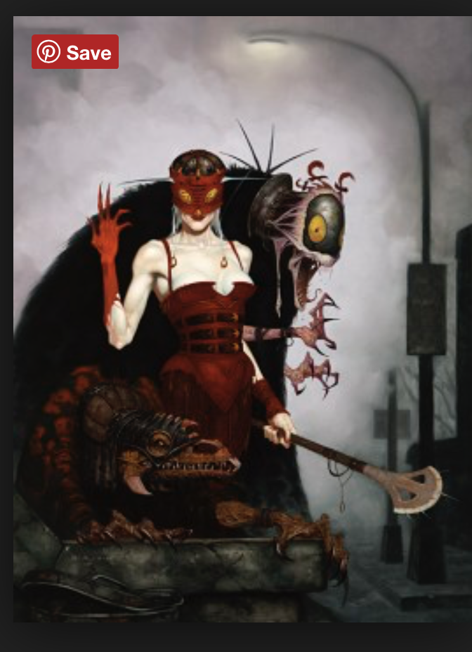
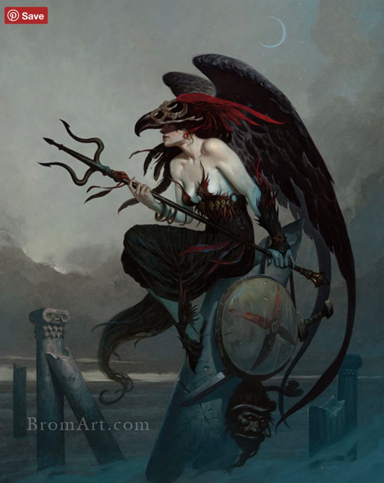
Try doing a scene with NO lighting and get all the local values to work first. Then add a little lighting where needed. This is the easy recipe to make it all work out very quickly and easily. I included some other examples by Brom who is a master with controlling local value.
Good luck!
SVS Faculty Instructor
www.leewhiteillustration.com -
@lee-white great input Lee. Yes, this is something I am aware that I do. I even lamented to my wife last night about having to lean on such a cruch in my art, but without it the image looked so lifeless. I have a serious issue when it comes to color. I cannot figure it out. When I do images in black and white, things seem to work well, but once I start dropping color in I cannot figure out how the values change. I have no clue how people just drop color onto an image and paint. Here are a couple of my black and white images. Notice I do not rely on rim lighting:
I cannot get from this to color without rim lighting the crap out of the images. My brain cannot fathom how it works. Color for me is such a confusing issue. Is there a transition in learning I am missing from doing black and white pieces and then applying color?
-
@lee-white looking better? I brightined the clouds behind him, and started removed the harsh rim lighting.
-
@eric-castleman I too, would like to hear how people approach this because I struggle with moving to color, especially when I'm doing a series in which certain local colors have to stay the same (character's clothes, for example.) What I started doing was painting a monochrome value study and then when I choose a color, I use the classic color picker (in Procreate) to make sure the value slider stays on the same place as the value in the monochrome study. It feels very mechanical though and I'd rather have a better innate sense about what I'm doing.
-
@eric-castleman The latest image us an improvement but the background ship is still too dark. It has nearly the same value as your character and with it being a more a simplified shape it draws way too much attention to itself. I would recommend lightening the background ship and darkening the clouds around it so that the biggest contrast in value is around the character.
I feel the same way you do about color. One thing that has helped me recently is to create a grayscale layer in Photoshop. Make a new layer that stays on top of the others. Change it from normal to color then fill the layer with pure black. It will make everything grayscale to reveal the values and you can turn it off and on anytime by hiding the layer. When I would struggle with a spot I would "turn on" the layer, select the spot in question in it's layer, bring up the Hue and Saturation menu, then adjust the sliders while in grayscale untill the value looked right. It's scary because you don't know what your color is going to be changed to but if you can get the value right you'll get a good idea or where the color should be if you're not happy with what the blind change did. Sometimes it's wonky but just breaking away from the color I thought I should use and tinkiering with new colors worked better for me. I hope you figure it out. This piece looks cool.
-
Yea, I use a glazing technique.
-
@eric-castleman Hey Eric - Here is a Sam Nielson video from Schoolism where he talks about exposure - https://www.youtube.com/watch?v=vRlc2B5l-HE when i did the paint over i thought in terms of exposure and tried to overexpose the background to make it recede and darken the foreground and save detail for the foreground - Robert Kondo and Dice Tsutsumi explain exposure best in one of their classes but i could not find a video for it - but here is a pretty good one from them concerning lighting - anyways - this might all be stuff you know but i found them helpful
-
@jon-anderson here it is with just a few changes you suggested. Busy day at work so just inching along until tonight.
-
@eric-castleman That is looking better. Keep an eye on the saturation of that background ship so that it still doesn't steal too much thunder from your character. Just dropping the saturation a little may go a long way in making it feel like it is actually in the background. One other thing I just notice, and you probably just haven't had time to adjust it yet, is the rim lighting on that ship. You reduced it on the foreground but it still looks heavy on that ship which makes it want to pop forward more than you might intend. (And I can totally relate to the "being at work" thing.)
-
Here’s an update:
-
I was wondering about that rope. Here's a quick view without it.And also open up a bit of space on the left side a bit and scale down the ship in the upper right.
-
also, here is a quick color pass. I did this using my finger on my laptop trackpad, so it's not very accurate, but it's a start. I wanted to simplify your shapes and separate your character. Maybe go very dark with your values and details on him so everything doesn't look like that muddy middle brown tone. Just a thought....