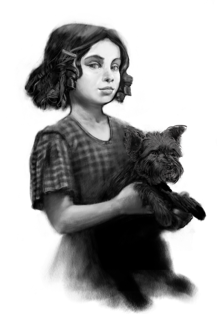
Dorothy 2.0 (WIP)- working on feedback from Will, Lee, and Jake (updated)
-
@kevin-longueil Oh! I never knew that about the circle. Thanks.
-
@eli Thank you Eli! I'll keep going with it for sure - need to work on Toto a bit too - started tinkering with modifying Glinda today also - my daughter is not pleased - she is 7 years old and an excellent critic ... I asked her how my new Glinda was looking and she said "well at least Grandma has a copy of the good one that you did" .. ouch.. but I'll keep pugging away at it
 Thank you again for the feedback
 -
I think the new Dorothy is much better in my opinion and looks beautifully kept within your stlye. 1 slight concern is that she doesn't feel so innocent as I would expect from a dorothy due to her almost smug expression (more like a Veruca salt than a Judy Garland)
-
The thing I see is the material is really well rendered toto is really well rendered also so my eye goes to them and not Dorothy's face? Why not complete the picture and render her face the same way as the rest? (p.s. i think your works great just my thought)
-
@gary-wilkinson Thank you for your feedback Gary! It is very reassuring to here that the new Dorothy is working much better - I definitely need to get her micro-expressions in a better place - I do want her to have a "knowing" expression but not in a way that seems smug - they can be closely linked - I think it is mostly the turn of her mouth that is bothering us - I will definitely get that sorted out! Thank you again

@Jason-Bowen Thank you Jason! It is definitely a work in progress and in need of a lot of work - I posted it at this stage hoping to find out if this version of Dorothy was working better with the rest of the series for folks or not - thank you again for the feedback and kind words! -
This definitely looks better. The rounder face gives it a younger look. Great work!
-
@kevin-longueil I don't think she looks smug. I like her expression, and I definitely get the "knowing" vibe. It has a slightly dark feel. I love that and think it is in keeping with your other Oz pieces. Also that's hilarious about your daughter's comment. Ouch indeed!
-
@kevin-longueil oh sorry I dived in too early.

-
@nyrryl-cadiz Thank you Nyrryl! I appreciate your feedback

@Eli Thank you again Eli - I'm glad you are seeing the slightly dark feel too - that is how I feel about these really:)
@Jason-Bowen Jason - You did not jump in too early - I think when putting Work In Progress images up for comment and critique folks may point out things that we have just not gotten to yet as needing work - but there is no harm in that and there is no way to know what someone may plan on fixing or not so I appreciate you taking the time to share your thoughts - I am hoping that I did not seem dismissive of your feedback! -
@kevin-longueil Not at all, stop trying to out gentleman me haha

-
Ha, ha! I just happened to watch that 3rd Thurs. on YouTube today, and then I saw this post. So the timing worked great for me, at least!

(I joined SVS less than a year ago, and hadn't seen that one yet.)I like this version of Dorothy much better! Her age is appropriate & I like the new face and hair. I like that you are basing the illustrations on the book rather than the film. Great job on applying the feedback and on your progress in improving your skills!
-
@miriam Thank you Miriam! - i really appreciate your feedback

-
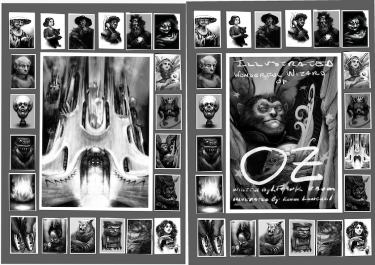
Here is an update of Dorothy 2.0 - mostly worked on the eyes a bit - i think she is looking better - i also started working on ideas for the cover - i'm thinking i should stick with the portraits and not make an illustration that does not reflect the format of the contents - these are my first ideas but i'm thinking now maybe limit the cover to a few of the main images?
Edit: (Just sneaking an updated image into this post - Toto is starting to come together


here are my first cover ideas - i'm thinking that not thinking primarily about text is a real noob mistake.... i'll keep at it though


-
@kevin-longueil
If you have all the pictures on the cover, I feel like they have less impact when the reader comes across them in the book, so you might want to save something for them to discover inside.Dorothy is looking good!
-
@kevin-longueil for some reason I feel that the cover should almost be blank and a dark green color with the text. Something simple. The work you did is amazing.
-
@miriam I think you are right for sure - i need to pare it down to one image or part of one image - Thank you for the feedback!
@Chip-Valecek Thank you Chip! - i think that your idea is very striking and i can picture it very well - i am operating on the premise that i need to keep it black and white for the kindle e-readers? My other thought is that i probably need to have one of my drawings on the cover to hopefully have it stand out when folks are scrolling through the many versions of the book - if i can use color i will definitely use and emerald green color layer on the drawing ...and if i can set it up for print that will be a good idea too - I really appreciate your feedback!
-
@kevin-longueil
I don't have a kindle reader, but I use the kindle app on my computer & phone (as well as other e-book apps), and the book covers are in color. They're usually the same cover as the print versions. -
I have both a Kindle and the Kindle app for my iPad and if you can do a cover that reads well in both black and white, and in color that would be great! For that, I think the flying monkey works better than the Emerald City. I also think the flying monkey, or maybe even more so Dorothy with Toto convey the Wizard of Oz more quickly because the Emerald City painting could be a city in a lot of fantasy works whereas the others are very specific to the Oz series. All of your stuff is amazing - I read all 14 books of the Oz series growing up and like your illustrations much better than the ones in the books I read.
-
@demotlj Very good point about the Emerald City - i was kind of leaning toward it - but i think you are right - i am working on the Dorothy image still, mostly trying to give Toto a bit more realism and maybe it will make a good cover image when it is done - i really appreciate you sharing your thoughts on the quality of the drawings in comparison to the ones that you have seen - one thing that nags at me is the fact that so many great illustrations have already been made for this book so to hear that they might stand up to the competition for you (who have read them all!)is very encouraging

@Miriam Thank you Miriam - you are right - i need to be sure it reads as well in black and white if i am going to do a color cover .. maybe the emerald overly or color layer i mentioned with Chip will work after all - thanks again
-
@Kevin-Longueil I was just showing these to my partner today and he was appropritately blown away as well. I don't think you need to worry about them standing up! They are wonderful.