Book Dummy: margins, physical layout, & bleed
-
Hello,
Stupid question alert! I'm way more stumped than I should be, but maybe you can help me out here.
I'm taking the SVS Illustrating Children's Books class, and I'm working on my own book dummy. Once it's finished and goes through several rounds of feedback and revisions, I'll either submit it to publishers, or self-publish. I haven't decided. Either way, it's mostly for fun / learning.
")
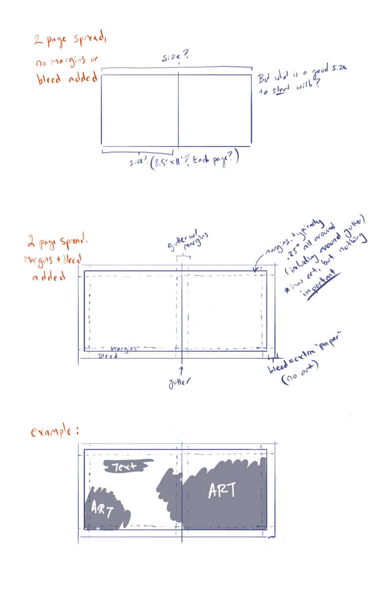
So, can someone please clarify what a good starting-point layout would be for a book dummy? On pg 24 of the illustration workbook it says: "8.5"x11" is a very standard size and, proportionally, if the editor wants to make your book bigger, they can easily do so before you get started on the final art." Does this mean each page is 8.5"x11"? Can you choose horizontal or vertical? That seems really big to me, even though many children's books are big.
When Jake Parker made his example book dummy in the class, the entire two-page spread was 6"x13" with .25" margins. Maybe I can start there, but I just want to make sure I understand!
On pg 109 of the handbook it gives the example of bleed: "If you are asked to add a half-inch bleed, your art director means a half-inch on each side; therefore, you will need to add one inch to both dimensions - so 8.5"x11" would become 9.5"x12" "
Bleed is left blank, right? Margins include some "extra" art, while bleed is ultimately extra, physical paper... is that correct?
I know the art director / publisher ultimately decides the exact page size and margins, but where do I start? I've watched the book dummy lessons on SVS, searched through the handbook, and looked at standard sizes for independent publishers / printers.
I don't know why I'm so confused, but I'd really appreciate some clarity!
Thanks so much!
-
How's this?
-
@carey-bowden Not sure if this is relevant but this is what i am using for my kindle direct publishing book - you fill out the calculator and it will create a template for you
https://kdp.amazon.com/en_US/cover-templates -
@kevin-longueil Thank you! I took a look, and when I click "trim size" I get a dropdown of about 20 various size options. I picked one just to see what happened, and it was really helpful!
So, now I know for kindle I can choose from that list.
Still wondering what is "industry standard / preferred" for physical books lolThanks again!
EDIT: the 8.5" x 11" seems like a good place to start, but I wonder if it's ever acceptable to do it horizontally? (11"x 8.5")
-
You could just measure some books and use them as guideline - that´s what I did for my own dummies
")
The publisher will give you the exact sizes for pages and bleed - but yes, 8.5 x 11 inches is quite standard. Standard bleed is 1/8 (minimum) to 1/4 (maximum) of an inch and the bleed is not left blank - it needs to be painted too. The bleed will be cut off when the pages are trimmed, but because the trimming process is not precise, there needs to be art all the way through the the edge of the paper, so that no white flashes up anywhere, no matter how unprecise the trimming is. -
@smceccarelli Thank you so much! That's so helpful!
Haha I did measure the books I had, but they were SO varied that I didn't really get any direction from it. (Guess it's time for a trip to the library) but I think 8.5" x 11" is fine. Do you know about doing the horizontal / landscape layout for those dimensions? (11" x 8.5")
May I ask, if the bleed DOES have art, what is the different between bleed and margins? AKA, why have both? Is is a way of saying: "don't put anything important between the margins to bleed, it might get sliced / lost in the gutter.
Thanks again, I was having such a hard time understanding these details!
-
@carey-bowden said in Book Dummy: margins, physical layout, & bleed:
Is is a way of saying: "don't put anything important between the margins to bleed, it might get sliced / lost in the gutter.
Yes, exactly. As smceccarelli mentioned, the trimming process can be unprecise so it's wise to not place anything important near the edges.
-
@carey-bowden There are horizontal books of course, and if you feel like your story would live better horizontal, just pick a book of which you like the format and use it a size guideline. If I look at my children's books collection, I would say vertically oriented books are the majority, but I don't think there's anything speaking against horizontal books (maybe verticals are easier to put on shelves? ;-)).
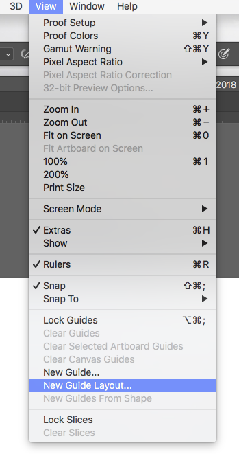
The term used in pre-press is not "margin" but "crop-mark" - which is (obviously) the mark where the page should be trimmed. The bleed is the area between the trim mark and the end of the art (so the security 1/8 or 1/4 of inch all round). Here is a screenshot of the export window for a print-ready file from InDesign: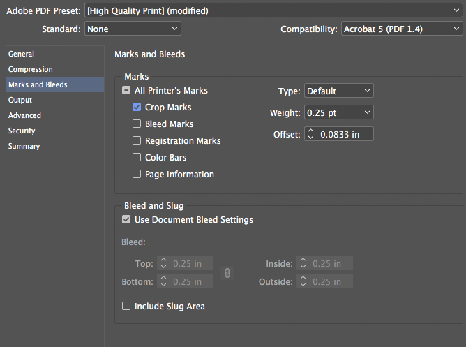
"Crop marks" are normally included (although some printers want you to take them off, as they also may become visible if the trim is imprecise). The "bleed marks" just mark the end of the paper (you see them only if you include the "slug", which is an additional space of white after the end of the bleed, in your print-ready file). All the rest is printer wizardry and I have only seen it in color proofs.
Here is an example of PS layout for the endpapers for a book I worked on last year. It's a full spread, the book is square, 8.5 x 8.5 inches and it's set up with 0.25" inches bleed: the first blue line from the border of the page is the crop mark and the space between the crop mark and the end of the page is the "bleed". The second blue line defines the "margin" of the page, that is the minimum space between the border of the page (after trimming) and the text blocks - it's only really relevant for text layout, but I often put one in just the same. The three line at the center are the gutter (central line) and the "gutter-safe-space" (not sure that's how it's called) - you should keep key illustration elements out of that space, as it can be lost if the book doesn't open flat.

So - don't put anything important in the gutter space and most definitely don't put anything important between the crop line and the end of the page as it will be trimmed off. The margins are not really your problem unless you also do the text layout (but it's fine to put stuff there, though it's close to the end of the page, so maybe not where people will really look).
-
@smceccarelli Thank you so much! You really helped me get unstuck. I'm going to give it a shot and see how it turns out.
-
@smceccarelli you are such a big help in the forum so I hope you don't mind if I ask about that layout. Is there a menu in Photoshop that allows you to plug in the numbers and the program makes these lines for you or is it done by hand with the brush and the ruler turned on? Thanks!
-
These are great questions that I've asked too, so I'm grateful that you've put them out here for us to learn from. It may be worthwhile to check on the specifications of the printing service you would want to go with if you do self publish. For instance, Createspace is unable to do print-on-demand books (an option if you don't have much money upfront or don't know how many books you'll be able to sell) if they're wider than 8 1/2 inches, meaning that you have to pay for regular offset printing.
-
@jon-anderson Sure! It's not as powerful as InDesign layout guides but you can do a lot in PS. Under the "View" menu you will find "New Guide Layout".
This opens a panel that allows you to set the bleed lines and the gutter safe space easily. With the settings here below for example, this is what you get:
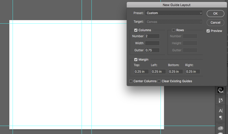
Of course if you want less than 1/4 inch bleed you can make it smaller.
You can "pull" any other guide from the rulers. If you activate "Rulers" from the "View" menu, you'll get two rulers at the side of your application window. You can set the units and the starting point, but I don't want to get too finicky with my explanation - you can find how to do it easily on the Adobe help documents. You can then literally "pull" guides off the rulers with the move tool (just click on the ruler and drag a guideline off it onto your document) and use the rulers to set them where you want them on the page.
If you activate "snap" in the view menu:
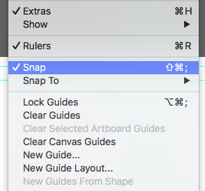
you will "feel" one guide snap in the center of the document, to give you the precise line of the gutter.
Because that also makes your painted lines "snap" to the guides and because guidelines can be disturbing while you work, I normally hide them and unhide them frequently. There is a command in the menu for that ("Hide Guides") but the shortcut is cmd-H . This will also hide the selections (the "marching ants") which can be useful sometimes (and sometimes maddening...but you get used to rely on guidelines for a lot of stuff and the advantages trump the disadvantages...).PS guidelines are not super-precise (if you work with InDesign you'll see small inconsistencies), but they're very useful. I normally set up a "master spread" with all the guidelines and the create any new page from that, so all is the same from page to page (you cannot export and import guidelines in native PS. There is a plug-in that does that though).
Hope this helps and it's not too technical!
-
@smceccarelli That is a huge help! Thank you so very much!