Society of Visual Storytelling

    SVSLearn Forums

    • Register
    • Login
    • Search
    • Recent
    • Tags
    • Popular
    • Users
    • Groups
    • Search

    Illustration critique

    Questions & Comments
    4
    8
    1113
    Loading More Posts
    • Oldest to Newest
    • Newest to Oldest
    • Most Votes
    Reply
    • Reply as topic
    Log in to reply
    This topic has been deleted. Only users with topic management privileges can see it.
    • Flordevitaz
      Flordevitaz last edited by

      Hello everyone,

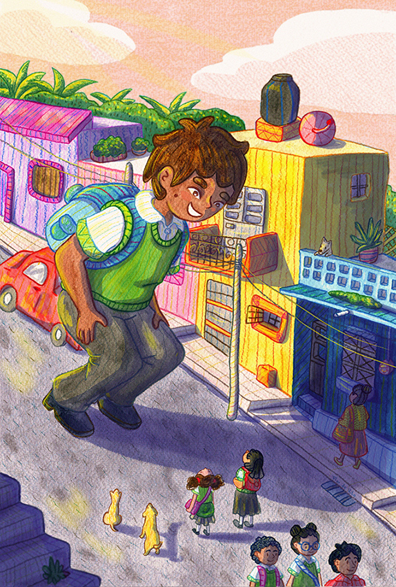
      I am working in this illustration, but I have problems with the lighting and I feel that something is missing.
      What do you think?

      0_1528431103911_04.jpg

      www.flordevitaz.com
      www.instagram.com/flordevitaaz

      1 Reply Last reply Reply Quote 0
      • braden H
        braden H last edited by

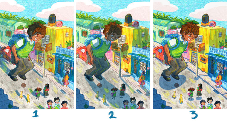
        I think of the options I prefer the lighting in number two. The cast shadow gives a sense of scale.

        I can see why you feel like something is missing, though. I think it's partially because there's no defined foreground, midground and/or background. It all looks like it's on the same plane.

        I have NO idea how you'd go about fixing this.

        Looks pretty good, though!

        Flordevitaz 1 Reply Last reply Reply Quote 1
        • Flordevitaz
          Flordevitaz @braden H last edited by

          @art-of-b
          Thank you so much. I didn´t notice that it looks on the same plane.

          www.flordevitaz.com
          www.instagram.com/flordevitaaz

          1 Reply Last reply Reply Quote 0
          • Flordevitaz
            Flordevitaz last edited by

            I worked on the different planes and tried to separate each plane a bit more by blurring. I also did some changes to the color.
            What do you think?

            0_1528497443622_LD2.jpg

            www.flordevitaz.com
            www.instagram.com/flordevitaaz

            1 Reply Last reply Reply Quote 2
            • artbytra
              artbytra SVS OG last edited by

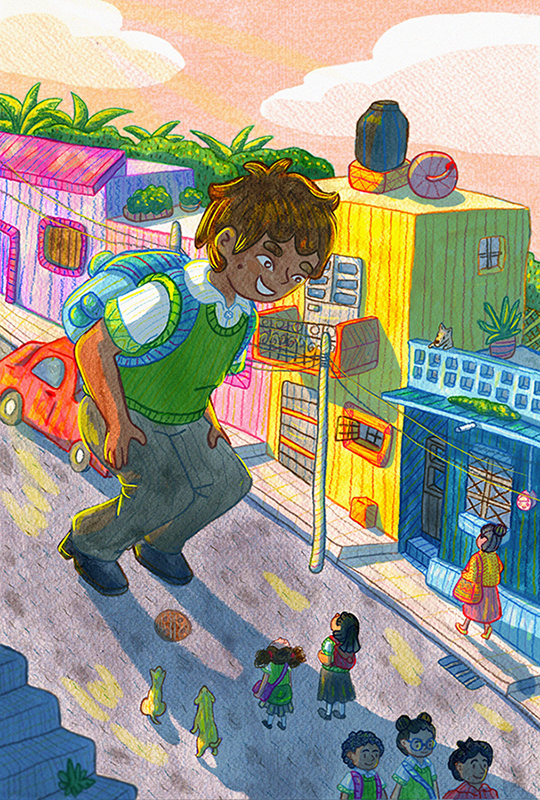
              @Flordevitaz I think the lighting is good and the color choices are really fun to look at! I just keep looking at the round item on the street. I believe it’s a manhole sewer thing, is it really necessary for the piece? Other than that I am an overall a fan of this!

              https://www.instagram.com/art.by.tra/

              1 Reply Last reply Reply Quote 1
              • Kayla Groening
                Kayla Groening last edited by Kayla Groening

                In the first image, the giant boy seems friendly in a neutral way. It's as though he was just wandering down the street and friendly greeting the people as he goes along his merry way.

                In the second picture, it feel like the boy is menacing and could be up to no good. I think it's because of how the shadow falls over the people in a looming sort of way. If this is not the intent, perhaps it would feel less intimidating if the shadow fell onto the buildings instead of onto the people below.

                In the third picture, it feels as if the boy is friendly in an excited/over-eager way. It's as though he is trying to get the little people to be his friends or come along with him on some grand adventure. It also seems like he is ready to jump up, whereas in the other two photos it seems like he is more grounded and just crouching down.

                In my opinion, each could work. It just depends on what story you are trying to convey.

                Kayla Groening
                Comic/Graphic Novel Artist
                Storytelling through Art.
                Facebook page: https://www.facebook.com/kaylagroeningillustration
                Instagram: https://www.instagram.com/kayla.groening.illustration/

                1 Reply Last reply Reply Quote 3
                • Flordevitaz
                  Flordevitaz last edited by

                  @fauxtoddgraphy and @kadelex thank you so much for your comments. They helped me a lot to notice things that I wasn't seeing.

                  I removed the manhole because like you said it didn´t have a purpose. I also changed the shadow so the character looks friendlier now.

                  www.flordevitaz.com
                  www.instagram.com/flordevitaaz

                  1 Reply Last reply Reply Quote 0
                  • Flordevitaz
                    Flordevitaz last edited by

                    Final version 😃

                    0_1528776851277_LD.jpg

                    www.flordevitaz.com
                    www.instagram.com/flordevitaaz

                    1 Reply Last reply Reply Quote 3
                    • First post
                      Last post