Goat illustration critique / advice needed
-
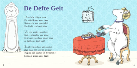
Hi! I'm currently working on a long-term project concerning a children's book about goats. Someone else is writing the text (little rhymes about all kinds of goats, in Dutch) and I'm doing the illustrations.
However, this is my first time illustrating a book and I'm having a hard time with the compositions. There are some things that need to be in the illustration, but I can't seem to fit it all in there and still keep it a kind of clean composition (because that's what we're going for).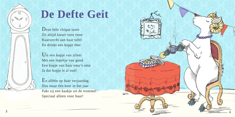
Here you see the first composition I did. I felt it was a bit too static. So I did another one (see below).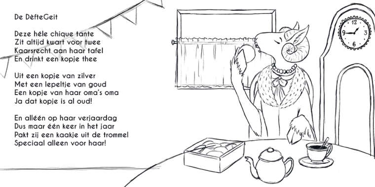
I like the character, but the composition is terrible in both in my opinion. I feel like I've learned a lot during the SVS classes, but I can't seem to put it to practise.
Do you have some advice for me to make these sketches more lively and attractive composition-wise? I've been at these for weeks but I can't seem to figure it out!
-
Its going to be adorable. You might try different viewpoints.. rather than these straight on sort of staged images you might add some interest just by jutting a wall in there and adding some side views of things. I don't know if I'm being clear really, but I think its Will Terry who talks about this more in depth in one of his classes..I think it could have been the 100 things class. I love your character!
-
@taru I think it's really nice, I prefer the top image. I think you have a few issues, for one I find the scratchy lines under the chair and table distracting, but you do need to have them grounded in the space, so they are not floating, maybe using a darker shadow rather than black lines would clean it up. They also don't seem to be on the same plane. There are a few tangents as well, I think you could lose the flags, they run right into the animals head. I love the animals attitude, you could play that up and maybe cross her legs. Great stuff. Chris
Hope you are not offended, I dropped your jpg. in photoshop and tried out some of the suggestions, only suggestions!