Need some help with how to paint a character that is a memory (idk how else to word it)
-
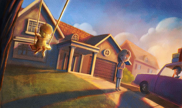
Am I getting the right vibe here? I still have a ways to go, and other memories to implement, but I think I am on the right track. Any thoughts?

-
This is a nice painting! But before moving forward I would recommend that you clearly explain what you want the viewer to understand is happening in this shot. That way you avoid any recommendations/crits based on misunderstandings.
-
And I just read that you have other memories to implement. That is intriguing but raises some questions. Do you have a tonal sketch you can post? Combined with the example of finished rendering here you should be able to get feedback that is genuinely useful.
-
Perhaps the clouds could carry the image of the memory, or the shadow from the mothers feet. I was trying to research solutions to this for you yesterday but it is a pretty hard thing to do without knowing the whole context. Perhaps looking at silent movies might give you ideas, or scenes in Citizen Kane.
-
@eric-castleman When I look at this, I'm reading this as: the mother is watching her son drive off for the first time and remembering when he was little on a swing, so if that's what you were going for, I'd say you are headed in the right direction. Your style is so soft in general though that it lessens the contrast between the memory and the rest of the painting so if I didn't know you were trying to depict a memory, I'm not sure I would have gotten it right away. In the illustrations others posted, the palette, saturation, and the value of the memory was very different rom the rest of the painting. It's a beautiful painting but you might have to push the contrast a little more.
-
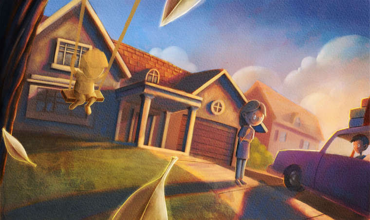
Thanks everyone for all the input. So I decided I didn't like how that boy was turning out, and am in the process of redoing it. The premise of the piece is that the mother is seeing off her son and memories of him growing up are throughout the piece. However, that might be altered a bit. This is where I get in trouble sometimes; I have a drawing, but not sure on how to execute, and through the process of rendering things force me to alter the design. I also tend to only draw things I somewhat can't draw which forces me to problem solve. So, obviously, the thing I didn't work out in the beginning is the thing causing me issues. I am starting to like where this is going though. I will work more on in later today when I have the time.

-
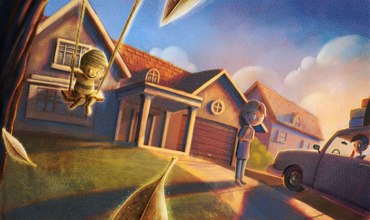
@eric-castleman One suggestion may be to desaturate and lower the opacity of the memory elements given how vivid the reality painting is. Also, I think the boy in the car is way too close to the edge of the image. My eyes see mom looking toward the edge and when I find the boy there's such a hard stop right behind him that it feels uncomfortable. I really like the concept and how you've approached it. I hope you can figure out a way to complete it.
-
Before I saw your painting, I thought you might be able to have a person holding a photograph with the memory images surrounding them with kind of a blur effect around each one & less saturated than the main image.
For this painting, I like the suggestion of putting the memory images in the clouds. You could also change the boy on the swing to an image on a leaf.
This is a tricky concept, but I like your painting so far! Another idea would be to have several Polaroid-style photos above & around the real-time image, shaped in a somewhat scattered arch with the edges / corners overlapping each other.
-
I love every suggestion here. So many great thoughts and ideas. Atm I want to see what I can do with where I am going with it then post it here. I am willing to scrap what I have done as far as the memory part. I will post tomorrow
-
@eric-castleman Love the coloring! I think the contrast between the two palettes works for the "memory" vibe you're going for.
Before you explained it, I thought that the kid in the car was doing the "remembering", because he's the one looking at the tree. Maybe he could be looking away?
Excellent work with such a tricky idea. Looking forward to seeing how it turns out.
-
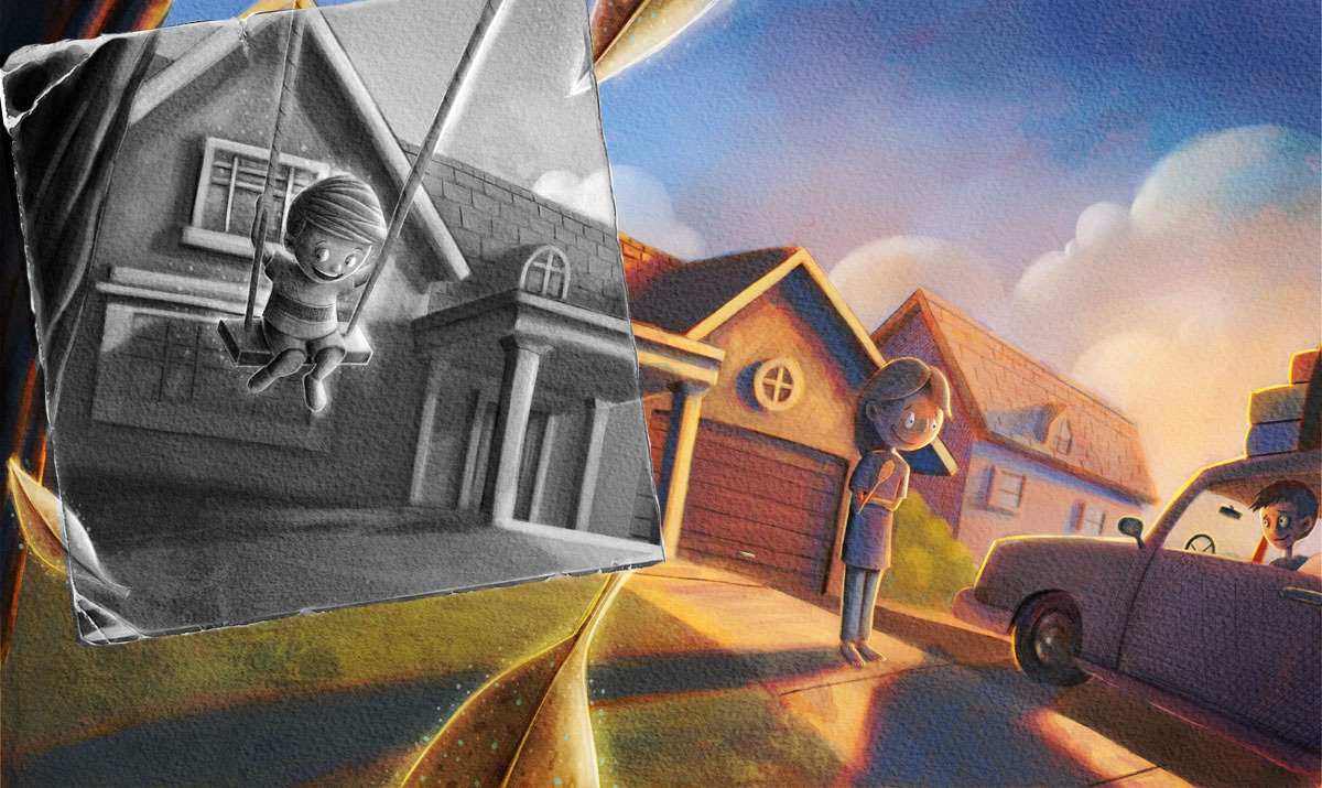
A few more details are needed, but I think the general gist is readable. I really want to try a few more things, but the mistake I made with this one was to assume that the memories were going to be transparent and that I needed the entire painting done so that the image bled through, however, now I know after hearing from everyone and seeing really references, that the design really needs to be based on the hook more than I assumed.
I just accepted my first professional job yesterday which is super exciting, but I need to get my butt working on that since the drawings are due in a little over a week. Thanks everyone. Please continue to add to this thread with any thoughts you have, everything has been so helpful.

-
another idea... use an old photo as a framing device and desaturate it to black/white

-
@eric-castleman Congrats on getting the job!
-
@eric-castleman congrats on the job! That's awesome. How did they find you? Also what @JohnMK suggested is very clear as to what is going on.
-
oh, forgot to say I love your style, Eric. That 'H.B. Lewis' painted look is one I'm trying to achieve myself
-
Thanks you guys! @Chip-Valecek they found via Twitter I think. A month ago the art director for Highlights Magazine started fallowing me after I posted a picture on the #kidlit on the specific day dedicated to kidlit, which is either Wednesday or Thursdays I cannot remember. Anywho, yeah, they contacted me a couple of days ago to do a full page in Highlights Magazine which is quite an intimidating first job. Very excited, but also very much going through imposter syndrome at the same time lol.
-
@johnmk I actually think that is a very good idea.
-
@Eric-Castleman another small tweak... if the leaves overlap the photo it looks like it's been blown away by the wind, sort of a lost and discarded photo which adds another layer of meaning to the image

-
@eric-castleman that is amazing, I am so excited for you! I can't wait to see what you do for them!
-
Debated writing this as you described the Highlights project as your first professional job (Congratulations!) and this topic is a pretty big deviation from your original post, but I know that SVS is not a place to train amateurs but rather professionals.
With that in mind I'd like to offer a suggestion regarding the contract for this project. If you've already signed and sent back the contract, no worries, just keep the following in mind for the next project. If you haven't yet signed the contract I'd suggest that you check carefully the section that covers "Rights Licensed" or "Copyright licensed".
My experience with Highlights is that Highlights "buys all rights" as part of their "boilerplate" contract. This means that you are signing an "All Rights" contract. That means that Highlights pays you once for all rights associated with your copyright and then they can reuse the image over and over again, even sub-licensing it to a different company (and Highlights gets paid for the sub-license) without ever paying you again. Highlights has ability to do that for as long as copyright protection lasts on that piece.
I would suggest that you always try to negotiate a copyright license that leaves the control of your copyrights with you rather than the client. The idea is that you will build up a bank of images over your career that can generate passive revenue streams. Basically if a client (in this case Highlights) decides they would like to reuse your work in another issue, or in one of their other magazines or book publishing venues, it is quite easy for them to contact you to do so. And I imagine you'd be more than happy to make the same image available again for an additional licensing fee. ( I always enjoy getting contacted to relicense an image I've already created!)
Now, I have no illusions that you are going to try and aggressively negotiate with Highlights on this first project. I know I didn't try and change a thing on my first professional illustration assignment. I simply wanted to let you know what was possible, and in fact standard for most professional illustrators. As soon as you are comfortable don't be shy about asking for better contract terms. If you never ask they will never be offered.
I wish you good luck with the project!