Need help figuring out the major color drop off when going from my cintiq to PC
-
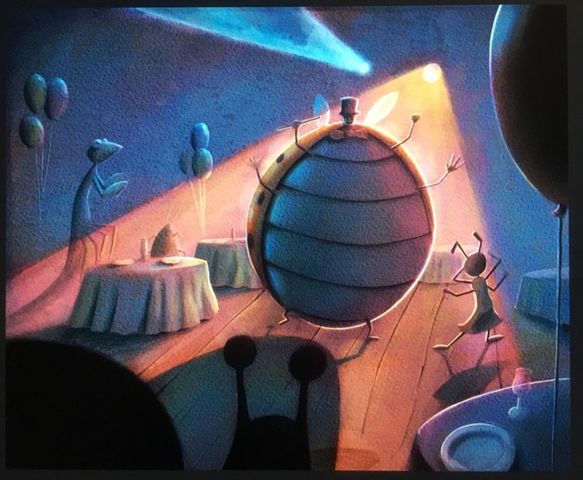
So if anyone else is a Cintiq user, I am sure you have run into this issue. The color of my pieces have a secere drop off from what I am working on on my cintiq and the finished product seen on any other screen. What is the solution to this? Here is an example
Here is the image as seen on my Cintiq
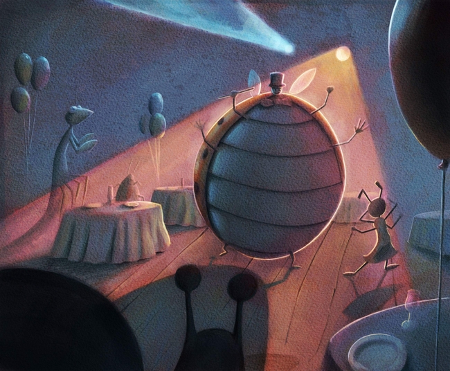
Here is the image as seen on any other screen

Any help would be greatly appreciated.
-
@eric-castleman If there is a solution, I could never find it. I have the opposite - the colors on my Cintiq are a bit duller than on my second monitor - it depends on the monitor you have. Let´s not even get started on what happens when you print.
There are countless people out there who talk about color calibration between monitors, between monitors and printer, etc... There is a device that actually reads the colors of any two monitors with a camera (Spyder is one make, but there are many) and supposedly matches them so that they are the same.
I work with many professional photographers in my day job, and even they say that it´s a waste of time and money and it doesn’t really work anyhow.
The simple thing is, you cannot control how people see your art. So even if your two monitors match, a person viewing it on another monitor or an a mobile device will have a different experience anyhow (first and foremost your AD). And printing - unless you do it yourself - is out of your control anyhow.So, I can`t say that I would not welcome a solution, but so far I’ve just sort of appreciated the fact that I have at least two different sampling of what my art will look like in the world. I keep a second window on my second monitor while I work, so I can see the art on both at the same time. The navigator window of PS is a good option, but the best is to actually duplicate the window (It´s under the View or the Window menu, I’m not sure). This has several advantages compared to the navigator - maybe a topic for a different discussion
")
-
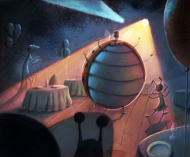
@smceccarelli thanks!!! For some reason that makes me feel better. However, I don’t know why this is, but I found that if I save my image as a jpeg, and then paint over it, it somehow translates on both screens better. Here is the results
Before saving the image as a jpeg and additional highlights added
After
Awhile back I remember reading about how you had your painting on both monitors, and ever since then I have done the same. The monitor I use is quite cheap, but I remember talking with a professional musicians who does music for films, and he said that in the recording studio he always uses the worst speakers he can find to play back his music, so that he can make sure it sounds good on every sort of speaker, and it seems you have a similar mindset.
Anywho, glad I am not alone in this stress...btw, will the AD figure out the whole printing side of it?
-
There are print specialists that take care of that - depending on the client of course, but normally it´s a separate person, especially if it´s offset printing (anything above 5000 copies is generally offset print). The AD will review the proofs and approve them, or require changes in calibration if needed. In books, you as the illustrator get to review the proofs as well.