UPDATE: Venom Contest (Done and Submitted)
-
I see a lot of votes for C but I'm pushing B. C has issues with focal point leading you out of the design. I'm also suggesting you don't "paint" it but rather go pen tool and graphic shapes, I know this isn't how you normally work but this type of thing needs to work at the size of a playing card and a huge poster
-
@rcartwright I see what you mean with the focal point, I was thinking of turning his head in and using his tongue to lead you around the image since it will mostly be black/blue and the tongue will be red. That would be the focal point.
I agree with the ink/shapes but I am not good enough with that style. I might try doing both and seeing which works. When I do paint i do it at like 20 inches at the longest side which would be able to scale up and down.
-
Can you make a side view thumbnail with his mouth open? I’ve always thought his profile was super unique.
-
So I'm not going to be much help here I'm afraid, but I'll chime in anyway, lol. I know jack squat about venom, but after looking at the trailer, I like either A or C. My first impression was C, because yes it looks more dynamic. But I'm also drawn to A because venom has such a gnarly head design that a portrait could really show it off.
And I don't know how quite to articulate this, but in my opinion, portraits tend to feel more personal. It's like the equivalent of interacting with someone at a close distance. It puts you face to face with them and a sort of relationship it formed and you wonder more about their motivations as a character. Zoomed out views puts more distance between you and the character and you start wondering about them in the context of a larger scene. You're relationship to them is more passive, but it creates more action and you wonder what they'll do. Even with an intense character like venom, I think this concept still applies. I'm not saying one is better than the other, but it can inform the way you want to have your viewer interact with the character.
Hope that made sense. Good luck on this piece!
-
@Eric-Castleman the only reason I didn't do a side view is because so many fan art pieces are done that way and I wanted to stand out a little.
@TessaW I totally understand where you are coming from on that. That is why I was drawn to A as well at first. But with so many going with C maybe I will try to do both. I think you get to submit up to 10 per artist. Who has time for 10 LOL
-
@chip-valecek SO stoked for this movie! If you could somehow combine A and C, (piece of cake, right?! Haha!) Use the dynamic element of the pose of C but incorporate elements of his human face like you did in A?
-
I should go for C... think you have could do a bit more story in that one...
-
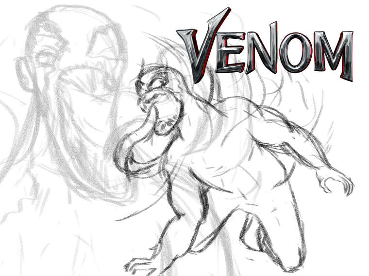
@eli I think you may be onto something here, so I combined them. With A being a faded out in the background.
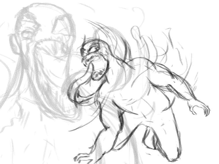
But now I read over the details of the contest and they state "Artists, designers and illustrators from around the world are invited to create one-of-a-kind static artwork for Venom inspired by the latest trailer. Venom faces off against Riot and we’d like you to summon your inner anti-hero and unleash your imagination to show us the best battle scene you can capture."
Do you think I need to rethink this and do a fight scene? Most of the entries people posted in the comments are not fight scene with Riot...
-
Here is the full link to the contest in case anyone else wants to join in on the fun or if you think after reading it I need to change to a fight scene.
https://www.talenthouse.com/i/create-artwork-inspired-by-venom-and-sony-pictures
-
@chip-valecek Not knowing the story at all, who is Riot? "as one of five symbiotes who are effectively the "children" of Venom" from a ScreenReant Article.
https://screenrant.com/venom-movie-riot-riz-ahmed/
Anyways "symbiotic" came up as well. Maybe develop in your work how Riot came into being along with battling. An extension from human/Spider man to Venom and from Venom the "child" Riot. As I said I don't know the stroy very well, but even if others are not doing it, but it has been asked to include it, do take their suggestion to heart if you feel you are capable of pulling it off!
") Heather B.
Heather B.Instagram: www.instagram.com/heatherboyd.illustration/
Website: https://heatherboydillustration.ca
Shop: https://www.inprnt.com/search/products?q=HeatherBoydIllustration
Ko-Fi: https://ko-fi.com/heatherboydillustrationBe blessed,
-
@heather-boyd the symbiote is basically an alien that attaches itself to a host to survive. For the sake of the movie the symbiote Venom has Eddie Brock (spiderman was originally the first to have it) and Riot has the head of the Life Foundation. There are other symbiotes like Carnage being my favorite, and I have a feeling he might be a hidden character in the movie. But now my nerd is showing and getting off topic LOL.
I will sketch out a new idea and post it tonight. If I have time I might as well finish the one I started above and submit both.
-
@chip-valecek like in Stargate SG 1
symbiotic -
@chip-valecek You can't go wrong with a fight scene. More characters equals a more dynamic illustration which equals a higher level of difficulty. That will help you help you stand out especially if others are not doing it.
-
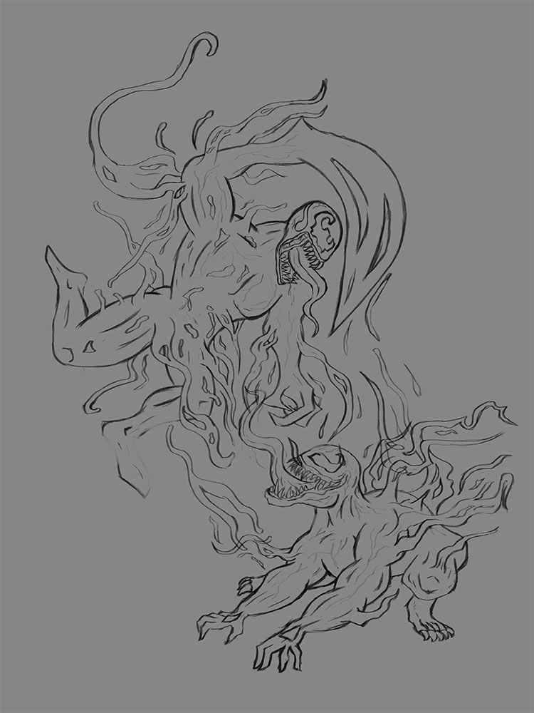
Here is sketch 2 with both characters. Again, i want to keep the background simple to focus on the characters. How does the flow feel with this?
-
Same sketch, changed to vertical layout with them closer together. Added in the Title to see how placement would work. Thoughts?
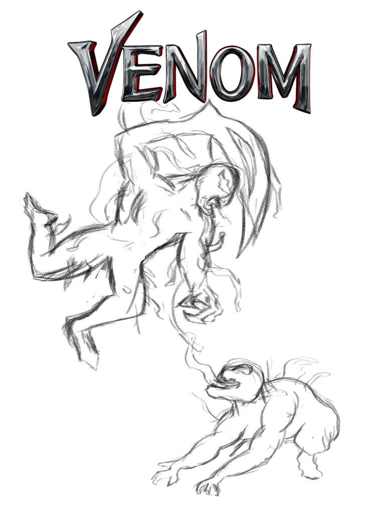
This is my first go below, which I really like and will try to do as well.
-
@chip-valecek I don't think this necessarily need to be a fight scene. I'm actually working on a piece for this contest as well. Maybe instead of having venom show up twice have venom in the foreground and Riot in the background.
-
@rajsolankiart I am seeing a lot that are just copies of other pieces. There have been a few good submissions but most are not a fight scene. But I keep going back to this "show us the best battle scene you can capture" and I feel they are looking for some sort of action. Either way I plan on doing both pieces.
-
@chip-valecek Yes, I followed the link and it does seem that they are specifying a fight scene.
-
I would suggest C.
Not only does the gesture capture more of the feeling of Venom (he was pretty aggressive), but if this piece might be used as part of promotion, I can see more places that they can put type and other graphic elements in 'C' than I can see in 'A' without messing with the focus of the image.
Looks like a fun piece!
-
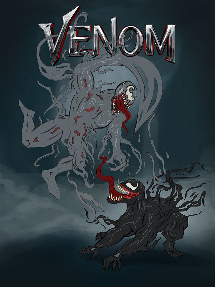
First of all I would like to thank you all for your input. I am feeling really good with my progress so far. Here is where I am right now.
Cleaned sketch:
Local Color and masks on characters:

Background (keeping it simple but wanted hits of a city back there):
I am looking forward to working on the shadows and lighting. Going to be a busy day today so I hope to work on that later or tomorrow and then onto the fun part of rendering out the characters. Please let me know what you think so far.