Master copies -- Always useful!
-
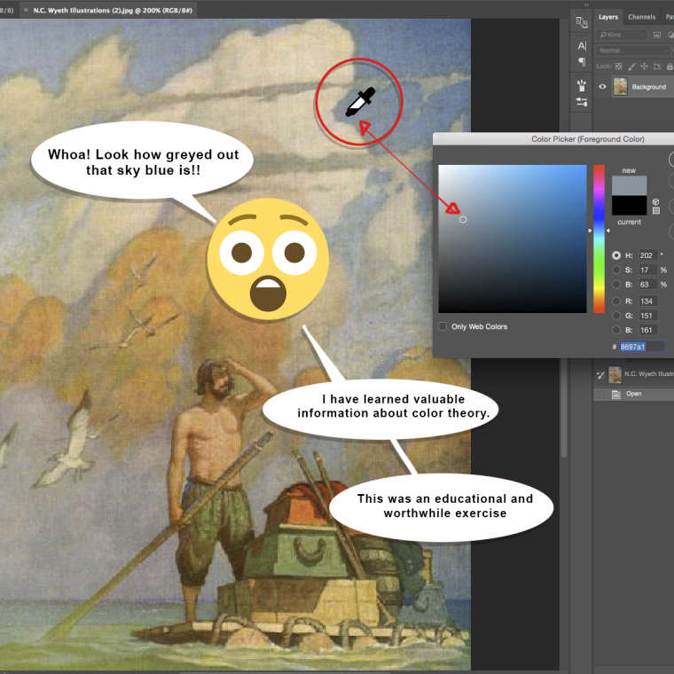
@eric-castleman My opinion is that sampling colors digitally is valuable. Especially if you are consciously doing so. I'm always amazed when (for example) a "pure blue " color is actually just a greyish brown, but appears blue because of the color(s) next to it. All this is color theory at its finest!
-
@eric-castleman I am going to go against what david said here. I never let my students sample the original artwork. The reason is you need to start to understand what "relative color" and "relative value" are. Relative color/Relative value is how a color or value is perceived vs. what it actually is. For example, using david's "pure blue" example, you may start by actually picking a blue because that is what it looks like. But then when you put it on your painting, you will see instantly that you are way too saturated compared to the original painting. Then you have to figure out how to desaturate that blue down and that is where all the learning comes in. If you just sample the original, the original painter has already done the work for you.
SVS Faculty Instructor
www.leewhiteillustration.com -
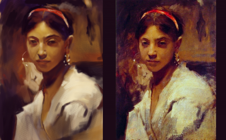
@jason-bowen very nice! BTW, I would always suggest posting the original along with your copy when posting master copies. That way we can see how close you came and offer advice.
SVS Faculty Instructor
www.leewhiteillustration.com -
@lee-white thanks. I didn't think of that I will next time.

-
@Eric-Castleman -- And here you get to see the difference in teaching styles. While @Lee-White is certainly not wrong in his zeal to challenge students right from the start, I feel that it's just as appropriate to work up toward mixing (or choosing) the colors by eye. To clarify what I wrote earlier I think that "consciously" digitally sampling colors can be a useful way to get a handle on color theory. Especially when starting out.
-
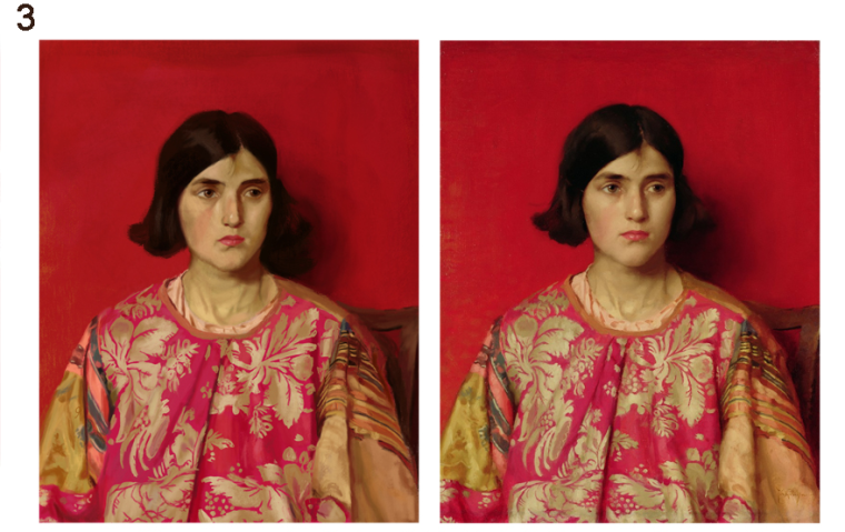
@davidhohn This is so helpful to see. I've been glancing back and forth between the original and your copy, noticing the similarities and differences. I'm drawn to the differences (e.g., the door sizes, the angle of the main house to the roof, the sharpness or textured edges of some of the washes of color, how there's blue on the right side of the sky in the original and not in your copy) and find myself deciding which effects I prefer. For example, I much prefer some of the textured edges that appear in your copy, but I miss that bit of blue in the sky in the original. I'll try to fit in some master copies this month in my schedule. As for sampling colors from the original versus figuring it out on your own, I think that if you're working digitally, why not save time and look at the sampled color? But still make sure you understand what's happening.
-
I have students try it on their own at first, then once the copy is finished, they go back and color sample the original image to see how close they got. I feel like this is more practical in a learning environment, but definitely try both methods out and see which works for you. If you absolutely can't hit a color in your master copy, then sample it and evaluate it like david says. Avoid mindless sampling though, that is a crutch that is cheating! : )
-
Also, I have proof that my method works better. Check out these master copies below.
This one is using my technique:
And this one is from one of David's students:
HAHA!!!! BURN!
-
@Lee-White First off, lol at your latest post! As for the master studies, I kinda had this plan to hold off on the style ones until a bit later. For the past 5 years or so I've been working on fundamentals when I could find the time, and just started making my own work last year. I wanted to see what flowed out naturally with at least 10 pieces or so and then buckle down more on style exploration. Between trying to make my own work and taking classes here and at schoolism, style exploration has been put on the back burner.
That being said, I'm always cautious with these types of studies. I can copy pretty well and my mind goes on autopilot. I have to go in with an agenda and make sure I am aware and present.
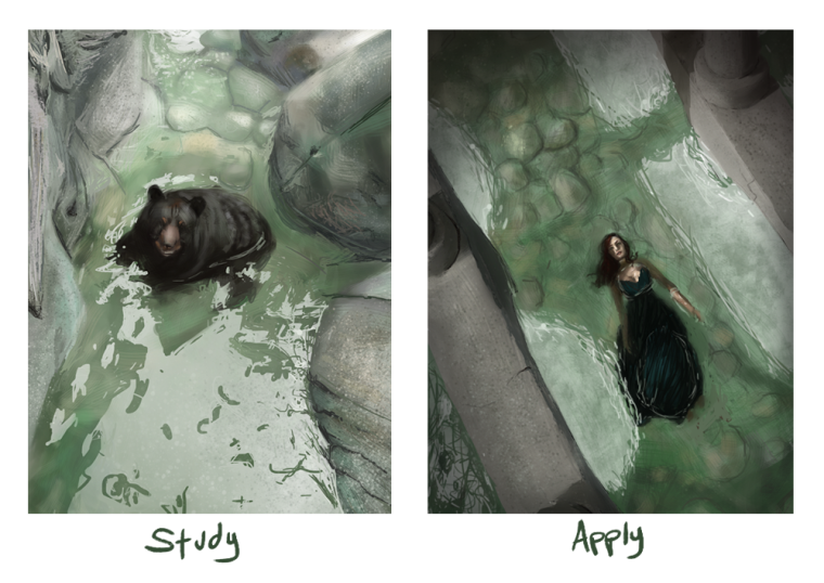
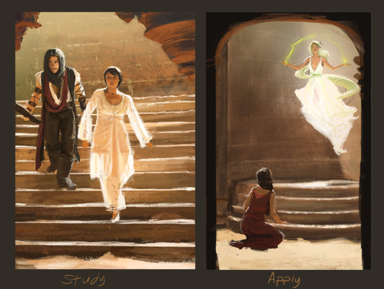
I went on a master study spree with studies like the following before I realized I wasn't learning anything:
I learn a lot more if I apply the studies right away with stuff like this, kinda like what Eric was saying with applying other people's work to his own style:
-
Shoot, I'm feeling like a pea walking amongst giants over here.
I thought I'd thank @davidhohn for posting his master copy and introducing me to another great artist, mister Kenard Pak, but before I reached the comment box I saw so many more interesting insights.
@TessaW are these studies made with you being conscious and aware of what you're doing and what you're learning like you said? Because it really looks like they paid off. Your applies look great. Not that I am fit to give critiques, I'm just judging with my eyes. -
@tianlian Always happy to share cool illustrators! @Lee-White and I were chatting about his work and we both think that the best stuff is on his tumblr http://pandagun.tumblr.com (rather than his website -- which is still great!)
Enjoy!
-
Awesome thanks for sharing!
-
@lee-white I would suggest that it also depends where on the learning process you are. When I first joined SVS and decided to get serious about learning color, I started digitally by tracing a photo, color sampling everything in the photo, and painting it. It was incredibly eye-opening to me to discover for example, that nothing in the "yellow boat" was actually yellow. I did that on a couple of photos, and then did a few photos trying to match by eye alone. My understanding of the way light and shadow affected stuff was accelerated immensely by those short exercises. I didn't do it for long because I agree that learning to see color without a color picker is really important and now that I'm trying to learn traditional watercolors and mixing my own colors, I have had to understand relative values and saturation much more but when I started out, I was such a neophyte with color that the color picker exercise was really helpful.
-
@tianlian Yeah. The first image I posted, the woman with the red background- I wasn't clear on what I was trying to achieve. I just copied it. Have you ever been reading and realize you weren't actually paying attention to what your were reading and have no idea what you just read? That study was like that. I also hadn't taken a color and light course yet that would help me organize what I was seeing in the master study.
The other two, I really had to think while I was applying the information to my own piece. I also had taken a color and light course, and I was seeing the studies through the information that course had given me.