Assessment of my work
-
Hi SVS, it has been a little over a year as a subscriber here and I thought it's time to do an assessment of my work, but with help from you. If it wouldn't be too much trouble, could you view my work from my "svs past" so that I can tighten up my "svs future"? Also I’m trying to see which are strong portfolio pieces.
Please comment on what I should work on? Exploring more through the sketch phase is what I need to do more but what else? I know color choices could be beefed up. Mainly, I would like to get better and what better way than through my svs peers! Thanks in advance! Todd
-
I think most of your pieces could be improved by focusing on light and shadow a bit more. Your works are all the same tone and value throughout, but if you could vary tones it would help guide peoples' eyes to the focal point.
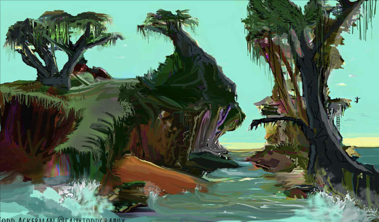
I like how you're experimenting with bolder colors in the first piece - I only just saw the guy jumping off the cliff. That red sand in the foreground is pretty saturated compared to the area around it - maybe try desaturating it a little, because right now it's the focal point.
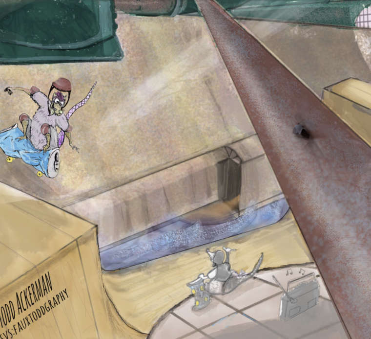
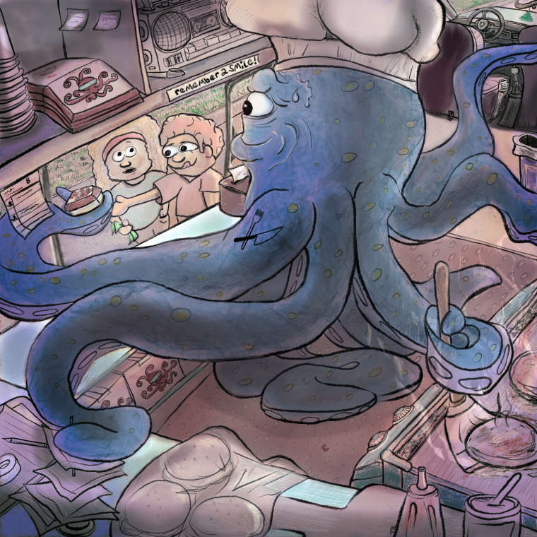
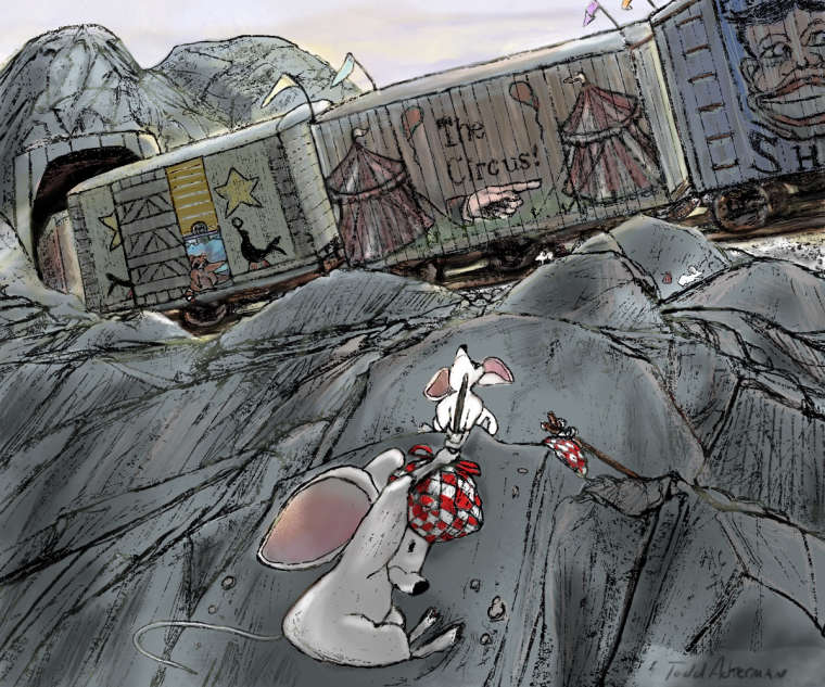
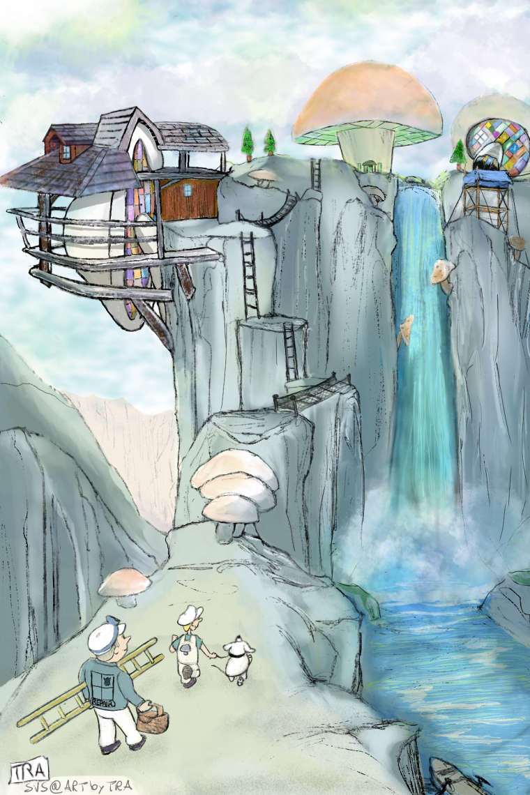
I think the pieces I like best right now are the octopus chef, the mice trying to climb up the rocks, and the piece where the guys and the dog are approaching the house by the waterfall.
So, long story short, I agree with your assessment that color choices are what
-
I agree with @TwiggyT Right now your linework and your color's values are all too similar to be conveying depth or emphasizing the focal points. If you varied the weight and/or texture of your linework, you might not need to tweak your value so much, or if you tweaked your color value, you might not have to play with your linework as much. You can of course do both, if you so choose.
I feel your octopus piece and your train piece are the most successful in terms of focal points and depth. In the octopus piece, you have played more with the values and the weight of the linework, the result is that the image reads more clearly right off the bat, and the focal points are given adequate emphasis. On the train piece, you've also given more contrast to your focal point by giving it lighter values, a punch of saturated red, and calming down the texture in the area. Well done!
The good thing about your pieces is that they have a lot of personality and expression, so you have a great base to rally your studies around. Keep going, you've done a lot of good work.
-
-
Hi Todd,
I'm very much at the basic stage of art, but I hope you find my comments helpful. Unlike most above, the octopus was not my favorite, although it is a nicely done image.
") My favorites were "grandma" and the train.
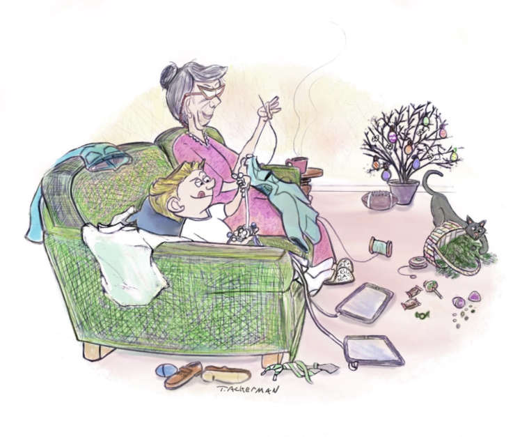
My favorites were "grandma" and the train.For grandma, I like the way you captured the chaos of a young boy in the room with all the items around. You could maybe have added a few more small items to the clutter. I like how the little boy visually echoes grandma — she with her needle and he with a cord. The tongue out of his mouth is a nice touch. I like how you captured the texture of the chair they are sitting on, and I can imagine its rough, green tweed perfectly. I (as a cat person) especially like the cat you added, although I'd like to see the facial expression a little better.
I love the train and mice! In part for the artwork, and in part for the story it tells. I guess the mice fell out of the train? This is very dramatic and it's obvious there is an attempt at a rescue. It sure caught my attention! I like the way you captured the wood texture on the train, especially on the "Circus hand" car. One suggestion: the hand points to the right, and maybe you could in turn highlight that small mouse down to the right; and maybe have him facing down, OR add another mouse below. Utilize elements to lead the eye from that central hand down to the ongoing rescue. The central figures are centered to me, and I wonder if they could be shifted a bit sideways? If you moved them a little left, you could also have the mouse tail pointing back up towards the open car (with a racoon?) and complete the story of how the mice ended up here. I love this image even more after analyzing it.
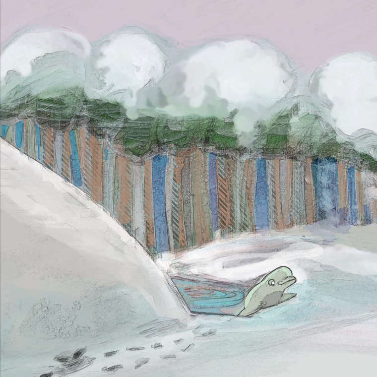
My least favorite is the waterfall. The mushroom buildings are creative and do I like the way you rendered the water. The pastel colors are appealing in general. But it doesn't wow me, and I feel like the whole image is a bit washed out. Perhaps as noted above, varying the tones a bit would give this some oomph.
Keep up the good work. I feel inspired to continue learning.
-
I agree with the previous posts. Lighting and value is a good place to work on. My favorite pieces are the mice; but it took me a long look before I saw the smaller mice, and realized that they are trying to get on the train, rather than feeling. At least I think that is what is going on. But I love the dynamic composition and its a great story moment. I feel anxious for them!
Also, keep working on perspective. You are getting closer, but there are still a lot of issues with perspective. To use the mice image again, it looks like the train is about to roll over on them. And I can't tell if we are looking up at the train from below?
Keep it up!
-
@TwiggyT
@TessaW
@Chip-Valecek
@riftweaver
@stringfellowartColor and Light classes here I come! Thank you all for the nice comments and giving much needed advice for furthering my work. I appreciate you taking the time! -Todd