Some thoughts on my drawing?
-
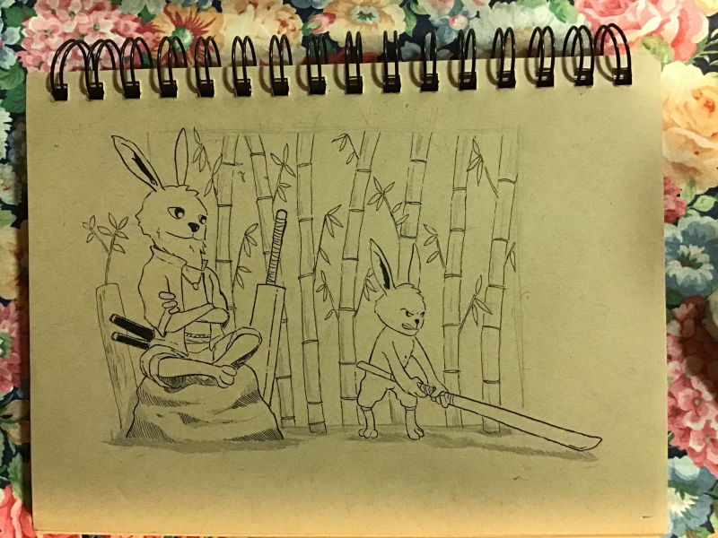
Hi everyone! I’m Billy and I’ve recently started to draw seriously. I have been drawing on and off my whole life and now I’ve decided that I want to become better as drawing is one of the few things that I love. This past summer I have been working on my fundamentals with Svslearn and I think I’m making some progress. I’ve never shared my art online before because I always feel self conscious. But I think it’s time for me to step out of my comfort zone. Here is my latest drawing, feedbacks are greatly appreciated!
P/s: Sorry if the light is bad, my apartment doesn’t have great lighting
-
Looks pretty awesome to me
")
Is there anything in particular you're looking for feedback on?
-
Thanks man! I was thinking if I could get some feedback on composition and the background.
-
Your composition seems fine to me (though composition isn't my strongest suit).
As for the background (quite nice, by the way) my instinct would be to make it fade a little by using finer or lighter lines. Either that or give your characters a tad more of a contour line so that they pop a little from the background.
-
I like this piece and the expression on the smaller bunny is great. With regards to composition since you were asking I really like how the rock and bigger bunny form one larger triangular shape. I would consider putting in some foreground elements maybe just black silhouettes of more bamboo at the edges this would also help with the sword that leads you out to the corner of the image.
Cheers
-
I think its working. The composition reads well and i like the overall mood I am getting from it. Maybe just the small bunny feels a bit too rigid to me, probably because of the legs - it doesn't feel like the legs are supporting the main idea of the action. mby Look up some references for the position.
But again I like this one overall
-
I wish there was more dramatic tension in the little bunny’s body. Like he was really struggling to pick up that sword. The face is great, put some of that emotion into his torso and back. It would also be a nice contrast to the serenity of the older bunny.
-
Nice work! Thank you for sharing your work and asking for feedback, it's a scary step, but totally worth it.
Is the smaller guy picking up the sword? Or striking something?
If he's striking something, and we're talking composition, you might consider putting that more front and center.
If he's trying to pick up the sword, you could push the gesture to indicate him pulling against the weight of the sword as well.
Another thing on composition, if you don't know about it yet, using the "rule of thirds" would be a great way to help balance and bring focus to the important parts. So, for example, you might do something where the big bunny's head is 1/3 from the top and 1/3 from the left, while the smaller bunny's head could be 1/3 from the bottom and 1/3 from the right. That's just an example, but it's a simple rule that can help with composition.
The last thing I will say, if you want to work on composition, make sure you are clear about where the border is around your drawing. If you're calling it the edge of the paper, then that's fine, but be clear about that, because composition is as much about the space that isn't filled in as much as it is about the space that is filled in.
Anyway, great job! I hope some of what I've said can be of use to you!
-
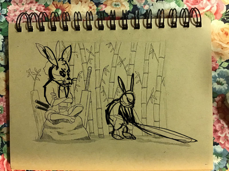
Hey I hope you don't mind I did a little draw over that might help you out too add a little drama to the poses.