Fall - WIP (The battle of leaves)
-
Looks like the votes are all over, I like number 2 the most. It frames the character nicely.
-
@gary-wilkinson Like this idea and 2 and 3 are my favorites. Really like the character sketch and 3/4 view. #2 is nice and simple, feels like a cover illustration, and you could even do it as cover, with a hand-lettered title. #3 brings in other characters, and feels more fun and active.
-
@gary-wilkinson 2,3, and 6 for me too - 3 with a bit of the gesture of 2 would be a great way to go - be a really nice book cover design with the space at the top. Looking forward to seeing where you go with this!
-
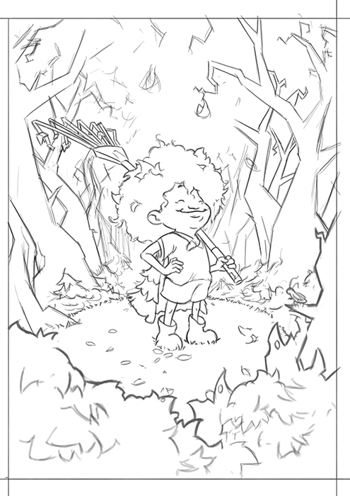
Thanks again for everyone's advice. I've decided to go with 2 (although I might look again at 3 someday in a different style)
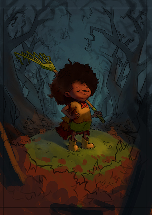
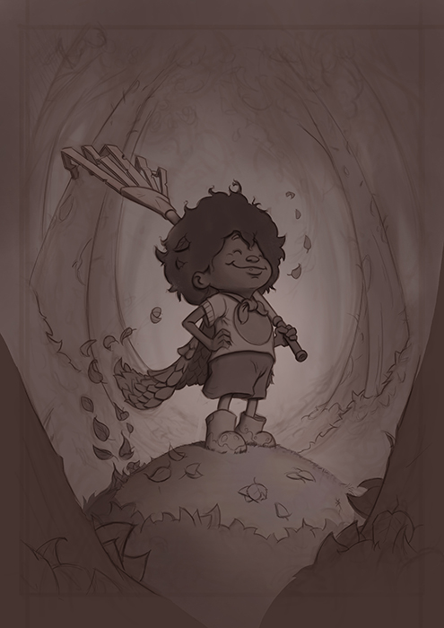
I've now got my linework down and have been playing around with a few color schemes. I quite like the idea of having the leaves around the mound of grass she is on and having somewhat of a dynamic light over her face with the background receeding into blue.
-
Nice work, love the characters expression, she looks so proud! I think the blue background with the shapes of those trees looks a little scary or ominous and it conflicts with how happy she looks. Although from your description she was battling them so it could have been a pretty dramatic battle haha! Great job, can't wait to see it finished!
-
@shiggins180 you're right about it being too ominous and think it would fit the right scene but maybe not this one. I was rewatching Will Terry's 10 step video again recently (along with creative composition) and he really pushed the idea of getting a good sketch if things aren't working out right. I think I will go back to the sketch phase again to fix a few things
-
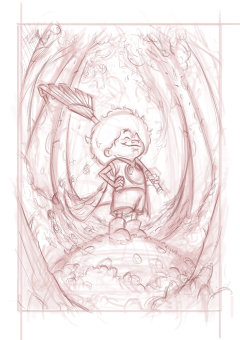
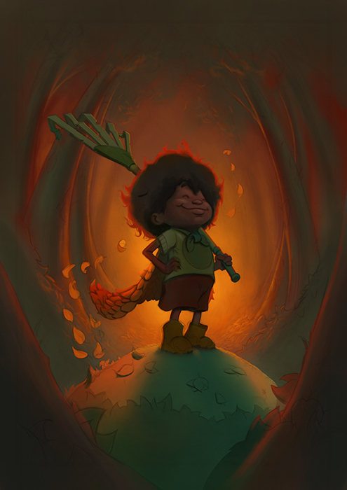
I think I really want to push the superhero angle of this piece and feel it needs more heroic impact and less eeriness. Take 2:
-
Nice improvements, and I do like your warm/cool color scheme! As I see it on my monitor, maybe push the lights a bit? The whole thing is keyed way down. But the glow looks really nice.
-
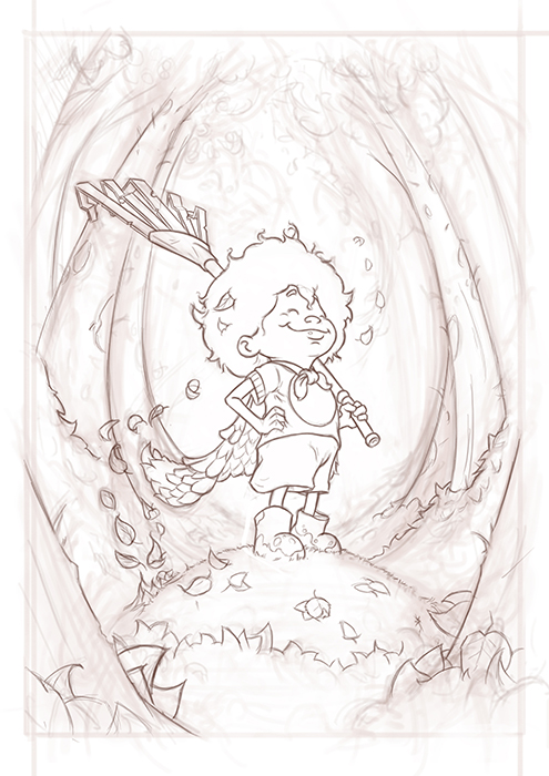
@gary-wilkinson The line looks pretty good. He definitely seems accomplish
-
@Gary-Wilkinson the FACE on that kid! Adorable and proud!! Awesome.
-
A few updates to the painting. I thought I would try and follow Will's process as he outlines it in the 10 steps to digital painting to see if I can get a process that is a bit more streamlined, my own process is very similar, but I feel like I jump around too much or correct issues that could have been resolved earlier.
Refined the linework
Added tone
Color Studies
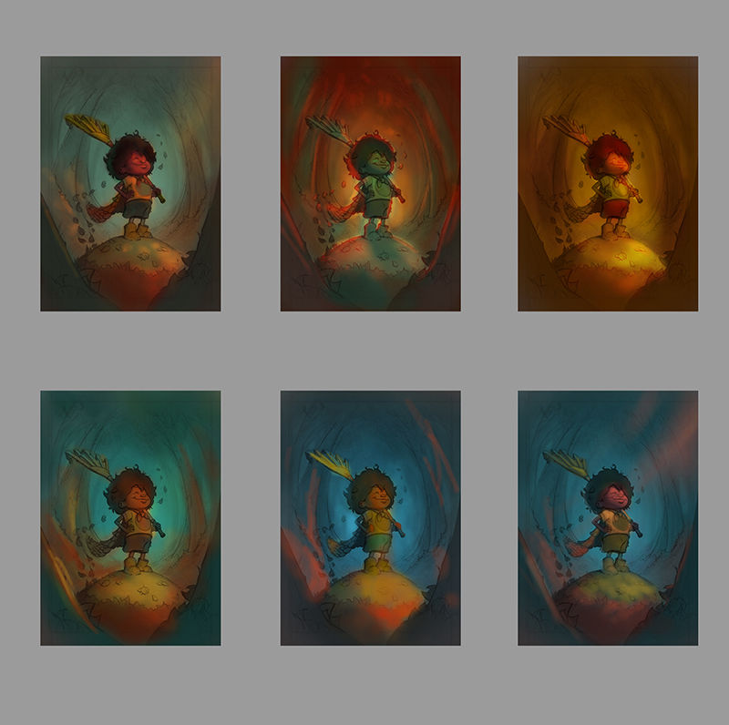
I think I like the middle top one with the back lighting as it's a style I haven't done much and seems to add to the heroic-ness of the character. What are your thoughts?
-
@gary-wilkinson Very nice! I think the top middle one feels very 'autumn'. It's a good choice.
-
@art-of-b i totally agree. That soft warm backlighting really gives off that autom vibe.
-
Slowly getting there, trying to decide on the best way to lighten up the front face of the character, along with a few other bits and pieces. I want the character to be of a dark skin, but finding it tough to balance the colors hitting her from the front as she ends up looking too green. Any advice is appreciated
-
This post is deleted! -
@gary-wilkinson yesss I love the latest version! You’re really sending big fall vibes! The lighting is gorgeous. I only have one tiny suggestion- maybe a little weight underfoot, on the pile of leaves, to stop it looking like a hill and more of a pile of leaves. Does that make sense? Can’t wait to see it all finished!
-
@gary-wilkinson argh ignore me! I just realised it IS a hill not a pile of leaves

 ️ Sorry!
-
@gary-wilkinson Awesome! I also like the middle top best.
-
This is awesome.
") I love the pose and expression of your character.
I love the pose and expression of your character.For having lost some leaves, the canopy seems, to me, to be blocking more light than my mind would predict... could there be more warm light from above (or bouncing off of the trees in the foreground) in addition to the strong glow from behind? Maybe that would give you a bit more of a skin tone palate, that leans not quite as far towards the greens and blues, and highlights her great expression. If this was my piece that's what I might try, but I'm excited to see what you end up doing. Your skill level and command of colors is far beyond mine, so I'm grateful for the chance to learn from you.
-
Finally finished it and added it to the main contest page. It was a nightmare getting this one done, but I think I learned a lot from my initial mistakes and have definitely come to appreciate the need to get a good sketch down first

@PoppyK thanks Poppy. I can see why you were mistaken with the hill. I was going to have it as a pile of leaves originally, but decided that it would be the only area without leaves, as though she had raked that area already.
@Jon-Anderson Thanks Jon. I'm glad the one I also liked was the one most others preferred
@KathrynAdebayo Thanks for the advice Kathyryn. You're right about the light and there should be a lot more of it coming from gaps where there should be no leaves. I wanted to avoid leaving the trees empty at the top though (even though they have lost a lot of leaves) to balance the values and make the main light in the center of the image. With my final version I took a bit of artistic licensing and added in a 2nd warm light to the front rather than a cool light as I could never seem to get that to work right anyhow.