Fall - double meaning
-
If you don't go with #2 for the competition, as it seems like it's not the popular choice, I hope you paint it anyway! I don't know why, but I love it so much.
Website: www.tessawrathall.com
Instagram: www.instagram.com/tessawrathall_art/
-
@EmilyM @robgale @Jade-V @Art-of-B @Debra-Garcia @TessaW @Chip-Valecek
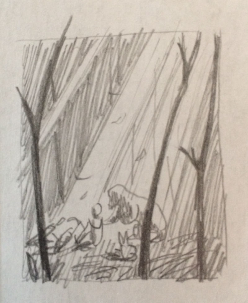
Wow, thank you all so much for your generous input. I appreciated the comments about silhouette. I think that's something I'm starting to notice about strong pieces that I admire - use of easily readable shapes - so I think I'll go for a variant of #1 for that reason.Here are 3 options for values. Maybe I should be more focused at this point, but different ideas for environments came to mind, so that's what I jotted down. I'm leaning towards A because it feels most calm to me, but the characters are smaller, so I don't know if that's a con I should watch out for. I'd appreciate input at this stage if anyone has advice or ideas.
A)
")
C)
-
@tessaw
") The idea of a bunch of animals crowded around a kid, helping him or her to feel better, has always been a neat scene to me. Maybe I will paint this one too some day. Thanks for the encouragement!
The idea of a bunch of animals crowded around a kid, helping him or her to feel better, has always been a neat scene to me. Maybe I will paint this one too some day. Thanks for the encouragement! -
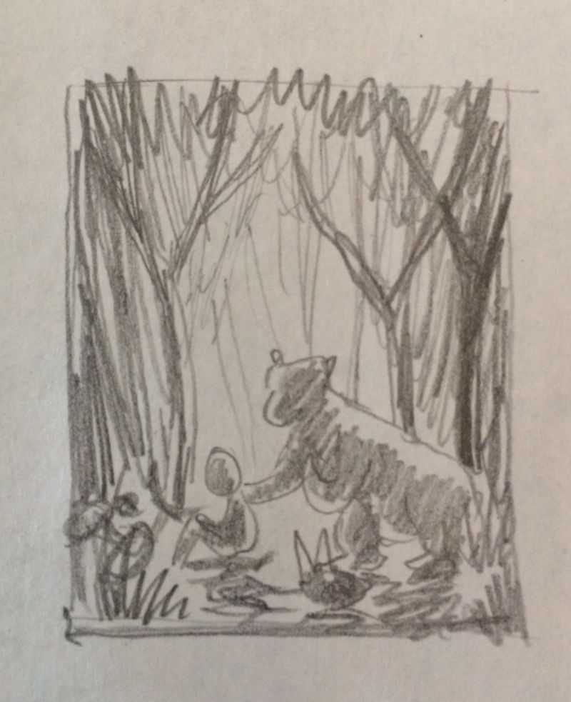
@kathrynadebayo I like "a" in the value studies. It gives an easy to read silhouette with fore, mid, and background to provide varying values to help the piece. Add in that dapple lighting and it really sets the stage for an immersive world.
-
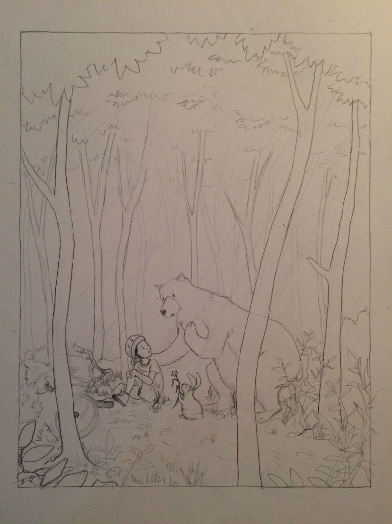
Thank you @Jon-Anderson! I appreciate your input very much. I did go with that idea... here's a sketch. Are there spots that anyone sees that look off?
-
@kathrynadebayo No critique just now, I just want to tell you that I love this.
-
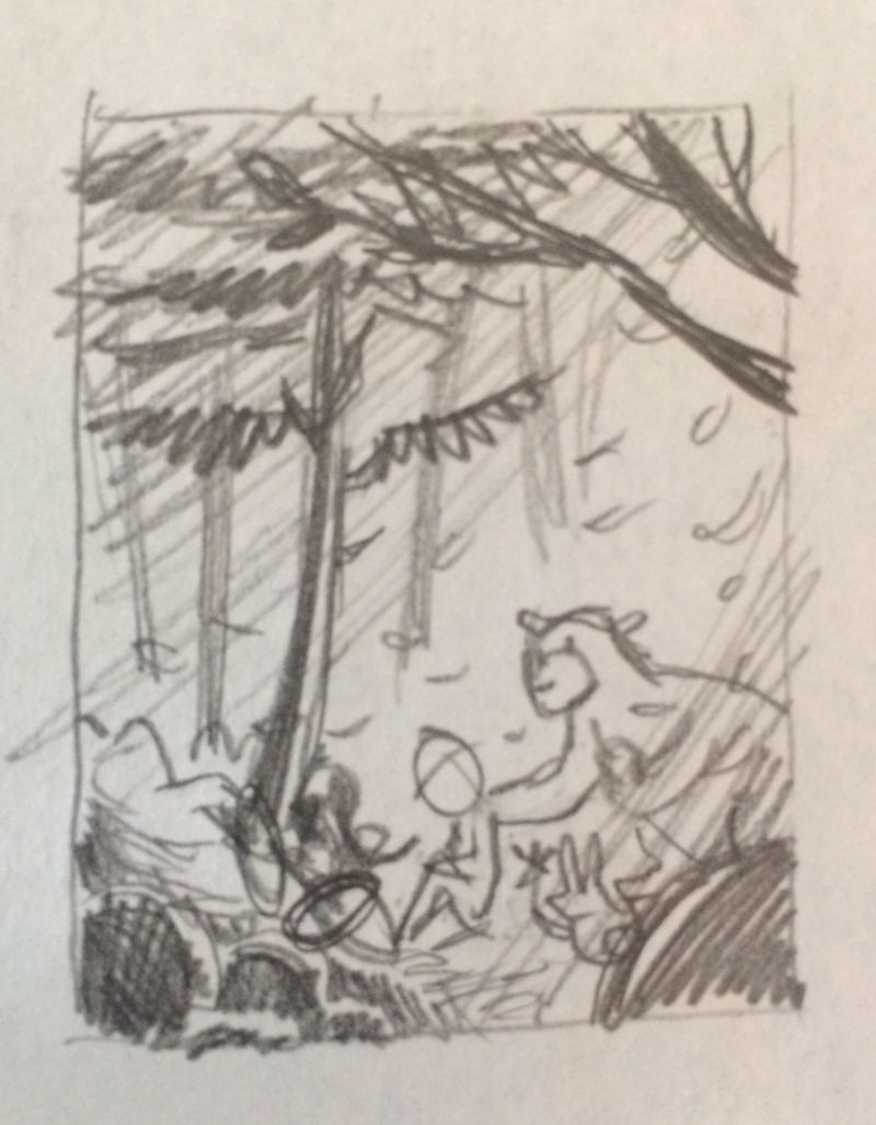
This process is so exciting. The part that I'm worried about is color since that's a weak point of mine, but at least for now, I feel ok enough with the sketch to move in that direction. Here's where things are at now after some adjustments...
If anyone has an eye for mistakes that I'm missing, I hope you have a chance to post before this takes on too much permanence! (I don't have the tools to work digitally at this point.)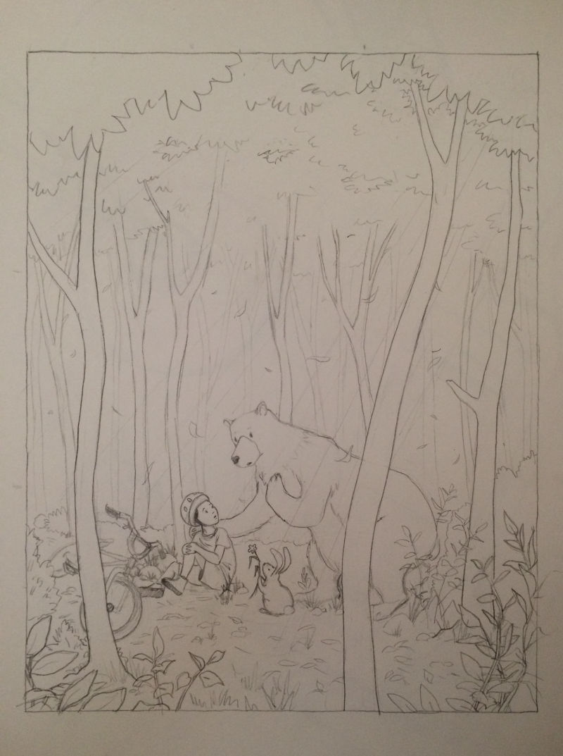
-
@eli
That's very encouraging! Now let's hope a decent sketch manages to become an ok painting. Colors are the hardest part for me. By the way, I like your work very much! -
@kathrynadebayo this looks great! I love the bunny giving the flower for comfort. SO cute.
-
@KathrynAdebayo this is a really sweet image. Love the characters and the expressions. Those tall trees increase the feeling of how alone he is in the forest. Then those sweet, unexpected friends come to comfort him. Really great!
-
I love this! One suggestion, maybe put eyelashes on the bear to make her look like a sweet mama bear? It would make her appear more nurturing. And Mama bears need more good PR.
-
This is great @KathrynAdebayo! Nice work. I'm looking forward to seeing how you handle the painting / color and light. One thing I like to do is another round of value and color studies, which are like thumbnails, but using the drawing you've put together and it allows you to experiment with light and dark and color ideas. I find it makes my color choices way easier because I can put aside the drawing while focusing on values and then on colors. I always find that if I'm struggling with something, the more I can break it down into pieces the better.
Anyway, just wanted to offer that tidbit that's been helpful for me, great job!
-
@Chip-Valecek @Whitney-Simms @chrisaakins @robgale
Hello! Thank you all for your input and encouragement... It's so helpful to get feedback.
Chris mentioned momma bears getting more PR, and being a momma bear myself, I appreciate that.
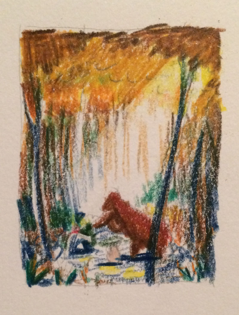
In regards to this piece, I have recently been inspired by the book, "You and Me, Little Bear" by Martin Waddell and illustrated by Barbara Firth, because it's such a loving story about a father bear and child bear that shows the tenderness and caring nature of dads. That's kind of what I was going for here, so I'll probably keep the bear as is and not add any features that might suggest it's a she-bear.@robgale, you mentioned color and value studies, and when I read that comment I said to myself, "Yes! This is just what I need to do." Thank you so much for taking the time to share your advice.
Here's the color study I decided to go for in general. If anyone has advice about how the colors here could be adjusted to be more effective, I'm all ears.
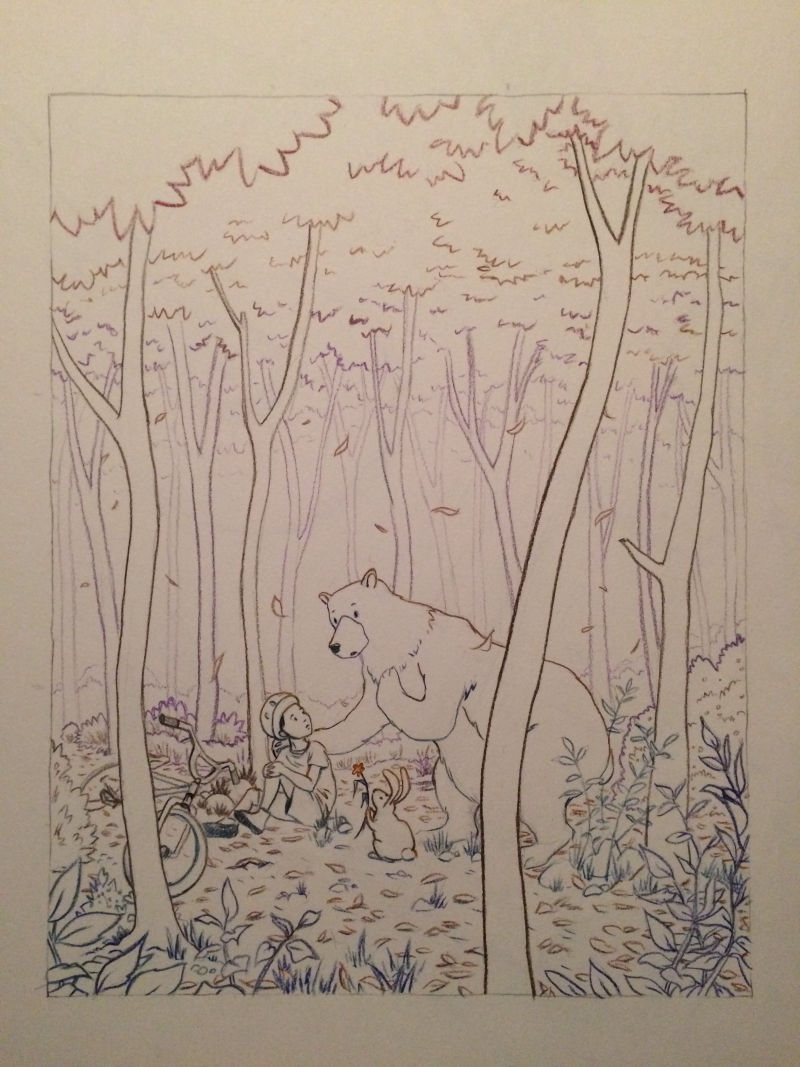
And here's the line work done in colored pencil to prepare for watercolors:
-
@kathrynadebayo Awesome! Your line drawing is looking nice! I like how you're using different colors for different lines, it's already coming to life.
For your color study, if you're going to watercolor the final, I would do some color studies in watercolor. I think you'll find that it's going to be way more helpful.
For example, you might not be able to, or even want to replicate some of the darker colors (I'm thinking of the dark blue of the trees and dark red of the bear) of your colored pencil study. I would think with watercolor, you're going to be doing something with a lighter color palette and less contrast than what you can achieve with colored pencil.
That being said, I'm not a watercolor artist, so I say do what feels most useful for you, I've just always found that if I can solve a problem quickly in a color study, it often saves me a ton of time and heartache.
Great work!
-
@kathrynadebayo So cool to see your process. I like your line drawing a lot. Looking forward to seeing your progress.
-
@robgale You are absolutely right. I should have done the color study in watercolor. I appreciate you commenting again to make that suggestion... I can see now as I'm working with the paints the wisdom of using the same medium.
@Johanna-Kim I love your work! Great to hear from you!
-
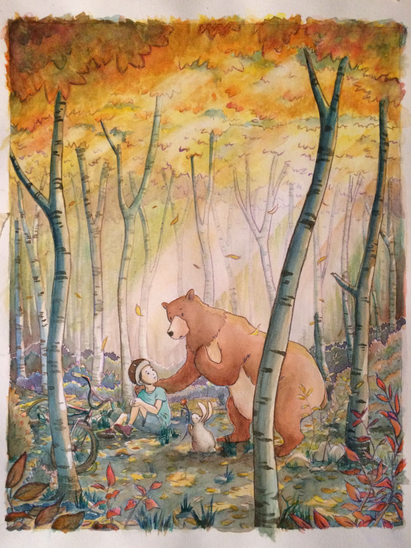
The scary part of adding color is ending up being a lot of fun.
Here's where things are currently. If anyone has suggestions, I'm all ears.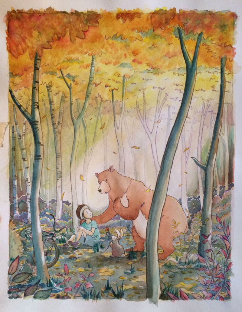
-
More progress.
I'll probably sit on this for a day or two before trying to make a nice digital version. All feedback welcome. Does anything look off? Maybe the bear is a bit flat?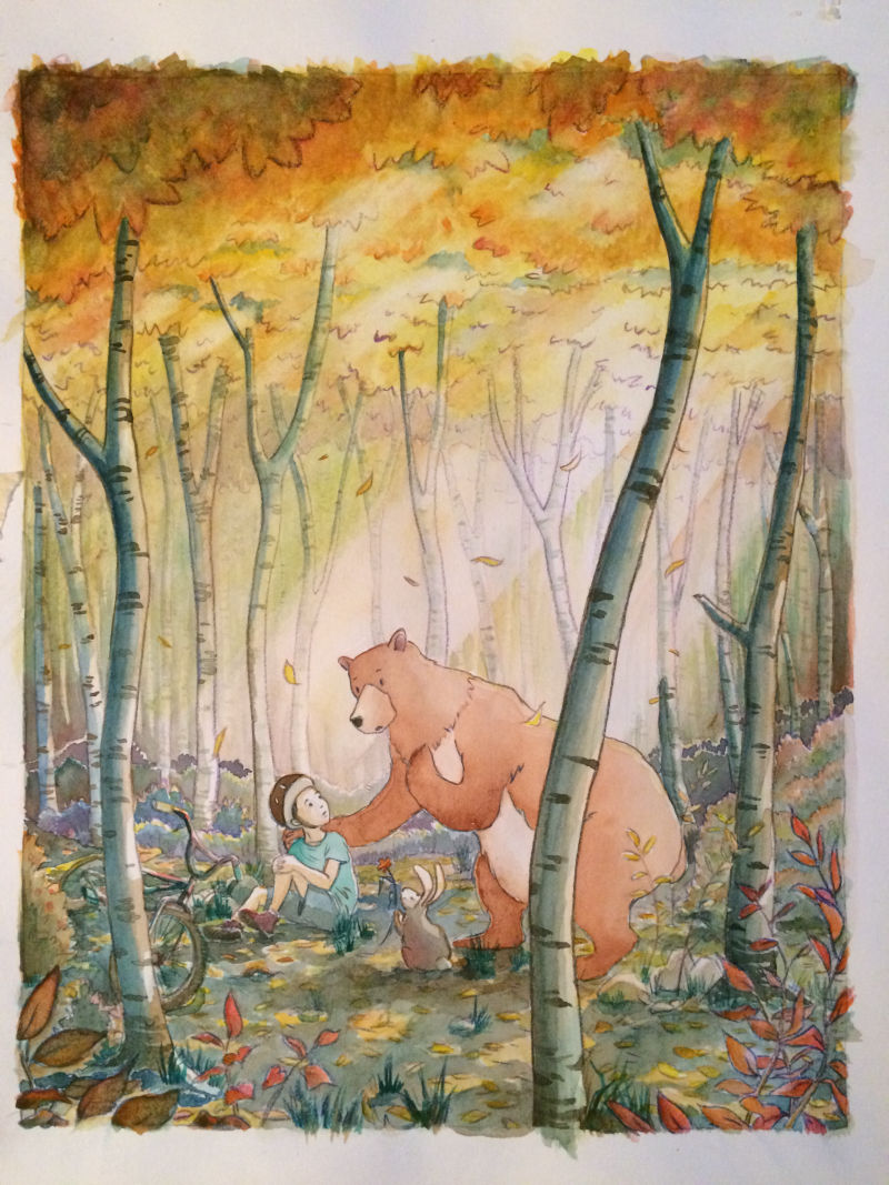
-
I love the glowiness (if that's not a word, it should be) of this! It captures the soft feel of autumn so well. In my opinion, the bear could pop a little more, and the bunny gets a little lost. This is SUCH a sweet image, and I really love it.
-
Such good advice, @Eli . Thank you so much for helping me with this piece. Maybe this is a little better?