Online portfolio website / looking for feedback
-
Hi everyone!
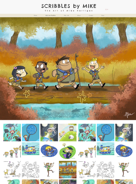
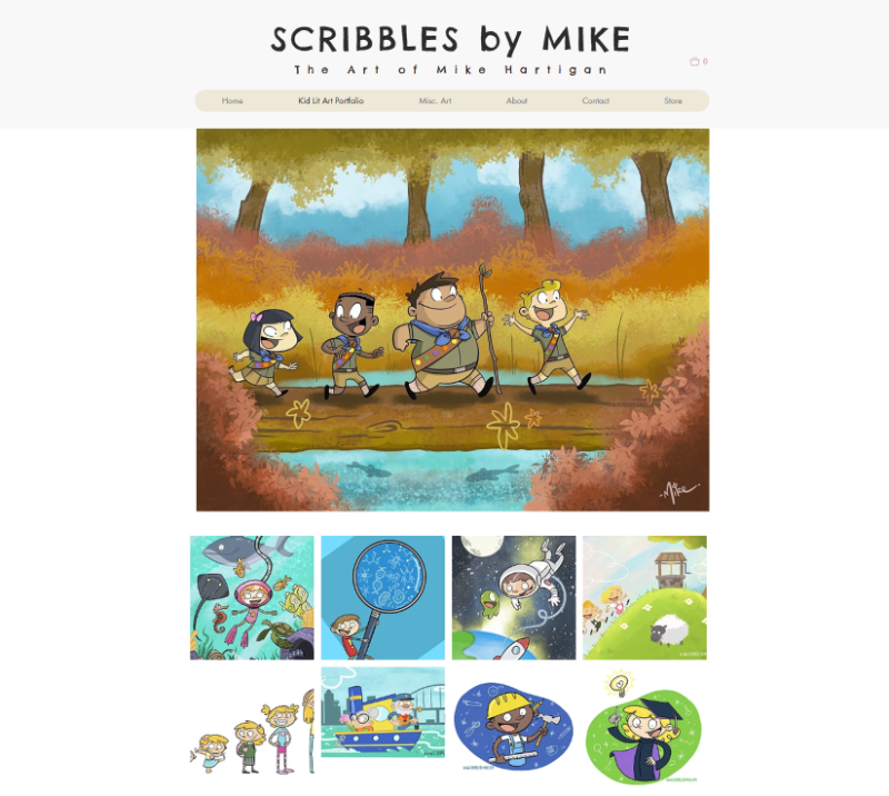
So I'm trying to get my website/portfolio ready to send off to prospective agents and was hoping if anyone had the time to give it a looksie, maybe you could offer any feedback (good or constructive)Personally i don't like the idea of opening right on a full gallery - but i have made it one simple click to get anywhere of importance.
Anyway, here is the link: Scribbles by Mike
Appreciate anyone's time and feedback
-
Love it! Realy very easy to navigate and looks so fresh
") ! Wonderful work!
! Wonderful work!Aaaaaand one of my dreams is to visit New Zealand! :smiling_face_with_open_mouth_cold_sweat:
-
Hey Mike,
Good looking site, very precise and consistent. Easily navigable. If I was an art director, I would definitely feel confident in what style and genre of work you provide.
Nothing to critique... the store link got me out of the zone pretty quickly though (populated with placeholders). Maybe disable until you have that filled with your work.
Nice Job.
-
Wonderful illustrations! I think the site is great as-is, the only thing I might suggest is making your superhero illustrations their own category on the home page/in the nav.
-
Hi Mike, I like the website and the work on it. A few things that stood out to me though were:
There is a lot of empty space on both the left and right side of your page. Would it be possible to use all of that space, allowing the preview images to be larger?
I think the hearts (likes?) are a bit of a distraction and i'm not really sure of their use.
When clicking on a image again there is a lot of white space to the right with only a small amount of text for each piece. How about having the text underneath the image and have the illustration more central?
(I am viewing your website using firefox on my computer)
- also just to add that I really like the "Off for a walk" piece

- also just to add that I really like the "Off for a walk" piece
-
@mariana_0101 Thanks so much! you totally should visit!
@studioMiguel Yeah i had planned to update the big cartel store sooner and then put a link here . So will get on to that asap thanks for the feedback!
@StudioLooong I was trying to avoid too many categories so lumped them all in misc - but well noted. maybe ill look into that next
@Gary-Wilkinson I used Wix when creating the site and my noob website building skills didn't quite understand the grid it tries to keep you within (which is to keep your site looking fine on mobile devices) - so i will look to fill in the white space and then go and remove those images from the mobile version. As far as the hearts and the white spaces on the images thats the gallery on wix - i dont think i can change that without coding knowledge. Thanks very much for the feedback - very helpful - and glad you liked 'Off for a Walk'! -
the art is great and the website looks really nice but could use a few tweaks.
The space at the top is like air around your name/logo to let it breathe. I wouldn't add anything next to it, or at least I would make them much lighter and may be even smaller as not to compete with the main element.
I would use 1 of your horizontal illustrations in it's real size or in a size that matches the width of everything else. it will showcase your work and add a focal point to your home page
the social media icons need to be smaller in my opinion
make sure all paragraphs text is aligned at the left, or flush left. It will look more organized that way.
I tried something I hope it helps full width:
or center only
and make sure it looks good on cellphone.
if you want the website to work only as a portfolio then that's fine, if you want the website to get you traffic then you may want to look into writing blogs and read up on SEO.
-
Very cool and made me smile!
I've been in New Zealand and loved it! I wish it wasn't so far away from Europe.. -
Lovely looking website, easy to navigate and your work really stands out on the pages.
I agree with @HeidiGFX , I would lose the illustrations you have alongside your name at the top, even when I expand my browser I still can't see all of the images so it's a bit of a distraction and not needed as you already have your great work on display below your name. Plus 'Scribbles by Mike' is such a strong title!
I personally wouldn't call one of your categories 'Kid Lit Art Portfolio', maybe just 'Children's Illustration', to me that just makes it sound a bit more professional
Other than that I love the look of it all and your work is brilliant! Love the humour you portray in your illustrations