Composition Goal....did it get it?!
-

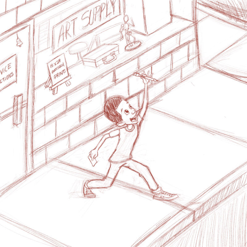
Presketch composition.
Goal: This Is the introductory illustration and needs to convey that this new pencil is the “end all, be all” to know how to draw!
 Did I hit that?!
Please tell me one reason why or why not!
Far from the color stage, but the wall will be muted , (undecided if I will keep subtle brick work lines ) so that Duddles and the new pencil pop against the background.
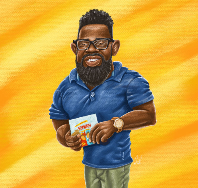
This is another joke/fan illustration of an illustrator I admire (in addition to Will, Jake & Lee of course
 ) I posted on my IG that he is an amalgam of: James Harden, Ronnie Coleman and Kadir Nelson!
 -
In my opinion, YES! I love the joyful expression on the kid's face, and I like the perspective a lot! I love how he has the pencil elevated. I guess if one thing feels just a little off to me, it's the position of his legs--maybe if he looked more like he is bouncing a bit to match his elated upper body gesture? His feet feel too grounded and I'd like to see more of a "walking on air" kind of feeling... I hope this makes sense. Also, if I could get one of those pencils, I'd be pretty happy, too!
-
Nice image, one tiny thing if your keeping the line work in the final then I would change the direction of the pavement lines as it looks like a drop of
-
@rcartwright Thanks, ha it does look like a drop off. Those are however just scribbles to indicate the contrast of the street to sidewalk....silimilar to the scribbles in the top right corner. Thanks again.
-
@eli Thank toy sooooo much....I really needed another pair o eyes. That’s what it’s missing. I will raise that left foot or a joyful leap. Thank you thank you thank you.... I sincerely mean that.
www.chrisdudleyart.com
@artdud
Instagram: @chrisdudleyart -
@art-dud Yay! so glad it helped! looking forward to seeing the progress on this!

-
Love the emotion you’re striving to convey! There are a couple of things I would change, but the one that stands out more is that the kid looks too small compared to his surroundings. He is also in the dead center of the composition - it may look more dynamic if you shift him slightly off-center, ideally with his head on one of the thirds line. Your perspective is also a little off - the pavement and brick lines should be slightly converging to their off-page vanishing points, and the vertical lines would be converging towards the bottom, not towards the top, as you have them now. I love his expression!
-
@smceccarelli Thank You so much for your response. I will emplimemt these and repost.
-
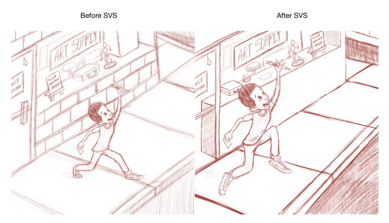
Adjustments made based on suggestions. Thanks @smceccarelli @rcartwright @Eli
It may not be perfect, but what a HUGE compositional difference!
www.chrisdudleyart.com
@artdud
Instagram: @chrisdudleyart -
@art-dud Wow, it looks GREAT!!
-
@eli THANK YOU ALL! This the first book I have written AND illustrated, so doing everything with little to no outside input from others can make you blind to some things. Especially since I am also working on client projects.