Dream and Imagination Room Portfolio Piece
-
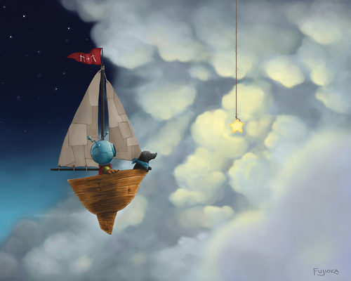
Really beautiful piece and concept! I agree with what Kevin said about the left side of the piece. Maybe there's just to much space there that are not needed, and since there's some objects that are lighter, it grabs the attention of the viewer a little bit more than desired. Thinking this way, I would like to suggest a little crop, because for me it would put the kid trying to reach the star closely to one gold point in the image. The way it is now, it's almost at the center and I think maybe you could benefit from the rule of thirds to make it more interesting by cropping the left side a little bit.
Also, the warmer touch Matt applied to it makes a huge difference in the feeling overall.
")
Nice job, when I grow up I definitely want to learn to paint like you!

-
@Nightseye Thanks! I like shiny stuff too, haha, so I actually did have a few more actual star shaped stars amongst the clouds before deciding to go with just one. But perhaps I should revisit that idea. I may have just put those other stars in the wrong place
-
@joyce_carmo said:
Really beautiful piece and concept! I agree with what Kevin said about the left side of the piece. Maybe there's just to much space there that are not needed, and since there's some objects that are lighter, it grabs the attention of the viewer a little bit more than desired. Thinking this way, I would like to suggest a little crop, because for me it would put the kid trying to reach the star closely to one gold point in the image. The way it is now, it's almost at the center and I think maybe you could benefit from the rule of thirds to make it more interesting by cropping the left side a little bit.
Darkening the edges might serve as a type of crop too--it lessens the amount of information and causes the eye to stay in the lighted areas. If this was in a book I think it would be a 2-page spread and if that is what the idea was I don't think it could be cropped.
-
@joyce_carmo Yeah, I think I'll crop it before including it in my portfolio. The piece was originally not as wide, but the client wanted it to be wider in case they wanted to fade out the left or right to include text there. And as far as learning to paint like me, from what I've seen, you've already got your own wonderful art style
Thanks for the critique! -
@mattramsey yeah, you've got a nice point! I just didn't thought about the context in which the picture would be presented, just the picture itself.
@shinjifujioka thank you too.
-
very creative! I really like this image.
-
I LOVE THIS piece, very whimsical. Only wishing the little boy was larger so you could really soak in his expression for me. Everything else is really great. Things look realistic yet perfect for children. Well done and hope to see more.
-
This look awesome. You pulled off what I failed to with my 3rd Thursday piece in the lighting. I'm using this as reference while I rework mine.
-
First, this piece is simply stunning. I really LOVE it. I also love your H&H work, especially this piece :
If I really want to find something to critique, I would have to go with @johntutulliart and @Kevin-Longueil. We can see that the boy is the focal point of your painting, but I feel like he is getting lost in the details of the room. I think either cropping the image, or darkening the edges as @matrasmey suggested could help us focus on the boy a lot more.
That being said, I just love everything else about it.
-
You have a great style and rendering abilities. Very nice work. I would agree with some of the other comments that your piece needs some warmth in it. I really appreciate all the interesting items you included in the bedroom scene. Thanks for sharing your work!
 (
(