Cover Design - Looking for input
-
I signed in with my Adobe account and it says File corrupted or not supported.
Looking forward to give some input when you get an image posted.
Branden Brushett
3D Game Artist/Writer/Illustrator
Portfolio: https://brandenbrushett.wixsite.com/portfolio
Instagram: www.instagram.com/picturebookjourney -
@meilidesigns I post my images on facebook and then download them to put on here and it works. Then I sometimes quickly delete the FB page if I don't want others to see it
") It works for me, maybe you coud do that. I'd love to see the image!
It works for me, maybe you coud do that. I'd love to see the image! -
-
@meilidesigns
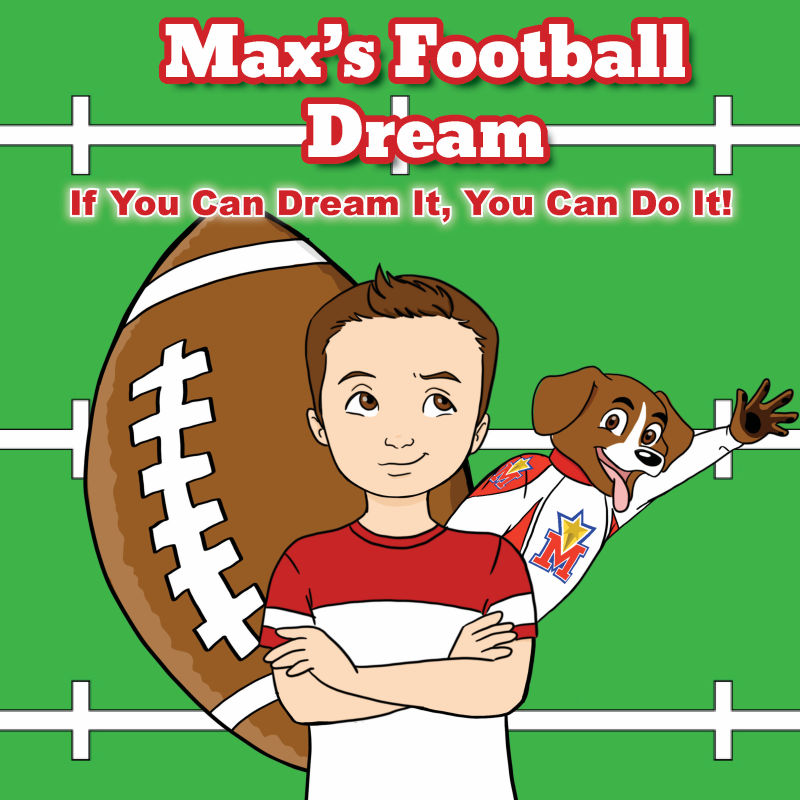
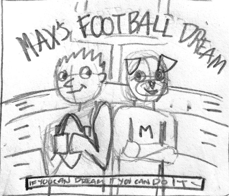
This is the 3rd idea with the football going the other way. Not sure the author will want this.Thank you for your input!
Kait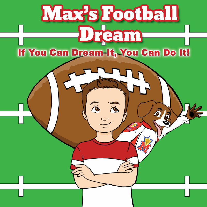
-
@branden-brushett
Just uploaded the images to the post. There are three different images - please see the comments for the others. -
Of the 3 compositions, I do like the one going vertical the most. Though I'm confused by the dog. It throws it off a bit for me but I guess some context into the story would clear that up? Is the dog necessary?
If it were me, I would try having the football be the background with the title of the book in it. Not sure how that would look, just a thought. I understand the author wants something specific.
Another thought would be to have the football in the dogs hand as if he is catching it.
With the font.. again, this is just me, I would get rid of the outline and the glow. And drop the white yard lines to begin below the title so it's not crossing through the Dream part of the title. Or you could use those white yard lines, make the font plain white (no red outline) and have them intersect into the title "Max's Football Dream" as if the yard lines were painted with the words in it.
Keep playing with it and let's see what others say too. Good job btw! I like the boys expression.
Branden Brushett
3D Game Artist/Writer/Illustrator
Portfolio: https://brandenbrushett.wixsite.com/portfolio
Instagram: www.instagram.com/picturebookjourney -
@meilidesigns I only see one image. I'm wondering if the football would look better at an angle. There are already a lot of vertical and horizontal lines. But that might affect th placing of the text too. I might put the dog somewhere else too or rearrange him a bit. Looks really nice. Clean and colorful
Marsha Ottum Owen
-
Thank you so much! The author wanted a mascot (the dog) that would appear throughout a series of books. All of the books will be about things Max dreams of - like being a football player.
I will play around some more!
Kait -
@marsha-kay-ottum-owen
Thank you! The other 2 images are in the comments. One is on an angle a bit. Not really happy with the composition of any of them. Can you see the others? -
I think the way you've rendered everything is really nice but you could introduce some structure to the scale and placement of the elements in your composition to help it read a little better. The size of the boy doesn't make sense compared to the dog, ball, or the field. If the football needs to be large and vertical behind the boy I would make it much larger to appear as more of a graphic background than an object competing for attention with the characters. If not, I would try having the boy holding a football instead.
The way the dog is placed creates a tangent with the kid's shoulder. Is the dog a character with a role in the story? If so maybe you could have the boy and him standing back to back with their arms crossed or interacting in some other way. Having the two of them standing on the same plane would also leave more room to use the football behind them as a secondary element.
If the dog isn't relevant to the story maybe you could create some sort of little circle/seal/logo that could contain him up near the title? Maybe something like the little "I can read it" mark on this book?
I would also try to stay away from using outlines and glows/shadows at the same time on the text. The simpler the better.
-
Nice work, honestly I like the second one the best for composition. Having the brown football behind the brown hair of the kid and the brown dog on the other two, looses the readability just a bit.
-
@meilidesigns Yes, I see them now. Of the three I do like the one with the football at an angle.