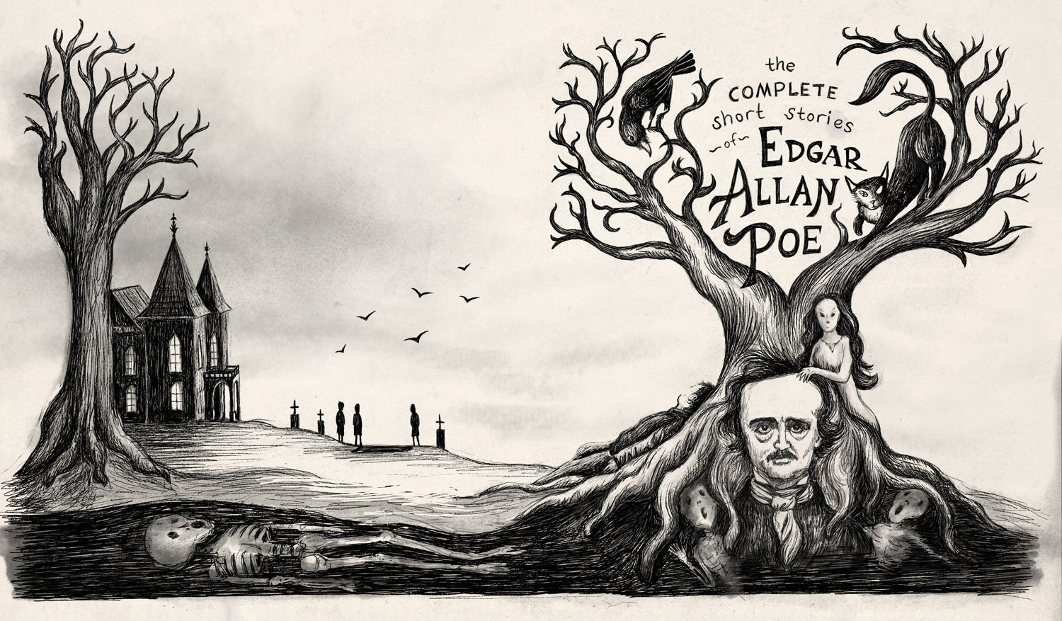
November 3rd Thursday - Poe sketches
-
LOVE this one
-
@Ace-Connell and @Rich-Green Thank you
")
@Rob-Smith Thanks! I like the idea of the hair melding and flowing with the tree, I’ll try to do that a bit more. I agree also about muted palette.
@Thrace-Shirley-Mears Great idea I will try that! It takes the edge off the white but not too colourful either.
-
Updated version...I tried to be subtle with the changes, hope I went far enough.
-
@Dulcie Yup... I'm a big fan
Ace
-
@Dulcie Looks so good!!! Great work!!!
-
@Dulcie I like your cover. I can really imagine it on a bookshelf. 3 little things are bothering me.
- hill on the left is cut off.
- Tree on the left seems like was cut shrunken because there was not enough space. (original version with just half of the tree works better imho)
- I dont like how the title "the COMPLETE short stories" is written. Just a gut feeling, Also I am not a native speaker, but is "of" ever used? I thought it is always "by E.A.POE".
-
Thanks @Jiří-Kůs, all good points. I'll crop a bit of that left side off, but allowing room for bleed I should fix those things anyway. I will have a think to see if I can do the title better.
I didn't think too deeply about the exact wording, to be honest....going a quick google, I think 'of' is permissible in this case, because there are other books like that. But perhaps I could phrase it better....will have a think.
-
This has turned very nice! I really like the feel of this cover.
-
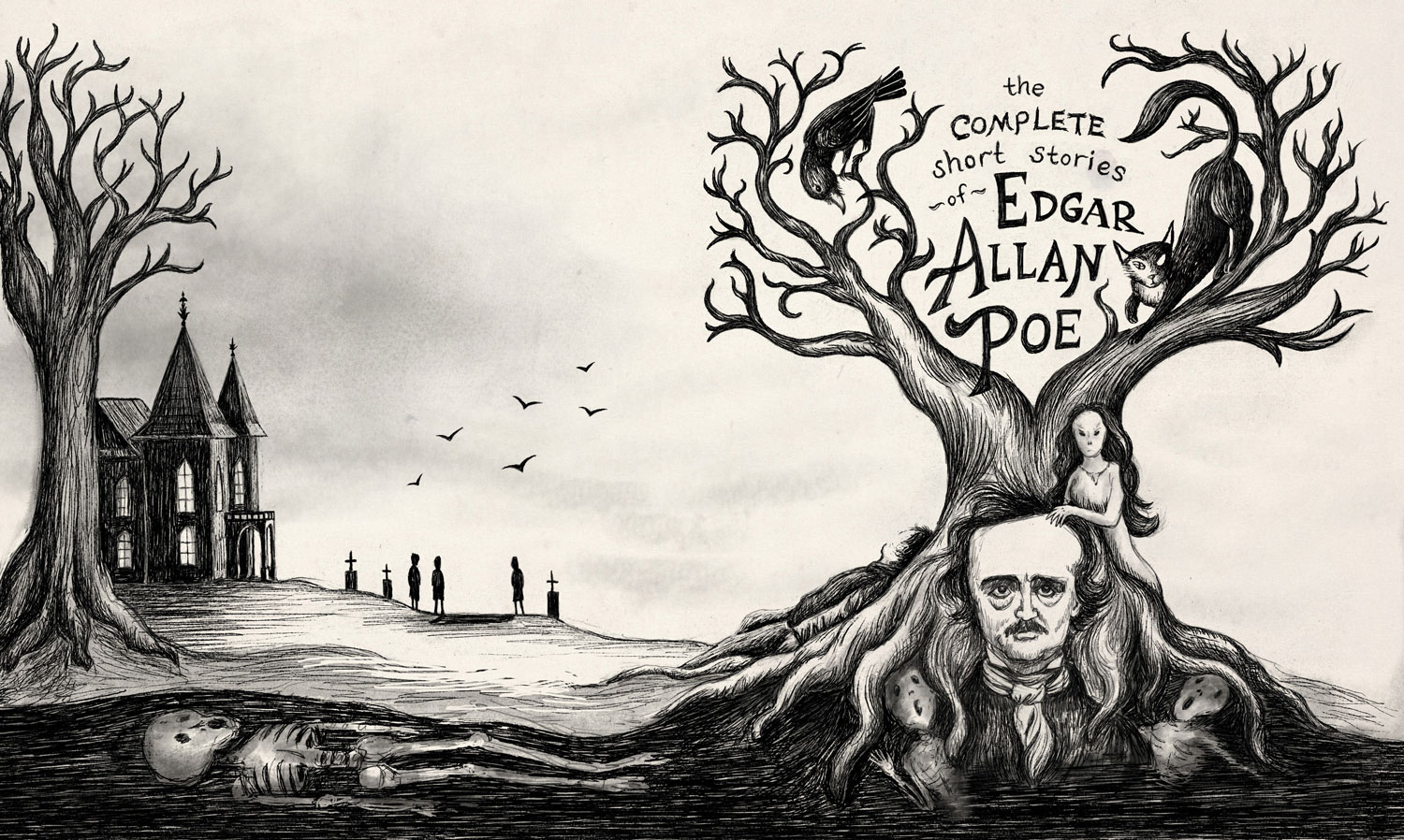
Hi @Dulcie as you know I think this piece is really fantastic. The one thing I keep seeing when I look at it is this: the house appears to be leaning or sinking in towards the viewer. The perspective is off -for example on the back roof I do not think it should be drawn with such a slant down towards the tree - it would actually be almost horizontal from the angle the view is at. With the current slant it makes it appear the farther side of the house is taller than the side we are facing and therefore it looks like its leaning. And the same is true for the entryway - you would not see the top edge of the far side of its roof from this position. Hopefully this makes sense.
-
@Rich-Green That is very true. Good catch!
Ace
-
@Rich-Green - thanks for pointing that out! Now you mention it, I can totally see you are right. It’s like I drew it slightly from above but the viewer is at ground/tree level. Will fix that
-
Well this is the updated version. I've had enough of working on this now so I'm calling it finished
-
@Dulcie the revisions on the perspective of the house make all the difference. I also like that you now have the tree by the house going out of frame. It feels much better to me that way. I really enjoy this piece so much Dulcie! I am really hoping it gets picked next week!
-
Re-reading your original post here and how you thought "oh no I'm gonna hate this..it's dark & death related, not children's books, not cute...." and then to see how you took the challenge head on and WON last night is just an awesome testament to the fact that life begins outside your comfort zone!!! Congrats again!!!
-
Thanks Rich - it is a funny thing that I really didn’t like the brief to start with
I have really appreciated your enthusiasm and that of everyone in this thread, and the helpful pointers. I was thinking, well if I don’t get critiqued at least I feel like I’ve made progress and a lot of that is down to the feedback we give each other in this forum. <gives forum group hug> -
@Dulcie I thought your piece was very deserving of a critique.. Good job. I really liked the old etching feel of the image.
-
@Dulcie Yours was absolutely my favorite! Congratulations on your win!!
-
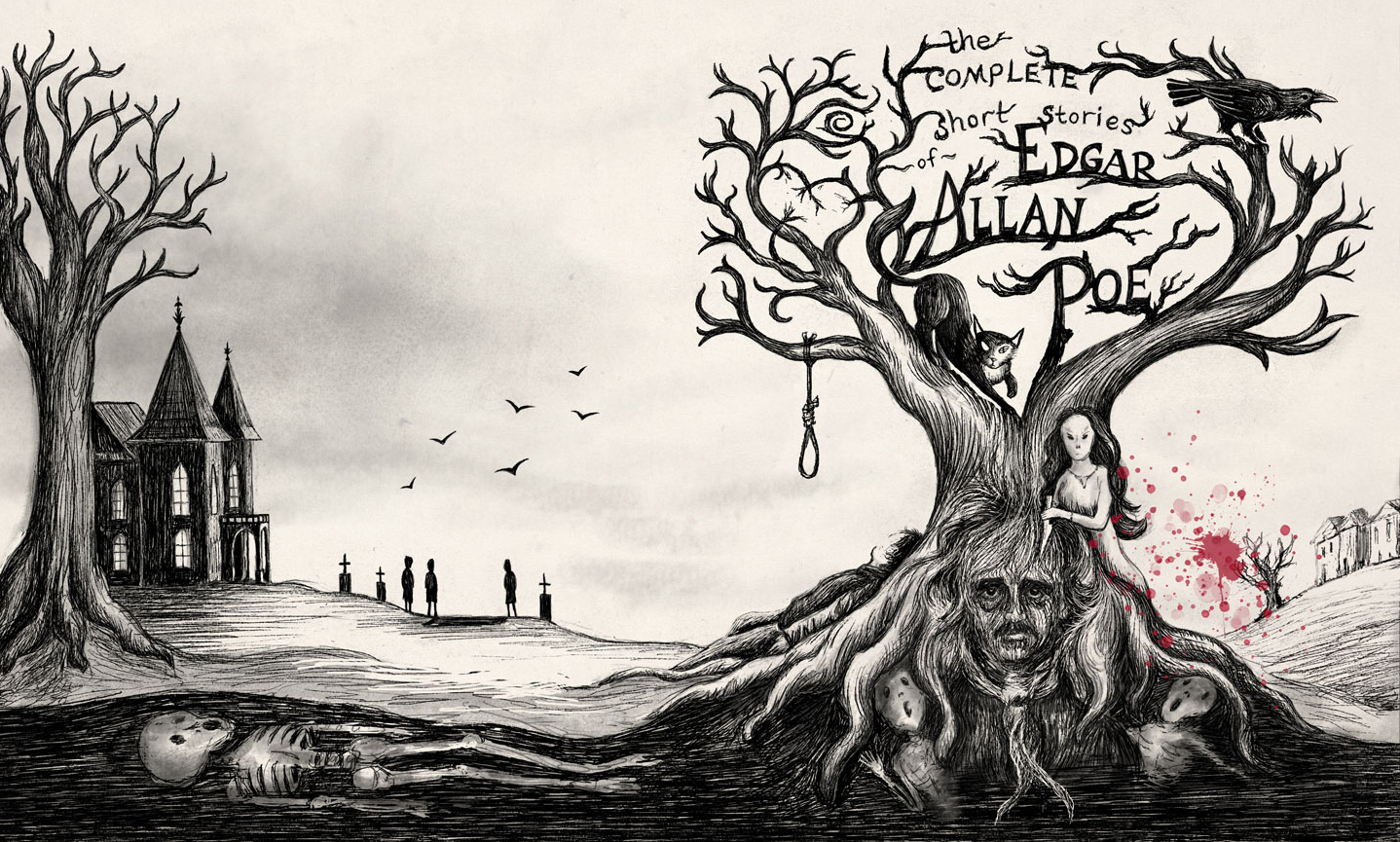
I updated my piece following @Lee-White's critique a few months back (thanks Lee for the advice!):
-
@Dulcie OH WOW - you just took my favorite piece and took it up another level. I really love the added details in the tree branches - the symbol of the heart and what looks sort of like a spiral eye. Then how you made Poe part of the actual bark of the tree is awesome. And the splash of blood red is really nice. The progression on this piece is just AWESOME!!!
-
@Rich-Green Glad you approve! Thank you for your very generous words and also for your enthusiasm - it is contagious and makes me want to do more!