Society of Visual Storytelling

    SVSLearn Forums

    • Register
    • Login
    • Search
    • Recent
    • Tags
    • Popular
    • Users
    • Groups
    • Search

    DnD drawing WIP feedback welcome!

    Artwork
    7
    30
    2062
    Loading More Posts
    • Oldest to Newest
    • Newest to Oldest
    • Most Votes
    Reply
    • Reply as topic
    Log in to reply
    This topic has been deleted. Only users with topic management privileges can see it.
    • rcartwright
      rcartwright @ArtofAleksey last edited by

      @swordofodin I feel like the axe head may be an issue when you add value as it will really add a lot of weight to the left side but overall I like the characters

      https://www.scbwi.org/members/richard-cartwright/
      https://www.instagram.com/richardwcartwright/
      https://www.pinterest.ca/richcartwright3/art-of-richard-cartwright/
      https://www.richardwcartwright.ca/

      ArtofAleksey 1 Reply Last reply Reply Quote 1
      • ArtofAleksey
        ArtofAleksey @rcartwright last edited by

        @rcartwright good point. I was trying to use the bottom curve of the axe as a frame for the little adventurer. Maybe if I play with the shape more. Thank you!

        instagram and twitter: @artofaleksey
        alekseyillustration.com

        1 Reply Last reply Reply Quote 0
        • ArtofAleksey
          ArtofAleksey last edited by

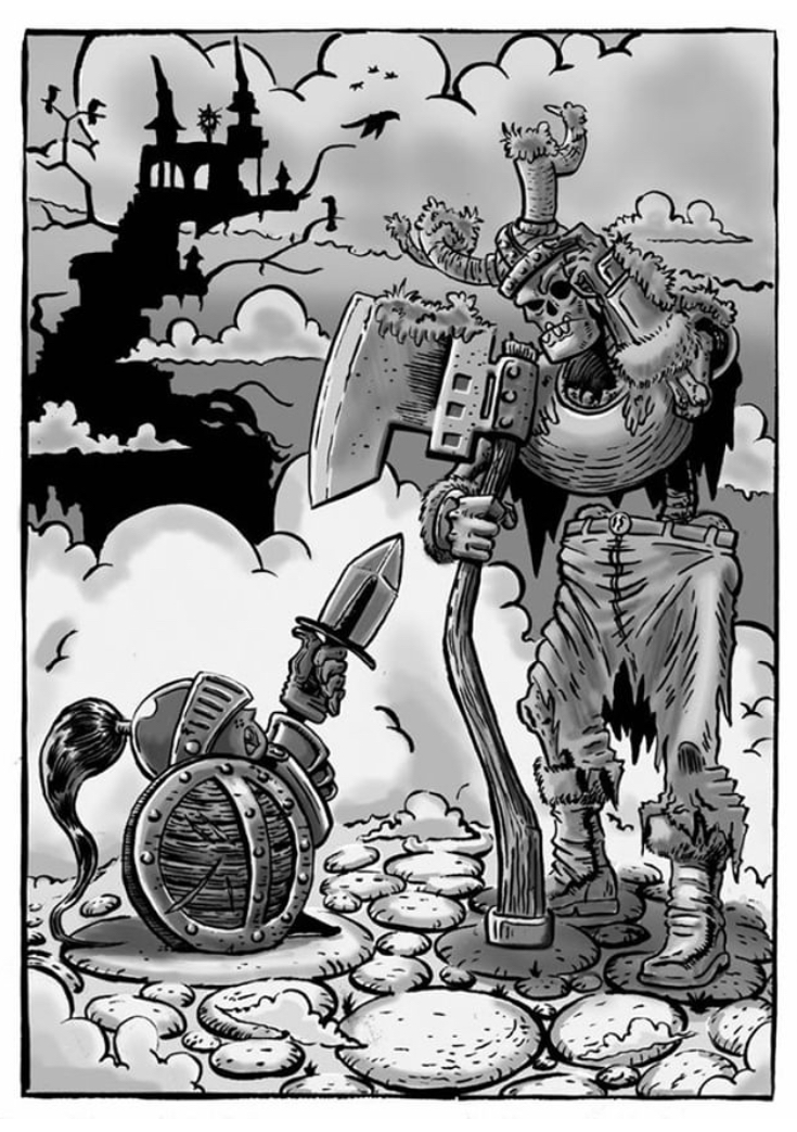
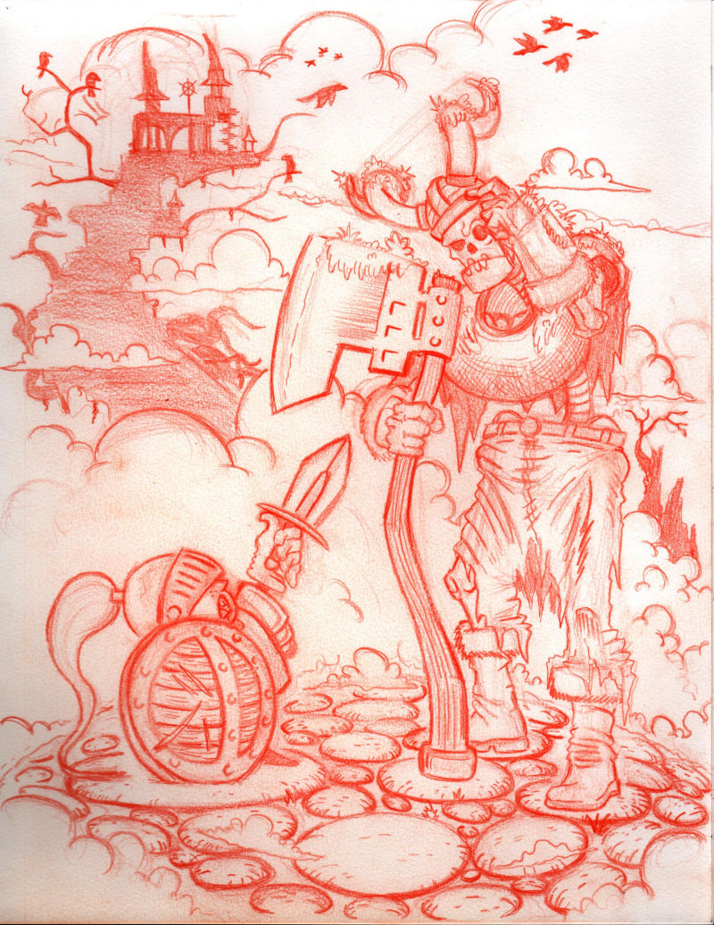
          @rcartwright @Art-of-B ok so I think these changes have helped. I made the axe smaller, and gave it some textures so it doesn’t draw the eyes as much. It feels like mr skelington draws the eye at first but since he’s looking at the little adventurer it goes there next. The clouds i used to create some mood and to help frame the kid better. Mage tower with birbs in the background rather than a giant treasure test. I really tried to knock out the tangents before figuring out tone and stuff. Please let me know your thoughts ❤
          0_1544484180282_F26506B3-B889-499D-B2FE-89EBC5A068C9.jpeg

          instagram and twitter: @artofaleksey
          alekseyillustration.com

          rcartwright 1 Reply Last reply Reply Quote 1
          • rcartwright
            rcartwright @ArtofAleksey last edited by

            @swordofodin This looks very much improved in my opinion

            https://www.scbwi.org/members/richard-cartwright/
            https://www.instagram.com/richardwcartwright/
            https://www.pinterest.ca/richcartwright3/art-of-richard-cartwright/
            https://www.richardwcartwright.ca/

            1 Reply Last reply Reply Quote 2
            • ThisKateCreates
              ThisKateCreates last edited by

              I think that reads better than the first. Maybe you want the contrast between the character and background higher than between the tower and other background elements though? Maybe use the darkest dark somewhere in the character and push the tower into the midtones? Or move the overall background to a lower value for more contrast with the character which is higher value?

              If you want the focus on the tiny character maybe even put the dark tower directly behind her so her outline stands out strongly.

              https://www.instagram.com/thiskatecreates

              ArtofAleksey 1 Reply Last reply Reply Quote 1
              • ArtofAleksey
                ArtofAleksey @ThisKateCreates last edited by

                @thiskatecreates hmm ok. So bigger contrast on the kiddo less on skelington. Does this read ok?

                0_1544503348515_126EE980-DCF8-404A-8A61-743284F15B1F.jpeg

                instagram and twitter: @artofaleksey
                alekseyillustration.com

                1 Reply Last reply Reply Quote 1
                • ThisKateCreates
                  ThisKateCreates last edited by

                  Definitely see the kiddo pops more now. I'm excited to see how it comes together after so much work on the composition. 🙂

                  https://www.instagram.com/thiskatecreates

                  ArtofAleksey 2 Replies Last reply Reply Quote 1
                  • ArtofAleksey
                    ArtofAleksey @ThisKateCreates last edited by

                    @thiskatecreates you and me both...

                    instagram and twitter: @artofaleksey
                    alekseyillustration.com

                    1 Reply Last reply Reply Quote 0
                    • ArtofAleksey
                      ArtofAleksey last edited by

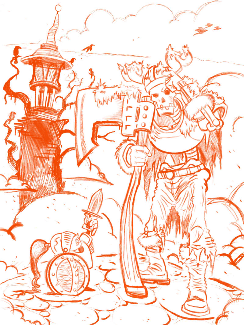
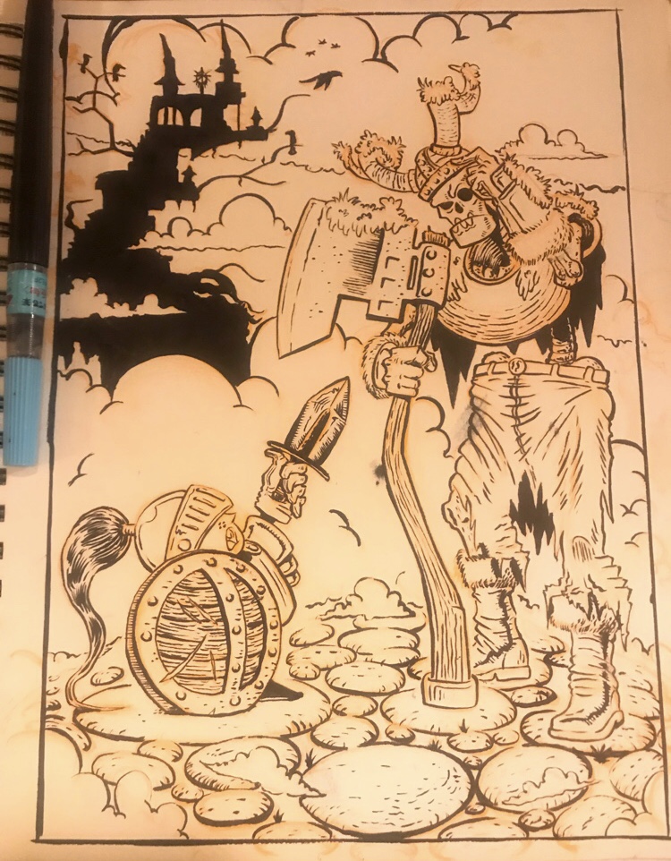
                      Ok so now that im happy with the digital version, started redrawing it on paper.. i missed you paper. This is mainly so i can ink it. Wish me luck.

                      0_1544589904767_65B8C504-AF08-415D-A926-F9467CDAC7F8.jpeg

                      instagram and twitter: @artofaleksey
                      alekseyillustration.com

                      1 Reply Last reply Reply Quote 2
                      • ArtofAleksey
                        ArtofAleksey @ThisKateCreates last edited by

                        @thiskatecreates @rcartwright @Art-of-B ok everyone.. i redrew it with pencil, scanned it in prep for inking. What do you guys think so far? 0_1544679719696_Kid adventurer pencil.jpg

                        instagram and twitter: @artofaleksey
                        alekseyillustration.com

                        rcartwright 1 Reply Last reply Reply Quote 2
                        • ThisKateCreates
                          ThisKateCreates last edited by

                          Definitely coming along. I'm wondering if the tower even needs to be there though. When I see the full drawing it is detailed enough to feel like a main element. It looks really cool but if the story is "tiny knight trying to take skeletal warrior at swordpoint" does it feed the story/idea and add to composition?

                          In the second post, before changing to the tower, you had greyed out/added atmospheric perspective to the background and that brought the focus to the characters. If you use color and/or line weight, depending on how you work, to push the tower back that will leave the focus on the characters and still keep the cool, creepy background.

                          Stapleton Kearns is a landscape painter who doesn't really post anymore, but he has a funny series on design problems. The competing elements he calls the "one for each eye" problem. https://stapletonkearns.blogspot.com/2011/05/encyclopedia-of-dumb-design-ideas-4.html

                          He's a bit harsh, but I find his "Encyclopedia of Dumb Design Ideas" really stuck with me and I see all of them trying to show up in my compositions sometimes....

                          The story you are telling and both the characters and background are really excellent . The facial expressions and body language have it. If you edit further I would only focus on drawing the eye to the action.

                          https://www.instagram.com/thiskatecreates

                          ArtofAleksey 1 Reply Last reply Reply Quote 1
                          • Jonas Zavacky
                            Jonas Zavacky last edited by

                            Hi @swordofodin I like the style and how its shaping. I like the comp - It makes nice cycling pattern - the little guy - skeleton head - the castle. But the birds that are flying of the page and the dead tree behind the skeleton guy is breaking the flow - my eye is trapped there. Imo I would erase these two elements.

                            Other than that I really like it and I am looking forward how you will conquer this further

                            1 Reply Last reply Reply Quote 1
                            • ArtofAleksey
                              ArtofAleksey @ThisKateCreates last edited by

                              @thiskatecreates @Jonas-Zavacky this is amazing feedback thank you guys so much. Gonna get right on that!

                              instagram and twitter: @artofaleksey
                              alekseyillustration.com

                              1 Reply Last reply Reply Quote 1
                              • rcartwright
                                rcartwright @ArtofAleksey last edited by

                                @swordofodin Very nice is there a reason you like to use traditional ink? Have tried finishing a piece digitally?

                                https://www.scbwi.org/members/richard-cartwright/
                                https://www.instagram.com/richardwcartwright/
                                https://www.pinterest.ca/richcartwright3/art-of-richard-cartwright/
                                https://www.richardwcartwright.ca/

                                ArtofAleksey 1 Reply Last reply Reply Quote 1
                                • ArtofAleksey
                                  ArtofAleksey @rcartwright last edited by

                                  @rcartwright Thanks! Yeah I have done several finished digital pieces using the procreate app on my ipad. There's some on my instagram. I just like the feeling of making something on paper with pencil and ink. It just makes me feel way more accomplished for some reason? That's just me though. For this one I will probably ink it on paper, scan it in and color it digitally.

                                  instagram and twitter: @artofaleksey
                                  alekseyillustration.com

                                  1 Reply Last reply Reply Quote 1
                                  • ArtofAleksey
                                    ArtofAleksey last edited by

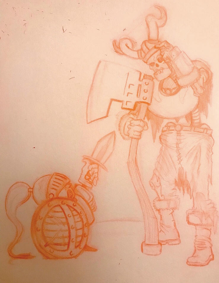
                                    Alright.. here is the inked version. Just gotta fix the blotched parts and smudges with some white and then i can do a scan. And then gonna attempt coloring. Any thoughts? 0_1544915709618_4751AA19-D22F-429F-812F-B9F7CE56215C.jpeg

                                    instagram and twitter: @artofaleksey
                                    alekseyillustration.com

                                    1 Reply Last reply Reply Quote 8
                                    • Kaelin Twede 0
                                      Kaelin Twede 0 last edited by

                                      Amazing layout and design! Good job!

                                      ArtofAleksey 1 Reply Last reply Reply Quote 1
                                      • braden H
                                        braden H last edited by

                                        Looks pretty good to me. I was expecting you to do the whole thing digitally, but traditional inks are pretty awesome, too 🙂

                                        I think this'll make some nice clean lines. Looking forward to seeing the colouring.

                                        1 Reply Last reply Reply Quote 1
                                        • ArtofAleksey
                                          ArtofAleksey @Kaelin Twede 0 last edited by

                                          @kaelin-twede-0 @Art-of-B thanks! I hope it looks good when i color it. I’m still pretty awful at it but we’ll see what happens

                                          instagram and twitter: @artofaleksey
                                          alekseyillustration.com

                                          1 Reply Last reply Reply Quote 0
                                          • ArtofAleksey
                                            ArtofAleksey last edited by

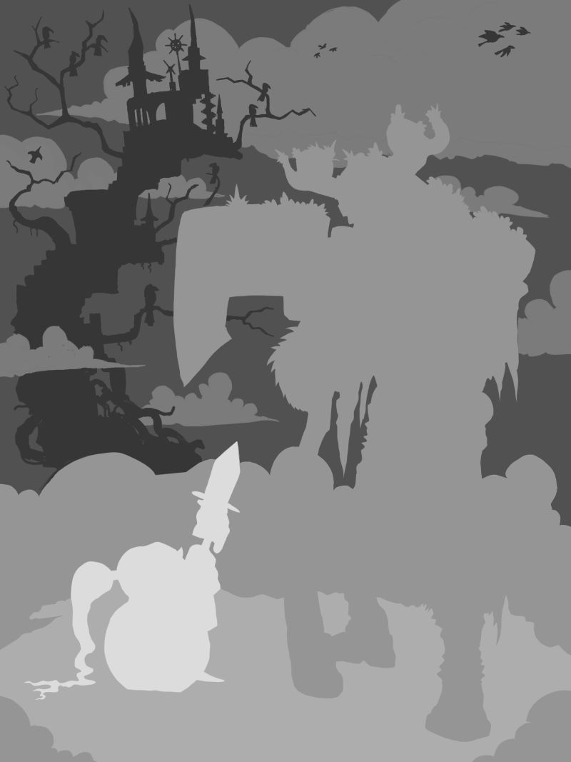
                                            Ok so before i start adding color, i did the values.
                                            Im going For a more diffused light appearance so I might take the drop shadows away. I think I’m gonna keep the highlights though. Ty @Art-of-B for your feedback earlier.

                                            0_1545149434038_34530DDB-C10E-4C41-BF92-95446A3656D9.jpeg

                                            instagram and twitter: @artofaleksey
                                            alekseyillustration.com

                                            1 Reply Last reply Reply Quote 5
                                            • First post
                                              Last post