Society of Visual Storytelling

    SVSLearn Forums

    • Register
    • Login
    • Search
    • Recent
    • Tags
    • Popular
    • Users
    • Groups
    • Search

    My first book cover thumbnails

    Artwork
    15
    22
    1426
    Loading More Posts
    • Oldest to Newest
    • Newest to Oldest
    • Most Votes
    Reply
    • Reply as topic
    Log in to reply
    This topic has been deleted. Only users with topic management privileges can see it.
    • NessIllustration
      NessIllustration Pro last edited by

      I'm doing research right now for the cover of my first book, the little panda book šŸ™‚ The story is about colors so I'm trying to show a lot of color in the cover, but I also want it to be very simple and striking. I made so many thumbnails, but these are the 7 that I like the most. This is my first book and I'm no expert on what makes a perfect book cover... I'd really like your opinion on which you like the most and why!
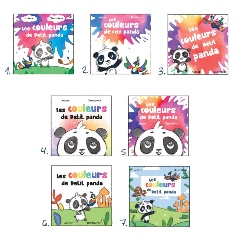
      0_1546288573488_CouvertureTests.jpg

      vanessastoilova.com
      instagram.com/vanessa.stoilova/

      Check out my Youtube channel for tips on how to start your career in illustration! www.youtube.com/c/ArtBusinesswithNess

      DOTTYP Sophie Lawson Laurel Aylesworth 3 Replies Last reply Reply Quote 7
      • ThisKateCreates
        ThisKateCreates last edited by

        Ohhh! I like 4! Colorful and fun but my eyes focus on the title.

        https://www.instagram.com/thiskatecreates

        1 Reply Last reply Reply Quote 2
        • K
          Kat SVS OG last edited by

          I'm no expert in book covers either. But I like 5 the most, although I'd probably adjust the text a little because the word "de" seems to get lost a bit in that little spot of color. I love the splash of paint, though!

          My second pick is #2 because it's bright and colorful, but also you can read the text easily.

          1 Reply Last reply Reply Quote 2
          • DOTTYP
            DOTTYP @NessIllustration last edited by

            @nessillustration I like 4 and 2. They are all lovely

            scribbles.artstation.com
            www.instagram.com/dottypaints

            1 Reply Last reply Reply Quote 1
            • TwiggyT
              TwiggyT last edited by

              3 and 5 draw my eyes the most. I think because the images and the text work together more in those.

              http://twiggyt.com
              Instagram: www.instagram.com/twiggyt_art/
              Twitter: @twiggyt_art

              1 Reply Last reply Reply Quote 2
              • NessIllustration
                NessIllustration Pro last edited by

                Thank you guys! This seems to go in the same direction I was thinking - my favourite was 4, my boyfriend's favourite was 2! So hard to choose...

                vanessastoilova.com
                instagram.com/vanessa.stoilova/

                Check out my Youtube channel for tips on how to start your career in illustration! www.youtube.com/c/ArtBusinesswithNess

                1 Reply Last reply Reply Quote 0
                • Judy Elizabeth Wilson
                  Judy Elizabeth Wilson SVS OG last edited by

                  I like 7. Looks pro. Also 4. Great work!

                  Website http://www.judyelizabethwilson.com/

                  Instagram https://www.instagram.com/judyelizabethart/

                  Sharing positivity through art.

                  1 Reply Last reply Reply Quote 1
                  • carriecopadraws
                    carriecopadraws SVS OG last edited by

                    I like the splatter of 5, but 4 is great too - the contrast of the rainbow color behind a B&W panda is very striking and eye-catching. Great shapes too.

                    Carrie Copa
                    https://carriecopadraws.com/

                    NessIllustration 1 Reply Last reply Reply Quote 2
                    • NessIllustration
                      NessIllustration Pro @carriecopadraws last edited by

                      @carriecopa Uhmm, you're right.. I might do 4 but with a splatter like 5 instead of the pastel colors...

                      vanessastoilova.com
                      instagram.com/vanessa.stoilova/

                      Check out my Youtube channel for tips on how to start your career in illustration! www.youtube.com/c/ArtBusinesswithNess

                      1 Reply Last reply Reply Quote 2
                      • Sophie Lawson
                        Sophie Lawson @NessIllustration last edited by

                        @nessillustration

                        My favourite is 3

                        I really like them all though, in fact I love them šŸ™‚ I love how the colours pop with the black and white of little Panda.

                        I picked 3 because it has a simpleness to it, yet feels fun. Feels like an explosion of colour is inside!

                        • SophieLawson.com •
                        YouTube @SOPHiELAWSON

                        1 Reply Last reply Reply Quote 1
                        • ArtofAleksey
                          ArtofAleksey last edited by ArtofAleksey

                          I’d really like to see the full panda and parrot in the shot because the panda is black and white and clearly the main character. But the spalsh in 1 and 2 look the best with that touch of tealish-blue on the sode it looks perfect. So 2 with a bigger splash i think.

                          instagram and twitter: @artofaleksey
                          alekseyillustration.com

                          1 Reply Last reply Reply Quote 1
                          • NessIllustration
                            NessIllustration Pro last edited by

                            Thank you so much everyone! All the answers are so varied! No one voted for 1 and 6 though, so I can at least eliminate those 2 hihi

                            vanessastoilova.com
                            instagram.com/vanessa.stoilova/

                            Check out my Youtube channel for tips on how to start your career in illustration! www.youtube.com/c/ArtBusinesswithNess

                            1 Reply Last reply Reply Quote 0
                            • Laurel Aylesworth
                              Laurel Aylesworth @NessIllustration last edited by

                              @nessillustration I like 2, 3, and 5 the best.

                              www.laurelaylesworth.com
                              instagram.com/laurelaylesworth

                              1 Reply Last reply Reply Quote 1
                              • Jeanne.M.Bowman
                                Jeanne.M.Bowman last edited by

                                I actually like the first 2 the best. I like #1 because of the lion tail- it makes you wonder what could be coming next and urges you to open the book. I also like the gentle slope of the hill and the way the animals all seem to be doing something, or going somewhere. I like #2 because it is simple, and joyful, and the close up of the two characters makes it seem more intimate. Number #3 is exciting with the splash, but I don't like the animals sort of pasted onto the front of the cover. It does not feel as well thought out as the others. 4 and 5 are certainly cute, but i would pick 5 over 4 because it has more energy. The soft pastel wash makes me think more of a bedtime kind of book, which is fine but colors can tend to wake us up, so it doesn't feel 100% appropriate to me. I like #6 because it gives atmosphere and energy, but the focus on color is lost a little bit. If you could add more colorful plants in there, I think it would wake it back up. It is a pretty solid composition and the horizon line makes it feel much more calm than the others. I think the sloping landscape in #7 is an improvement from #6, but I do not like the box around the letters, and I feel like you could add more color in the foliage in number 7 to make it really pop. I think these are all fantastic and really, they would all work. I think it comes down to what YOU want to make!

                                instagram.com/jeanneillustrates
                                jeannebowmanillustrates.com

                                NessIllustration 1 Reply Last reply Reply Quote 0
                                • NessIllustration
                                  NessIllustration Pro @Jeanne.M.Bowman last edited by

                                  @jeanebean Thank you SO much Jeane, that is incredibly helpful! I feel that whichever one ends up being the one, I'll refer back to your comment to improve on it more. Thank you ā¤

                                  vanessastoilova.com
                                  instagram.com/vanessa.stoilova/

                                  Check out my Youtube channel for tips on how to start your career in illustration! www.youtube.com/c/ArtBusinesswithNess

                                  Jeanne.M.Bowman 1 Reply Last reply Reply Quote 0
                                  • Jeanne.M.Bowman
                                    Jeanne.M.Bowman @NessIllustration last edited by

                                    @nessillustration Just make sure to show the final, if you can! I would love to see more of your work.

                                    instagram.com/jeanneillustrates
                                    jeannebowmanillustrates.com

                                    NessIllustration 1 Reply Last reply Reply Quote 1
                                    • NessIllustration
                                      NessIllustration Pro @Jeanne.M.Bowman last edited by

                                      @jeanebean Absolutely!! I can't wait to show you guys this book when it comes together, and it will be soon too since the launch date has been set closer. It was originally supposed to release in the fall but they think it will do better in the Spring so I'm working full throttle on this and it'll be ready in a few months!

                                      vanessastoilova.com
                                      instagram.com/vanessa.stoilova/

                                      Check out my Youtube channel for tips on how to start your career in illustration! www.youtube.com/c/ArtBusinesswithNess

                                      1 Reply Last reply Reply Quote 2
                                      • Miriam
                                        Miriam last edited by

                                        I like the variation of your different ideas.

                                        #2 is my favorite because the poses of the 2 characters are cute and so full of excitement. I like the color splash, and how it reflects the exuberance of the characters, while still leaving some white space to keep it from being too overwhelming. It would be nice to see more variation in the edges of the splatter as in #1

                                        It looks like it will be a fun book.

                                        1 Reply Last reply Reply Quote 1
                                        • Johanna Kim
                                          Johanna Kim SVS OG last edited by

                                          So interesting to see what others vote for. I like #4 best, then #5, then #2. #4 and #5 have the biggest eyes, and that's what my eyes tend to gravitate towards, but I tend to prefer the subdued colors of 4. I like the relationship between the two characters on #2.

                                          http://www.johannakim.com
                                          http://instagram.com/johannahkim/

                                          1 Reply Last reply Reply Quote 2
                                          • ScribblesByMike
                                            ScribblesByMike last edited by

                                            Love #5! i think it works for a childrens book cover better than #4 as its bolder.

                                            Strange things are afoot at the Circle K!

                                            Portfolio: www.scribblesbymike.com
                                            Instagram: www.instagram.com/mikehartigan
                                            Twitter: www.twitter.com/mikehartigan
                                            Facebook: www.facebook.com/cartoonsbymike
                                            Tumblr: www.tumblr.com/blog/mikehartigan

                                            1 Reply Last reply Reply Quote 2
                                            • First post
                                              Last post