Website Critique
-
Hi everyone,
I'm looking for critique on my web site. It's www.twiggyt.com
Specifically, does it look like a site for children's book illustration? Should I have more artwork? Less artwork? Is the gallery format confusing? Does my about me section sound stupid? (I always think it does.)
Please note that there's usually a logo in the top left corner, but for whatever reason it's not showing up. It's beyond my skills to fix, but my husband is trying to figure it out. Anyway, here's the logo:

So please imagine, if you will, that we have the logo working. Hopefully we'll get it sorted out soon.http://twiggyt.com
Instagram: www.instagram.com/twiggyt_art/
Twitter: @twiggyt_art -
I like the look and content. It's simple, but gets straight to the point. The artwork is very nice.
Your logo issue seems to be related to the layout. I can see it when the page is expanded wide, but not when it is in more of a portrait/vertical layout. It's actually pointing to two different images depending on the width of the page. That's not good design on the developers part.
Landscape (missing) points to: http://twiggyt.com/wp-content/uploads/2019/01/Twiggy_T_Logo_Jan2019.png
Portrait (working) points to: http://twiggyt.com/wp-content/uploads/2018/02/t_logo_gradient_letter.png
You may want to use a different WP template. They can be hard to troubleshoot if you're not experienced (and frustrating even if you are). You could get a similar look with many different templates.
-
@SketchyArtish Thanks for doing that! I'm going to forward that to my husband. If worse comes to worse I guess I'll find a new template.
-
Hi TwiggyT,
I'm going to jump in here if you don't mind because I have done a bit of this with my students at uni and hopefully I can help?
First of all, lovely illustration work.
Having the layout with tiles is good because it puts no barrier between the idly curious and your art.(They don't have to click anything to get what you do.) That being said I think you could possibly shorten the introduction and keep it to; what this is, who you are and a call to action -which you have there- but shorten it up a little just so, especially on mobile devices, they don't have to scroll as far to see more art. People are soooooo lazy when it comes to websites and its best not to make them work for anything.
The same goes for the about page, I think you could hit the beats of what you want to say and then add some kind of a "More about me" paragraph below for the curious. Its not too silly or anything but I'd say Business then Play, if that makes sense? That would be stuff like the explanation of your name and other details that make you feel like a real person
Which might be a job for Inigo?
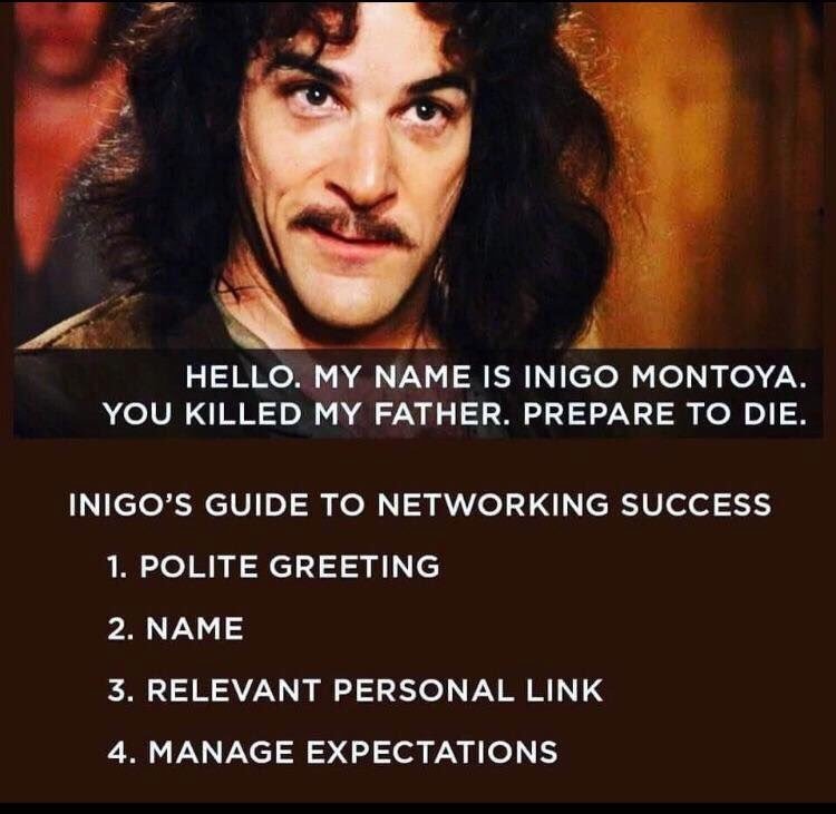 Sooooorrryyy couldn't help it....but its good stuff, haha.
I am also noticing the logo issue but it's only on the title page that doesn't seem to show the image. The rest seem to work fine.
Finally maybe a bit too much of a technical note but if you have the money to buy an SSL certificate for the hosting of your website that always makes it look just a skooch more professional. Its the difference between the browser reading: http, or; https (Small I know) but it stops some browsers and malware scanners from throwing up a big scary "THREAT DETECTED!" page when they can't verify the certificate and that might save you a job down the track cause you're not scaring people away one in one hundred times.
I like the little Mamet/Opossum thing on the contact page, that's cute :smiling_face_with_open_mouth_cold_sweat:
Hope that helps at all,
Peace!

-
@Kris Wow, thanks for this! I did that paragraph on the front page for SEO purposes -- I'll rework it as you suggested and put the rest below the (digital?) fold. Gotta appease the almighty Google, right?
I'll mention the SSL certificate to my husband. #outofmyleague
Also, nice meme.
Does 'manage expectations' mean to say something like, "This is what I do, this is my specialty"?
-
Haha, no worries. Google will no doubt reward you for your devotion.
Yes perhaps that more applicable to an actual meet than a passive introduction. I think in this case "Manage expectations" could be interpreted as something more like "What you (want to) do." For instance, you want to illustrate children's books rather than, say, graphic novels. Extreme example but the idea comes back to what the SVS guys talk about, making sure you are known as the person who does X so you don't end up doing technical manuals for ride on lawn mowers...:smiling_face_with_open_mouth_cold_sweat:
I think you're already fielding that one anyway so I wouldn't worry about it too much. I probably shouldn't have put the meme in
-
@TwiggyT it looks good on my phone! I think you have a good amount of art especially with great character expression
-
Hi Twiggy,
I think the site is cute and the about me page is really fun! I would add few pictures into the gallery, but that's not necessary I think.")