Background and Character Design for personal project
-
@NessIllustration I got some other characters, I'll attach them so you can tell me your thoughts
-
@Jose-A-Nieto I feel like the problem may be style and design more than anything else, actuallt
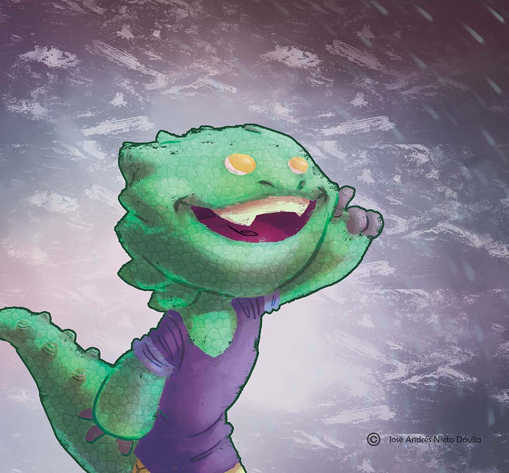
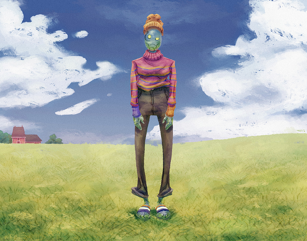
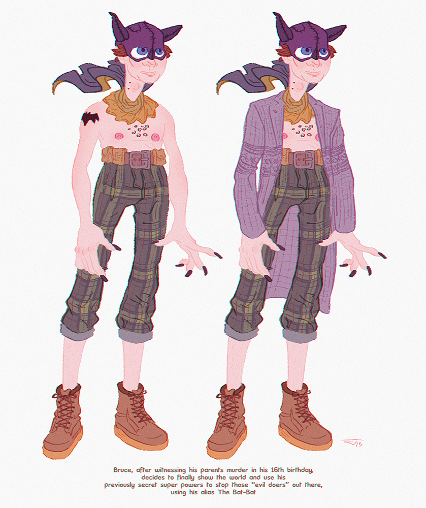
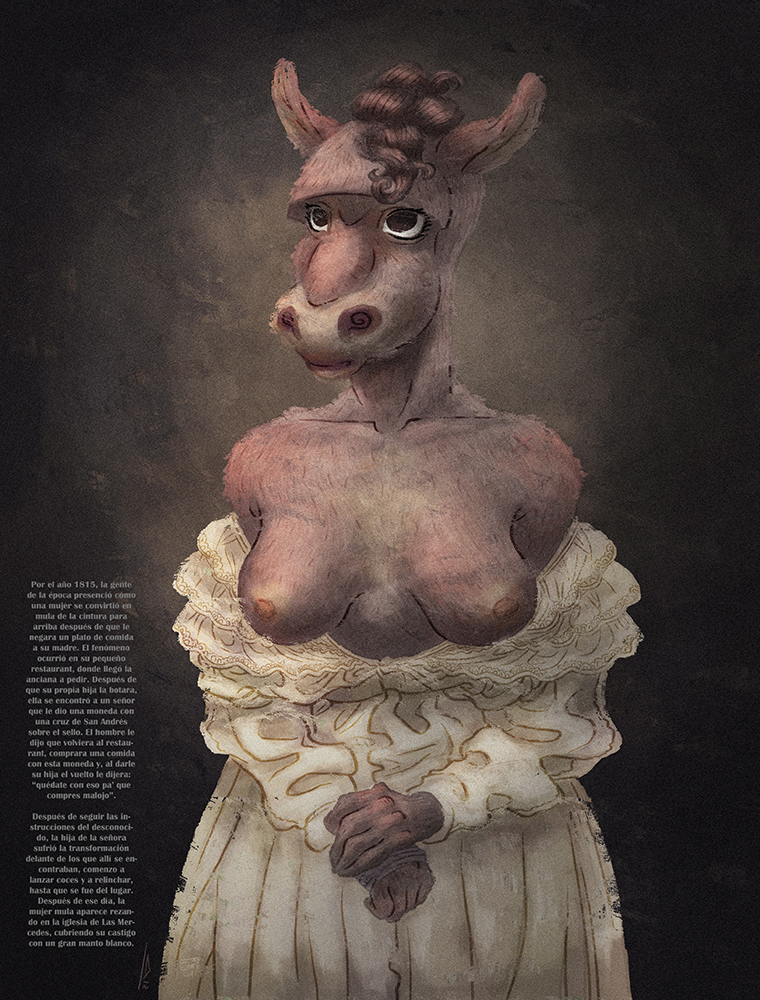
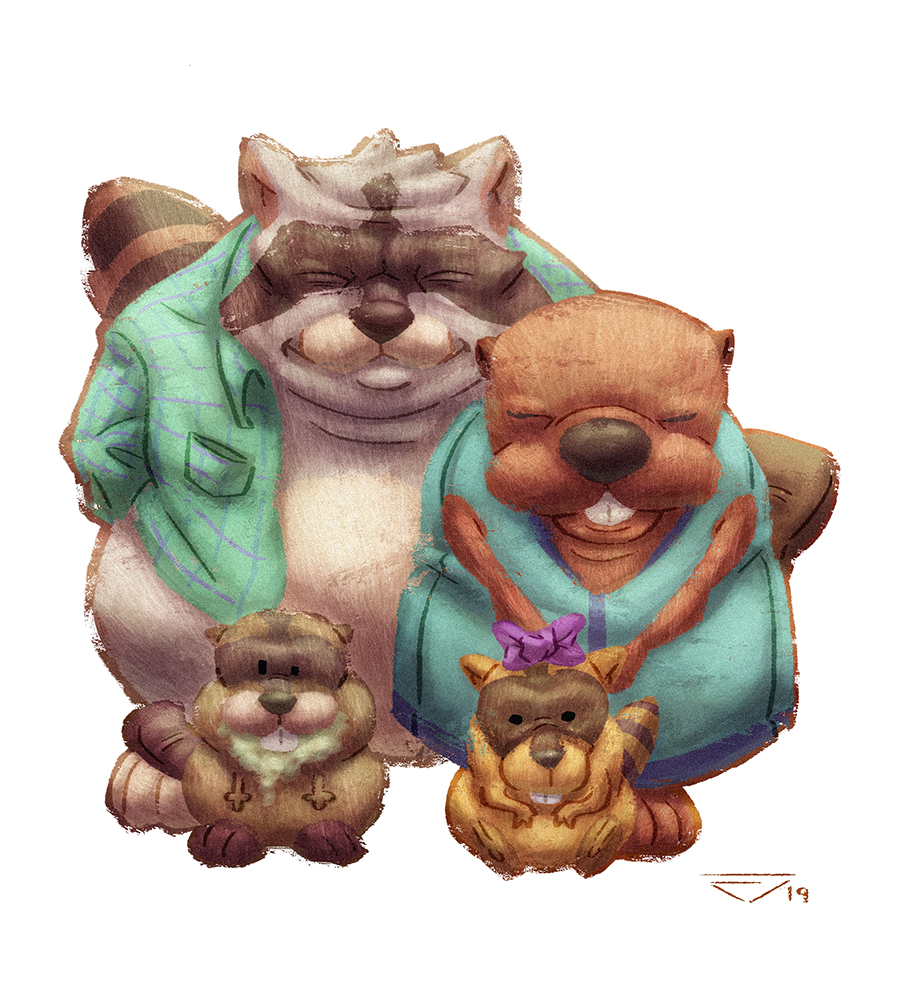
 It's kind of overworked texture-wise, in a way that looks great on background but is distracting and sometimes even goes a little bit into slightly creepy territory. The eyes are the biggest issue in that regard. But I really like the style you used for the Bruce character, his design and style are a mile above the rest! That style would still work with your background style without fear of the characters blending in the background! And for making a character that people can feel for, it's all about the eyes and good design. We humans always look to someone's eyes to connect. And design is about a balance of unity and variety in your shapes, lines and volumes. Nothing that would be fixed with a hat or glasses, you have to look at creating a strong base design. I feel like in some of your illustrations you may be overcompensating with a lot of textures to hide a poor underlying design, which doesn't help. Ironically, your least textured images (Bruce and the donkey woman) are by far the most successful characters of the bunch! I think you already know how to do it, you just have to learn to recognize what it is that works so you can reliably reproduce that process over and over again at will.
 -
@NessIllustration Thanks a lot for the observations. Really appreciate it! I will work on the eyes better, and sketch in general before getting on with the colors
Cheers!
-
@Jose-A-Nieto when the pupils are centered like that and there are no eyelids or eyebrows it comes off very spoopy especially if the eyes are red.
instagram and twitter: @artofaleksey
alekseyillustration.com -
@Aleksey Noted. Thank you!
-
Hiiii @Jose-A-Nieto!
First I want to thank you for sharing your art with this community! Getting critiqued is difficult and heart-wrenching so I applaud your bravery and your grace in accepting critiques on your artwork. Secondly, I am a super amateur artist with no art school background, so please take my opinion with a grain of salt. Also, I hope I'm using all the art terminology correctly below, haha.
I just finished Will Terry's Creative Composition Class 2.0 so I'm looking at your background work through that lens. Both of your backgrounds appear to be in 1-point perspective with the horizon in the center of the page. Maybe try moving the "camera angle" in more dynamic positions to give your backgrounds more interest? Like viewing the playground from the play structure on the right, or looking up from the sandbox, or even looking down from a branch in the tree.
I think paying attention to lighting would help as well. The first image in the playground has the sunlight coming straight down, but maybe have it come at an angle so you can really see some interesting shadow shapes (like the shadow from the tree leaves, nice!) and so that the structures could also have better-defined tones (light, medium, dark) on different sides (see jake parker's Tone section in "How to Draw Everything" class).
There are also a lot of warm colors in your backgrounds, which could compete for the viewer's attention if your main characters are also mainly composed of warm colors. I would try using mostly cool colors and using warm/highly saturated colors sparingly for what's really interesting or important.
Lastly, I think you could push the range of your values a lot more. Like making the dark things really dark. Your illustrations seem to be mostly light, so I think adding a bit more contrast will make it more interesting.
If I've said anything incorrect, please forgive me. These are just my own opinions. Also, critiquing your image helps me think of these same things when I create my own images, so thank you for helping me! I wish you all the best, Jose!
April
-
@ashinmakes P.S. I took a glance at your IG and I love your linework!

-
@ashinmakes Thanks a lot for all your observations April! You don't have to have a degree on art to be able to see how to improve an image, I myself dropped out of an art degree (A decision that still haunts me). Anyway, I certainly feel you on the composition points and consider it very important! Now, the reason behind this simple camera angles I have chosen is based of the nature of the project that is an imaginary cartoon, so the backgrounds are depicted as some kind of "base", or in a establishing shot fashion so the audience knows where all the action happens (the playground and the classroom) and how they look, and if you give the storyboards a look you'll see that basically this is what is needed on the most part. Regardless, you are right, I'll give the scene a more dynamic look the next time
Now, on the colors I tried to make the BG as flat as possible so the characters with their green, and blue clothes would pop up, it could be revisited tho, painting their fur with cool colors as well.
And finally on the images being too bright, I have to admit I didn't do it so the image wouldn't look so interesting with shadows everywhere, but then again, it could be interesting to try it.
Thank you for your comment, I look forward to hear more feedback in the future because for years everyone has told me "oh that looks so nice" and that's that.
Again, thanks
Cheers
-
Hi Jose-
I think your 2nd background is stronger because it’s got more defined diagonal lines and open areas for potential story text. The first background image shows you can draw a nice playground setting, but there is something off with the depth perception, but I can’t pinpoint what, maybe it’s the placement of your light source. There are shadows on the right side of the sandbox that the same intensity as the shandows under the trees.
With the character drawing you have an interesting mix of triangles and circles making up both characters, with more triangles and pointy bits on the adult character. Characters made up of circles read as more friendly, while ones with lots of triangles are seen as more villainous. I think the teacher should have less pointy bits unless you plan to make him the bad guy.
")
-
Thanks a lot @RobinCampbellArt . I will work on more interesting lighting and composition the next time
Cheers!
PS: Sorry for replying so late, the site didn't notify me of your comment