new illustration
-
@saciia_ yes thank you it makes perfect sense!
") I worked a bit more on the first one, but yeah it's static (i wanted that in a way tho) and not really working... so I will go with the third one and see where it will lead. Thanks for the points!!
I worked a bit more on the first one, but yeah it's static (i wanted that in a way tho) and not really working... so I will go with the third one and see where it will lead. Thanks for the points!!@RobinCampbellArt Thank you for the input! Why is that you think it will read better? (i am really curious - not trying to dis your opinion!! :D)
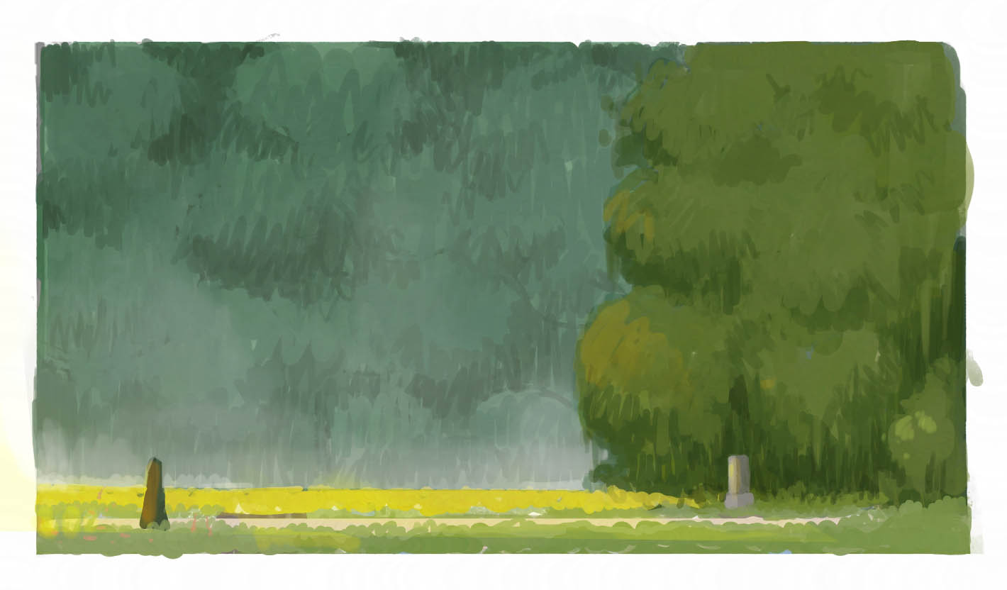
Btw there is aversion for what kind of colors i am roughly going

but I am NOT going with this comp further.
-
My eyes were also drawn to the third option. I think the view is very dynamic from that angle and the shapes of the forest are more interesting to the eye. The color scheme is really nice - I might go with even a slightly higher saturation on the background forest green color to make the contrast a bit higher between the foreground forest and background forest.
-
@djly thanks!! yeah the contrast is weird on that one! thank you for pointing out!
-
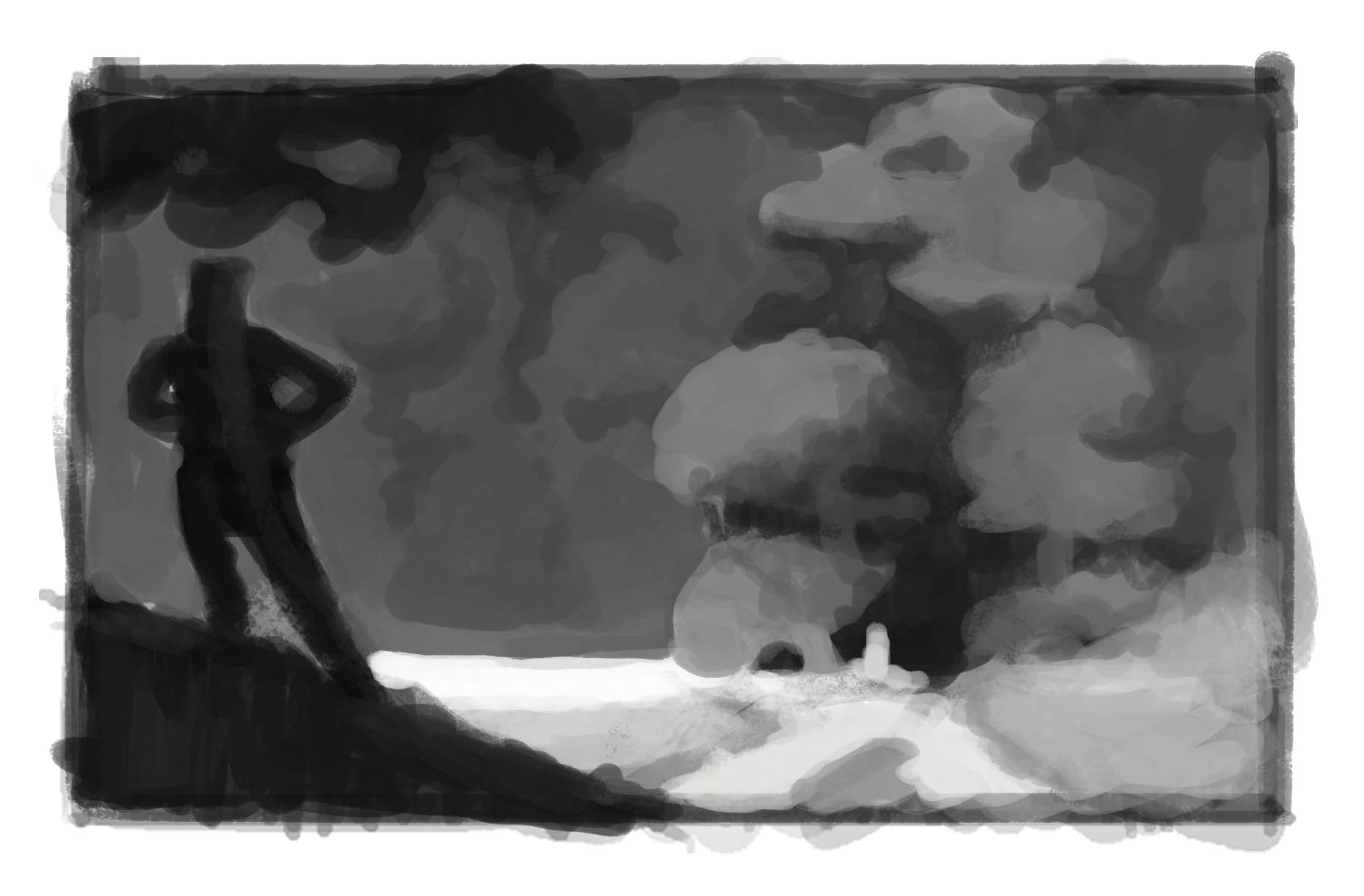
@Jonas-Zavacky - Regarding the darks and the idea of that leading a view’s eye around an image, it’s one of many things, line and color also can be used to direct the eye. There are other things too: tone and pattern can factor into it too.
In your third image I’m picking up a directionality formed by all the mid and light-toned elements converging on the centerline at the left side..it’s creating an arrow pointing left. On the left are dark elements in the sky creating a squiggly diagonal towards a centerline. Then on the bottom left is a strong diagonal squat triangle that’s also dark, going up towards the centerline. Perhaps what I’m saying only matters if this image is part of a story, because stories visually should read left to right. Do you see what I mean? -
@RobinCampbellArt Oh, I see!! Thank you for taking your time and explaining it to me!
-
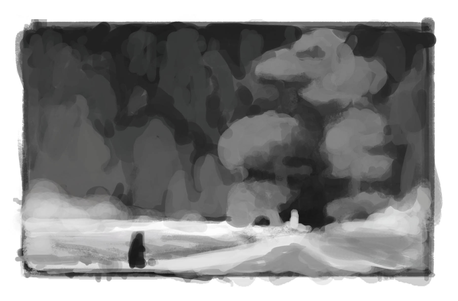
So here's an update. Value and shape sketch. Was trying to make interesting shapes that are helping to lead the eye where I want.
-
I have to admit I also like your coloured version a lot! Anyhow the mood is majestic and the last picture you postet seems very adventurous. So I think both are really good! Probably just depends on your story and character :face_savouring_delicious_food:
Instagram: saciia_
-
@saciia_ thanks a lot!! Haha majestic is the word I was trying to use while describing the mood i was going for, but my dictionary @!?^*
Yes the character pose is very much in the proces.. think it is key to get it right since it will change the storytelling depending which pose i will use
-
@Jonas-Zavacky -Seeing your value study is perfect timing for me... I will be doing color studies fo a few images this week for a workshop assignment. It will be my first time doing them, but I can see by how you’ve layed down values it will be helpful for picking the right tones in the high interest areas. Very nice:-)
-
@RobinCampbellArt glad you like it and that it was helpfull to you!! Good luck woth the studies!
-
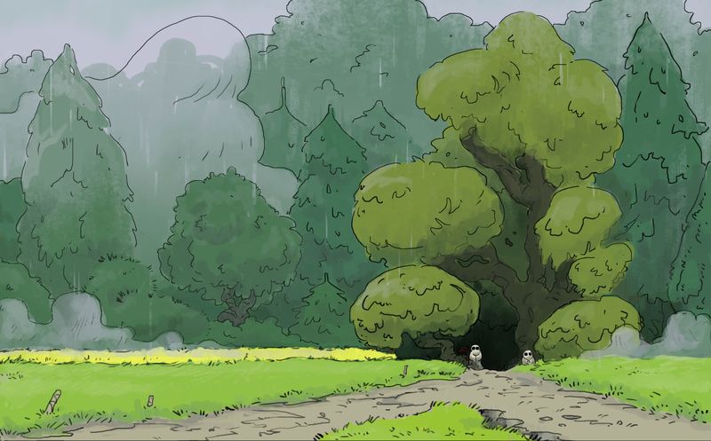
Worked on the comp a bit more... Made the character smaller to sell the idea that he is tiny person heading somewhere unknown. also made the background forest more interesting, but in such a way that it is helping to sell the focal area (at least I am trying to :smiling_face_with_open_mouth_closed_eyes: )
-
@Jonas-Zavacky I really like this color study. The cooler greens push into the background while the warmer greens pop.
-
@Jonas-Zavacky I'm really digging this layout. My eye goes to the white shape against the black opening and the black figure is a close second read. I love how you handled the clumps of foliage in your color rough- the patterning of your lines made it feel detailed while keeping it loose. I can't wait to see how this develops!
SVS Instructor
https://www.annadaviscourt.com/ -
@AnnaDaviscourt Nice to hear you like it! Thanks! I was originally planning to paint it whole, but I wanna use linework now, bcs I enjoy it far more. So I am curious how it develops too :Dw
-
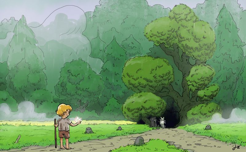
Some update on the illustration. Made linework and colors with basic rendering which I probably change, bcs it is kinda messy :smiling_face_with_open_mouth_cold_sweat: and wanna move to character soon.
But anything that bugs you on this? Thaanks
-
Hey there
managed to work on it more and this is what I have so far. :).
I consider it almost finish, but what are your thoughts? and Thanks so much for every feedback I got so far!!! ^^
-
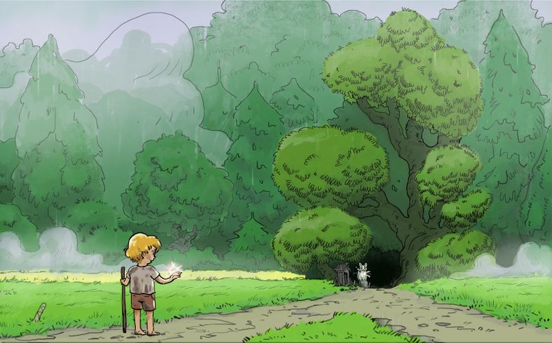
alright, so this is the final picture I guess
It took me more time then I expected, but I had real fun doing it (at least when I switched to linework )Thanks for every feedback you gave me

-
@Jonas-Zavacky I like these original colours - they are very moody.
Instagram: www.instagram.com/heatherboyd.illustration/
Website: https://heatherboydillustration.ca
Shop: https://www.inprnt.com/search/products?q=HeatherBoydIllustration
Ko-Fi: https://ko-fi.com/heatherboydillustrationBe blessed,
-
@Heather-Boyd Thanks, Heather! Do you mean the ones on the version without the boy? I like them too but for some reason, I found them dirty
-
@Jonas-Zavacky Yes the one without the boy -I understand your point though. I tend to enjoy darker tones -this one felt more like a dewy rainy day and I love your mist/fog.