new illustration
-
Hey there
") just finished portfolio for school so I am starting a new illustration.
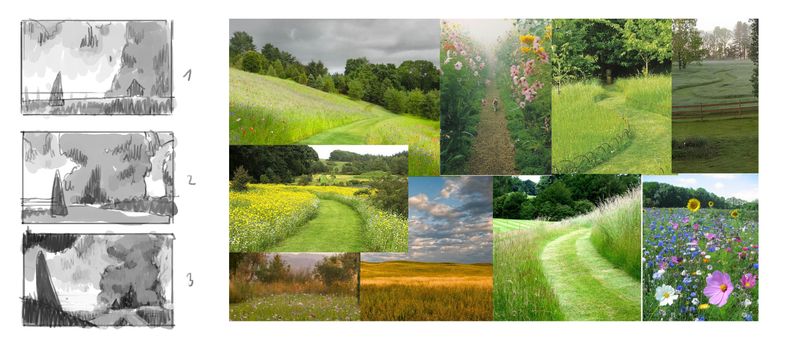
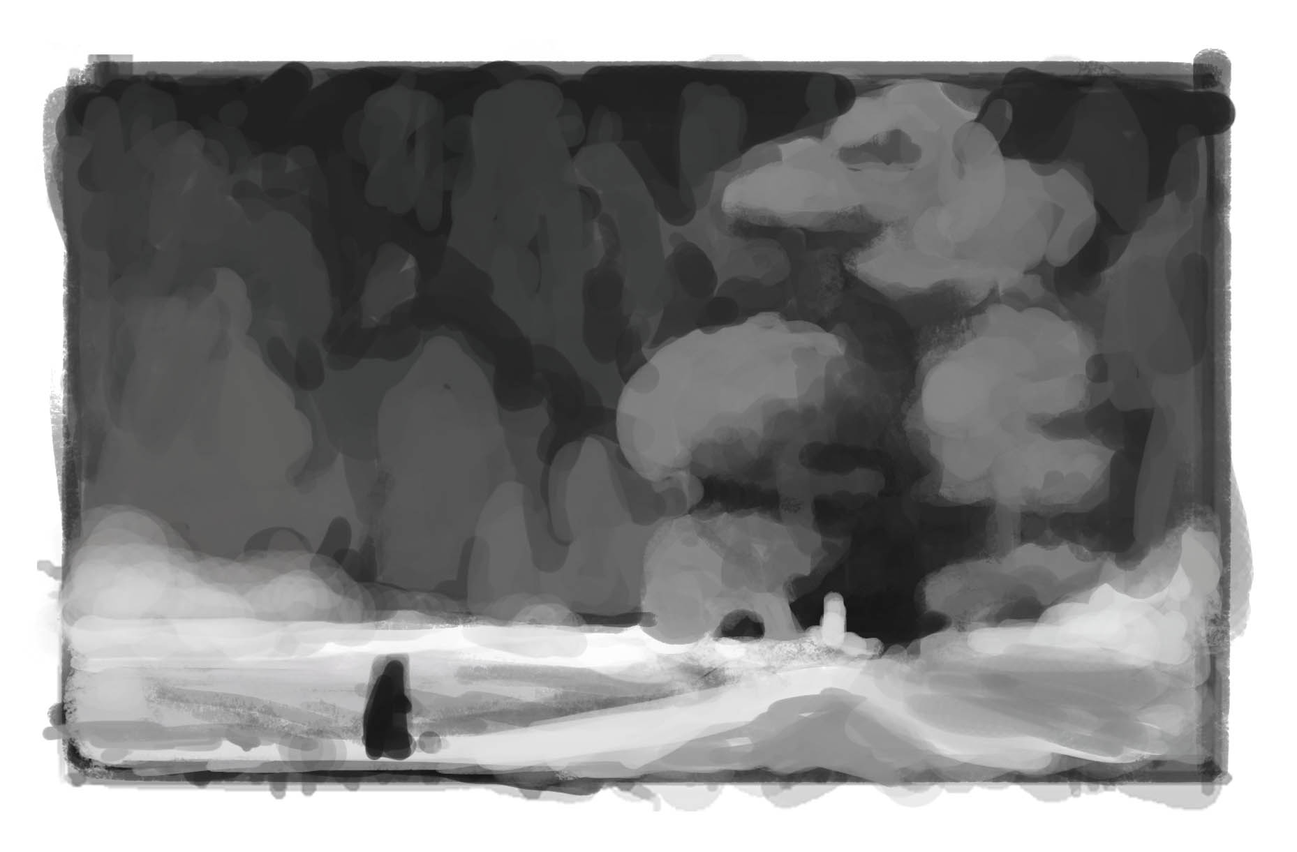
just finished portfolio for school so I am starting a new illustration.Here are some thumbnails I drew so far. It is illustration moment where this guy was on road for some time and is about to head in into the enchanted, mysterious forest.
I am going for a mysterious vibe, but not an obvious one. It is summer time so the character is surrounded by colorful flowers and yellow field - which all that is surrounded by a mysterious forest of darker color. (maybe something like the quiet moment before storm)
Which of these is the closest to what I described? The first one is what I initially envisioned, but I don't want to definitely stick to it.
and as you can see I add a vision board next to the thumbs .
Thanks for every feedback
-
Hi
I try to describe what came to my mind at first sight. The most catchy for me is number 3 ...my eyes are immediately drawn to it. It shows really nice contrast and also it gets darker there in the distance, it makes me aware there is something, it creates this slight nervous feeling in me - there comes a change in the environment. I know number 1 is your favourite but it seems like the most static, I also concentrate more on the landscape in the front instead of my eyes beeing led into the woods (which happens nicely in 3) and I also miss some contrast. Number 2 reminds me of a nice landscape photograph ...everything harmonious, anyhow soothing - but that’s not the feeling you want to evoke I guess. So all in all I feel like the higher the number the stronger the thumb. Number 1 looks definitely more friendly, maybe that´s also your intention, but I would try to add some darker values as well or maybe a slightly more leading path into the woods, because it just kind of leads out of the picture now. Okay, I hope that all made sense -
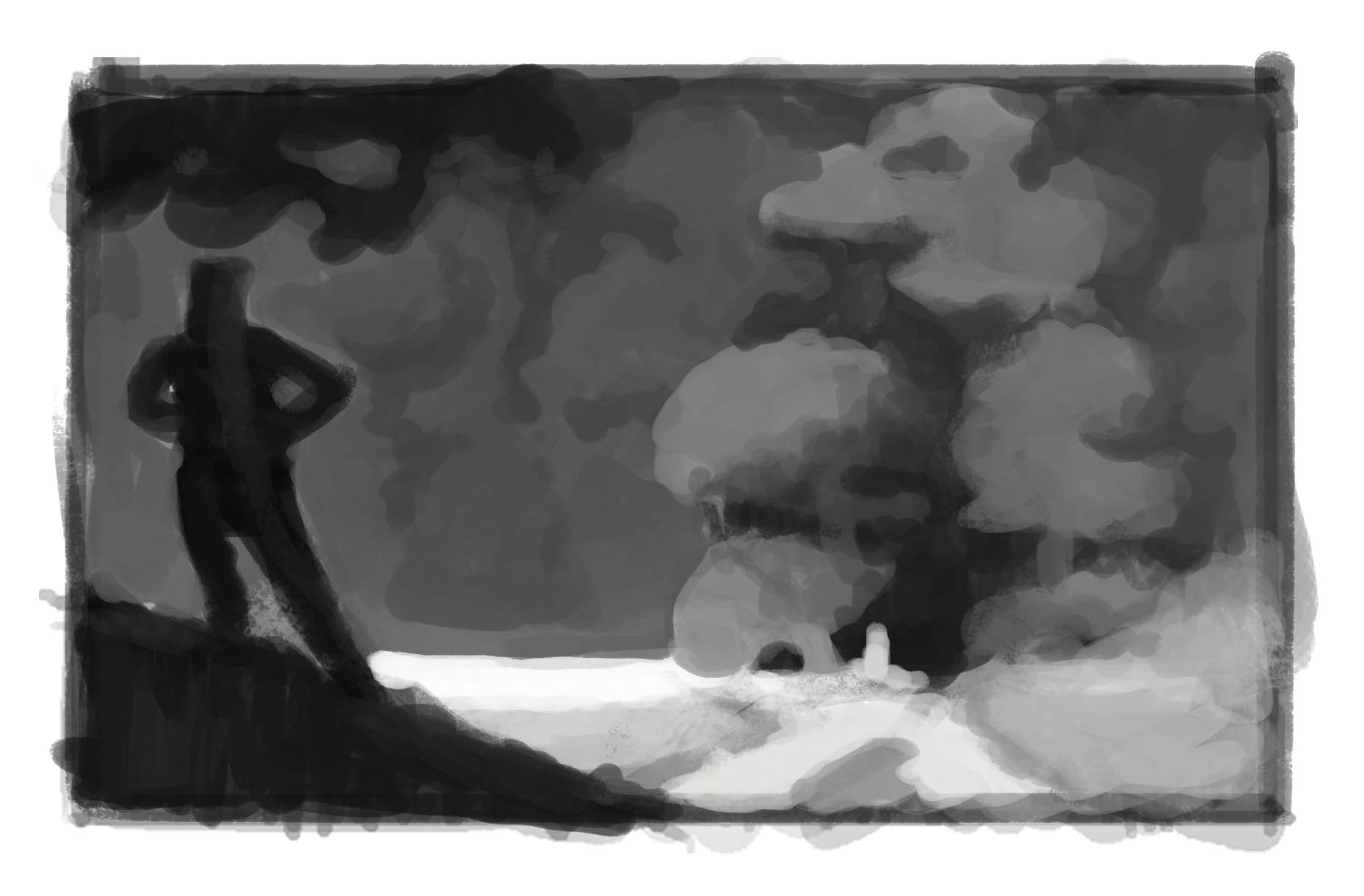
@Jonas-Zavacky -The third one is the strongest. If it were me, I’d flip it so the dark elements are on the right to get the image to read better from left to right.
-
@saciia_ yes thank you it makes perfect sense!
I worked a bit more on the first one, but yeah it's static (i wanted that in a way tho) and not really working... so I will go with the third one and see where it will lead. Thanks for the points!!@RobinCampbellArt Thank you for the input! Why is that you think it will read better? (i am really curious - not trying to dis your opinion!! :D)
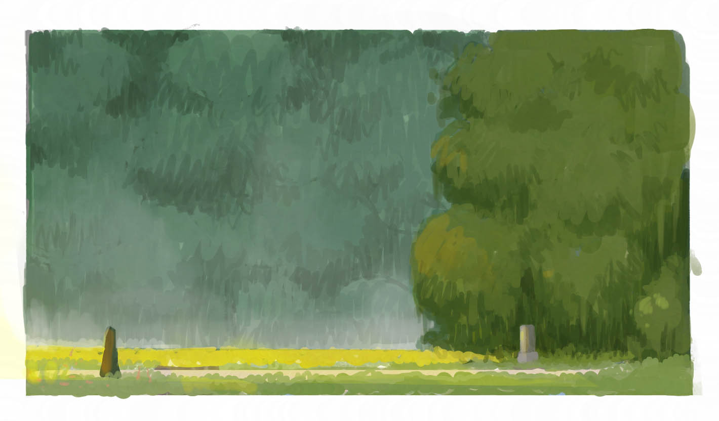
Btw there is aversion for what kind of colors i am roughly going

but I am NOT going with this comp further.
-
My eyes were also drawn to the third option. I think the view is very dynamic from that angle and the shapes of the forest are more interesting to the eye. The color scheme is really nice - I might go with even a slightly higher saturation on the background forest green color to make the contrast a bit higher between the foreground forest and background forest.
-
@djly thanks!! yeah the contrast is weird on that one! thank you for pointing out!
-
@Jonas-Zavacky - Regarding the darks and the idea of that leading a view’s eye around an image, it’s one of many things, line and color also can be used to direct the eye. There are other things too: tone and pattern can factor into it too.
In your third image I’m picking up a directionality formed by all the mid and light-toned elements converging on the centerline at the left side..it’s creating an arrow pointing left. On the left are dark elements in the sky creating a squiggly diagonal towards a centerline. Then on the bottom left is a strong diagonal squat triangle that’s also dark, going up towards the centerline. Perhaps what I’m saying only matters if this image is part of a story, because stories visually should read left to right. Do you see what I mean? -
@RobinCampbellArt Oh, I see!! Thank you for taking your time and explaining it to me!
-
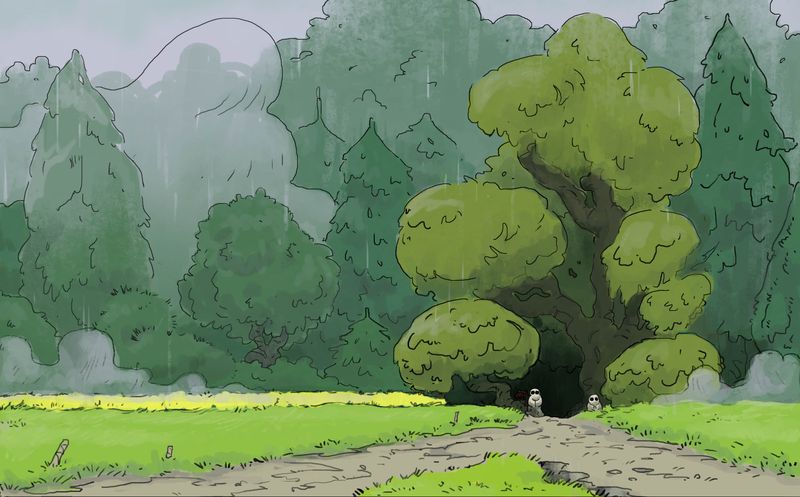
So here's an update. Value and shape sketch. Was trying to make interesting shapes that are helping to lead the eye where I want.
-
I have to admit I also like your coloured version a lot! Anyhow the mood is majestic and the last picture you postet seems very adventurous. So I think both are really good! Probably just depends on your story and character :face_savouring_delicious_food:
Instagram: saciia_
-
@saciia_ thanks a lot!! Haha majestic is the word I was trying to use while describing the mood i was going for, but my dictionary @!?^*
Yes the character pose is very much in the proces.. think it is key to get it right since it will change the storytelling depending which pose i will use
-
@Jonas-Zavacky -Seeing your value study is perfect timing for me... I will be doing color studies fo a few images this week for a workshop assignment. It will be my first time doing them, but I can see by how you’ve layed down values it will be helpful for picking the right tones in the high interest areas. Very nice:-)
-
@RobinCampbellArt glad you like it and that it was helpfull to you!! Good luck woth the studies!
-
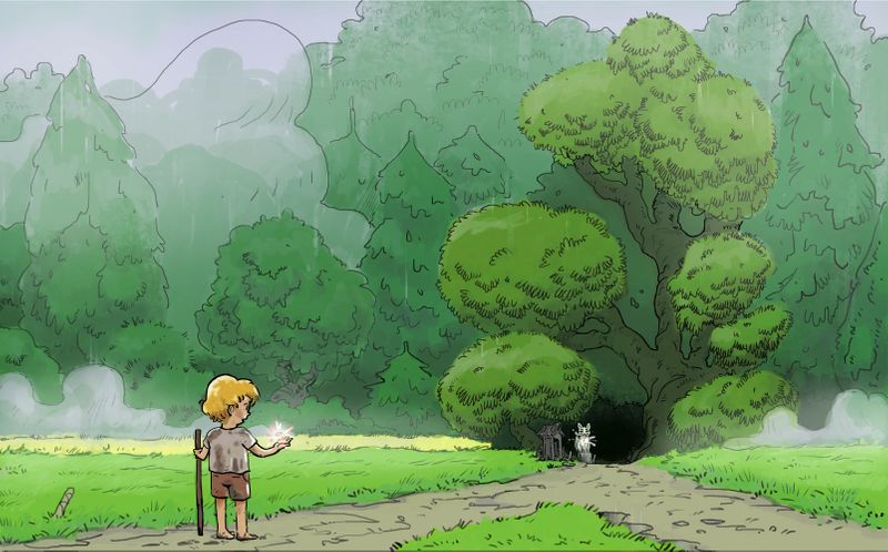
Worked on the comp a bit more... Made the character smaller to sell the idea that he is tiny person heading somewhere unknown. also made the background forest more interesting, but in such a way that it is helping to sell the focal area (at least I am trying to :smiling_face_with_open_mouth_closed_eyes: )
-
@Jonas-Zavacky I really like this color study. The cooler greens push into the background while the warmer greens pop.
-
@Jonas-Zavacky I'm really digging this layout. My eye goes to the white shape against the black opening and the black figure is a close second read. I love how you handled the clumps of foliage in your color rough- the patterning of your lines made it feel detailed while keeping it loose. I can't wait to see how this develops!
SVS Instructor
https://www.annadaviscourt.com/ -
@AnnaDaviscourt Nice to hear you like it! Thanks! I was originally planning to paint it whole, but I wanna use linework now, bcs I enjoy it far more. So I am curious how it develops too :Dw
-
Some update on the illustration. Made linework and colors with basic rendering which I probably change, bcs it is kinda messy :smiling_face_with_open_mouth_cold_sweat: and wanna move to character soon.
But anything that bugs you on this? Thaanks
-
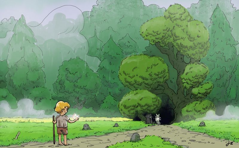
Hey there
managed to work on it more and this is what I have so far. :).
I consider it almost finish, but what are your thoughts? and Thanks so much for every feedback I got so far!!! ^^
-
alright, so this is the final picture I guess
It took me more time then I expected, but I had real fun doing it (at least when I switched to linework )Thanks for every feedback you gave me