Society of Visual Storytelling

    SVSLearn Forums

    • Register
    • Login
    • Search
    • Recent
    • Tags
    • Popular
    • Users
    • Groups
    • Search

    WIM Book Cover "The Wind in the Willows"

    Artwork
    13
    44
    3268
    Loading More Posts
    • Oldest to Newest
    • Newest to Oldest
    • Most Votes
    Reply
    • Reply as topic
    Log in to reply
    This topic has been deleted. Only users with topic management privileges can see it.
    • Elizabeth Rose
      Elizabeth Rose last edited by

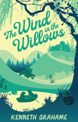
      Otters are finally made! Yey! Also added some trees too. What do you all think about the gradient blue in the pine tress and the big willow tree? If I go with the gradient, I will be adding more gradients so that they don't seem odd and left out.

      Screen Shot 2019-03-14 at 7.30.08 AM.png

      1 Reply Last reply Reply Quote 1
      • andersoncarman
        andersoncarman last edited by

        @Squirrelsize Yo! this is coming along great. Here are my thoughts:

        I like the color palette it's cool and very relaxing which is really nice. I love the willow framing everything and how it feels like the willow is holding all the characters under its boughs.

        I feel that you need to play with your Unity a little more. You have all the characters, car, and manor in high detail. But the environment is too flat in comparison, it does not feel cohesive as a whole.

        The figures and tree especially look like you dragged a jpeg into illustrator and just applied a trace filter, and so you ended up with the very blotchy rendering on the tree. I actually really like this rendering, but since the whole piece doesn't follow that element it looks pasted together. Especially the otter in the lower left right now, it looks like a sticker added to the composition after the fact.

        I would actually suggest cutting out some of the figures. I know you have spent a lot of time on them and it would suck to throw out work, But, I would simplify it down to just mole and rat in the boat and keep the manor on the hill, but cut out the car, badger, and otters. I know you wanted to show all the main characters in the cover, it's getting overcrowded and the other elements don't mesh as well. Simplifying it to mole and rat in the boat would really help this design.

        I love the lettering, and the angle that it is at!

        Keep up the great work! this is gonna rock and I can't wait to see you continue along.

        Cheers,
        Anderson Carman

        https://www.andersoncarman.com/
        https://www.instagram.com/andersoncarman/

        Elizabeth Rose 1 Reply Last reply Reply Quote 1
        • Elizabeth Rose
          Elizabeth Rose @andersoncarman last edited by

          @andersoncarman Haha! You know, I totally agree with it looking over crowded. I have been thinking about the idea of taking things out. I think that would be a good direction to go for. I also agree about it not looking cohesive. I think taking out some of the characters and elements will help. I'll mess around with that and see how it looks. Thanks for the input man! Someone with fresh eyes can really make nagging thoughts real. lol

          What are your thoughts on the gradients?

          1 Reply Last reply Reply Quote 0
          • Elizabeth Rose
            Elizabeth Rose last edited by Elizabeth Rose

            Yep! I like it Better
            I think I need to do something about that texture on the tree now. I reckon either add more texture to the rest of the scape or take it out all together.
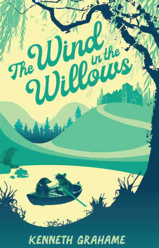
            Screen Shot 2019-03-14 at 11.06.37 AM.png

            1 Reply Last reply Reply Quote 1
            • Elizabeth Rose
              Elizabeth Rose last edited by

              Textures Galore!
              I added a wee bit of orange in the sunrise. Should I leave it? Yea or nay?

              I'm still working on the gradients and I need to tweak the mansion and surrounding trees.
              Anything else that pops out to you all that I should change or move around?

              Screen Shot 2019-03-15 at 7.33.56 AM.png

              Jonas Zavacky Pamela Fraley 2 Replies Last reply Reply Quote 7
              • Jonas Zavacky
                Jonas Zavacky @Elizabeth Rose last edited by

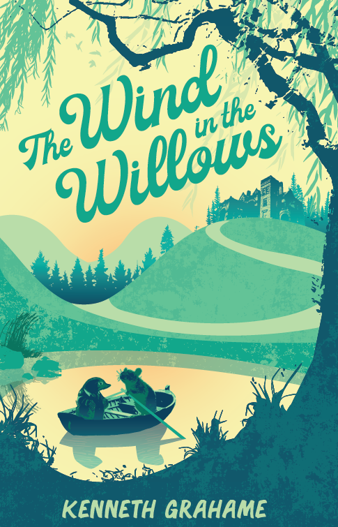
                @Squirrelsize hey that looks really good already ! excited to see the final - and I am for the orange light πŸ™‚

                1 Reply Last reply Reply Quote 1
                • MichaelaH
                  MichaelaH last edited by

                  I like the texture and the color change, makes it warmer.

                  https://www.instagram.com/michaelaheimlich/
                  https://www.heimlich-illustration.de/

                  1 Reply Last reply Reply Quote 2
                  • avfarrar
                    avfarrar last edited by avfarrar

                    I also can't wait to see the final! Always really impressed with your art style @Squirrelsize . Great job!

                    There is beauty in life!

                    WWW.AVFILLUSTRATION.COM
                    www.instagram.com/avfillustration/

                    1 Reply Last reply Reply Quote 1
                    • Pamela Fraley
                      Pamela Fraley SVS OG @Elizabeth Rose last edited by

                      @Squirrelsize I love this! I love the texture and the trees and I like the orange you added too. It makes the characters pop I think since it’s refleced in the water as well.

                      instagram.com/fraleycreates

                      1 Reply Last reply Reply Quote 1
                      • demotlj
                        demotlj SVS OG last edited by

                        I'm late to the party but I vote for orange too. Really nice cover.

                        Laurie DeMott
                        instagram.com/demotlj

                        1 Reply Last reply Reply Quote 1
                        • Elizabeth Rose
                          Elizabeth Rose last edited by

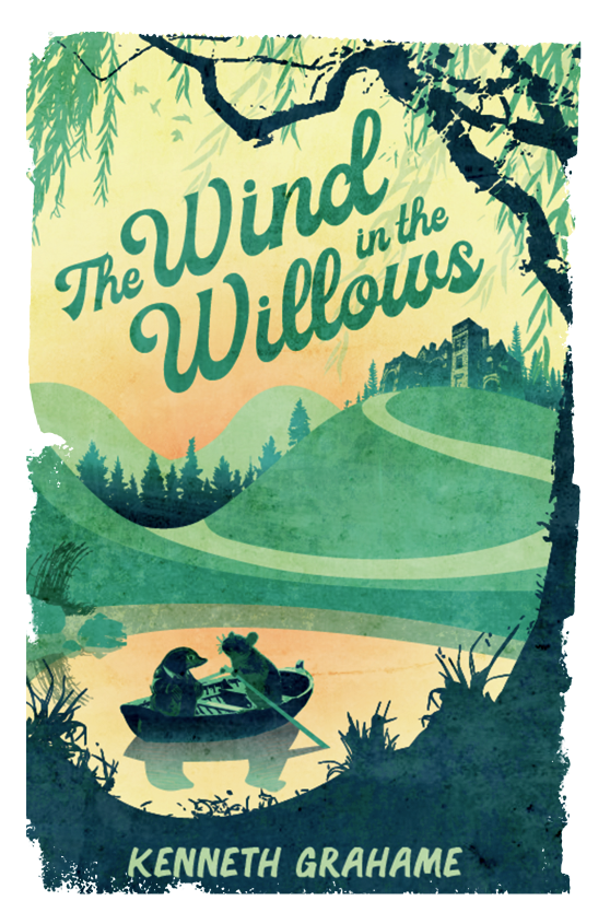
                          I'm having more fun with textures and effects. I tweaked around with the title typography. I'm liking how the title looks, but I'm thinking I might try a few different fonts for the author's name at the bottom of the cover. Not sure if I like it or not. What do you all think? Maybe something that will compliment the font title a bit more. Do you all have any good fonts that could work?

                          You all liked the orange so much I added a bit more!

                          Screen Shot 2019-03-18 at 7.52.28 AM.png

                          1 Reply Last reply Reply Quote 3
                          • MichaelaH
                            MichaelaH last edited by

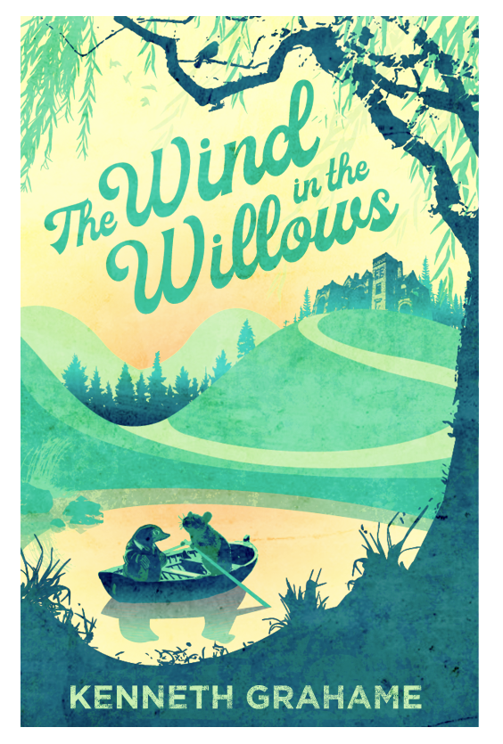
                            It is much better, more orange is also good idea. Like the texture on the sea and the background. I do like more the sharp edge of the cover, like the version before, not the texture edge of the cover as now.

                            https://www.instagram.com/michaelaheimlich/
                            https://www.heimlich-illustration.de/

                            1 Reply Last reply Reply Quote 1
                            • Elizabeth Rose
                              Elizabeth Rose last edited by

                              Here is another one with a few different effects. I also did the hard edge too πŸ™‚

                              How do you all feel about the new Author's name font?

                              Screen Shot 2019-03-18 at 8.57.10 AM.png

                              1 Reply Last reply Reply Quote 1
                              • Elizabeth Rose
                                Elizabeth Rose last edited by

                                This post is deleted!
                                1 Reply Last reply Reply Quote 0
                                • Elizabeth Rose
                                  Elizabeth Rose last edited by

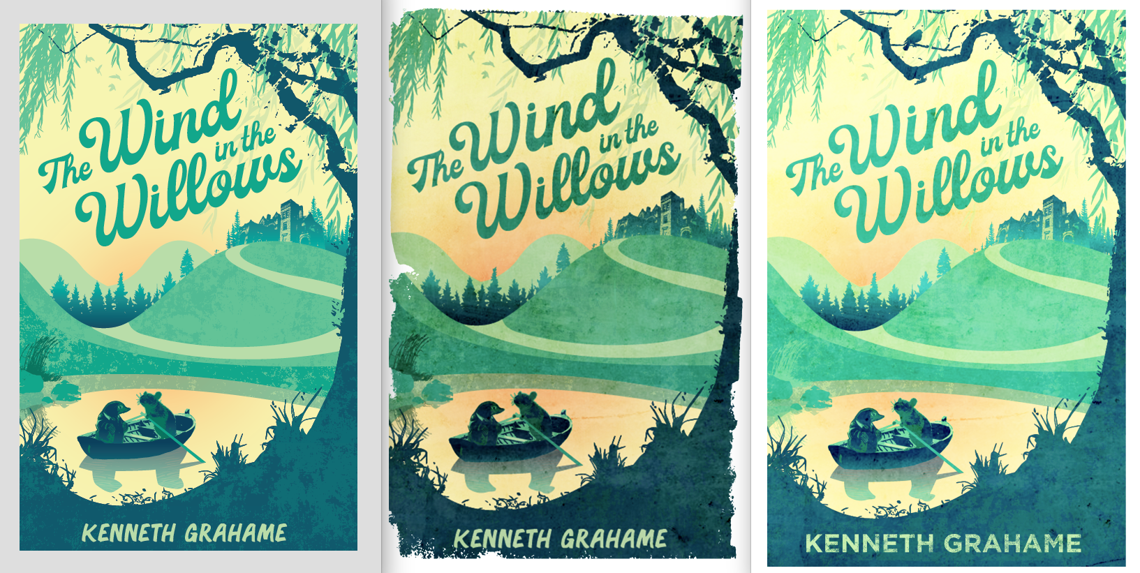
                                  Here are the last three for comparison:

                                  Screen Shot 2019-03-18 at 9.04.38 AM.png

                                  Chip Valecek Heather Boyd 2 Replies Last reply Reply Quote 0
                                  • Chip Valecek
                                    Chip Valecek SVS Team SVS OG @Elizabeth Rose last edited by

                                    @Squirrelsize this really came together great. I prefer the middle on but with a hard edge. As far as the author font, I tend to like something very basic and in the sans serif family. But that is just my opinion on that.


                                    https://www.instagram.com/chipvalecek/
                                    https://www.facebook.com/cvalecek
                                    http://www.cshellmedia.com/

                                    1 Reply Last reply Reply Quote 1
                                    • MichaelaH
                                      MichaelaH last edited by

                                      I also prefer the middle one and with hard edge.

                                      https://www.instagram.com/michaelaheimlich/
                                      https://www.heimlich-illustration.de/

                                      1 Reply Last reply Reply Quote 2
                                      • Heather Boyd
                                        Heather Boyd @Elizabeth Rose last edited by

                                        @Squirrelsize I like the first two. The last one I find too light ad the characters in the boat to sharp a contrast -I feel it gets lost/messy. πŸ™‚ Which now looking at the second one I find the character and boat area similar to my issue with the third one but like it better.

                                        Instagram: www.instagram.com/heatherboyd.illustration/
                                        Website: https://heatherboydillustration.ca
                                        Shop: https://www.inprnt.com/search/products?q=HeatherBoydIllustration
                                        Ko-Fi: https://ko-fi.com/heatherboydillustration

                                        Be blessed,

                                        1 Reply Last reply Reply Quote 1
                                        • Elizabeth Rose
                                          Elizabeth Rose last edited by

                                          Wow! Thanks you all! Some really good tips and suggestions πŸ™‚

                                          1 Reply Last reply Reply Quote 0
                                          • Elizabeth Rose
                                            Elizabeth Rose last edited by

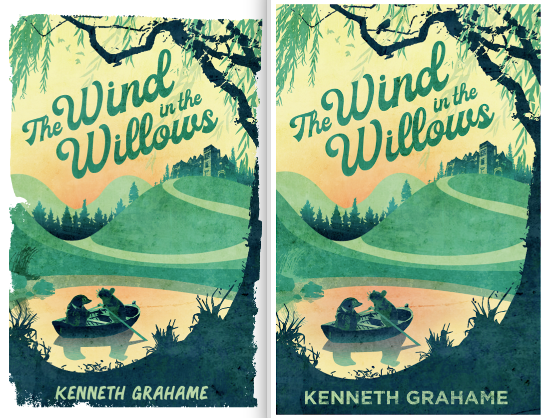
                                            Left is the old dark one. Right is the new with straight edges.

                                            Screen Shot 2019-03-18 at 10.02.11 AM.png

                                            Jon Anderson 1 Reply Last reply Reply Quote 5
                                            • First post
                                              Last post