Greetings! Feedback for my comic style illustration
-
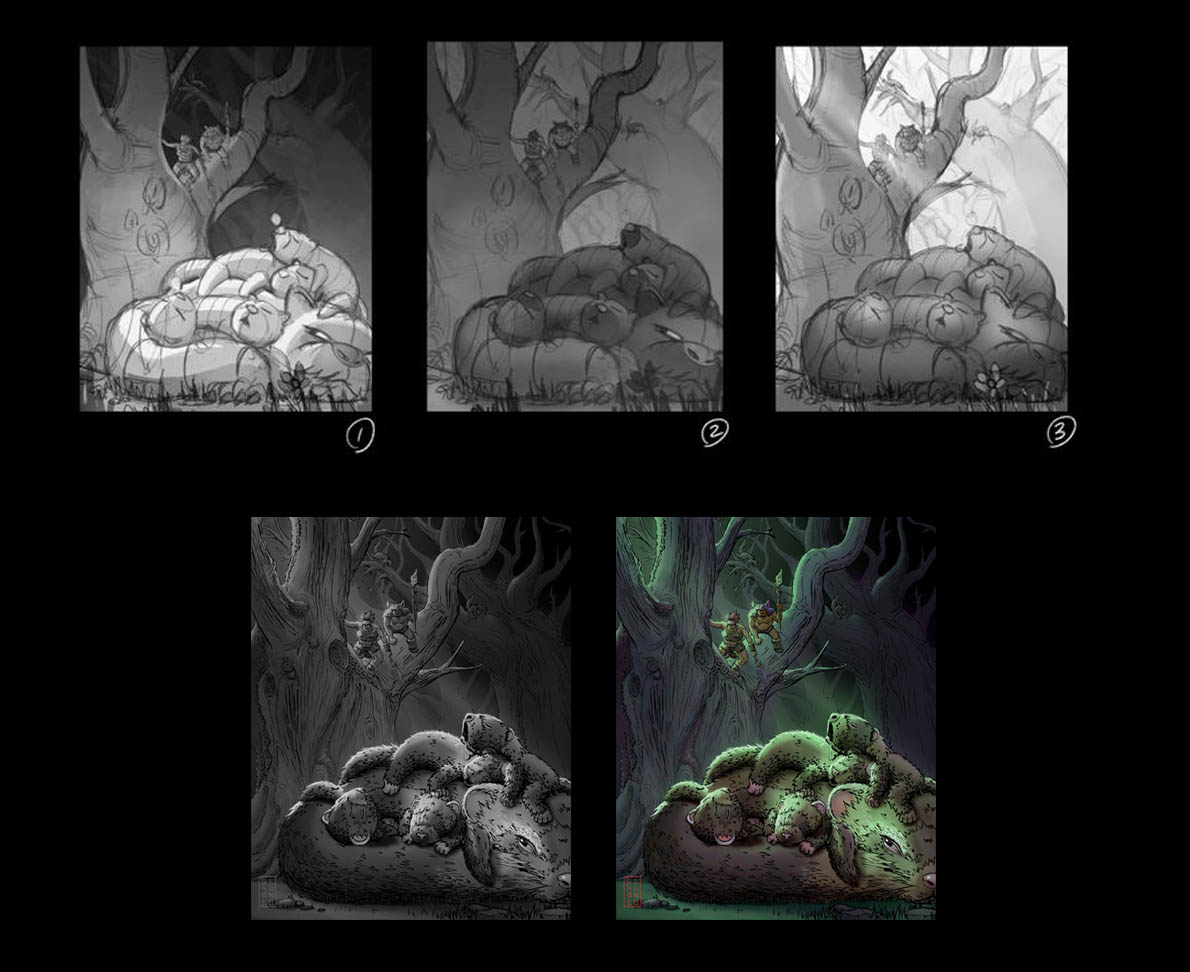
Love the 3rd one!
-
My gut tells me to go with one but with the background of 3. I’m just imagining this warm scene with these animals all cuddle up and having a nap while the background where the sapiens are is in this cool lighter blue/green light.
-
@Gabriel-Lung first off, welcome to the forums. Second I actually prefer the 1st one based on your description as what is going on. It gives it more of a night feel.
-
I'd have to agree with most and say the third one. The light shining on the ferrets leads my eye directly to them. After that, I get to explore the rest of the image and find the humans.
The first one has great values in it, but it almost seems like the ferrets are glowing.
Whichever one you choose I am excited to see the end result!
-
Thank you so much for the feedback everyone!
I had a feeling that #3 worked better but held onto #1 since it was my first one.
Excited to show you guys the result!
-
@Gabriel-Lung Welcome to the forums-and to the courageous act of starting out with posting your work.
I skimmed your words-and went right to the image. Here's how I read the image: I interpreted the den of animals to be bears, and I looked hard and found the small creatures in the tree-but didn't quite read them as humans or homo sapiens. I think of bears as having round faces and snouts, ferrets are having longer, more angular features. Now I don't know if you're going for literal humans and ferrets, or human-like and ferret-like. Great choices, we artists have! I think the scale is what through me off, because the humans are in the trees, I could see them as tiny creatures-elves?
I like the complexity of the lighting in 3 as most pronounced, with the 1rst one being my second choice. 3 reads to me as twilight, or the magical cathedral lighting that occurs in a forest; 1 reads more as night.Keep going-I think you're doing great!
-
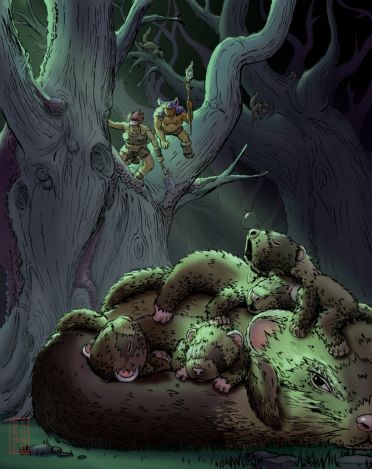
@Susan-Marks Hey Susan! Sorry for the late response! I was already in the midst of finalizing my illustration and thought I would show you the final result with all your feedback put into consideration. Definitely the ferrets needed the most attention. I wanted the ferrets to be human-like and also a bit bigger than the homo-sapiens. I was hoping the ones in the background would give the viewer that clue. Not sure if it was successful or not.
As for the lighting I put everyone's feedback into consideration and tried to go for #3 but found it wasn't quite working for the overall mysterious mood. So I decided to combine elements from #1 & #3 and felt that this worked the best.
Overall I'm happy with the way this turned out stylistically. I feel it is close to the vision I had for it and I'm looking forward to exploring more with it. I think all that is left is some touch ups and I also want to play with the noise a bit more because I think it really adds a nice feel and texture to the piece. Would be great to hear everyone's feedback and then move forward from there.
Thanks guys!
-
@Gabriel-Lung This is coming along nicely.
A couple thoughts on the revision.
First, I am not sure what is going on with the bubble on the little ferrets nose. I couldn't stop looking at it because I couldn't figure out what is supposed to be? Not sure if that is intentional or not so I thought I would provide that as feedback.
Second, I love the momma's eye. It is really adding to the mystery. But I think you could maybe push it further. Maybe a little more squinty or looking further to the left to give an even stronger shifty, sneaky, wary feeling.
Overall coming along nicely.
-
@theprairiefox Thanks for the feedback! the bubble was suppose to be a snot bubble. I took it out since its not important and i'd rather have more clarity. I also changed the mother ferret's eye!
-
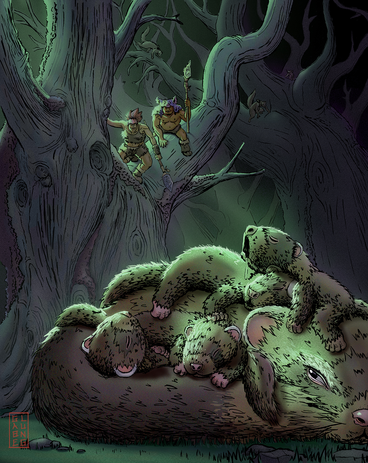
@Gabriel-Lung ohhh, I really like the change to the eye! It now is directing the viewer to the humans. And the momma looks a lot more mysterious/suspicious. Very nice.
-
Hei, really cool composition :-). Love the piece.
I loved both #1 and #3 composition and lighting. (you could add a bit more value separation between the tree and the human sitting on the tree if you want the human to read better.) I liked your comps more than the final version because of how you organised the value in the piece.
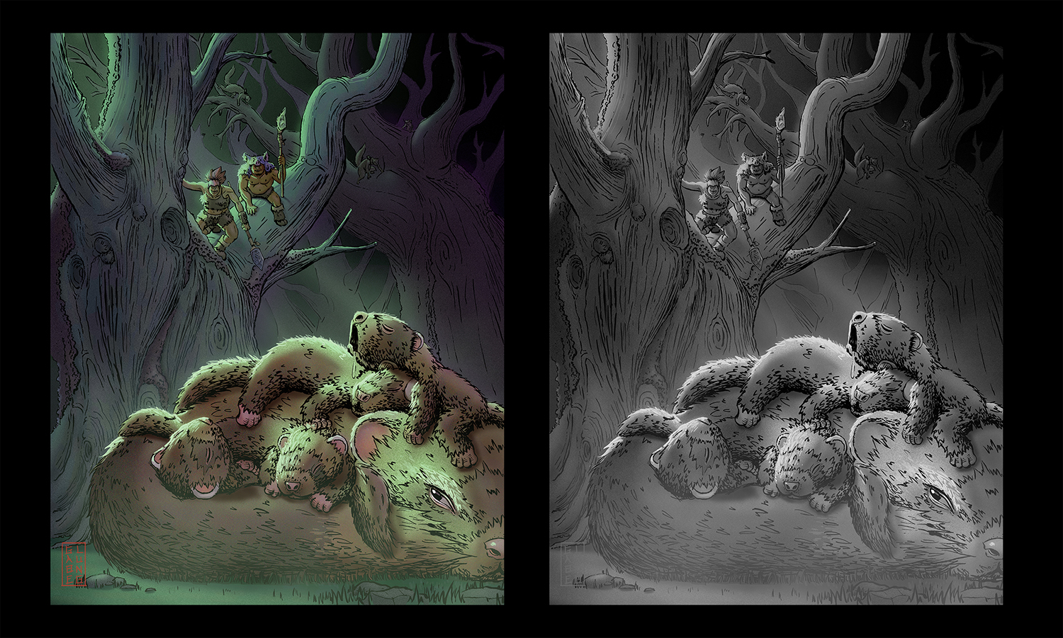
I turned your final image to grayscale to compare with the comps. Both #1 and #3 comps have a clear background and foreground separation. But in the final piece, the local value of the ferrets is blended into the background. The only thing that separates the ferrets from the background is the highlight of the ferrets, which do not make a strong silhouette. I would try to assign a different local value for the ferrets to separate with the background.
Hope this helps.
-
@xin-li Thank you for taking the time to put together your feedback! I appreciate that. You brought up a great point and after reading your comments I feel the same. The ferrets just don't stand out enough from the background. I experimented with lightening the value of the ferrets but It didn't quite work for me as I felt it took away from the overall sense of night in the scene. I did however play with some atmosphere to enhance the mood. I also increased the warmth in the foreground to add some color contrast. Finally I pushed everything more towards purple in the background to separate it from the mid-ground and foreground. I feel it's an improvement, let me know what you think!
Gabe