March Prompt Help
-
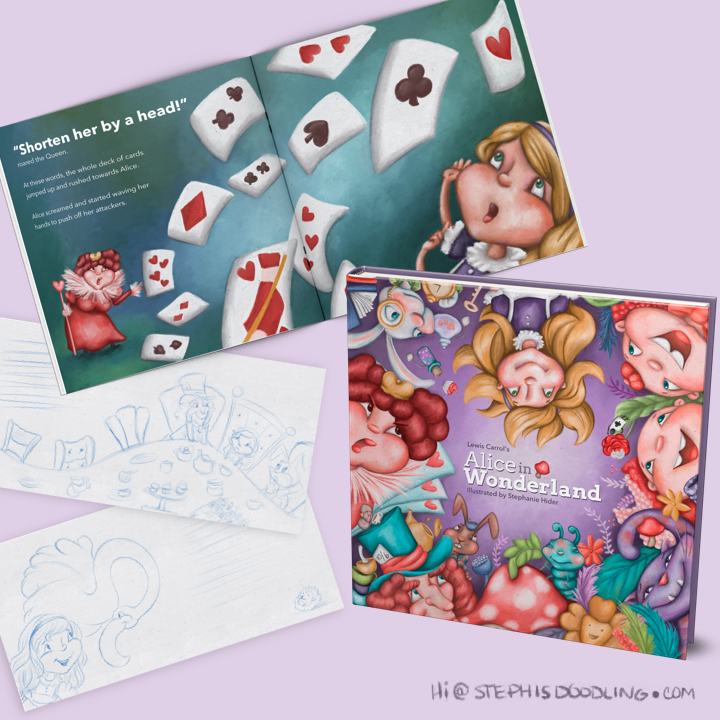
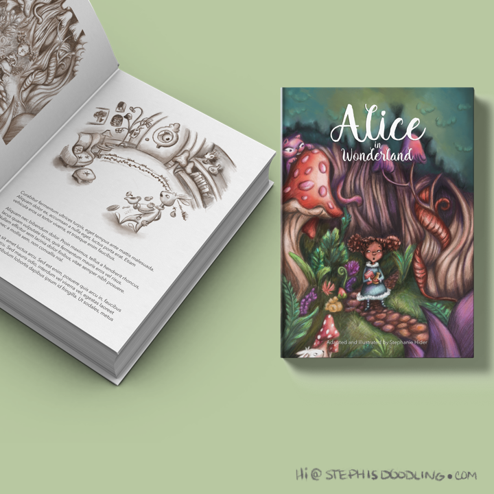
I did two covers for Alice in Wonderland for different age groups for the Plumawards and had planned on submitting one to the prompt for March here as well. Not sure which one to submit however and I believe we can only submit once. Any feedback would be great!
-
I really like the top one better. It feels more chaotic. I get the sense of topsy turvie with all characters and their placement. It’s great. The lower one looks good, but I don’t get a real sense of what it’s about and the title doesn’t seem married with the cover. I have no idea why. I do like the composition of it. Overall, I feel the top one is a better fit.
-
Just a note the two twin tweedle d and tweedle dumb don’t show up in the first book when I read it yet their on your front cover. I assume they show up in the Looking Glass though because I saw illustrations for them in my copy of it. Unless you made the book cover for both books combined.
But that cover is indeed fun and colourful! - the first one.
-
The first has a lot more energy I would have to concur with @Heather-Boyd and @Whitney-Simms.
-
I prefer the first one too, it would stand out on a shelf a lot more as it's so colourful and full of fun
")
-
OMG thank you guys so much that was very helpful
The first one it is! -
I understand why everyone is choosing the first one (energetic concept that gets the wackiness of the story, reads clearly), but I just wanted to say that I love the color scheme in the second! I would make Alice bolder, simpler, and more firmly rooted to the path, though. Just a suggestion in case you decide to tweak it.