Introduction // The Moment Before Critique Request
-
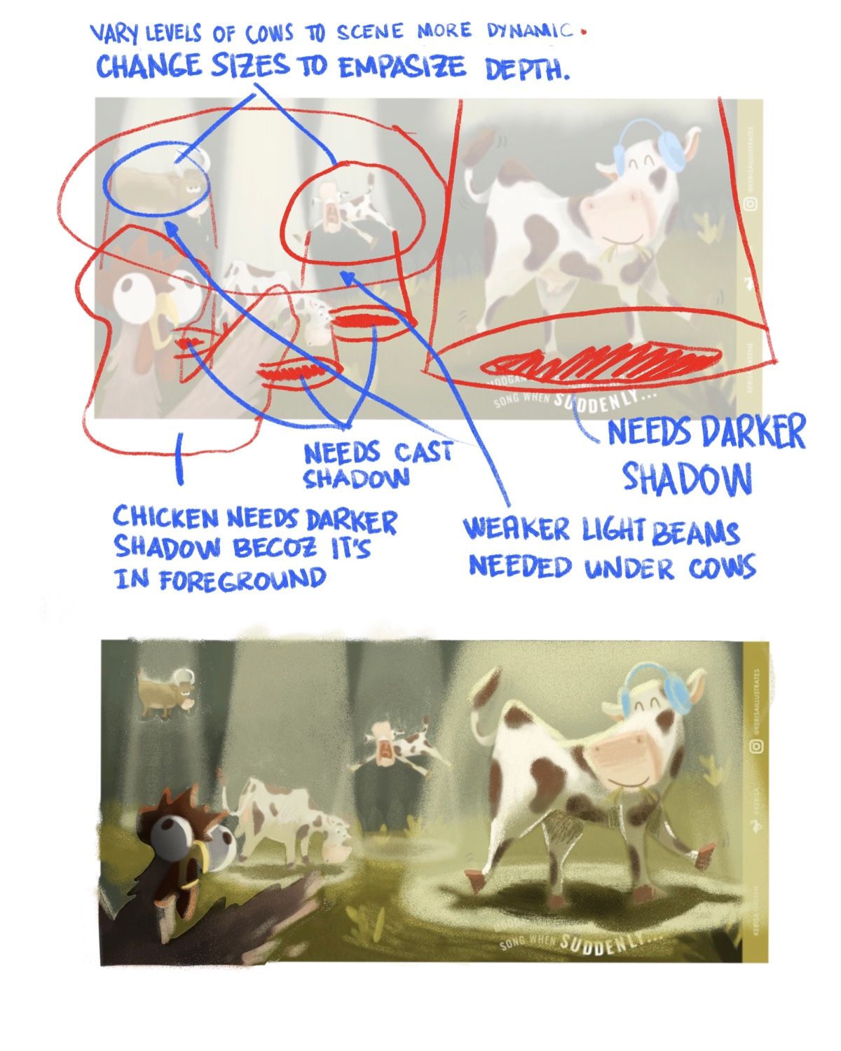
@Kerisa Hi! I was planning to write a detailed description on the issues I saw in your work but I’m a bit strapped for time so I apologize in advance for not doing so. Instead, i’ve attached an image below which points out the elements that I think we can still improve. I hope you can make out the things I wrote down there. Also, i did a rough paint over of your work to demonstrate how I would go about fixing it. I hope you find this helpful. I’m sorry I can’t explain further.

-
First, all of your guys are AMAZING!! Thank you so so much for all of the helpful feedback and for taking the time to do this, seriously floored by how helpful all of this was! I've been working editing the piece and hope to post an updating version very soon.
THANKS AGAIN!!
-
You guys made sooo many good points and such great advice. Here's my first round of taking in all of the different tips and implementing it into my piece. One thing that was clear is that the story wasn't very clear and I really wanted to make sure that it was easy to read that the cows were being abducted by UFOs, so I drew in a couple and emphasized the spotlight way more ( @nyrrylcadiz your draw over was sooo incredibly helpful, thank you for taking the time to do that! ).
@Jon-Anderson I definitely saw what you meant about everything looking very soft, I'm trying to find a good balance between texture and making sure the shapes are crisp. Hoping this is a better mix! If you have any tips on what you've done to work on this in your illustrations I'd love any tips.
@Johanna-Kim You are so right about the text! I was definitely just trying to force it in that space. Ended up moving the cow a bit and placed the text towards the top instead, hoping that gave it a bit more breathing room. Do you think it's too close to the cow now though?
Everyone mentioned shadow and lighting so I worked on bumping that up a bit. I can't tell if it's too chaotic now, I mean I know it would be a chaotic event if it was real but I don't want the piece to be overwhelming.
Again, loved all of the feedback, thank you all so so much for all your help! If you have any notes/tips for things that could be tweaked on this updated version I would greatly appreciate it!
Wish you a singin’ dancin’ good time,
KERISA GREENE
https://kerisaillustrates.com/
https://www.instagram.com/kerisaillustrates/ -
@Kerisa this looks amazing! Great job!

-
@Kerisa Looking good! I think the words have enough breathing room now. Their proximity to Moogan's headphones and tail seem fine.
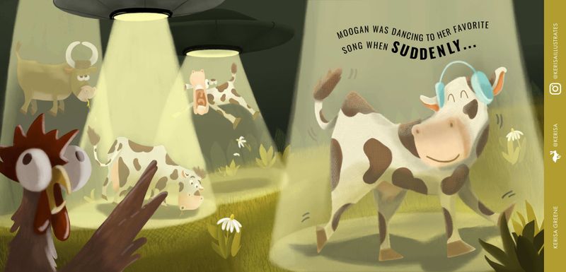
Regarding the feeling that the overall illustration might be too chaotic now, I kind've see what you mean. I miss the relative quiet of the original illustration, where no space ships were shown. I wonder if the action in the background is drawing too much attention or competing for attention, when the main focus should be Moogan. One thing to try to regain that focus is to dim the lights of the background light beams, and make Moogan's light beam the brightest. There could still be variation in the intensity of the background light beams, but the difference between each other could be subtle. I also think that you may not need two space ships. One is enough to show clearly what is happening. Although, I think most people have seen someone being beamed up by a spaceship, so you may be able to get away with showing no spaceships, as you did in the original.
Lastly, regarding the chicken/rooster in the foreground, you might consider adding a tiny yellowish rim light to his highlights, to show that he's picking up some up the yellow glow of the beams.
-
Lovely work and such a fun idea haha!
I agree with @Johanna-Kim that it might all look a bit too chaotic now, so in addition to what has already been said, maybe by making the the 3 other cows smaller too, that would help keep the attention on Moogan (great name by the way)? Maybe also try one of the light beams at more of an angle too, at the moment they all come straight down, which looks great, but it could be something to try and it may make your piece look even stronger")
-
This is such a great concept!
-
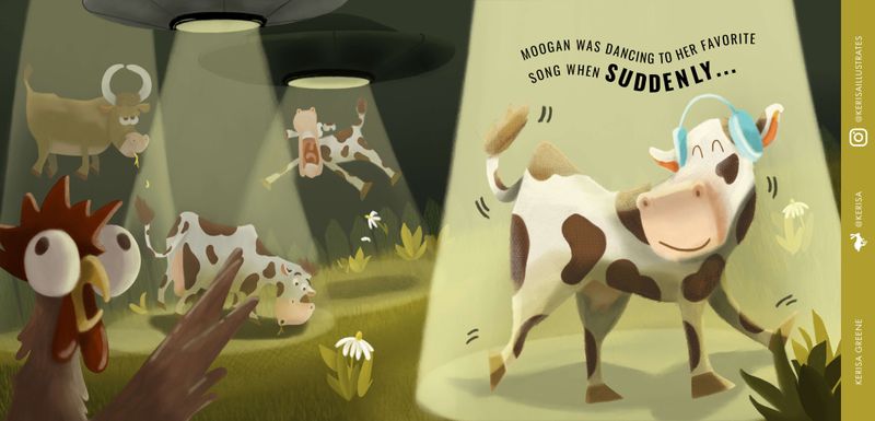
Thanks everyone so much for the feedback and push, definitely what I needed to make the piece better. Here's my attempt at making the chaos of the three cows fade into the background a bit more and highlight Moogan a bit more. Hoping this works as a solution!
-
Kerisa,
I have read through your initial post for this piece. You had great feedback for areas to improve but you also did a wonderful job of taking direction. Nice improvements. And - I love the way you branded your post!
I found (and followed) you on Instagram and also checked out your website. Are you really and truly working from your van?!! Are you using Procreate or PS?
I follow a few digital nomads and am kind of in awe of the guts of this generation of artists!
Amber
-
@Amber-Lynn-Benton Aw thank you so much!
Yay, I'll have to find and follow you too! And yes my husband and I are currently living in our '82 VW Vanagon full-time right, we're stockpiling as much money as we can for the next year and a half and then we'll be starting our road trip around the world! So scary and exciting! If you want to follow along on our van journey our Instagram handle is @pati_goes_places

I use Procreate to draw everything and then I used PS to add the branding stuff on the side and text. I'd love to eventually get a cintique but I don't think I have the room for that right now.
Wish you a singin’ dancin’ good time,
KERISA GREENE
https://kerisaillustrates.com/
https://www.instagram.com/kerisaillustrates/ -
@Kerisa That’s awesome and good luck on your preparations - your work is great!