WIP - Intense ronin showdown
-
Hello everyone! I love the activity on this forum, there are so many cool projects going on!
I really appreciated all the feedback I got from my the last piece I posted as it was very helpful. I've been working on a new piece lately and thought I would share my progress with everyone!
Story: During the Battle of Sekigahara, Kuzo is blinded and loses his master during the battle, thus becoming a Ronin. He now wanders the lands picking up dangerous bounty missions to get by and also in hopes of one day regaining his honor back.
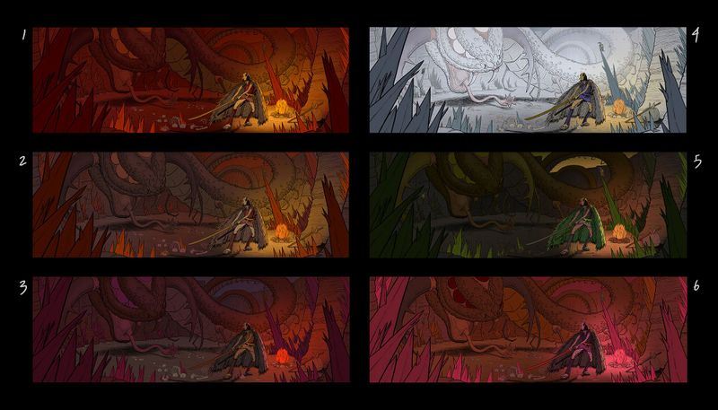
I struggled mightily getting the composition to work for this piece, I think it could be more dynamic but overall I like the direction that it's going. I wanted to a very threatening and intense moment and to me number 1 feels most successful. I think number 6 and 2 have some potential as well.
Thank you in advance and i'm looking forward to your responses!
-
Hey Gabriel, love the line work! I could totally see this style living in a graphic novel.
It sounds like you are asking for feedback on which color palette communicates that "threatening and intense moment" best. I'd agree—I think 1 works the best. However, 4 was the easiest for me to read at one quick glance. The cooler colors don't feel as ominous as the red shades of the other choices though, so it probably ranks the lowest in terms of your initial criteria.
Perhaps showing some of the fire light glinting off of the creature's scales and eyes would help the creature read better. A small note, but I kind of like the red eyes on the creature in 6.
Also, I can tell that you put a lot of thought into the composition of the piece. So good!
-
Hi @shinjifujioka, thank you for the feedback!
I think you made some nice points, especially regarding the clarity. I'm planning on playing with the atmosphere and lighting some more to really push the focal point in this piece. I'll definitely add some subtleties on the creature as well!
-
Hi Gabriel! This is a neat concept but I have to say it took me a while to see the threatening creature in the background. I would darken the creature or lighten the background behind the creature to make a value separation so that it reads quicker. It doesn't have to be drastic. Just a subtle shift can go a long way especially if you are wanting to convey that it's taking a stealthy approach to the Ronin. Of the color studies you've given I think 2 conveys the idea of intensity and danger while slightly revealing the threat with a different color (and value). The creature blends too well with the background in the others. That's my take. This image looks like it'll be fun to take to finish and I'm sure you'll have a blast.
-
I have to agree with @Jon-Anderson I didn't read the snake/dragon at all initially. I think value separation for the background would help a lot. Once I opened the image it read better with all the detail. One of the things I have used to make sure values are working well is shrink the image down so you lose the detail and make sure the image still reads.
It is a really fun image and design of the dragon... we don't want to lose it.
Good luck.
-
Hi @Jon-Anderson @theprairiefox, thank you for the feedback!
I think it gets lost as well, I was worried the snake would be too distracting as a second read since its all over the place in the image so I grouped it together with the background. I debated on making it lighter but will definitely keep this in mind as I approach the final!
-
@Gabriel-Lung I have to say, these are really awesome! I agree with @Jon-Anderson , #2 is really working the best! Maybe having some kind of light source on the creature’s head would help with it getting lost in the background. I don’t think it needs to be anything crazy. Maybe the light source could be coming from below to make the dragon look more ominous? I really want to see where this goes!
-
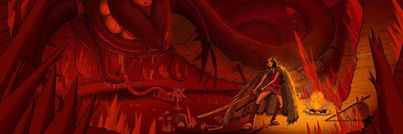
Hey guys! Thanks again for all the feedback! I was very careful with making the snake pop out but I also didn't want it to overpower the image and stay as a second read. I think the under lighting and rim lighting really helped. Overall I like how this turned out and i'm excited to hear everyone's thoughts.
-
The pose is a little weird for me. I know what pose you’re trying to make because ive seen lots of samurai and ninja stuff, but it kinda looks like his body is facing away and it’s not until you see the face that you notice he sees the snake monster. And the pose hes taking is not telling me that this scene is scary, regardless of how scary you draw the snake, the character in it is what tells the story through body language and I think it would be more suspenseful if they were turned towards the snake.
-
@Aleksey I agree I think the pose is kind of awkward and its what I struggled with the most. the idea was to have the ronin be in a mediated state before he takes on the snake but maybe that is conflicting with the overall mood of the piece?
-
@Gabriel-Lung no i like that’s what you’re going for, he’s able to keep composed in such an intense situation. I think i mean more that the feet and sword are pointing in a direction thats taking away from the scene.