Finishing Drills for a Chronic Dabbler.
-
@Nathalie-Kranich Yes, I know! It's okay, we'll figure our inner conflicts out.
Hans Christian Andersen!

-
Inching along with the posing and linework!:
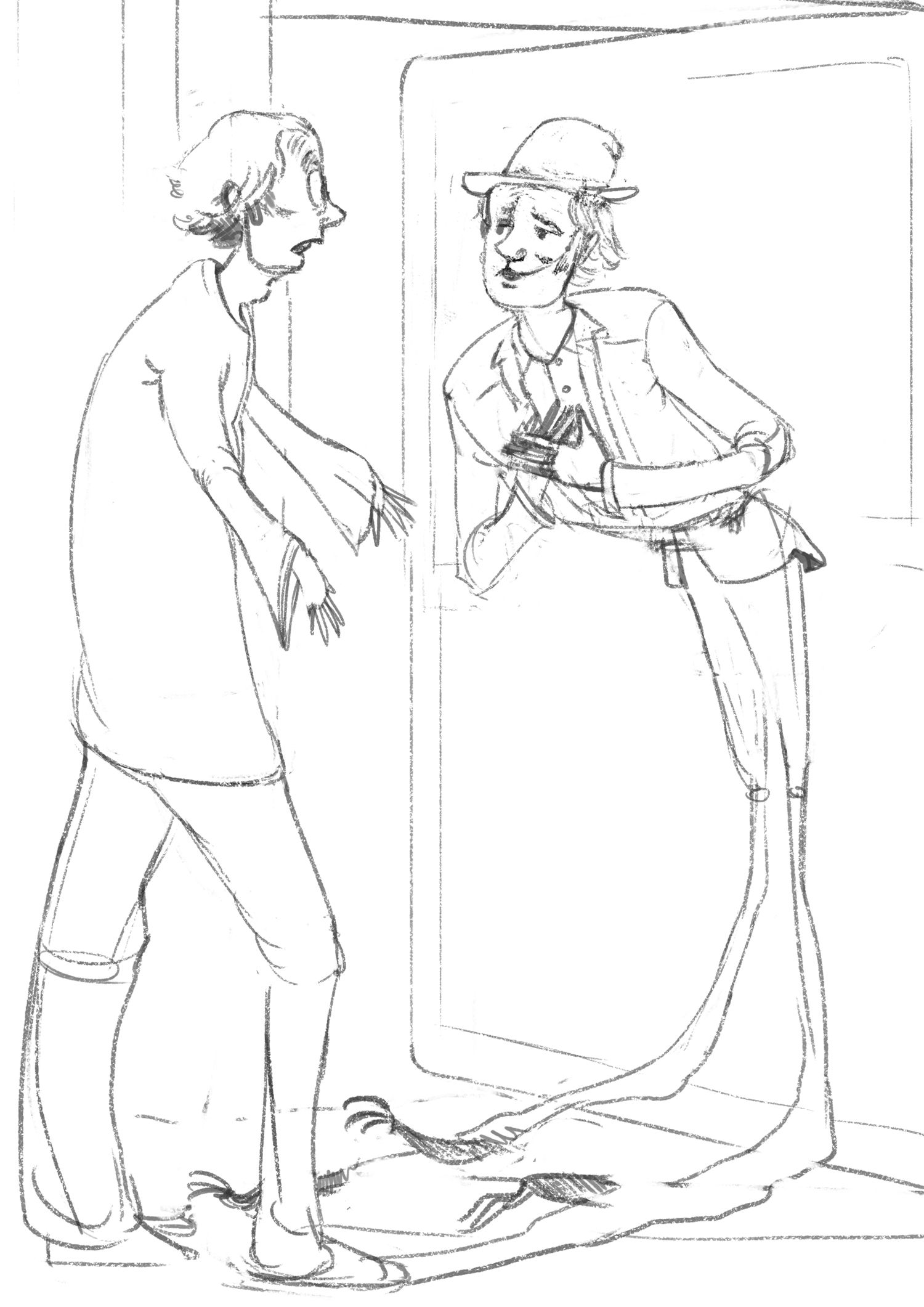
I'm wondering if viewers can tell that both characters are the same person? I'm trying to work on it so they still look like each other, despite their clothing and expressions being very different.
I also tried to ensure the door doesn't cut right through the middle of the picture, but it's still there. :S
https://www.instagram.com/sooryajart/
The Beatles: "Roll up, roll up for the Mystery Tour!"
-
@animatosoor Hmm I didn't knwo they were the same person, the hands should be longer on the original and the eyes differ to much, but hair and style is ok. I would put the knie from the shadow guy little down and the shadows parts on the floor thinner. Maybe the beard on the ear side that it is the same for moth in angle (going up)
-
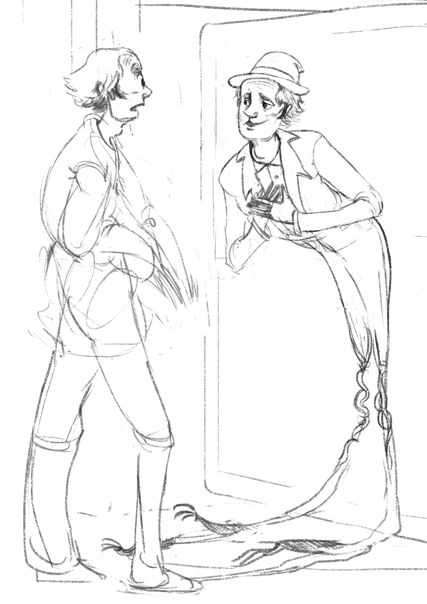
Thank you, @MichaelaH! I'll go work on those things. Revised sketch for now.:
-
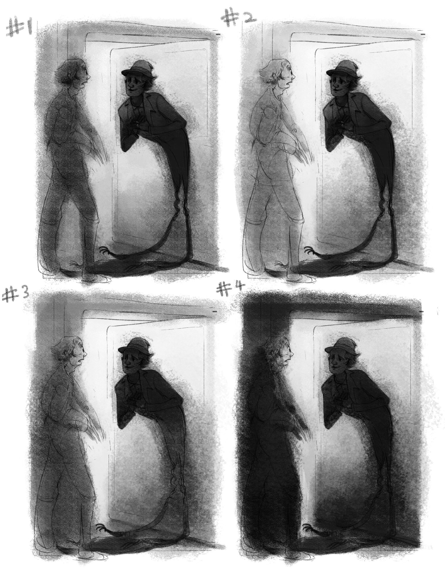
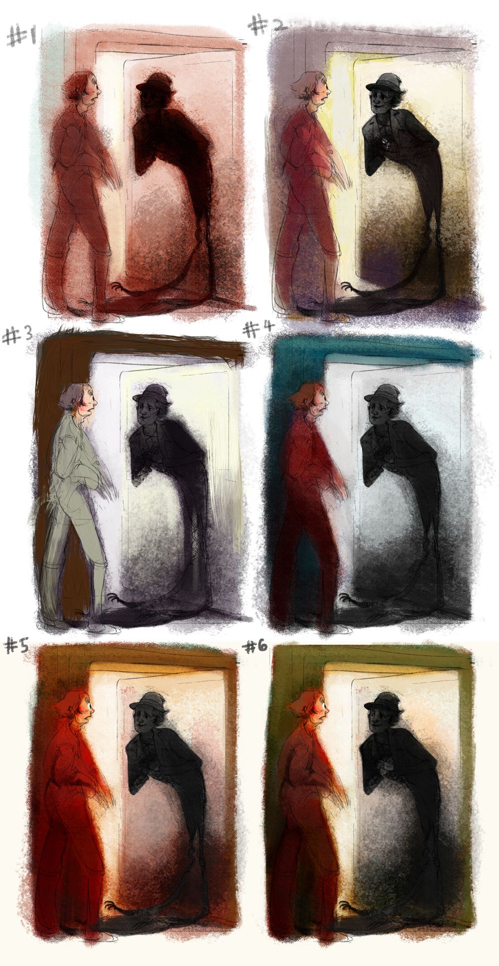
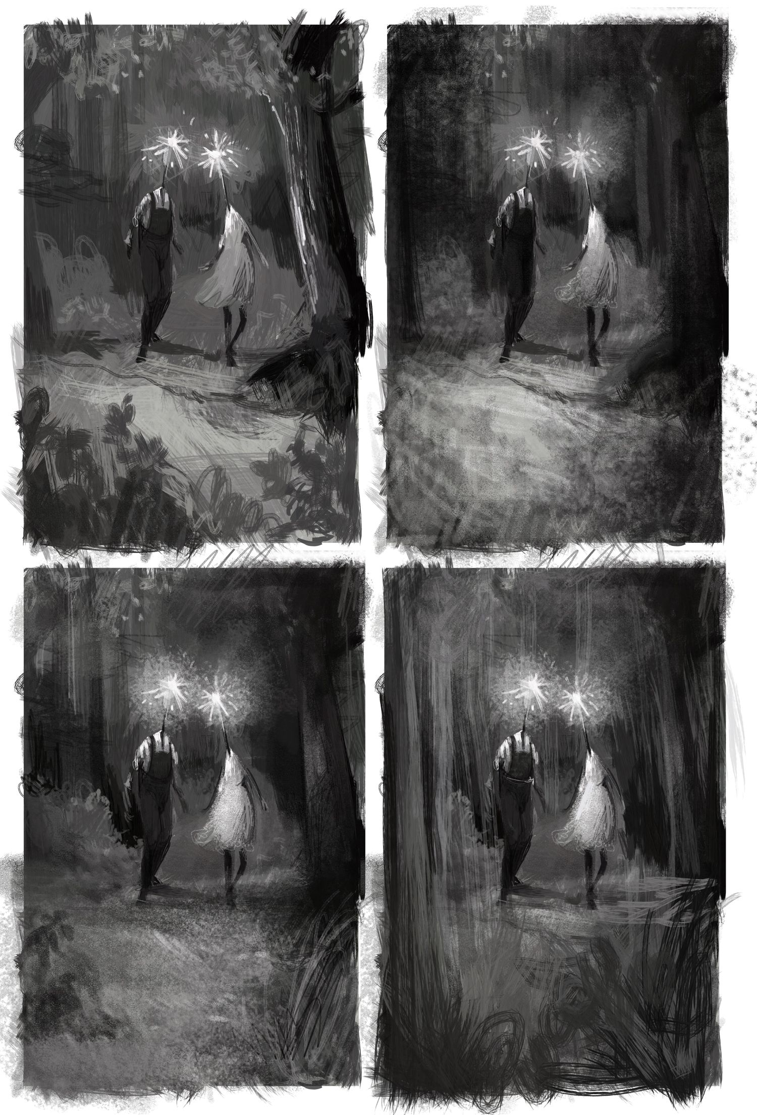
These were as much value studies for me as they were "rendering and mood studies." I'd like the end result to have a fuzzy feel as well, especially around the shadow. I'm leaning towards #3 and #4, personally!
-
I liek 3 the best, wil be good for the mood, 4 is great also, but maybe it will be to dark? Or maybe something between 3-4
-
I agree, @MichaelaH. I will be going for something in between #3 and #4. Thank you.

I have been doing these colour studies. I plan to do some more till I find something I really like.:
Overall, though, I've run into a failure this week: It's Monday, and I'm still at the colour studies stage with this. I'm realising how much of a struggle it is for me to pose human figures properly and have them interact in a convincing way.
https://www.instagram.com/sooryajart/
The Beatles: "Roll up, roll up for the Mystery Tour!"
-
@animatosoor I like 2 the best, after that maybe 6. Yeah I am also late, had to do some custom order...
-
@MichaelaH Thanks for your input! I know it can be hard to manage various deadlines. We can do this, though! You have my support.
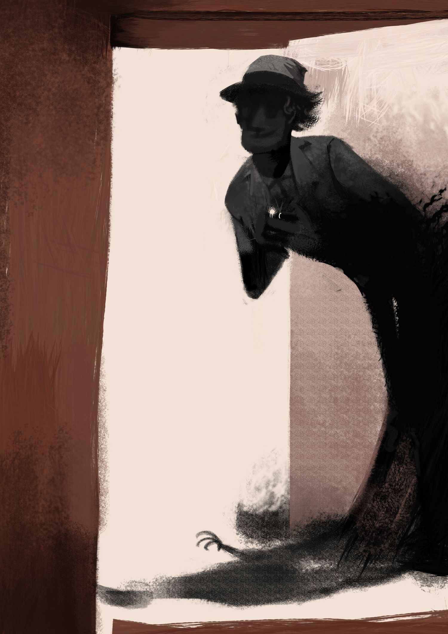
Progress shot:
-
I had to take a hiatus to deal with some personal stuff, but now I can do this again!
Week 8:
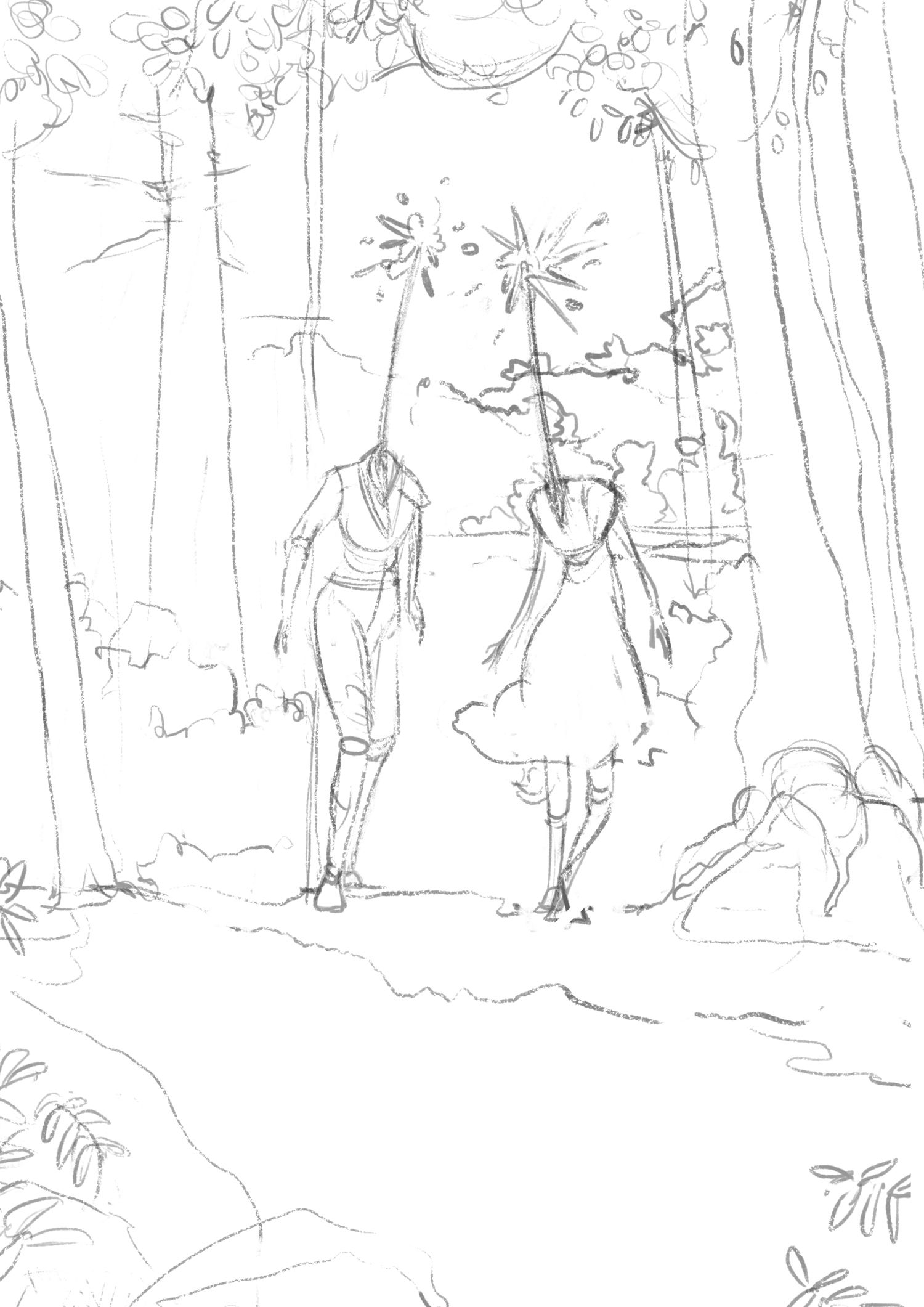
Exploratory sketches:
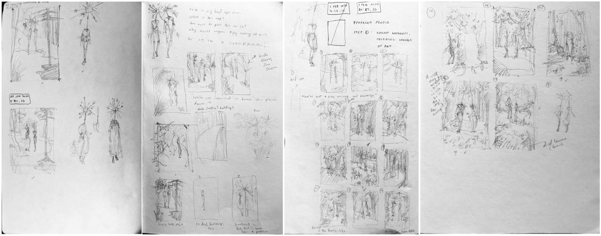
Sketch:
Value studies:
Colour studies:
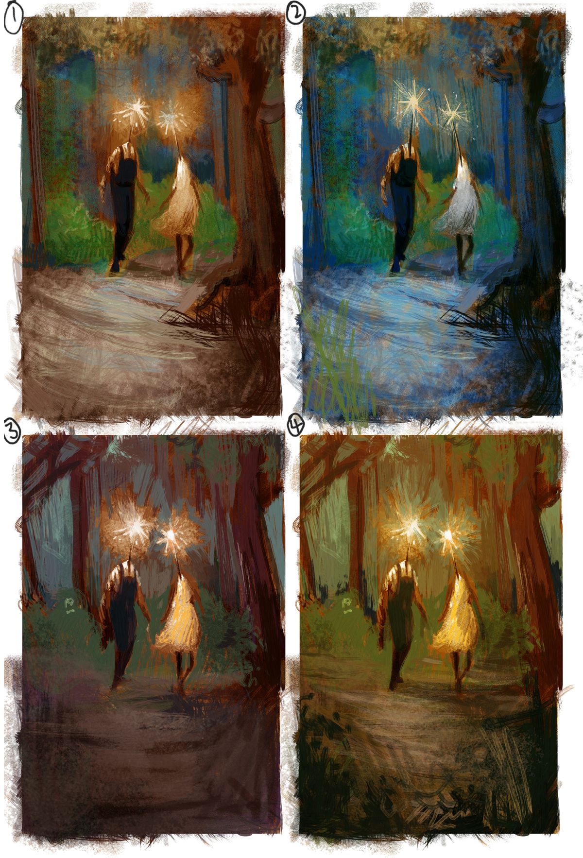
I would love feedback on this, please! Do any of the colour studies work? At this stage, is there anything I should change in the drawing?
")
https://www.instagram.com/sooryajart/
The Beatles: "Roll up, roll up for the Mystery Tour!"
-
@animatosoor 4 is my favourite, I was deciding through the others (1-2) before seeing number 4 and couldn't confidently decide. But when I saw 4 I thought wow yes! It was warm like number 1 but has a warmer autumn summer mix glow (my words do no justice how I feel about number 4). I also like the darker scribbles in the foreground. It encourages me to see you found a green that works so well in the warmer colour study of number 4.

-
Welcome back! I appreciate this thread, as I'm also a chronic dabbler and have a hard time finishing pieces. It's inspirational to see you get so much quality work done.
Color is one of those areas that can be pretty dang subjective- and I think you've gotten all 4 to look appealing already! My personal favs are 1 and 2.
-
@animatosoor I love this thread you have created! I can really relate! I think all your color studies are great but if I had to choose one I'd say #1.
-
@animatosoor Just wanted to pop in and say that I really admire your dedication here! It's very inspirational to a fellow dabbler. Keep up the good work!
-
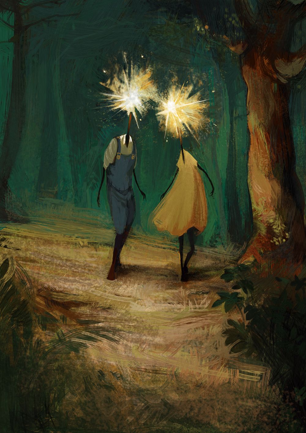
@Heather-Boyd Thank you for the lovely feedback! I was also leaning towards #4 and tried to make it work, but quickly realised that the glowing heads against the warm, light coloured background was light against light. D= I had to then choose a darker background so that I could have light against dark.
@TessaW Thank you, and I feel you - I still struggle with finishing my work. You can do it! We can support each other.
Thank you, @KaraDaniel - I did end up going with the cooler colours, haha.
@baileymvidler That's really sweet - thank you. All of you are so supportive.
Progress shot:
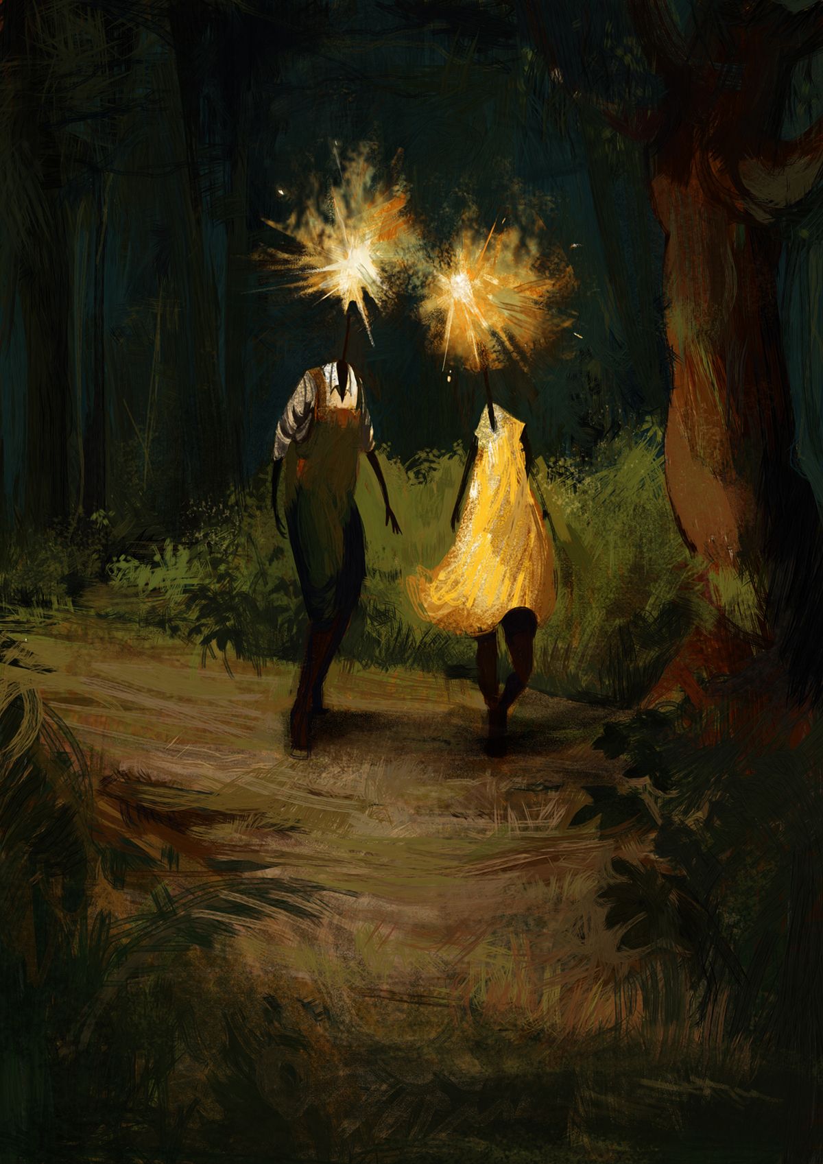
I was trying hard not to do yet another night-time scene, and yet here I am, lol. I do want to explore a variety of lighting situations and colour schemes in subsequent paintings. For this one, I am going to go and continue with the detailing. Any feedback would be welcome, as always.
-
Another progress shot:
Sometimes I wonder if the rough-looking strokes I've used here make the illustration look unfinished and unrefined?
-
I went and changed quite a bit because I felt the light value of the bushes in the background and the lady's dress were competing with the focal point - the glowing heads. I removed the bushes entirely because I felt they were making it hard to focus on the characters.
[Notes to self] Weak points to work on in subsequent pieces:
- Drapery - Struggled to draw and paint it
- Evening light - I don't know what colours to use
- Rendering style - How much texture do I really want in my work, and what kinds of strokes do I want to see in my work? Revisit dream portfolio.
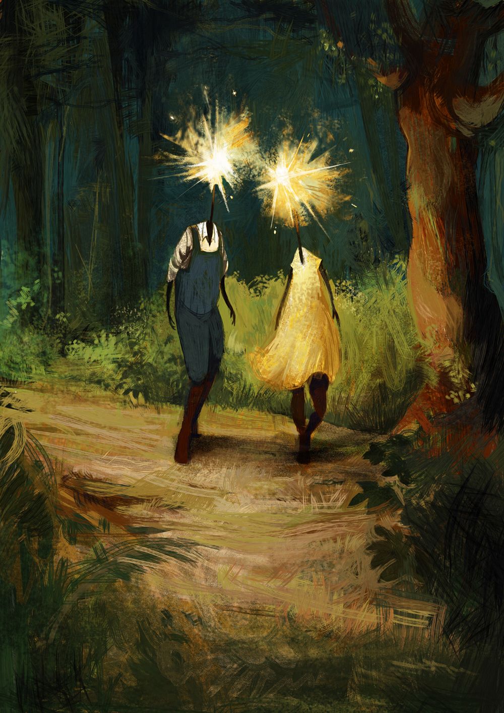
Final: