Society of Visual Storytelling

    SVSLearn Forums

    • Register
    • Login
    • Search
    • Recent
    • Tags
    • Popular
    • Users
    • Groups
    • Search

    What does the moon do

    Illustration
    9
    15
    3384
    Loading More Posts
    • Oldest to Newest
    • Newest to Oldest
    • Most Votes
    Reply
    • Reply as topic
    Log in to reply
    This topic has been deleted. Only users with topic management privileges can see it.
    • Lydia M
      Lydia M last edited by

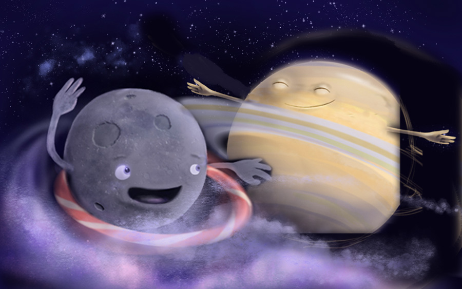
      I think with this one I got really excited and jumped into painting too soon. Does anyone else do that? I did a sketch with Saturn turned around and farther in the distance. An issue I'm having is that in reality Saturn is HUGE (and I'm also locked into a 3840 x 2400 format). The moon doesn't visit Saturn in reality either but I don't want them to be so close in size. I also flattened my original and hacked it up to get an idea of where I should go.

      Thank you so much for your input everyone!
      sk4etch.jpg hula2test.jpg

      www.lydiamueller.com
      Twitter @lydesigns

      1 Reply Last reply Reply Quote 0
      • joanie stone
        joanie stone last edited by

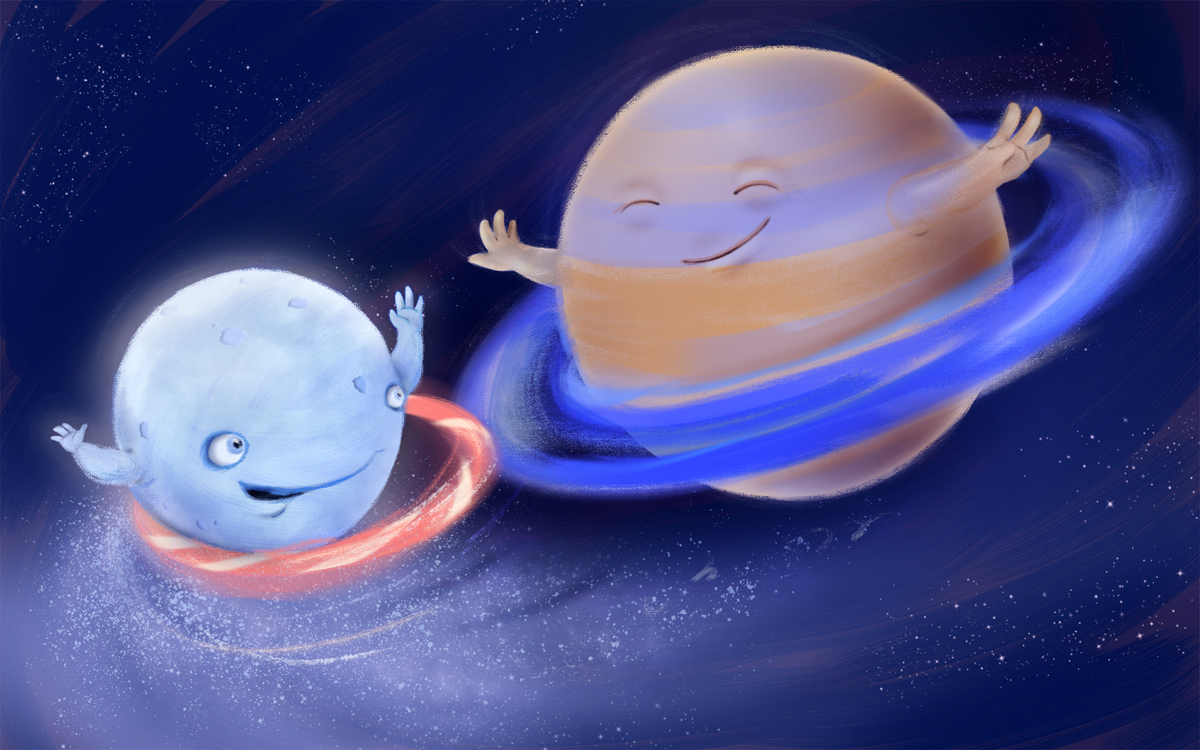
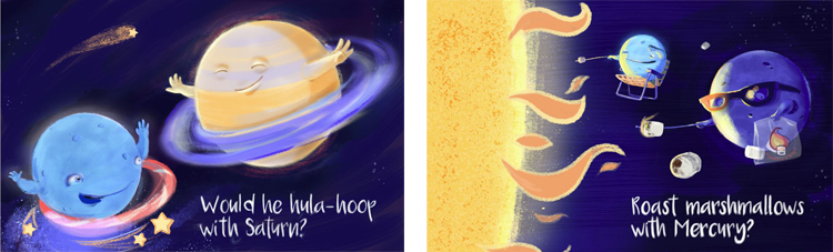
        I think the composition of your new sketch is working nicely. I think Saturn could be a tad bigger so there is more size variety. I like the sketch where they are more side to side rather than overlapping. Really great work and so cute.

        1 Reply Last reply Reply Quote 0
        • Joy Heyer
          Joy Heyer last edited by

          I like the idea of the moon being smaller than Saturn--like a little kid wanting to be like the "cool" older kid. The motion and emotion is so wonderful!

          Twitter: @Joy_Illustrated
          Instagram: joy_illustrated
          Website: joyheyer.com

          1 Reply Last reply Reply Quote 0
          • Lydia M
            Lydia M last edited by

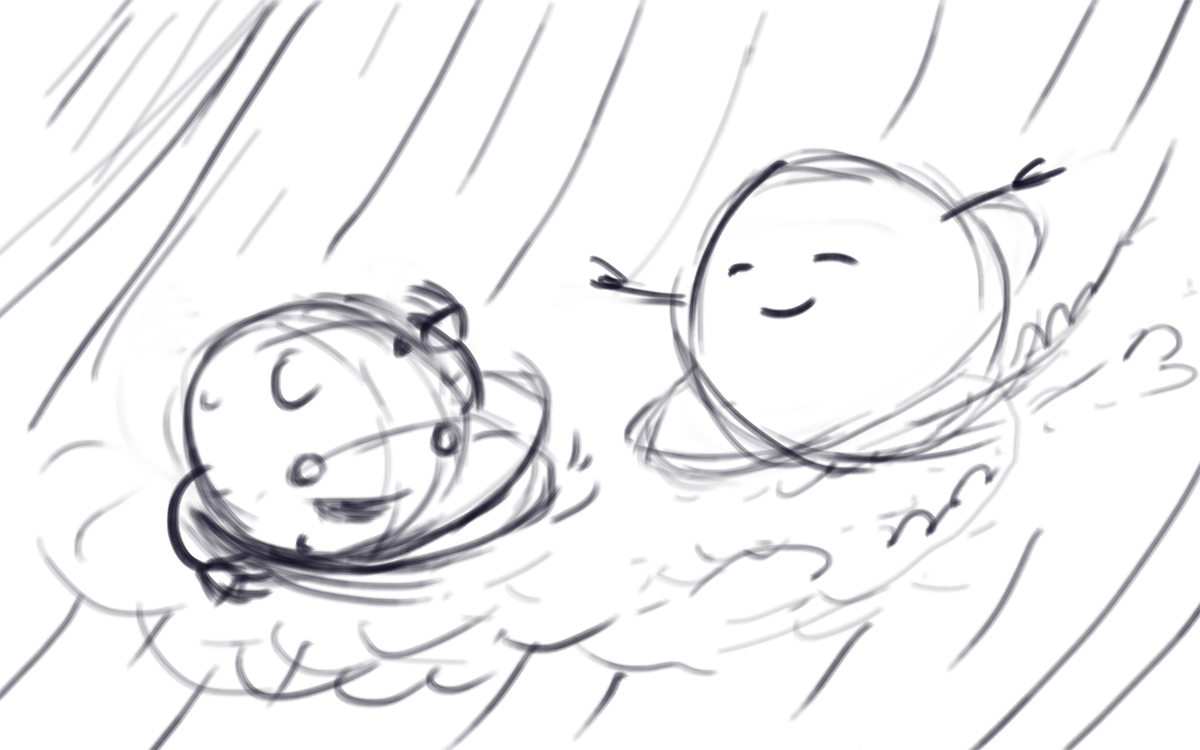
            So I started over because overall it was looking too bizarrely realistic. The moon was too close to real and that's why he was creeping me out. I think the new version has more movement. I'm still struggling with pushing Saturn into the background without losing her. I put a cool-tone overlay on her because she was bright yellow. I'm going to keep working on it. I definitely had more fun and felt less frustrated with this one.

            Hula_Try2.jpg

            www.lydiamueller.com
            Twitter @lydesigns

            1 Reply Last reply Reply Quote 2
            • Lydia M
              Lydia M last edited by

              Starting another one!

              marshmallows_cap.JPG

              www.lydiamueller.com
              Twitter @lydesigns

              Leontine 1 Reply Last reply Reply Quote 3
              • Leontine
                Leontine @Lydia M last edited by

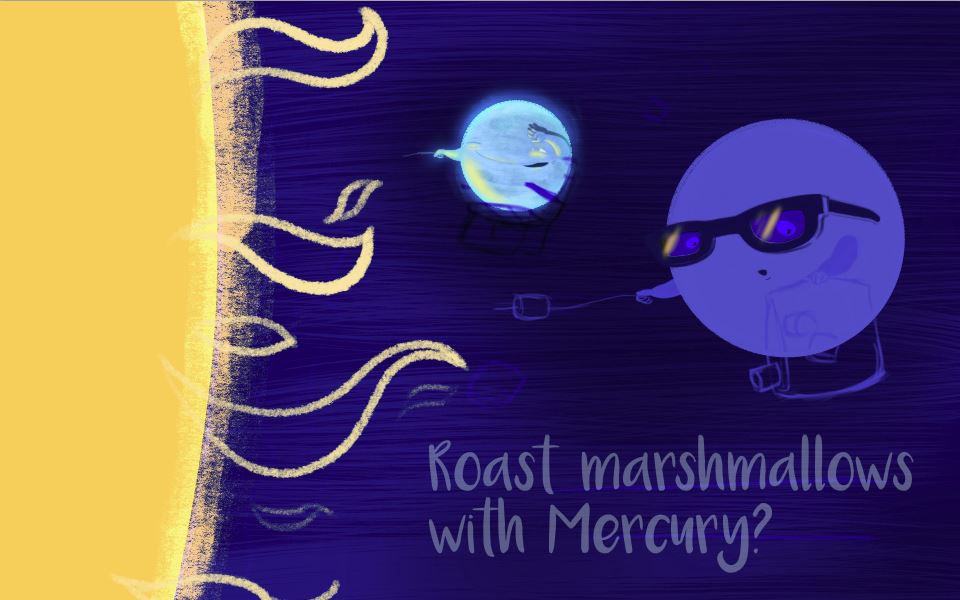
                @gimmehummus already love the sart of this, and its very good to make a series out of this! Its helps youu to find a stable style of art! The sun is beautiful!

                Leontine
                "A picture is worth a thousand words."

                https://leontineillustrator.com
                https://www.instagram.com/leontine.illustrator/
                http://www.facebook.com/leontineillustration

                1 Reply Last reply Reply Quote 0
                • Lydia M
                  Lydia M last edited by

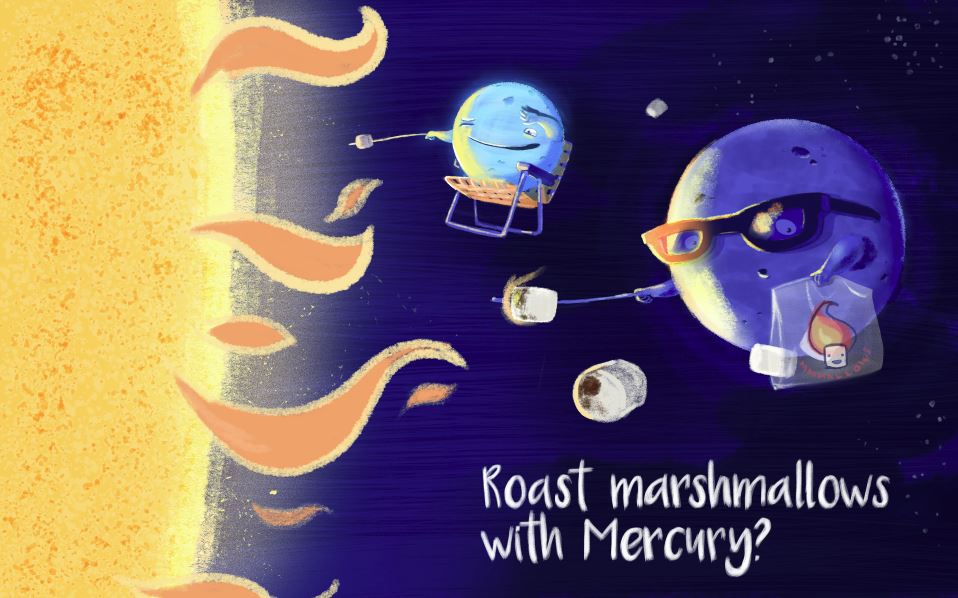
                  Any suggested changes? I had a hard time with the moon because it needed reflected light but still had to look moon-like. And its farther away.

                  Capture_mallows.JPG

                  www.lydiamueller.com
                  Twitter @lydesigns

                  1 Reply Last reply Reply Quote 1
                  • MOO
                    MOO SVS OG last edited by

                    This is quite different from the first one. It has a whole different feel to it. I like them both.

                    Marsha Ottum Owen

                    1 Reply Last reply Reply Quote 0
                    • Lydia M
                      Lydia M last edited by

                      I agree about the different feel. The hula one has a sweeter feel I think. I guess because of their expressions? I went over the hula one real quick and made some changes, trying to unify them because they'll all be part of the same book. Does anyone have any thoughts?

                      Does anyone ever feel overloaded with style ideas? I feel like a total commitment-phobe when it comes to art. Like I'm going to settle for the wrong one.

                      side2.jpg

                      www.lydiamueller.com
                      Twitter @lydesigns

                      1 Reply Last reply Reply Quote 2
                      • Dulcie
                        Dulcie SVS OG last edited by

                        I like the new hula-hooping one best, and the new Mercury one too! You should give yourself a break - it's really difficult to show gesture well when you only have a sphere and arms to work with! This is a difficult task IMO 🙂 And you're doing a great job.

                        Yes yes I totally feel like a style commitment-phobe! Every time I watch a new class I see a new way of working and think I must try this! And it's great and you learn stuff...but then I wonder well do I have to choose? If so, will it come naturally? I hope so. There's just so much fun stuff to choose from.

                        www.dulciemascord.com
                        https://www.instagram.com/dulciemascord
                        https://twitter.com/dulciemascord
                        https://www.facebook.com/dulciemascord

                        1 Reply Last reply Reply Quote 1
                        • First post
                          Last post