Learn how to draw Everything course
-
Hello fellow illustrators!
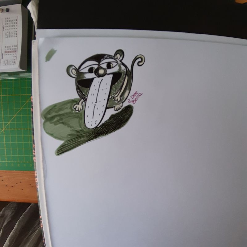
I am struggling with the "why" all my drawings looks like flat even after adding shades and did the forms construction. Here is an example of what I did... I feel so dumb.
Hope you could help.
XOXO GiusyJdeebella
Illustrator and maker
https://www.instagram.com/jdeebella -
Hi @jdeebella !
I definitely struggled with this throughout my art so hopefully I can offer some helpful feedback. What I would suggest is imagining your character taking up a 3D space. Thinking in terms of planes, where one intersects the other, will help you figure out which direction to hatch/crosshatch or shade in, which I think will help your images from feeling flat. I'm going to provide some examples, because I don't know about you, but I'm a visual learner and I find that it helps to see these things.
I did a rough sketch of your image below:
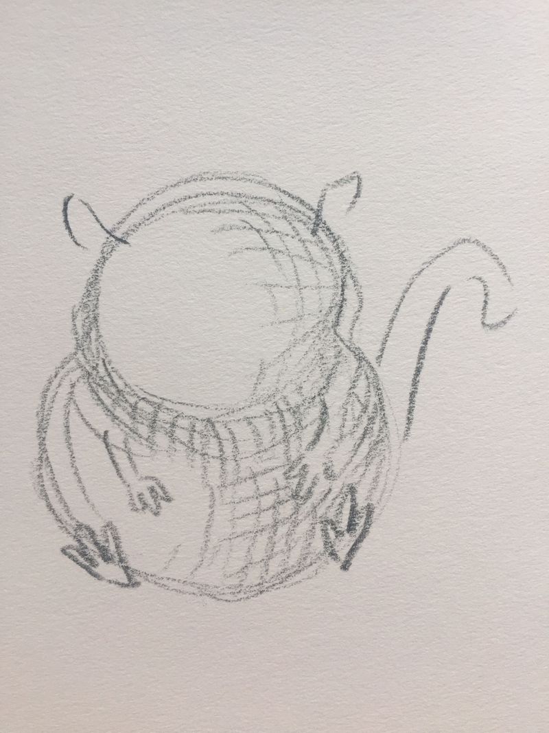
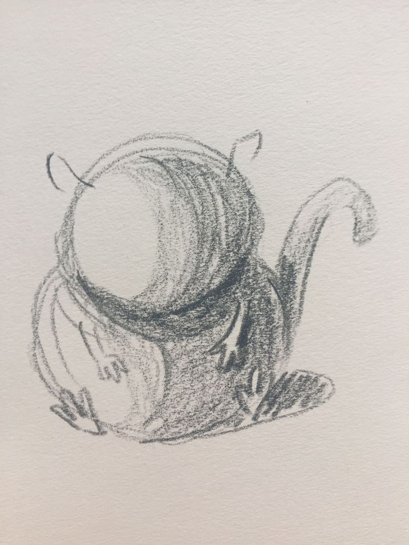
So it seems like your character is made up of two circles stacked on top of each other, or an otherwise kind of bean shape. When I think of shading I try to follow the shape of the form when I add hatching lines. The image above is how I would go about shading your hamster. Maybe start thinking about light source too? If the light is hitting the hamster on the left then the darkest part would be the right side, and under the neck, because the light wouldn't get there. If you want to block in tones, I would also try following the curved shapes of the forms, so your form would then look something like this:
Hope this is helpful in some way! I'm not sure if I explained it too well. -
Hi @jdeebella ! Cute character. When I look at your drawing I think the reason it's looking flat is because you are being inconsistent with the lighting, values, and rendering, so it's organized in a way that is confusing for the viewer.
-
Lighting- Your cast shadow doesn't connect to his body and the position of it indicates the lighting is coming slightly from the back, while the nose and over all body indicates lighting coming more toward the front. Additionally your line work is heavier on the light side of the forms in many places. The tongue, eyes, and limbs don't seem to be affected by light and shadow at all.
-
Values and rendering- Part of the creature's body is rendered smooth, part is choppy, part is cross hatched. The rendering doesn't seem to be organized in any particular way, and therefore confuses the lighting and what the body of the creature is like. Is it furry? Is it hairless? It is shiny? Is it matte? The nose is rendered with a large harsh highlight and therefore seem reflective and smooth. The muzzle also seems to have a large harsh highlight. Is the muzzle also reflective and smooth or is it furry? If the muzzle is made with fur it wouldn't have a hard white highlight like that. If that part of the fur is supposed to be white, I would expect a fur texture to be indicated with linework.
I think you would benefit from reviewing how light falls on simple objects, and also how cast shadows work in perspective. I would also recommend taking a perspective course if you haven't done so already. It will help a lot and get you stronger in your constructive drawing. Keep up the good work!
Website: www.tessawrathall.com
Instagram: www.instagram.com/tessawrathall_art/
-
-
One of the reasons is certainly that you're drawing the character in a straight-on angle. That's a very flattening angle. Try it in a 3/4 angle. The tongue also seem very straight and covers a good part of the body, those are all things that don't help the 3D comprehension of your drawing.
vanessastoilova.com
instagram.com/vanessa.stoilova/Check out my Youtube channel for tips on how to start your career in illustration! www.youtube.com/c/ArtBusinesswithNess
-
@Alicja-W thank you so much, this is very helpful, i will keep this in mind next time i draw a 3d character

Xoxo -
@NessIllustration
") that’s true! I think sometimes that’s because i don’t see well and I can’t focus a subject in the right angle position...
that’s true! I think sometimes that’s because i don’t see well and I can’t focus a subject in the right angle position... -
@TessaW yai! Thank you Tessa! Light is one of my most struggles. I think i need to draw much objects from reality to understand how light effects forms. Thank you for bringing it to my attention.
-
@jdeebella Hi, I struggle with flat characters too! I think Jake’s section V on shapes in How to Draw Everything is worth revisiting often.
Also, @TessaW pointed me to a book by Andrew Loomis titled “Fun with a Pencil” that has exercises with a circle explaining how to achieve form in the very first pages of the book.
The character you have chosen is a nice simple shape to use in practicing these exercises, so you will feel like you are making progress on something you created rather than examples in a book.
Now I need to go back to these again too!
-
@BichonBistro thanks for the suggestion! I will look fot that book