Dec. 3rd thursday sketch
-
@Chip-Valecek
Very true... I will try that and take a look")
-
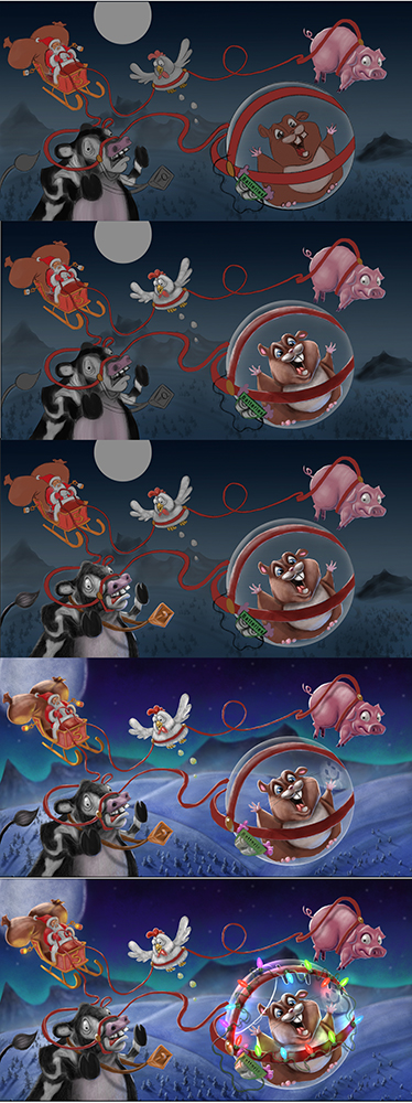
Update WIP
-
Update WIP
-
And here is where I am at right now...
Let me know your thoughts to improve... Thanks guys :).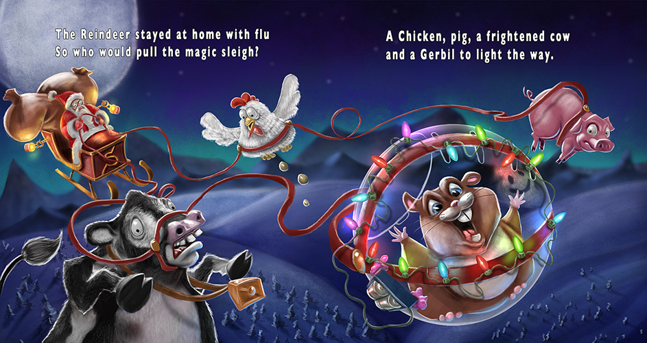
-
Nice story, so cute!!
-
Gorgeously rendered! I think it's a little heavy on the backlighting (rim lighting) for my taste. Looks too outlined. Perhaps soften/blur the white edging a bit?
Beautiful & cute!
-
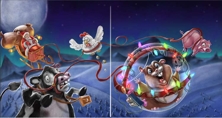
I really like the way you've done the lighting with the fairy lights, and the reflected light on the ball...really nicely done and I think this whole piece is so much fun! Love the rhyme too, brings the story together. Great work!
-
love feel of this and that chicken is so adorable haha
-
This post is deleted! -
@Nancy-Gormezano Thanks Nancy... Yeah, I may have went a bit too heavy on the rim lighting... It was tricky trying to get the contrast with the cow.... But I'm going to play around with toning it down a bit. Thanks for the critique
-
@Naroth-Kean Thanks
-
@Damien-Rambacher Thanks! Yes, I darkened it a bit to try to bring more contrast but I think you are right, it looked a bit better with the lighter background. I will work on that. Thanks for the critique.
-
@Dulcie
I appreciate the compliment. Thank you! -
Looks pretty crazy man. I like your expressions on the animals.
Hey I'm ArtMonkey and if you want to see my artwork you can check it here http://artmonkey1979.deviantart.com
-
@Art-Monkey Thanks! Glad you like it.
-
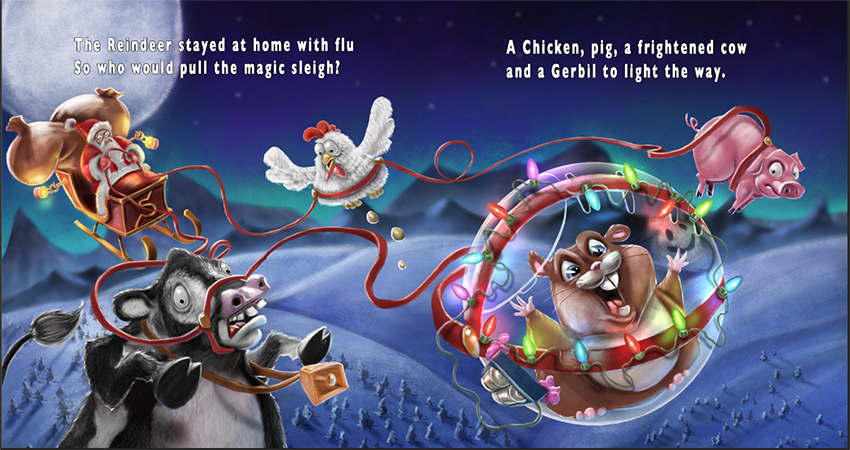
So here is another. The changes I made were to lower the brightness of some of the rim lighting on the cow, pig and gerbil. Lightened the background a bit then brightened the overall painting slightly as well as a slight bit more contrast. I'd love to hear anymore thoughts you guys might have for this image. Thanks a bunch
-
Yes! I like! (the changes are wonderful)
And now we will hear from the Text/Font/Grammar/All animals matter Nazi:
I love your rhyme - but I question capitalizing Reindeer, Gerbil and Chicken (but not pig, cow). Actually none of them should be capitalized unless you are doing a design (or those are their formal names). Then capitalize them all!
I would prefer a handwritten look to the text. But if you use a standard font, perhaps a more flowy, irregular placement, of the words, rather than straight blocky?
Text/fonts are my nemesis. I have a horrible time getting it right in my own stuff, and rarely succeed. So take my critique with a grain of snowflake salt (except for the capitalizing part).
-
ABSOLUTELY!!!! Yes, the text was the last thing I was going to deal with. I mostly threw it in there so I could get a feel for spacing and size but yes you are absolutely right about my capitalization issues :). I will definitely deal with those before turning it in.
If you have any ideas for some good fonts I would love to look for them online. I know it is a battle between making it very easily readable and at the same time being something that is visually nice to look at. My typography knowledge is... well, there is none. HAHA. But yes, if you or anyone else have any good thoughts about some quality fonts I could get that would be great! Thank you for the critique!
-
@Kris-Knight This has gotten better with each iteration. I really like the colors and value structure. A couple things you can look at that bother me about the image:
- Santa's eyes creep me out a bit. They seem to be completely popped out of the head.
- The eggs under the chicken do not add value for me. They are more distracting.
- Some of the reins look pasted on like around the cows muzzle, around the chicken's waist, and around the pig.
- I also am not sure the large moon is adding anything to your image.
By the way I really like the smiley face inside the ball. Nice detail.
-
Hi Kris!
I like this piece so much.
I wanted to say two things, which are more or less said by sean (@seanwelty) already.
I think that the moon is a bit distracting. I would make it smaller or would not show it at all, even if it is the light source.
The animals look a bit like cut and pasted. I guess this can be repaired by giving their edges a bit more blue light, so that they blend more into their environment.
The panic cow is my favorite! This whole piece will turn out great.