Dec. 3rd thursday sketch
-
@Kris-Knight Your rendering skills are very good. Love the image! The only comment I have is what if you de-saturated the background a little to allow your characters to pop. In specific the turquois lighting. My eye keeps going there. Just a thought....great job!
-
@Rob-Smith Hey Rob. Thanks for the critique, I'll definitely mess around with the saturation to see what it looks like. Thanks
")
-
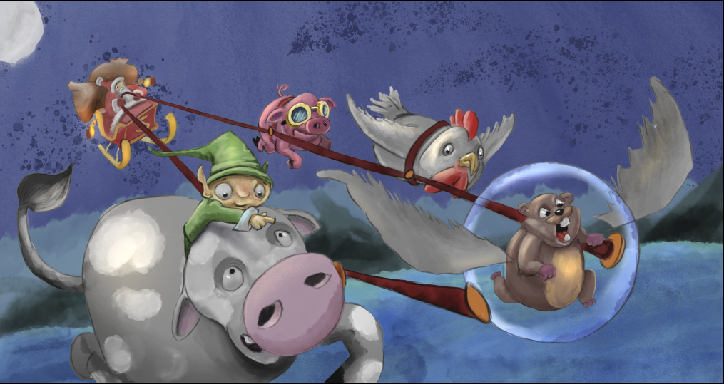
NEW WIP
So here is another version of my 3rd Thursday. Based on critiques as well as painting in a different style.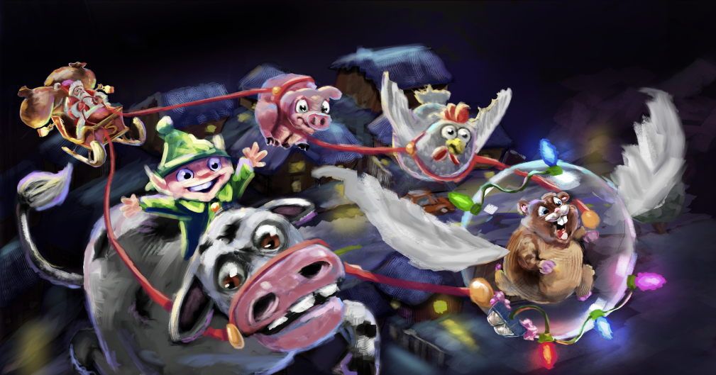
-
Hi Kris. I don't think their speed is coming through because there isn't a continuous line in the reins. The angles are all broken up. I liked their expressions in the original. The cow looks like he's going "meh" in this one. You know when someone takes off in a fast car and they get pushed back and look like they're straining against it? That would show how excited and surprisingly speedy that hamster is.
www.lydiamueller.com
Twitter @lydesigns -
Very nice Kris!
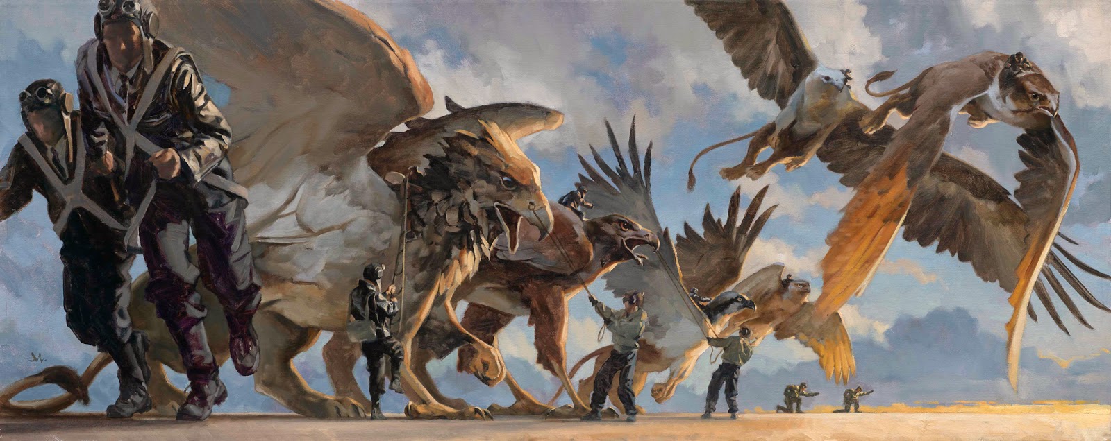
I think the original version is working much better than the newer one. Although it's fun to see the alternate style. Right now the most recent version feels like a sketch. I'm a big fan of loose painting, but it has to have a "finished" look to it as well. Check out Gregory Manchess to see what I'm talking about (shown here).
-
The big thing I'd watch out for in both versions is overlighting the scene. It's easy to get carried away with all the individual elements receiving a highlight, lit side, core shadow, shadow, and reflected light, but it's best to think about overall local value and then slightly brighten the lit side and slightly darken the shadow side. Reflected light should be a value or two darker than the main light.
In order to see what I mean, squint at your image and notice the value structure. there are brights and dark spots popping out everywhere. Now squint at gregory manchess's images. See how all of that broken paint work just calms down and goes into either the light or dark?
Here's a way to test that idea. I grabbed Greg's image and yours and ran them through the "posterize" filter in photoshop (set to 4 values). It basically simplifies detail down to it's local value and color. Look at how well Greg's holds up. It looks like a simple version of the original painting while yours gets a bit too spotty (Meaning there is too much highlighting going on).
Hope that helps some. : )

SVS Faculty Instructor
www.leewhiteillustration.com -
I like the new layout much better. Then hamster reminds me of Rhino from Bolt! Haha!
-
@Lee-White
Lee, I really appreciate you taking a look and giving me your feedback. I never did the posterize thing before so I will begin using that from now on.... I had been just desaturating everything to see if it was reading but now I see there is more to it. I'm a fan of the painterly style, for instance marco bucci and Zac Retz so I figured I would take a stab at it. Perhaps you would be kind enough to give me some direction about something. I'm worried that the "style" that I seem to be "okay" at is the more rendered type like in my first version but I have a big worry that it may not be a marketable style. I see everyone talking about attempting to make things look traditional.... so here is my question. What style should I be trying to achieve in children's book illustration? My goal (like others here) is to be an illustrator and writer/illustrator, so with that in mind I want to work towards a style that would be looked upon positively, so is the style in the first image I created marketable?.... or would it be better for me to really begin to work on finding a different style???? Thanks a bunch Lee I hope you can send me in the right direction. -
Haha yes. After I thought about using the gerbil for my image Rhino became one of my references
@Sharon-Sordo -
@gimmehummus Definitely a good thought. I'll be honest, I'm not sure how I would do that haha. On this version I was mostly trying to get it where it appeared like they were all working together. I'll have to think about that one.
-
Great questions! Style is a really tricky thing. The go to answer that all my teachers had was "don't worry about style, it will come naturally". What a bunch of crap that was and I hated hearing it. Now, what my teachers were probably alluding to is that you need to find a style that is natural to you. So that means looking at people who have that special something that goes where you want to and then trying it out. That means doing master copies and really analyzing what it is specifically that makes an image work. Is it the color? Brush strokes? shape design? etc. You need to really get in there and try a lot of stuff out.
One tip, start on EASY images. Your image here is very tricky with lots of detail and tough lighting. Not a good one to really veer too far from your comfort zone. Your first style is good, but it does seem very digital so you may want to incorporate some traditional texture overlays in it, etc. Try a lot of different techniques to get the look that works for you.
The only time that "style" is really a no-no is if you are chasing it because you think that is what other people want. It will always come across as gimmicky if you approach it in that way. The goal should be hitting an image that looks the way you want it to look. Traditional looking work will never go out of style, so figuring out how to get more of that look in your digital work can't be a bad thing. I do think gregory manchess or marco bucci would be a great starting point for you. Also taking some traditional painting classes will really make all of it mesh together in your brain.
Hope that helps some. Let me know if you need anything else. : )
-L
SVS Faculty Instructor
www.leewhiteillustration.com -
Thank you very much Lee! If I come up with anything else I will definitely let you know. I'm gonna let that info sink in as I try to tackle the Santa image again. Thanks a bunch
-
Omg why do i like the expression of your Santa so much XD
-
and yet another version.
So if you guys can't tell I've been using this month's 3rd thursday to attempt to take some chances in order to get out of my comfort zone and try other styles of painting. This is a WIP of a watercolor version along with some opaque texture brushes. As you guys can see in my first painting I really love rendering so this is a challenge for me to just do a little bit of shading and highlighting and not doing so much where it becomes "highly rendered". This is my first go at this style. Definitely was a challenge to do this.
-
I like the reins tighter like this, really liked the other painting style though! I thought you had it goin' on!
-
@bharris Thanks a bunch :). Yeah, the rendering style feels more natural to me... I just worry about if it is as marketable as some of the people here with the more traditional look????? I don't know lol. I will probably redo the piece in that style before turning it in lol.
-
@Kris-Knight I think it's very marketable! There are a lot of people here with more traditional approaches, but that shouldn't hold you back from a style you like working in. Gotta balance out the forum with different types of art and just improve what we do. I admire a lot of people's work here, and maybe wish I could render this or that way, but I'm still developing what I like, and want to just do me.
-
I like these animals in your latest change! This may not work but is there anyway to combine these animals with the background of your 1st rendition? Just a thought because I love the background of your 1st one and these animals have a lot of character!
-
@bharris I appreciate that, thank you :). I'm the same way... I see so much here that I like and want to learn from.
-
@Kris-Knight I'm definitely more drawn to this last style you've tried out, but like you're saying, it's for sure a personal preference thing. I do think if you were to go this route though that it needs to be developed further, it looks a little unfinished to me. The textured paint background is a bit too dark as well. Your characters are even drawn differently - they have that "cute" look to them that's perfect for kids.
However - when I say I'm more drawn to your last style I'm thinking in terms of children's books. Your highly rendered style is gorgeous (and I do like it!) but I envision it to belong more in the editorial illustration realm. Unless you played with blending a bit of the two - make your characters more "cute" and soften some things about your highly rendered style and it could work great for children's books (is that what you want to do BTW? Maybe I shouldn't assume!). That's what I think it's a bit off about your highly rendered style at the moment (for kids books) - it's pretty harsh and intense. So that's my advice - if you enjoy the highly rendered look the most, go with that but work at "cute-ify-ing" and "softening" here and there.
https://danettebyatt.com
Twitter @DanetteDraws
Instagram @DanetteDraws