Indoor scenes, critiques welcome.
-
During my process of putting together a protfolio, some of the feedback I got from this community was I do not have piece which is set in "Home", or "indoor" in general. So I decide to practice making indoor scenes.
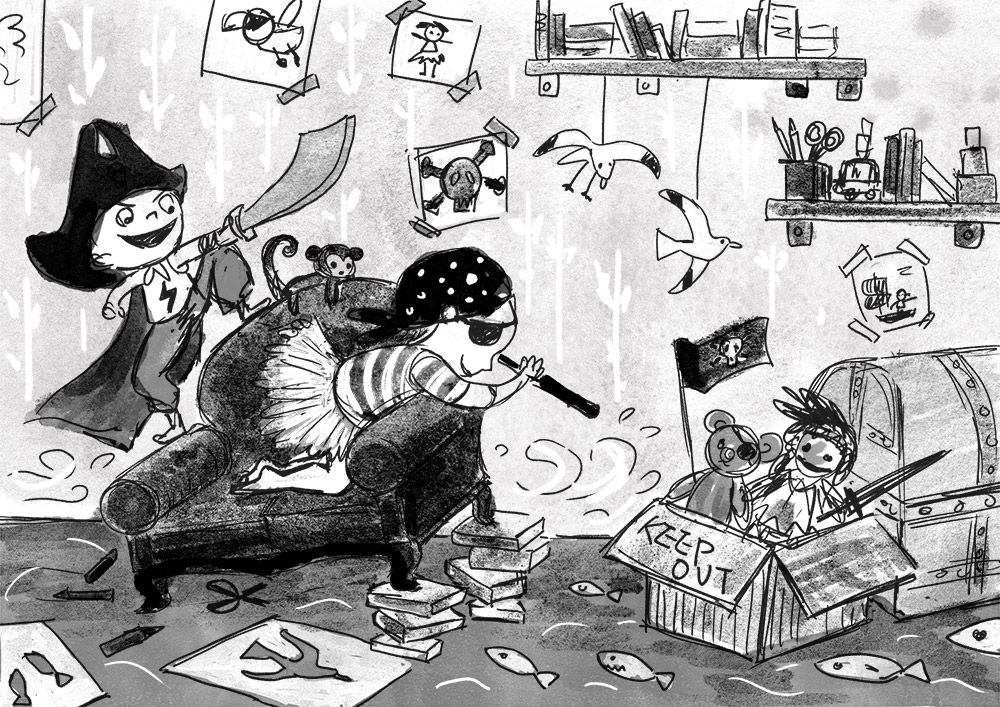
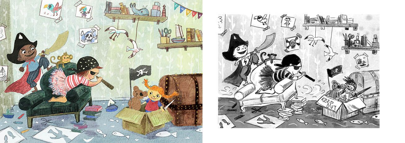
The image below is for SCBWI's monthly prompt "Dress up".
Story:
"I want to be a superman and a pirate."
"I want to be a ballerina, and a pirate."
"But mostly, we want to be pirates, hunting treasure and fight other pirates and stuff..."
Keywords: Fun, adventure.
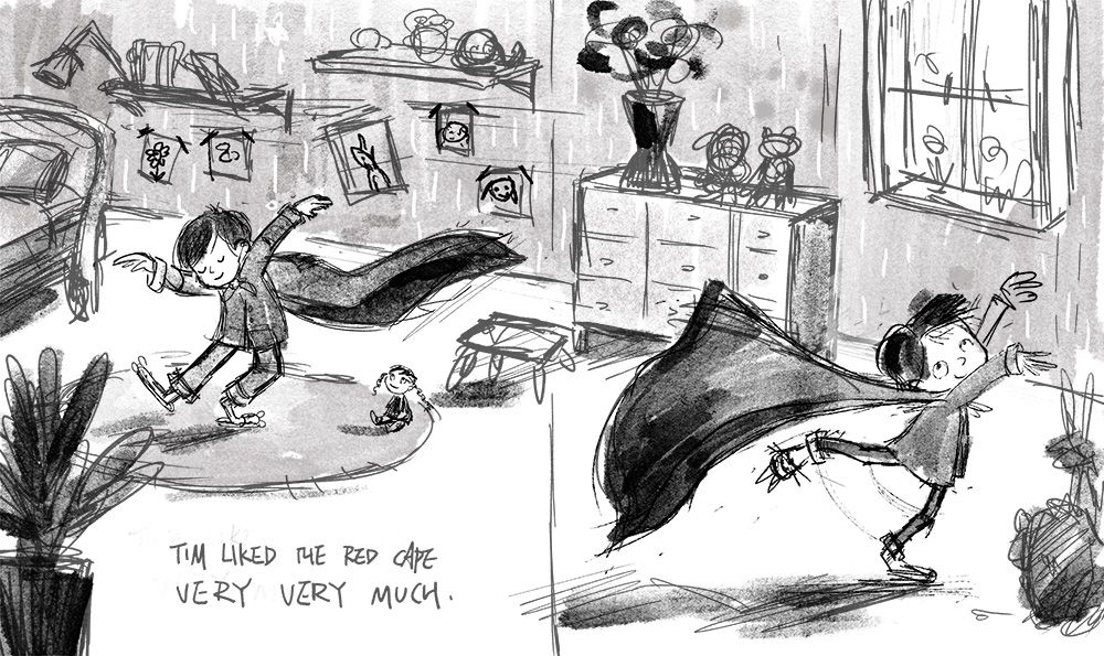
The image below is a spread from a picture book dummy I am working on. The story is about a tender boy finding strengh to be himself, rather than trying to be "strong" "tough", like boys was told to be.
Keywords: Delighted, warm in heart
I found it is hard to work with indoor scenes. I try to think of stuff included in the scenes as light shapes and dark shapes, instead of being caught up with drawing the objects. But my mind keep jumping back to "Now I am drawing a table, and now I am drawing a bookself."
Any feedback on the 2 image above?
Any advice on how to design indoor scene in general? -
@xin-li I really do not have much advice on this since I am not good at creating full images like this. But I think you are on the right track. The thing about the bottom image is that the floor line meets on both pages which makes me think its just one large image and not two different images. Maybe if they did line up or one was from a different angle that might work better. Or it could be the table in the gutter that is throwing me off.
-
@Chip-Valecek Thanks. Regarding to the bottom image, I did it on purpose. I have seen other artist do that: they draw one continues scene, but 2 different moments with the character. It is like camera panning while the charcter is moving along, if it make sense. I like that approach, wanted to try the technique myself. But if you find it confusing, that must be my excution has some issues :-).
-
I see what you did with the continuous scene, I've also seen other illustrators do that and it's a lovely idea, especially for a scene like yours where he is dancing around in his cape.
I adore you little boy character in his cape, beautiful movement in his arms and legs and I already want to know the rest of the story. I'm not the best at doing full scenes, but for me there's too much wall and shelves if you know what I mean. Maybe you could put the bed right up against the wall in the top left and then you can have his pictures stuck on around the headboard. You could also give him a little side table and lamp instead of the shelf directly above his bed?
I know this is only your initial rough, but at the moment it doesn't look like a little boys room, for example I doubt a little boy would have a plant/flowers in his room? Unless that is your intention. Apart from that I love it and it's going to be such a strong piece")
Your pirate idea is also lovely, the characters are brilliant and I love all the bits and bobs dotted around everywhere
the only thing that stands out is all the different angles you have going on. The shelves are straight on, the chest is angled to the right and the armchair to the left, if you see what I mean? I think with this one you could really play around with different compositions to make the chair,characters and box the main focus -
@hannahmccaffery thank you for the comments. This is really helpful. For the superhero kid image, I get what you mean by too much wall and shelves. I will play around the placement of bed and other furnitures. Yes. it is not a typical boy's room. It is part of the story - the boy is into what normally considered girly things. The text never says that, but I want to communicate this through image. I am glad you read it as NOT a typical boy's room.
In the pirate piece, I want to communicate that the kids have been playing around with everything in the room, things are not aligned because they have been messing around witht all the furniture. But if you find it odd with the angles, I probably should go in and play around a bit mroe, see if I can come up with a different solution.
Again, thank you.
-
@xin-li I agree with @hannahmccaffery about the plants. To me the plants make the room read more like a living room than a bedroom. To me, a potted plant or a vase of fresh flowers would require too much attention and maintenance to belong in a small kid's bedroom.
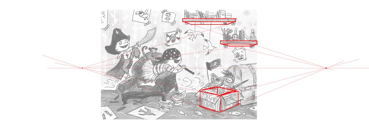
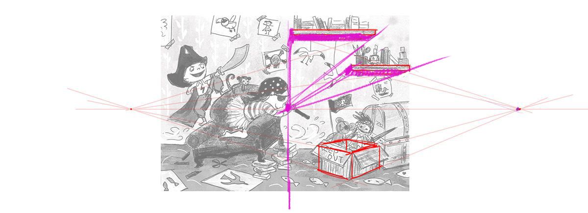
I don't think it's the placement of the objects in the pirate scene, it's the perspective. (excuse the poor draw over) Going off the perspective of the box, you would need to see a lot more of the bottom side of the shelves. It's also tricky to mix things in 1 and 2 point perspective. I'm pretty sure the way I've done it is not right. Hopefully someone can correct me.
I really love the way these are headed though. You have a very strong sense of character and gesture. Really good stuff!
Taylor Woolley
(Formerly Taylor Ackerman / StudioLooong)
Website: www.woolleystories.com
Instagram: https://www.instagram.com/woolleystories/ -
@StudioLooong thanks for draw over. It is a good start for me to play around. It does look more correct already with adding the bottom side of the shelves.
It is interesting about the plants, I have not thought about that would make the room more like a living room. I guess I will try to replace the plants with unicorn, big fluffy pillows or something :-). Thank you.
-
@StudioLooong @xin-li that's the word I was looking for, perspective! Not angles haha!
-
wow! I really love them. I like your playful characters and furniture. I am pretty sure you're on the right track!
I think just like others, I also thought it's a living room instead of a bedroom because of the plants. Maybe can put like toys, soccer ball, or something else on the top of the cupboard instead of flowers in the vase. Just need to give a little bit personality to the bedroom
can't wait to see more! -
@StudioLooong this is very helpful
-
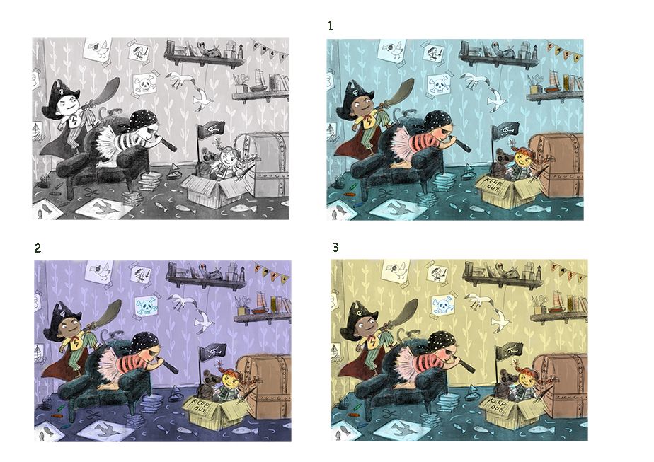
Trying to get "Dress Up" piece done before the SCBWI monthly deadline. I Am struggling with value and color on this piece, but manage to make osme progress. Any thoughts?
-
@xin-li I like number 3 the most
-
I like #3 as well.
-
These are awesome! 2 is my fav.
-
Doing the final push on this piece, still hoping to finish it today. I toned down the color for the background, trying to make the character stand out more.
I found myself keep feeling that the tight painting lost some of the inital enegy. I am also not sure if the background is a bit too busy, even though I kept things farely low contrast.Any thoughts?
-
Hi
I really like the concept of this, and the characters are looking great!I think the characters and the chair are standing out well from the background now, but the sword and the books the chair is standing on could be darker or outlined to separate more from the background and be more grouped with the children.
There is something about the box with the doll in it that is not quite working for me, it’s maybe a little stiff, less energetic and low contrast compared to the rest of the image.
The background looks very nice, but I think that right now it is a bit more «in focus» than the foreground, because the linework is more prominent than in some of the elements in the foreground. Maybe either adding linework in the foreground, or remove/tone down more in the background would help?
-
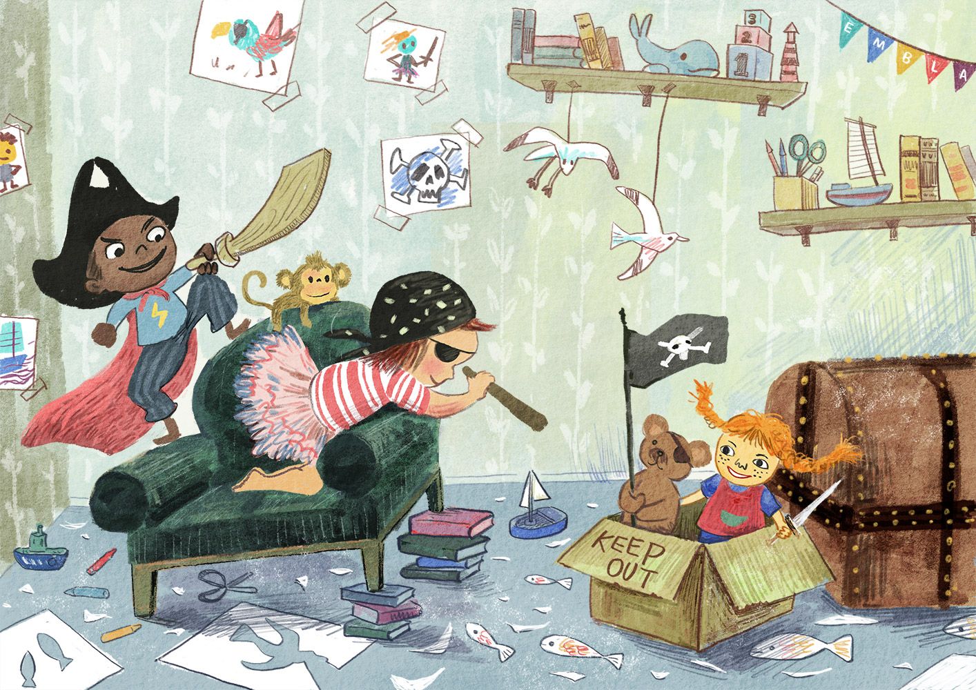
@karolifo thank you for the comments. I made some more progress, Added more line work in the forground. Hope this balance it out with the background. I might need to adjust the lines on the character to be a bit more prominent, and maybe adding more details on the characters.I think I might have to redrew the box with doll, you are right - it is kind of stiff.
Thank you for helping out.
-
@xin-li I think you’ve managed to keep a lot of the energy in the original sketch, but it always seems like a little is lost, doesn’t it? For some reason, maybe because there are a lot of angles in papers, boxes, etc, I like the curved legs on the chair in the sketch—it’s such a minor detail that I wouldn’t bother if it’s a pain to change. I also like the boy’s wider mouth in the sketch—he looks more engaged with it. I find environments very challenging and yours is fun to look at!
-
@BichonBistro thank you for the feedback. It is always very helpful to have other people take a look of the piece I am working on. I definitely will give another try on the facial expression on the boy. It is just going to be where people first.
I will see if I have time to work on a bit more of the sofa leg. I agree that the curved line look for interesting.
-
@StudioLooong It's sort of a tricky scene to figure out vanishing points and things like that. Its a somewhat stylized approach, so realism rules don't fit perfectly here. But there are some clues on how to solve it within the image. If you look at the floor plane, it's perfectly horizontal to the viewer. That means that you would use a 1 point perspective for the room itself. Since the shelves are also part of that box, it would also fall within the 1 point perspective. Anything within the room that is rotated would turn into a 2 point perspective like you have drawn on the box. Hope that makes sense. : )
That said, I like the finish that she chose better than using the vanishing points. Nice work @xin-li!
SVS Faculty Instructor
www.leewhiteillustration.com